


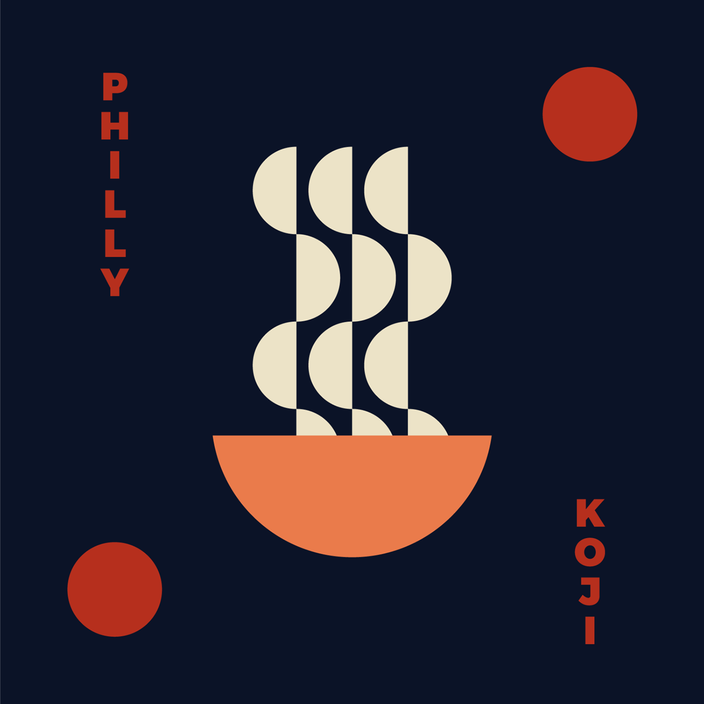
Philly Koji Co. Logo Case Study
—
Philly Koji Co. is a Philadelphia-based startup run by Jim Clarke. Jim and I worked together to create a flavorful logo mark for his business that was approachable and professional. Our goal was to create a unique aesthetic that could be built into a highly marketable brand.
Discovery and Mood Boards
Every new logo project begins with a discovery phase, wherein we work with our clients to understand their business goals, target market, and brand vision. We then create visual mood boards like the ones seen below that are meant to hone in on a clear visual direction for the logo design. Approval on a specific style at this point is critical to ensuring too much time isn’t wasted when it comes time to actually start putting pencil to paper, and has also proven to reduce our client’s uncertainty about what to expect from the first round of logos.
A very special thank you to all those designers out there that share their work so that others may use it as inspiration
Concept Sketches
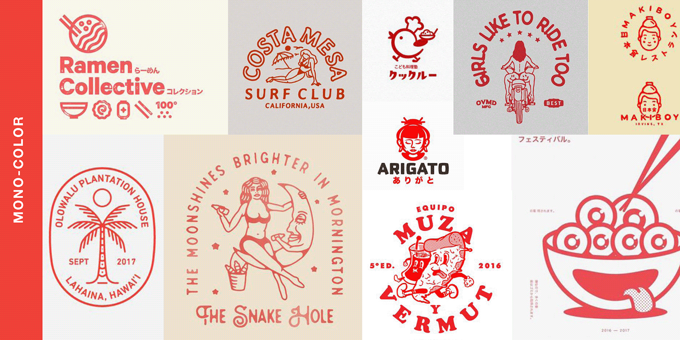
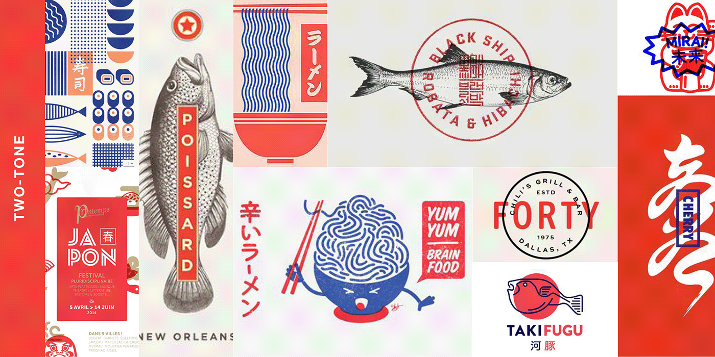
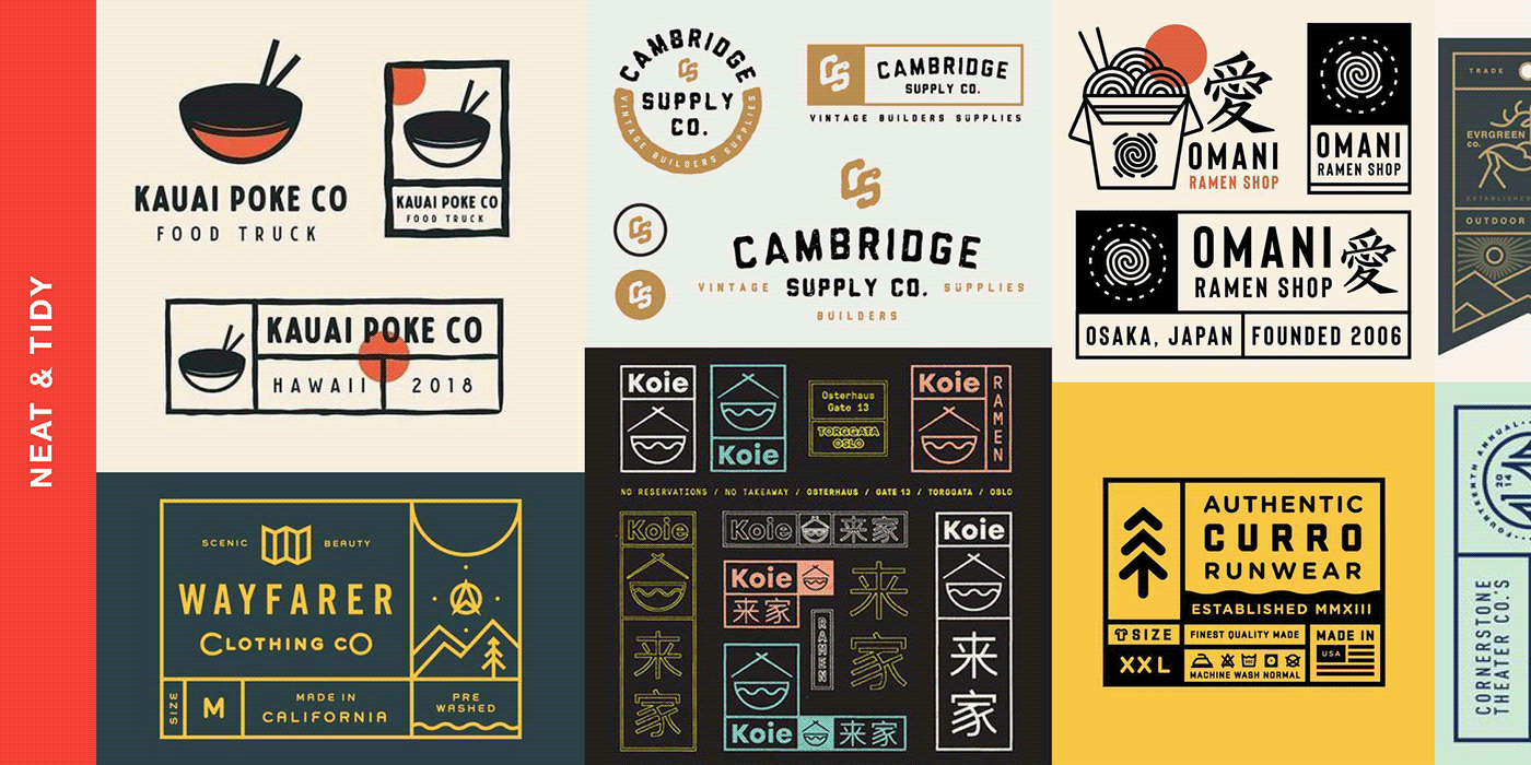
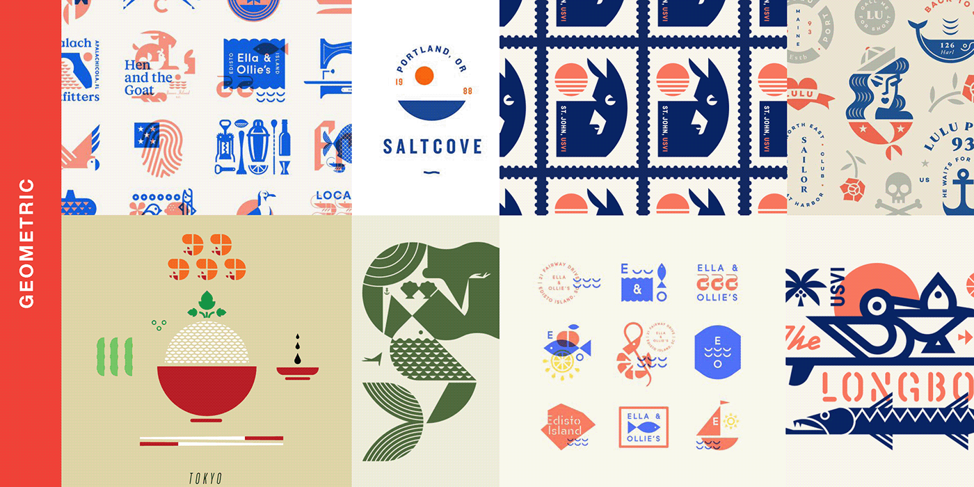
The discovery and mood board phase helped Jim Clarke and me narrow down the design aesthetic to both the “Mono-Color” (Fig. 1) and “Two-Tone” (Fig. 2) design aesthetic. We discussed creating an approachable, and inclusive logo mark that was fun, but not too silly that could be expanded in the future as the company grew in size.
I started by exploring simple illustrations with animals with miso at the focus, but decided that the original character designs would ultimately be too childish for the direction of the business.
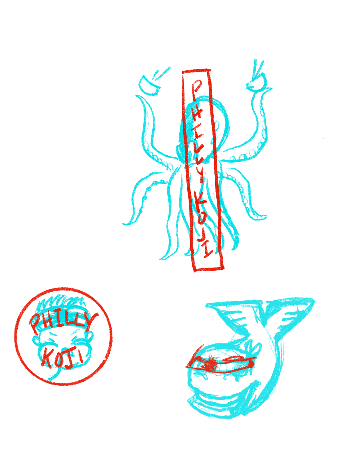

Drawing from Jiu Jitsu as Inspiration
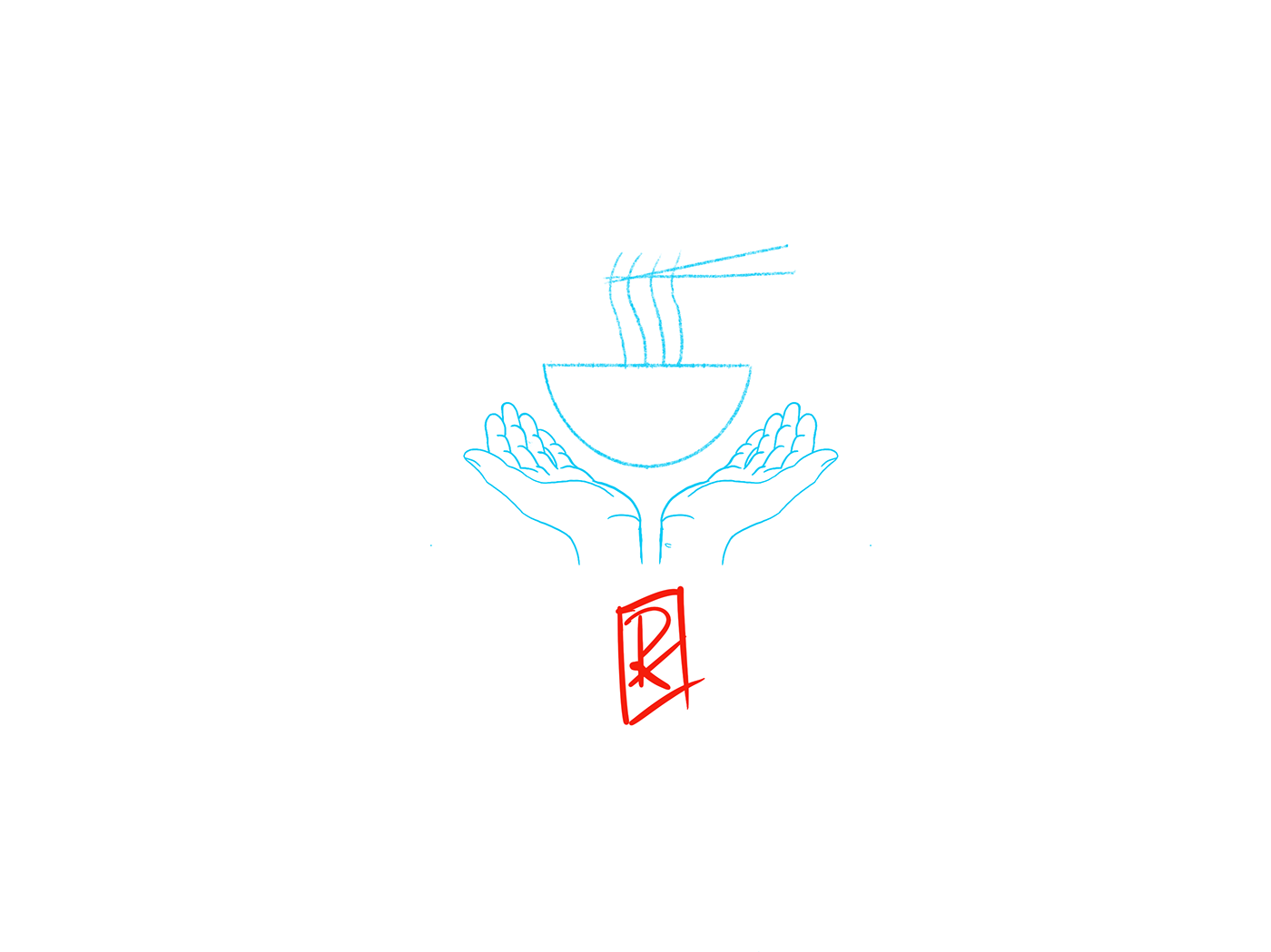
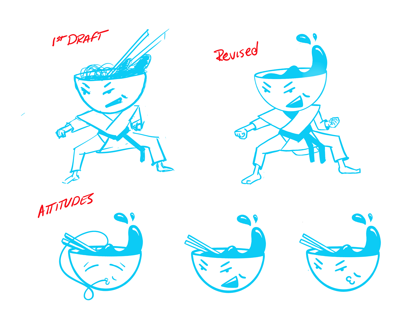
After exploring animals and a few faces of fat kids eating noodles (not pictured) I turned my attention to Jim’s love of Jiu Jitsu. The idea was to connect the owner and his brand to his two favorite things: cooking and martial arts. Jim loved the idea, but expressed some concerns about the character design as a long-term mark, and I agreed that it would probably be better to boil things down a bit more. I dropped the body from the original design and explored a few different facial expressions of just the “bowl-face”, and the brand quickly began to reveal itself.
Exploration of Typography and color combinations
The next step was pairing the right type-face to the brand and exploring more with the color palette.
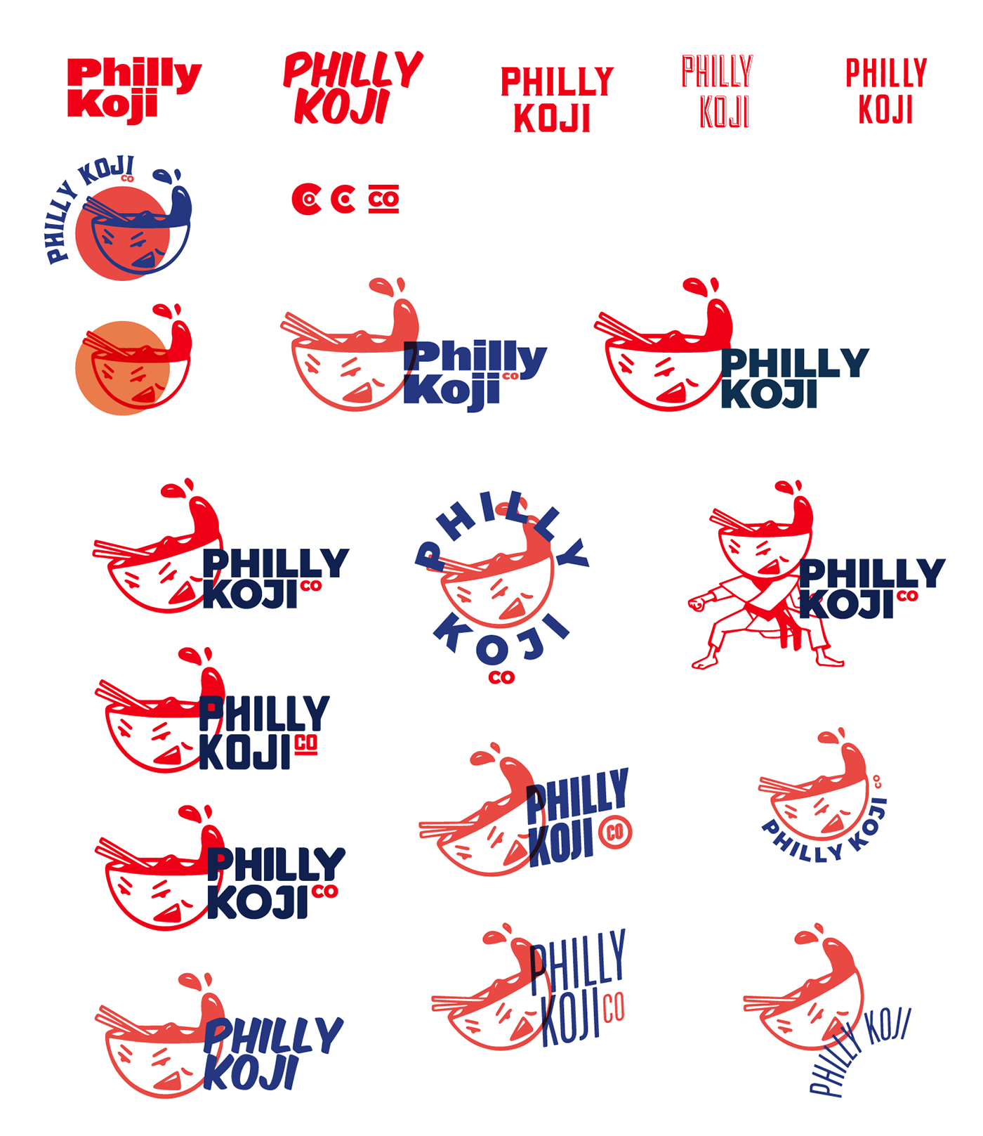
You’ll see from the images below I looked at number of different type styles ranging from playful to more utilitarian in aesthetic. I was originally torn between using a type treatment that would blend with the design and a style that would contrast with it.
Simplification of the mark
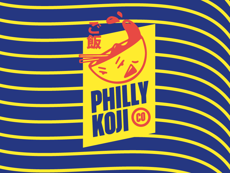
After type and color explorations Jim chose to go with the friendlier, less contrasting typeface called “Komika”. This pairing pushed the brand further down a more playful route that will excel in setting up exciting possibilities for future brand collateral like t-shirts, menus, posters and signage.
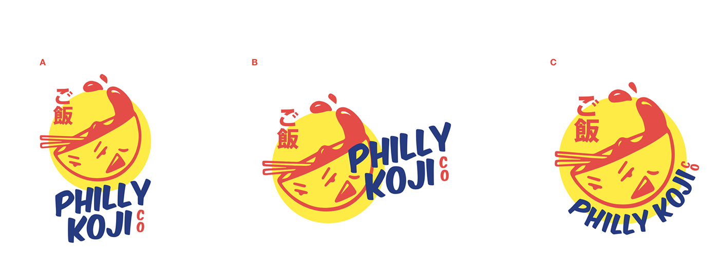
Finalization
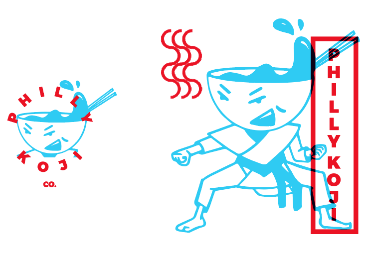
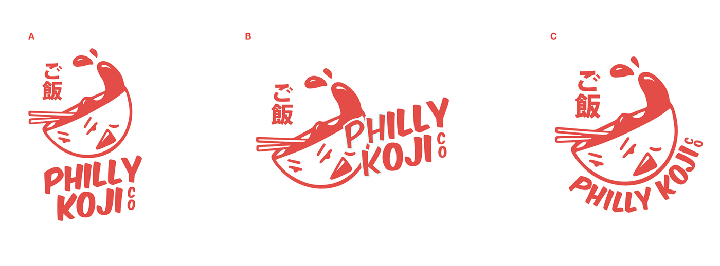
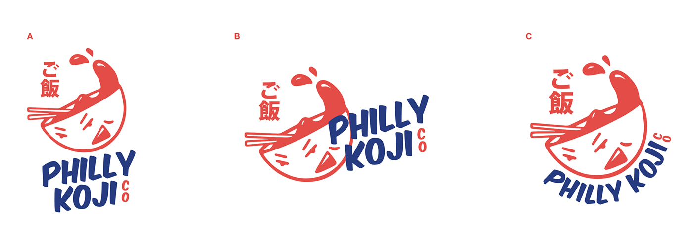
The final step was to create a few lockup variants that combined the approved logo mark and the type pairing in different orientations. Whenever I design a logo, I rarely ever just create one version. In the landscape of ever-changing digital formats I find it’s best to have a logo that can adapt to various placements. Below you’ll see vertical (stacked), horizontal (landscape), and circular versions of the design.
I also got sign-off from the client to go forward with a three-color mark that could be boiled down to, two or 1 colors.
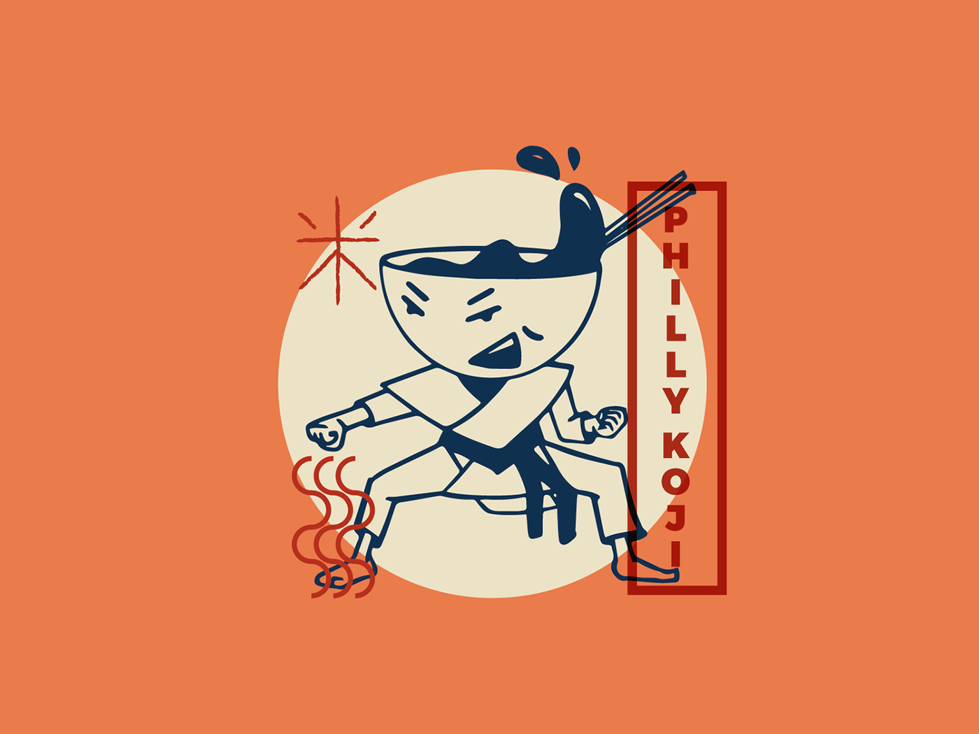
Next we see the introduction of blue as a secondary color.
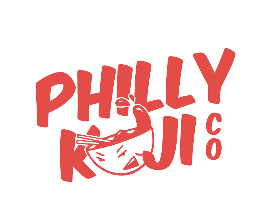
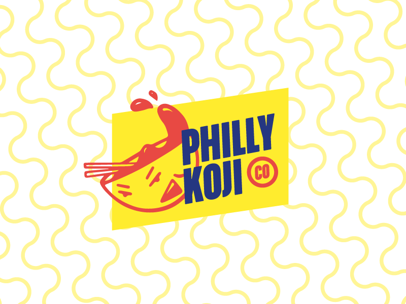
And finally the full three-color branding of Philly Koji Co.!
So basically..
From start to finish this logo project was a real labor of love. Working with Jim Clarke on his startup’s brand was an honor, and his willingness to collaborate and engage in honest conversation about his vision for his business yielded what we both feel is an incredibly unique logo mark.
Thanks for reading!


