Conceito.
A marca nasceu em Goiânia através da visão de dois jovens empreendedores que idealizaram a empresa com a premissa de oferecer atendimento exclusivo auxiliando o direcionamento financeiro de empresas, com estratégias para otimizar os gastos, com conhecimento técnico e humanizado, queriam também desvincular da visão formal que a gestão empresarial tem no mercado (normalmente muito formal), afinal de contas é um campo que a troca de informações e a recíproca é uma constante, então porque não ser mais humanizado?
Sendo assim a marca da SIC traz uma visão mais humanizada do campo da gestão empresarial pensando não só nos lucros financeiros como na qualidade de vida dos clientes e colaboradores, trazendo a experiência com a marca e a interação entre ambos, trazendo o equilíbrio entre estratégias financeiras e desenvolvimento entre pessoas de forma orgânica.
O desafio.
Como podemos ressignificar a visão da gestão empresarial de forma moderna e profissional?
Como equilibrar uma visão formal com algo mais humanizado?
Como tangibilizar a essência da marca?
A marca deverá refletir a solidez, as metas que são batidas pelas equipes em relação a vendas e satisfação da equipe, transmitir não só a qualidade de lucros financeiros como a qualidade de vida também.
_
Concept.
The brand was born in Goiânia through the vision of two young entrepreneurs who idealized the company with the premise of offering exclusive service assisting the financial direction of companies, with strategies to optimize expenses, with technical and humanized knowledge, they also wanted to disconnect from the formal vision that business management has in the market (usually very formal), after all it is a field where the exchange of information and the reciprocal is a constant, so why not be more humanized?
Thus, the SIC brand brings a more humanized view of the field of business management thinking not only about the financial profits but also about the quality of life of customers and employees, bringing the experience with the brand and the interaction between both, bringing the balance between financial strategies and development among people in an organic way.
The challenge.
How can we reframe the vision of business management in a modern and professional way?
How to balance a formal vision with something more humanized?
How to make tangible the essence of the brand?
The brand should reflect the solidity, the goals that are reached by the teams in relation to sales and team satisfaction, transmitting not only the quality of financial profits but also the quality of life as well.


A identidade.
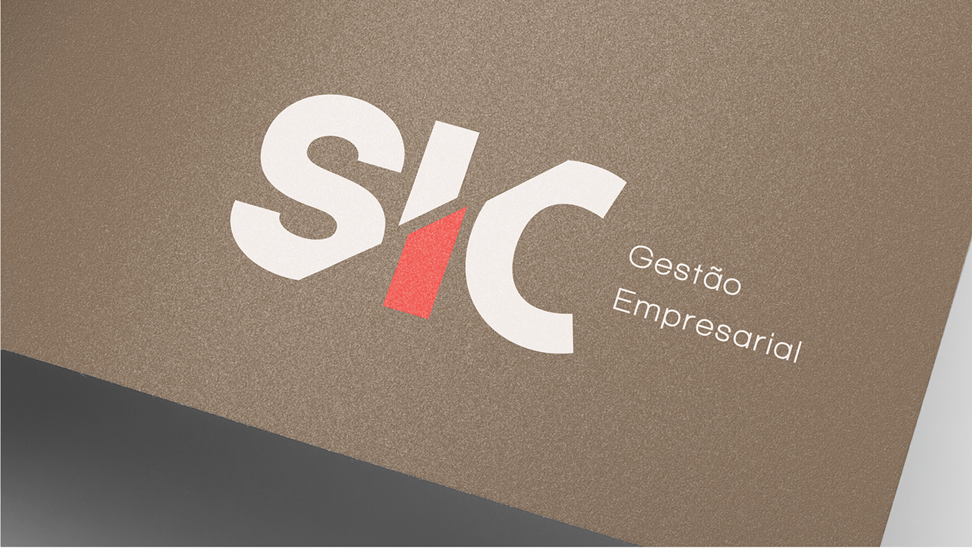
A tipografia projetada traz o nome da empresa com a vogal do centro cortada ao meio trazendo a sensação de corte de gastos, ruptura (da visão muito formal) e a idéia de não ser algo centralizador fazendo com que cada parte represente o cliente e o colaborador tangibilizando a sintonia entre ambos.
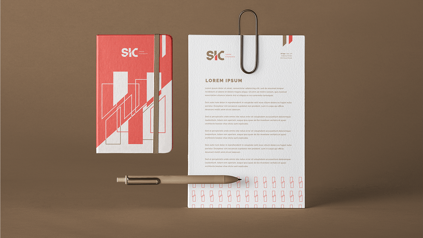
A Identidade Visual traz o conceito de interação entre pessoas de forma coordenada, a ideia é que a interação entre pessoas são trabalhadas como camadas sobre camadas que quanto mais sobrepostas mas força elas ganham, tangiblizados nos grafismos.
Paleta de cores.
As cores foram selecionadas cuidadosamente para equilibrar a visão formal com a humanização da marca, fazendo com que o vermelho seja a cor emocional, pois ela representa a confiança, trazendo bastante constraste, e os tons de marrom representam a parte mais sóbria e técnico da marca.
A união das cores representa a personalidade de uma marca profissional e humana, chamando atenção para um público que busca um atendimento mais próximo.
_
The identity.
The projected typography brings the name of the company with the center's vowel cut in half bringing the feeling of cutting costs, rupture (from the very formal view) and the idea of not being something centralizing, making each part represent the customer and the employee making the connection between both tangible.
The Visual Identity brings the concept of interaction between people in a coordinated way, the idea is that the interaction between people is worked as layers on layers that the more overlapping but the strength they gain, tangible in the graphics.
Color palette.
The colors were carefully selected to balance the formal vision with the humanization of the brand, making red the emotional color, as it represents trust, bringing a lot of contrast, and the shades of brown represent the most sober and technical part of the brand.
The union of colors represents the personality of a professional and human brand, drawing attention to an audience that seeks closer service.