Time-lapse of the staging for the show going up at Nokia Theater.
Adobe MAX 2013
Every year, I get that butterflies-in-my-stomach feeling as we begin to ponder the vexing question here at Adobe: How do you inspire the best creative minds in the world? Over the years, Adobe MAX has come to represent a sort of Holy Grail of creative gatherings, and establishing the identity for this annual event always provokes the same questions: How will the audience respond? Are we jumping the shark? Will we fail? It’s super-scary, and yet it’s also one of my favorite parts of the job as Adobe’s executive creative director because every year we get to work with some of the world’s best talent to build an identity for MAX that might, just maybe, possibly, totally nail it.
Every year, I get that butterflies-in-my-stomach feeling as we begin to ponder the vexing question here at Adobe: How do you inspire the best creative minds in the world? Over the years, Adobe MAX has come to represent a sort of Holy Grail of creative gatherings, and establishing the identity for this annual event always provokes the same questions: How will the audience respond? Are we jumping the shark? Will we fail? It’s super-scary, and yet it’s also one of my favorite parts of the job as Adobe’s executive creative director because every year we get to work with some of the world’s best talent to build an identity for MAX that might, just maybe, possibly, totally nail it.
In 2013, the process has once again proven to be nothing short of amazing. I chose four artists and creative teams to do one thing — give us their own interpretation of the Adobe MAX logo. And after many months of work by some of the most brilliant minds in their respective fields, I am pleased to share the results, along with some designer insight into the creative process and a peek at what went into creating these impressive pieces of work.

Vasava's version of the MAX identity.
It’s all about the love — Vasava
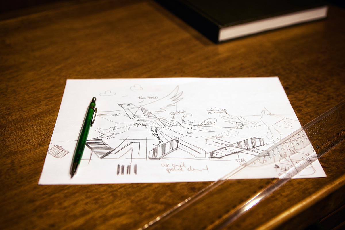
Everything the Vasava team works on seems to get infused with love. We’ve done plenty of projects with Vasava, and this agency’s untethered approach comes through in its broad range of skills — from old-school lithography to the most edgy of motion graphics. Vasava’s interpretation of the MAX logo is a great example of what I call its “patented poly-sketch technique,” where an idea that starts as a photo morphs into a sketch without losing the inherent qualities of the original image.
Everything the Vasava team works on seems to get infused with love. We’ve done plenty of projects with Vasava, and this agency’s untethered approach comes through in its broad range of skills — from old-school lithography to the most edgy of motion graphics. Vasava’s interpretation of the MAX logo is a great example of what I call its “patented poly-sketch technique,” where an idea that starts as a photo morphs into a sketch without losing the inherent qualities of the original image.

Enric Godes:
“We tried to capture creativity in the shape of a little red bird flying around. It’s going wherever the wind blows as a synonym of creativity, but wherever its wings and tail touch the ground, a spark evolves and unfolds. We found the idea interesting to give the MAX logo the spirit of the conference.
Visitors attend, get enlightened, and leave with new visions and ideas. Although the little bird didn’t prevent us from starting over a few times, every turn made the project more interesting, helped us to change our angle of sight, and evolved the project until the final artwork.”
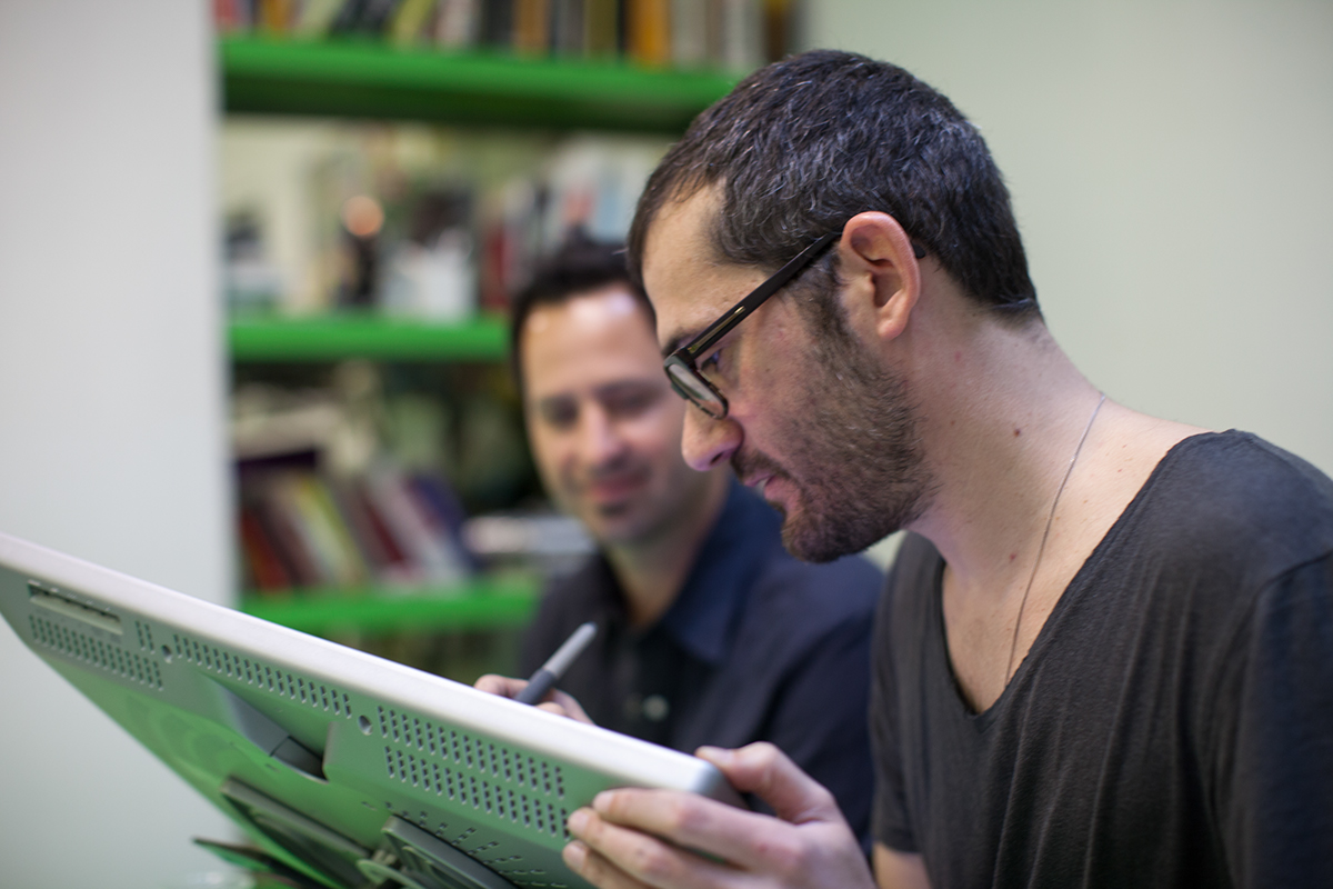
Bruno Selles and I playing at the studio.


Sagmeister & Walsh version of the MAX identity.
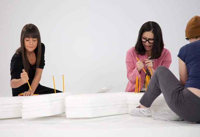
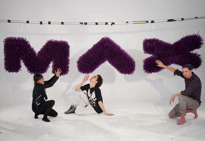
24 hours of play — Sagmeister & Walsh
The duo of Sagmeister & Walsh has repeatedly shown us how to push our own personal boundaries, edging toward the realm of discomfort, but in the most playful and innocent manner. They value the process as much as the product, and their 24-hour “stunt” of a project left us with more than a great final piece. It also left us with a great story. How often do you get to hang out with an all-star cast of artists pushing 8,000 pencils into Styrofoam? And when it’s all said and done, the identity of the 2013 Adobe MAX conference will not be a static moment but an evolving story that Sagmeister & Walsh have helped us begin to tell.
The duo of Sagmeister & Walsh has repeatedly shown us how to push our own personal boundaries, edging toward the realm of discomfort, but in the most playful and innocent manner. They value the process as much as the product, and their 24-hour “stunt” of a project left us with more than a great final piece. It also left us with a great story. How often do you get to hang out with an all-star cast of artists pushing 8,000 pencils into Styrofoam? And when it’s all said and done, the identity of the 2013 Adobe MAX conference will not be a static moment but an evolving story that Sagmeister & Walsh have helped us begin to tell.
Jessica Walsh:
“The topics of play and innovation were on our minds, so we decided to make a ‘creative play session’ where we would limit ourselves to a few basic materials and try out various ways of creating the MAX logo — all within a 24-hour period.
We decided to create a giant pencil installation. The basic tools consisted of pencils, rope, tape, and Styrofoam. There were several points throughout the process when I thought we would fail. It took much longer than expected to sharpen all the pencils and remove all the erasers. At midnight, we ran out of pencils and needed 1,000 more, and then around 3am, we decided to spray-paint the final piece completely purple and almost ran out of paint. The piece became way heavier than we expected, so it was a miracle that we were able to hang it. In the end, our interpretation of the MAX logo turned out to be a crazy sculpture, and we had tons of fun creating it.”


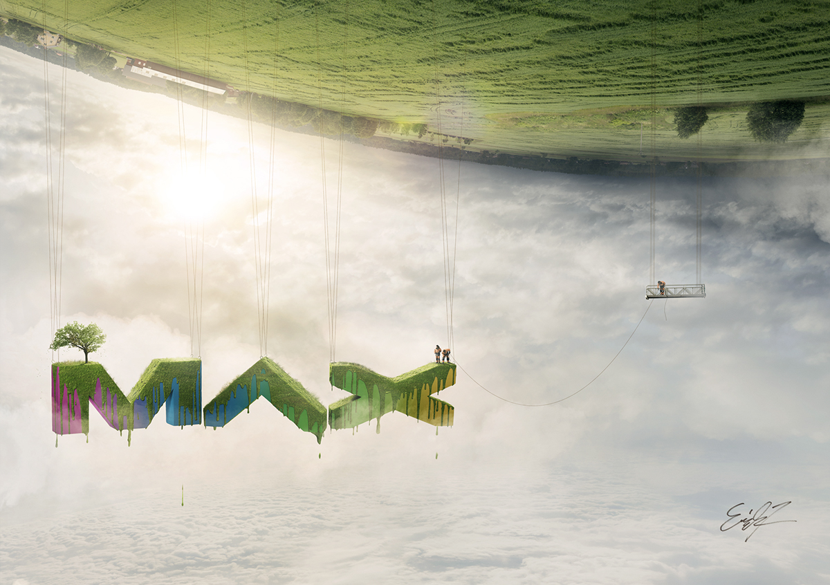
Erik Johansson's version of the MAX identity.
Germany meets Sweden — Erik Johansson
Erik Johansson has a distinct knack for translating the unexpected through his photography and retouching craftsmanship. His work manages to blend the seemingly disharmonious grunge of his Berlin residence with the quaint, environmental beauty of his Swedish upbringing.
But it’s his willingness to expose his design process to the larger community that has made him such a great partner this year. Erik generously allows us all to look under the mysterious cloak of production to see the mechanics of how he creates the mind-bending, Dalíesque sense of fanciful wonder. He understands that the more he shares, the more others will experiment with their own ideas. And by revealing the secrets to his craft, he steers us away from the urge to copy and toward our own capacity to create.

Erik Johansson talks materials:
“I wanted to make the MAX logo look like something real, something big but also playful and happy. I also wanted to use nature as a creative force in the piece and have a level of surrealism in it as well. I knew that I had to build a model of the shape to have something to begin with. Each of the letters was between 60–80 centimeters wide, hand-carved from Styrofoam, and painted with a hard coating.
I used a mixture of flour, food coloring, water, and coconut flakes to create the grass texture on top of the letters, dripping down. I think using real material in shooting is really good to make something look realistic — just seeing how the light reflects on the objects and how the perspective behaves.
“I’m very happy with the result — I love using real material to build my pieces, and the finished work was very close to the initial vision I had in mind.”


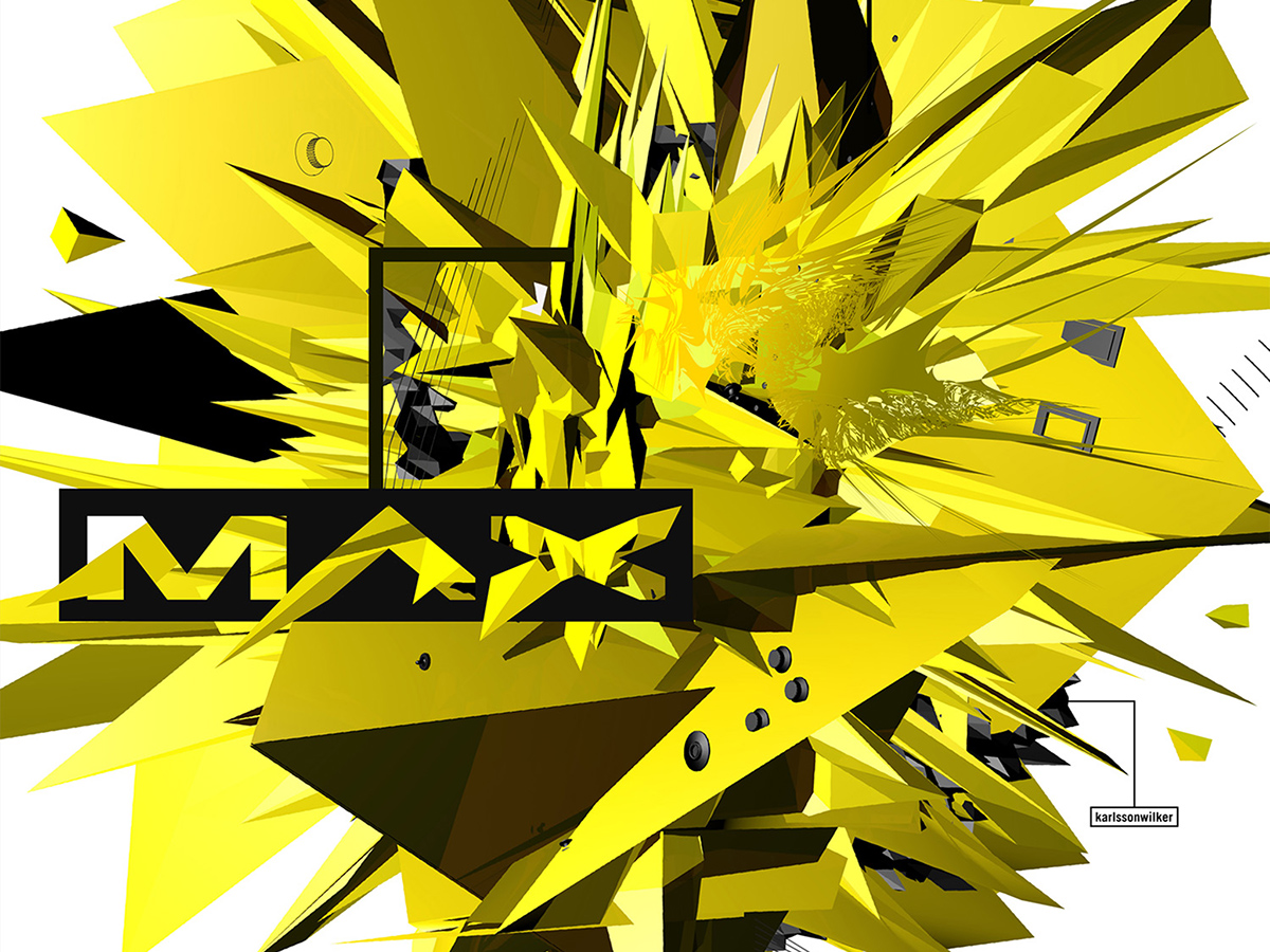
KarlssonWilker's version of the MAX identity.
“Fucking it up” with karlssonwilker
In an early conversation with Jan Wilker, he quickly boiled his design approach down to a single, no-nonsense statement: Take an idea and f**ck it up. karlssonwilker’s team has the ability to apply total freedom to the creative process with complete disregard for where it might end up. It’s this sense of the unexpected that led this team from an ‘80s style electric guitar and an old saying to its MAX logo interpretation. The energy that explodes from karlssonwilker’s work screams both external chaos and internal order in the same breath.
In an early conversation with Jan Wilker, he quickly boiled his design approach down to a single, no-nonsense statement: Take an idea and f**ck it up. karlssonwilker’s team has the ability to apply total freedom to the creative process with complete disregard for where it might end up. It’s this sense of the unexpected that led this team from an ‘80s style electric guitar and an old saying to its MAX logo interpretation. The energy that explodes from karlssonwilker’s work screams both external chaos and internal order in the same breath.
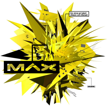
Jan Wilker weighs in:
“Adobe’s brief was simple: Whatever we would do, it was to highlight ‘creativity’ in a broad sense. The only things given to us were the MAX logo and its placement in the overall layout. Then there was this Latin saying, ‘Non omnes qui habent citharam sunt citharoedi,’ that we stumbled upon. It means ‘Not all those who own a musical instrument are musicians,’ and we thought that it relates, facetiously, to a creative conference organized by Adobe, the tool maker for designers. ‘Not all those who own Creative Suite....’
So we took an instrument — a guitar (Flying V) — and worked with it as designers, looking for shape, color, etc., and we changed it in the process. If you look closely enough, you will see knobs, strings, the bridge, and pegs. Not an illustration of ‘creativity’ but an abstract ‘explosion’ of sorts. And knowing it all comes from a Flying V, even better.”

Now what?
After the insane brainstorming has subsided, the 24-hour stunts are behind us, the logos are complete, and the Adobe Studio team has the goods in hand, we still had a show to put on. The Studio team and Adobe’s Events team, which has been designing the MAX event for the last ten years, go about the process of carrying these four interpretations of the MAX identity deep, deep into our event production.
After the insane brainstorming has subsided, the 24-hour stunts are behind us, the logos are complete, and the Adobe Studio team has the goods in hand, we still had a show to put on. The Studio team and Adobe’s Events team, which has been designing the MAX event for the last ten years, go about the process of carrying these four interpretations of the MAX identity deep, deep into our event production.
Staging design and keynote development and production were done by: PIX PRODUCTIONS

The execution of this task can be daunting, but the openness of our four design leaders offers so many ways to connect MAX attendees with their creative passion and processes. The follow-through for us is about getting the ideas and the people into the same room together and then watching the sparks fly. Which circles us right back to the original purpose of Adobe MAX, and really to my role at Adobe in general: to get the design community excited and then show them how Adobe’s technologies can help them tell their own stories. So just like we reinvent our show every year with an all-new take on the MAX identity, so too can you reinvigorate and refuel your creative passions at MAX 2013. I invite you to join the storyline of our evolving Adobe technologies and let us show you a great time in the process. This peek into the process of how Adobe works with leaders in our creative world is just the start of a tale we will continue to tell, with your help, as we explore and create the new frontiers of design together.


