


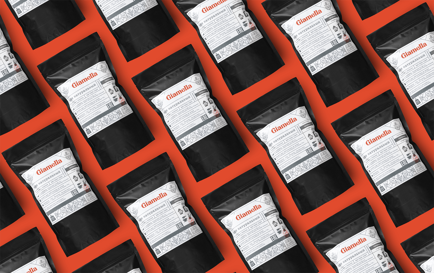
GIAMELLA — natural coffee
logotype & packaging
© 2020
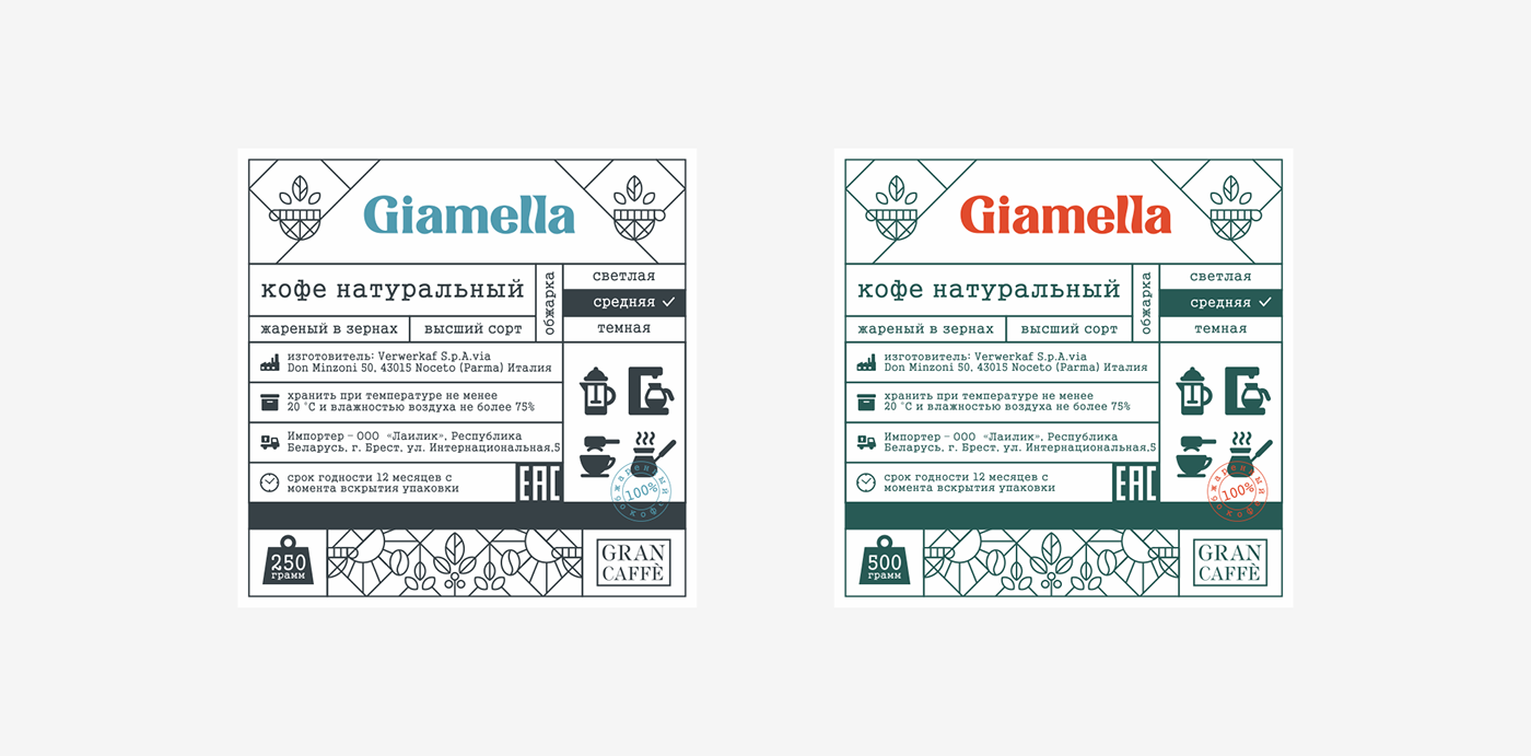
Coffee is a drink with a long history. It has its own internal philosophy. Our main task was to convey this. What comes to mind first when a person thinks about delicious coffee? — aroma. The aroma is the main identifier of this drink. It is most often paid attention to when choosing coffee. Therefore, in the logo, we decided to convey this philosophy with flavor. Between the two letters "l", we laid the silhouette of the steam from the coffee (visualization of the aroma). Also, this element identifies the brand in the field of coffee drinks, as in combination with two letters " l " repeats the slot in the coffee bean. If we consider the brand as a whole, first of all, it should be expensive, strict, rich and serious enough, given the target audience of this drink. Strict font forms make it possible to convey this seriousness, but at the same time, retain the uniqueness of the font, which indicates the variety of taste qualities of the product and distinguishes it from competitors


Tick Style © 2020
All Rights Reserved.


