Monetate is the global leader in personalization software for consumer-facing brands on e-commerce. Mihomi got hired to reshape its branding by giving it an exciting new look. The client discovered that their existing branding was not resonating with their target audience.
So, they initiated a major revamp that was necessary to stay competitive.
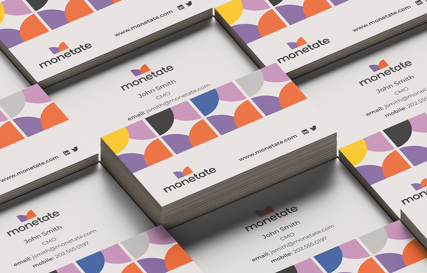
You see the “M” symbol made of pure geometric 1/4 circles. The beautiful curvy “M” also symbolizes many different things. They could be the items you can find in retail stores, a hat, bikini top, or something more organic, such as butterfly or mountain. Or it reminds you of the pie chart embodied data visualization coupled with some tech feel. The bold, rounded typeface has been selected to complement the symbol and create a visually harmonious look. The flat ends of each letter are also associated with the flat edges of the curvy M very well.
Alternative color combinations are available to represent different target audiences in a wide range of demographics.