


This case study and mobile app prototype concept were completed as the final capstone project for Springboard’s UX career track bootcamp.
Background
In today's world full of distractions around every corner, many often need to employ strategies to stay focused and increase their productivity. I know this is a problem for me and many of my closest friends and family. There have been many times in the past that I would sit down to check facebook for just a moment, only to realize that an hour of my life just disappeared. Social media sites are designed to engage users as part of their monetization strategy. Endless scrolling feeds and notifications can become an addiction to some, which in turn waste their time and reduce their productivity. For many people, smartphones and social media are often the main sources of their distraction due to how universal and ubiquitous smart phones have become. I have tried several productivity apps in the past with varying degrees of success, but none ever seemed to cure the time wasting or distraction. When I enrolled in Springboards UX career track bootcamp, an intensive 6 month long user experience bootcamp we were asked to create a finished mobile app prototype from scratch using user experience methods. We were told that if the problem we chose to solve was something that affected us, we would likely feel more invested in the project and be happier with the end result. I knew I wanted to do something related to distraction and productivity, especially in relations to social media and smartphones. In this case study, I will present my work and findings over the different stages of the user experience process and how I arrived at the solutions that I did.
Objectives
I thought that if smartphones and distraction were such a problem for myself and many of my friends, perhaps I could learn from their struggles. Could I create tools and resources that could help me and others like me achieve our goals, stop wasting time and become more productive? Could I somehow turn the source of our distraction into a tool to help us become more productive? These are ambitious questions which led me to come up with these 4 objectives I wanted to complete for this project:
1. Learn what struggles or pain points users may have that limit their productivity or cause them distractions
2. Ideate and brainstorm solutions as to what tools or features could help users become more productive
3. Test, implement, and iterate concepts with real users to figure out what the best solutions to their struggles might be
4. Create a working prototype and final user interface design with features, functions and tools that can help users boost their productivity
Role
Because I was required to complete all aspects of the creation of the final prototype myself for the course, I had to take on all of the roles of an entire UX team. This included taking on the roles of UX researcher, user experiences tester, information architect and user interface designer.
Process and methods

Design Thinking 101: NNGROUP.COM
I decided to use the principles of the Design Thinking methodology developed by the Nielsen Norman Group for this project. Design thinking is described as a non-linear, user-centered, solutions based approach to design. Design thinking is also an iterative process, this allowed me to test and implement changes to my design based on first hand research and testing. This process works great because it allowed me to revisit different stages of the process in order to ultimately come up with a more robust final product. This method is based on six stages explained below:
1.Empathize:
I learned who the user was by using empathy and conducting user research. I conducted surveys, interviewed users and gained insight into what the problem might be.
2.Define:
I identified the user’s problems, needs, and paint points. I took the findings gained from users and synthesized them into deliverables such as affinity maps, empathy maps, and ultimately personas. In this stage I was also able to define the problems I would need to solve.
3. Ideate:
I came up with ideas and possible solutions to the problem. I brainstormed, sketched, and revisited my findings from the previous stages to ideate what tools or features might help the user.
4. Prototype:
I created several iterations from low fidelity paper prototypes to high fidelity clickable wireframes in order to later test different functions, aspects, or designs with users.
5. Test:
I conducted tests with users with the prototypes I created. This way I was able to find out what worked, and what didn't while I made further iterations based on my findings.
6. Implement:
In the final stage, I implemented all of the findings from user testing to build a final iteration of the highest fidelity. The final prototype included full user interface designs featuring all the functionalities I believed my users would need to solve their problem.
Secondary research
I conducted secondary research by searching for news articles and scholarly research papers online that dealt with smartphone addiction, social media addiction, distraction, and productivity. I really wanted to learn as much as I could about productivity issues related to smartphone use and social media use. I also wanted to learn if there were any solutions to the problem such as apps or tactics people were using.
After reading dozens of articles and papers, some points stood out:

The research pointed to the fact that social media companies intentionally tried to make their products addictive. Several of the articles went in depth into the methods social media companies employ in order to increase engagement and get users hooked on their products. I thought it would be important to remember what ways they were designed to be addictive as a reference while designing the app.
Ways apps designed to be addictive:
1. Variable rewards and placement of hidden rewards at random moments
2. Endless feeds filled with engaging content
3. Inducing a fear of missing out or missing something important
It was also clear that many people have begun to notice how much social media and smartphones were negatively affecting their lives. People were trying things like deleting twitter, or hiding their phones in order to be more productive. A couple of the articles reported on tactics people were using in order to limit their usage and increase productivity in the face of smartphones. I decided to document the tactics in order to see if they could lead to possible functionalities or features that could be used in the app or help users.
Tactics people are using:
1. Deleting problem apps
2. Logging off apps after use
3. Turning off notifications
4. Turning smart phones off or hiding away in backpack or drawer
5. Only checking apps certain times of the day
6. Not using phones in bedroom or before bed
7. Using a desktop browser instead of a smartphone for work
8. Setting phone screen to grayscale
9. Using mobile apps that show usage statistics
10. Using mobile apps that can block notifications
11. Using apps that reward productivity
12. Putting reminders like rubber bands around smartphones to remember not to use
13. Switching to a flip phone
14. Committing to a digital detox and not using smartphone for long periods of time
15. Using analog tools such as alarm clocks or watches rather than smartphones
16. Cutting off internet for certain times of the day
Market research
Market research is incredibly important before creating an app. You want to make sure that there is a market that would be willing to buy your product before investing too much time and money. You also want to learn if others are doing or already have done what you plan on doing. This way you can scan the field and see who competitors might be and learn from what they may be doing successfully or failing at. Doing research, it became very clear that there were thousands of productivity apps on the market. There seemed to be all sorts of apps that could help you do anything and help you solve specific problems or reach certain goals. I knew I needed to focus on apps that might be important to learn from in my problem space. So that meant apps that helped with distraction, focus, smartphone addiction. I still wanted to explore all the different categories and segments of productivity apps on the market in order to get a better understanding of possible competitors or existing solutions. I made a chart showing some of the apps I came across and tried to take note of some of the features they had. I did this to understand the market better and get a grasp of the current tools and functionalities that existed.

Comparative/competitive analysis
After researching the productivity app market, I was able to break down the types of apps into 8 categories.
Current productivity app categories:
1. To-do list apps
2. Calendar and reminder apps
3. Time management apps
4. Gamified habit tracking apps
5. Pomodoro timer apps
6. Apps that block notifications
7. Time usage and visualization apps
8. Apps that block visits to other apps
There were also some interesting functionalities I noticed in some of the apps I looked at. I made sure to take note for future reference.
Some tools or features that stood out:
1. Social media usage statistics and usage breakdowns
2. Rewards for users who time spent less time using phone
3. Progress trackers
4. Disabling notifications
5. Reminders and warnings to stop or block users from visiting apps
6. Task reminders
7. Pomodoro Timers
Screener Survey
In order to gain more quantitative research data, I created a screener survey on google forms and posted it to several productivity and smartphone addiction Facebook groups. I wanted to find users to interview who struggled with focus and productivity. I also wanted to gain insights into the problem space I was dealing with. I wanted to gather real world information that could inform my research so I would not be using assumptions during the design process. I asked users to leave their emails so I could contact them later for interviews. 47 respondents completed the survey. I reached out to 8 of them for later interviewing.

Some interesting survey insights

User Interviews
After reaching out to 8 users for interviews, I was able to interview half of them in person and the other half over Skype. I wrote an interview script with 30 questions regarding the user's productivity habits and their relationship with their smartphones. I wanted to gain insights into what pain points they may have and learn what sort of problems users had regarding productivity especially in relation to smartphones. I also wanted to learn what sort of distractions the users dealt with on a daily basis and if they used any tactics or tools to help them.

Affinity Mapping
Affinity mapping is a crucial way to gain valuable insights from the user interviews. I took quotes and answers from the user interviews and wrote them on post-it notes. I put them up on a white board and began to group together similar post-it to create an affinity map. I grouped things by behavior, habits, paint-points, wants, and needs.

Organized affinity map grouped into categories that emerged
After organizing post-its with similarities together, 8 groupings emerged:
1. Opening tabs and addiction behavior
2. Reminders
3. Productivity actions
4. Visualization and motivation
4. Visualization and motivation
5. To-do list usage and breaking tasks down and getting started on tasks
6. How people end up on social media and end up being distracted
7. Productivity app pain points
8. Advice and wants
Once all of the items were organized and categorized, I would be able to focus on what pain points users had, what needs they might have.
Personas
After conducting user research, surveys, interviews and creating an affinity map, I further synthesized the data to create personas. Personas are important because they allow you to remember your user and who it is you are designing for. It keeps the user’s pain points, needs, wants and struggles at the forefront of every decision throughout the rest of the design process. It also allows you to focus on a narrowed down user based on research rather than on assumptions. Two main persona types emerged with different pain points, needs, and wants. The first is Lucy who struggles with smartphone addiction and wants to spend less time on social media. The second is Mark, who has used apps in the past for their productivity struggles, but doesn’t anymore because they feel like the apps were not useful or engaging. The main persona I focused on as a primary user group was Lucy.


Empathy mapping
In order to further understand the user’s needs and habits, I synthesized some of the findings from users and created empathy maps. I made two empathy maps, one for each persona.
Empathy maps offer insight into user’s thoughts, feelings, needs and habits. These empathy maps show users pains, possible gains, what they feel, what they see, and what they say and what they do. This stage is valuable in helping synthesize possible needs of the user and ultimately help figure out what tools might help them.
Lucy’s empathy map:

Marks’s empathy map:

Narrowing focus
After looking back at my empathy maps, personas, affinity map and market research I began to narrow down the focus of the app. Using all of the qualitative and quantitative data I gathered, I brainstormed possible solutions that could help solve the users pain points and fulfill their needs.
Wants:
First I narrowed down possible functions that lined up with the user’s wants. I came up with 3 basic categories with possible functions for each.

Critical functions for users:
After listing out the possible wants, I organized the key functionalities for the app into 5 critical functions. These functions would be tools and features could hopefully best reflect the needs of the users as well as answer their main pain points.

Information Architecture
Site map
After narrowing down the focus and discovering critical functions that best fit user’s needs I decided to organize them into a site map. The site map shows the relationship between pages and navigation through the app prototype. I gave each of the 5 critical functions its own page and screen with sub pages and functions that could be reached by more advanced users.

User flows
After designing a site map, I created user flows for 4 red routes the user could take. Red routes are critical flows that help the user complete tasks that best serve their needs and pain points. I created flows for the timer feature, blacklisting feature, progress page, and usage information. The flows I created are based on what I believed would best reflect the path users would navigate throughout the app.

Sketches
Low fidelity sketches
After figuring out what actions and flows the user would take, I sketched my ideas on paper. I made several iterations of rough sketches, but settled on some visual solutions I believed could work best. I decided to take inspiration from another pomodoro timer based app called the Forest: Stay focused which I discovered while conducting market research. The app uses a cute character as a motivation for users to stay engaged with the app. I decided that a tomato character would be the perfect mascot for my app due to the fact that it is based on using pomodoro tomato timers. I sketched the character inside a timer ring with a dial as a way to motivate the user. The timer ring and dial were also inspired by Forest:Stay Focused. I rendered rewards and items that could be added to the garden as well. I also made sketches for the time usage visualization function, timeline, blacklist check mark system, and gamification screens.

High fidelity sketches
I further refined my rough sketches in higher fidelity, locking in more details. I mostly worked on refinements to the layout and placement of items and objects. No new functionality or features were added. I did this so that objects such as buttons, toggle switches, and boxes could be read more easily by users when I would later create a usable, clickable paper prototype.

Wireframes
I created wireframes using the design program Sketch for each of the user red routes. I wanted to reflect the placement and navigation from the high fidelity sketches as best as I could. I decided to make high-fidelity wireframes so that it would be easier to conduct further user testing and prototyping.

Clickable prototypes
I used Marvel App’s prototyping software to create 3 iterations of clickable prototypes at varying levels of fidelity: High-fidelity sketch, wireframe, and with final visual designs. I created the prototypes to conduct usability testing with real users.

Usability testing
In order to validate my assumptions, and make sure there were no usability issues with the app prototypes, I decided to conduct usability testing. I conducted 3 rounds of usability tests with the three varying fidelities of prototypes. I tried to find participants who had similar struggles as the 2 personas I created, this meant finding users who struggled with smartphone addiction or had trouble with productivity or focus. I conducted in person moderated usability tests and had each user complete a series of 6 tasks for each prototype. I asked users questions from a script while they attempted to complete tasks. I took notes and recorded the sessions with the user’s permission in order to gain insights into possible usability issues and possible design solutions. The tests for each iteration of prototype were very similar, and I created improvements based on synthesised data I received from testing with users. I laid out goals I wanted to achieve with the tests so I could learn from the outcomes and create design fixes.
Goals
1. Discover if there are any usability issues for the user when navigating between different tabs and pages. I wanted to see if the user could travel throughout the app with ease or if any points caused friction or confusion.
2. Learn if labels are named in a way that would help the user find what they are looking for more efficiently.
3. Test if digitally literate users were able to quickly find more advanced options such as sub-features, filters, or settings and utilize them effectively.
4. Determine whether or not functionalities work intuitively, or if there need to me more clues or hints as to how to use features
5. Validate weather the scope of the application was appropriate and if the features are useful
Outcomes
1. Users didn’t know how to use timer or that it would make them lose points
2. Users were confused as to what garden’s purpose was
3. Users were confused where the garden page was located
4. Users didn’t understand incentive and rewards system
5. Users were upset that they could not add more health
6. Users were confused on how to blacklisted apps for certain periods of time
7. Users were overwhelmed by the way times were displayed in usage details
8. User were overwhelmed by amount of toggle switches on blacklist page
Fixes
1. Tooltips were added to pomodoro timer in order to explain how it worked
2. A button to add more health was added to the garden’s health bar
3. Current accumulated points were made visible in pomodoro timer screen and garden screen at all times
4. The name of the “progress” screen was changed to “garden”
5. A more appropriate icon was designed for the garden page
6. Time usage details were re-designed to be easier to understand and visualize
7. Visuals for setting time periods for blacklist details were updated and simplified
8. Toggle switches were changed to check boxes for blacklist
Solutions
Timeline
Get up-to-date news about your habits and usage in order to visualize your progress. Get news about items you have purchased, achievements, and summaries of your smartphone usage.
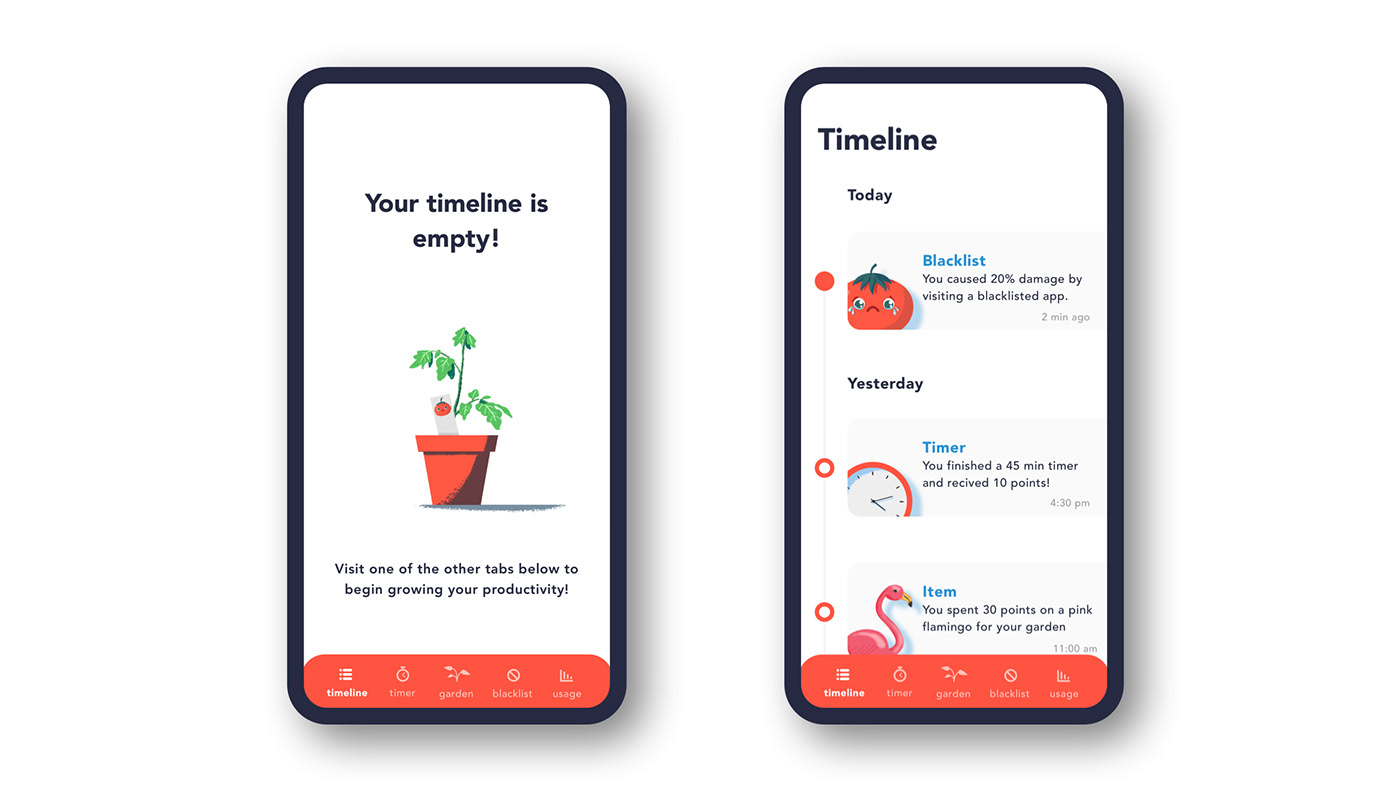
Timer
Use timers to reach peak performance and gain points you can redeem for rewards. You will get points for every timer session you successfully complete. You will lose points if you leave a timer early which will cause damage to your character's health.


Garden
Redeem your points to purchase items and rewards for your pomodoro and make the most beautiful garden ever. Your productivity will grow along with your garden!

Usage
Track your usage habits and find out how much time you spend scrolling in order to visualize your usage. Find which apps you use the most and block yourself from visiting them in order to reduce your screen time and become more productive!

Blacklist
Stop yourself from visiting apps that waste your time in order to boost your productivity. Get warnings to stop you before opening apps that you have blacklisted.

User Interface
After further user testing, and settling on final high definition wireframe solutions, I was able to put my bachelors of Fine Arts Degree and experience as a freelance designer to use by creating the final user interface design for the app prototype. I had never rendered UI screens in my professional experience, but found the process to be very similar to designing print layouts in InDesign. Because I work as a freelance illustrator as well, I felt it would be important to include illustrated elements in the design. Illustrations reinforce the concept of gamification by offering eye catching visuals that the user can empathize with or see as rewards. I also wanted to focus on making sure the illustrations matched the aesthetic of the UI. I also wanted a consistent visual language and branding system.
I spent a lot of time on behance.com and dribbble.com looking at current design trends in mobile UI and also to gain inspiration for what sort of visual language and branding system I could create for my designs. I created several mood boards and style guides. Some showed screens from different productivity apps, some showed screens with colors, typefaces or art I liked, and some showed minimalistic apps I thought were aesthetically pleasing. I was able to get a well established idea of what current trends there were and what sort of trends I wanted to follow.
I knew I wanted a consistent visual language throughout the application. I really wanted to focus on having lots of white space, and making sure elements, columns and grids were aligned properly.
I created hundreds of iterations of each page, experimenting with different colors, typefaces, and placements of items. I would nudge one element only a few pixels, play with the shapes of buttons and boxes, add drop shadows and take them away. In total, I created over 1000 individual iterations and variations of screen designs before setting on final designs.
All screens

Colors
For the red, I chose to use a tone that was close to a ripe tomato. I experimented with many tones and looked at a lot of visual inspiration online before settling on the final red tone. In order to contrast the bright red, I chose to use a blue tone as a secondary tone that would complement the red nicely without clashing. The body text is a very dark gray. In my design practice I rarely used full black because a dark gray adds more depth and visual interest. I tried to keep the color pallet limited in order to keep up the clean minimalistic appearance, in order to reduce distractions. Limited colors pallets are also often more aesthetically pleasing. In order to keep consistency, all secondary and tertiary design elements as well as drop shadows are based on varying levels of opacity of the main colors.

Typography
I chose Avenir as the sole typeface used in the app typeface. Avanir is a sans-serif, web-safe typeface that I believed offered more visual interest than Helvetica and included a large family of weights. It worked because it was a clean, minimalistic, non-distracting, typeface that matched the minimalistic aesthetic I was going for in the app. I also appreciated how the typeface looked good for body text as well as for headline text. I used a variety of sizes and weights of the font throughout the app.

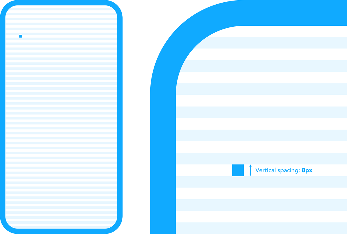
Horizontal spacing
Like I said before, the alignment of elements on the screen was very important to me. This was in order to make the design look cleaner, less distracting, and easier for the user. I set 4 columns each at 65px pixels. I used 4 columns so that the design could be responsive on different devices. I set the outer margins to 20px and also set the inner rows between columns to 20px. I really wanted to focus on making sure that the outer margin on both sides matched the inner margins in order to add a sense of balance. Many apps have text that goes nearly to the edge of the screen, I believe this can make it hard to read the screen and can be a distraction at times. For this project, I wanted to keep a certain amount of white space and padding on both sides in order to give the design room to breath without sacrificing valuable screen real-estate.

Vertical spacing
I constructed the layout on a 8px baseline grid, which would be 16px when doubled and offer the perfect place for body text to sit. This would allow body text room to breath, but also allow room for elements on the grid such as toggle switches, progress bars, and buttons. All elements and text would be sized in order to fit into the grid system.
Final thoughts
Social media and distraction are not likely to go away anytime soon. Productivity apps will likely play a role in helping people to become more productive in the future. I believe gamification and rewards can motivate users to change their habits and help them reduce distractions. I also believe it will be important to users to see how much time they are wasting in order to be motivated to change their habits and be well informed about their progress. After completing this project, my understanding of how apps are developed has changed dramatically. I expected most app designs to be sort of printed out onto the screen by experts who already knew how the app should look from the start. I now realized how it is an iterative process based on testing with users and empathizing with their needs. This has not been the first app project I have worked on, I have created several wireframes for websites and apps professionally before this course, but I learned valuable tools and strategies I did not employ in the past. I gained valuable insights into the process and methods that go into developing the user experience for a mobile application. I learned what different UX roles are required to complete a project and how they fit together. I also discovered what deliverables are expected. I learned a lot through the process of designing this app and feel inspired to possibly pursue this concept further and create a more fleshed out and robust version of the app in the future.
Thank you for taking the time to read my
case study!


