


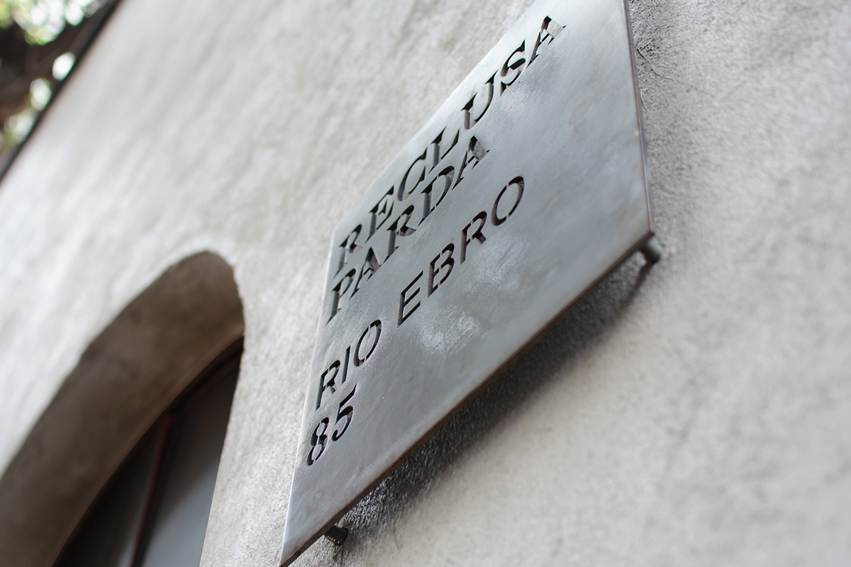


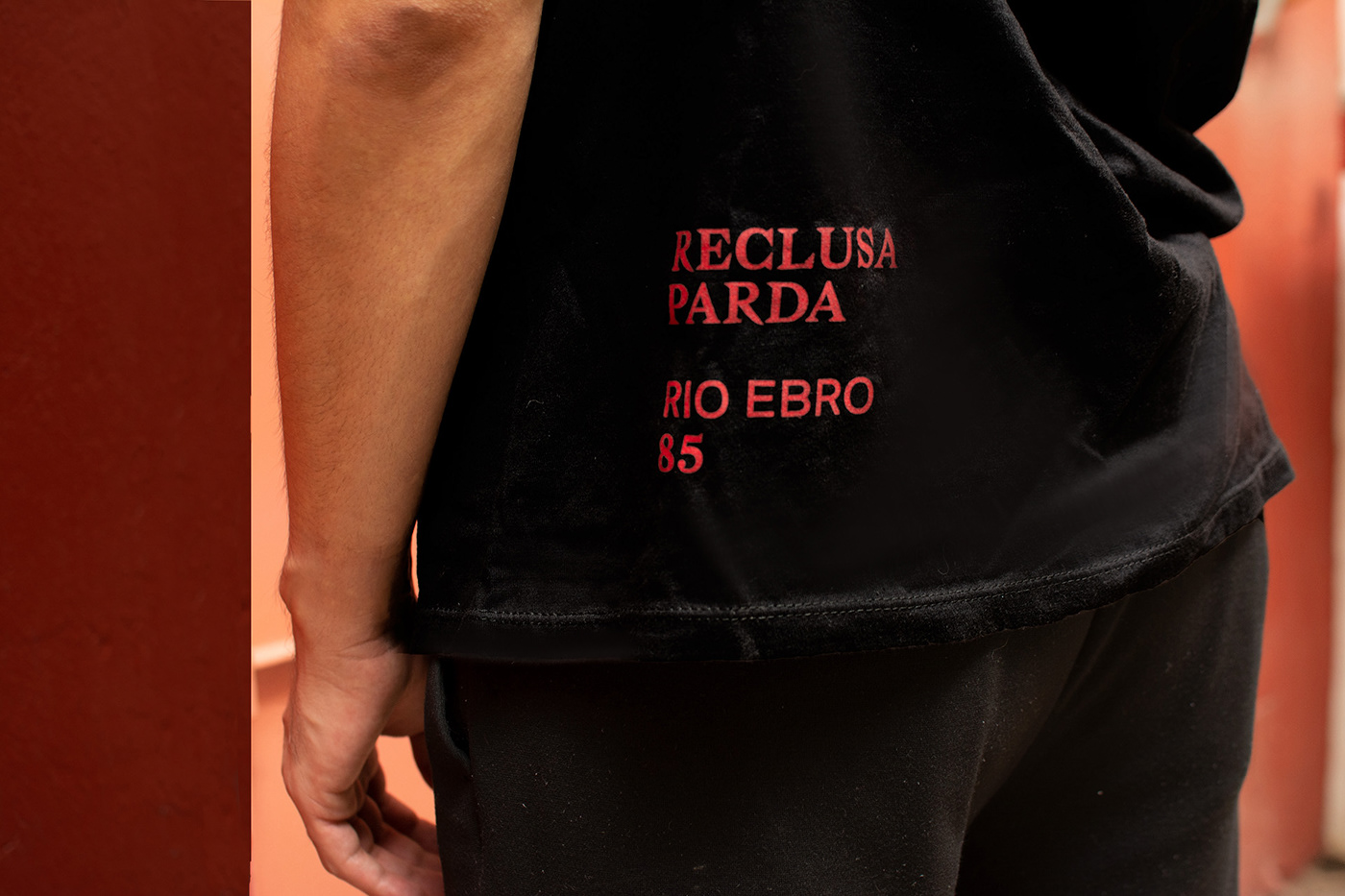
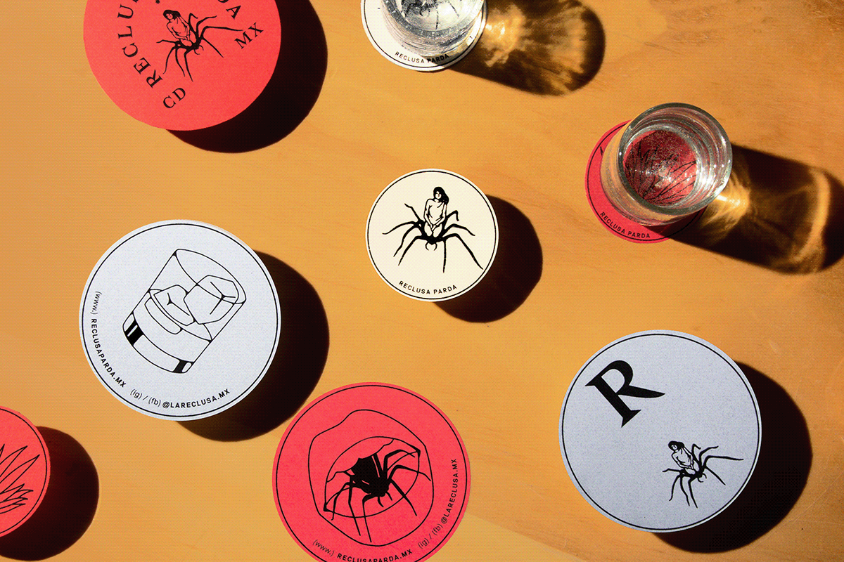


R E C L U S A P A R D A is a spot in Mexico City where Mexican food, Mezcal and the underground art scene meet each other. The main theme for this graphic identity was the symbol of a spider. Spiders are not mainstream, they hide in warm, urban places, they are mysterious, powerful and they are gender neutral. This is the concept we worked with.
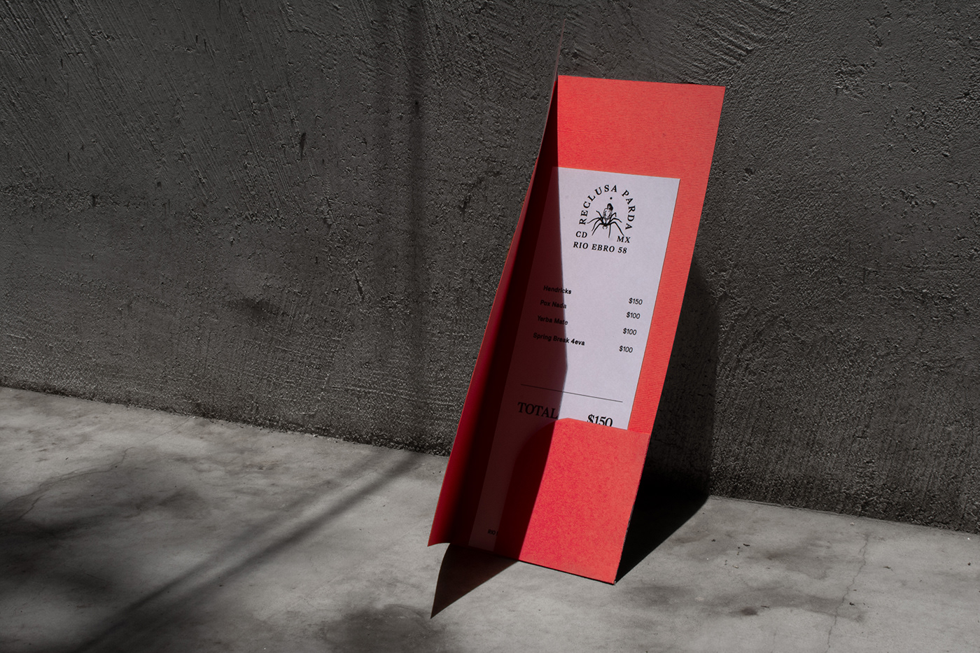
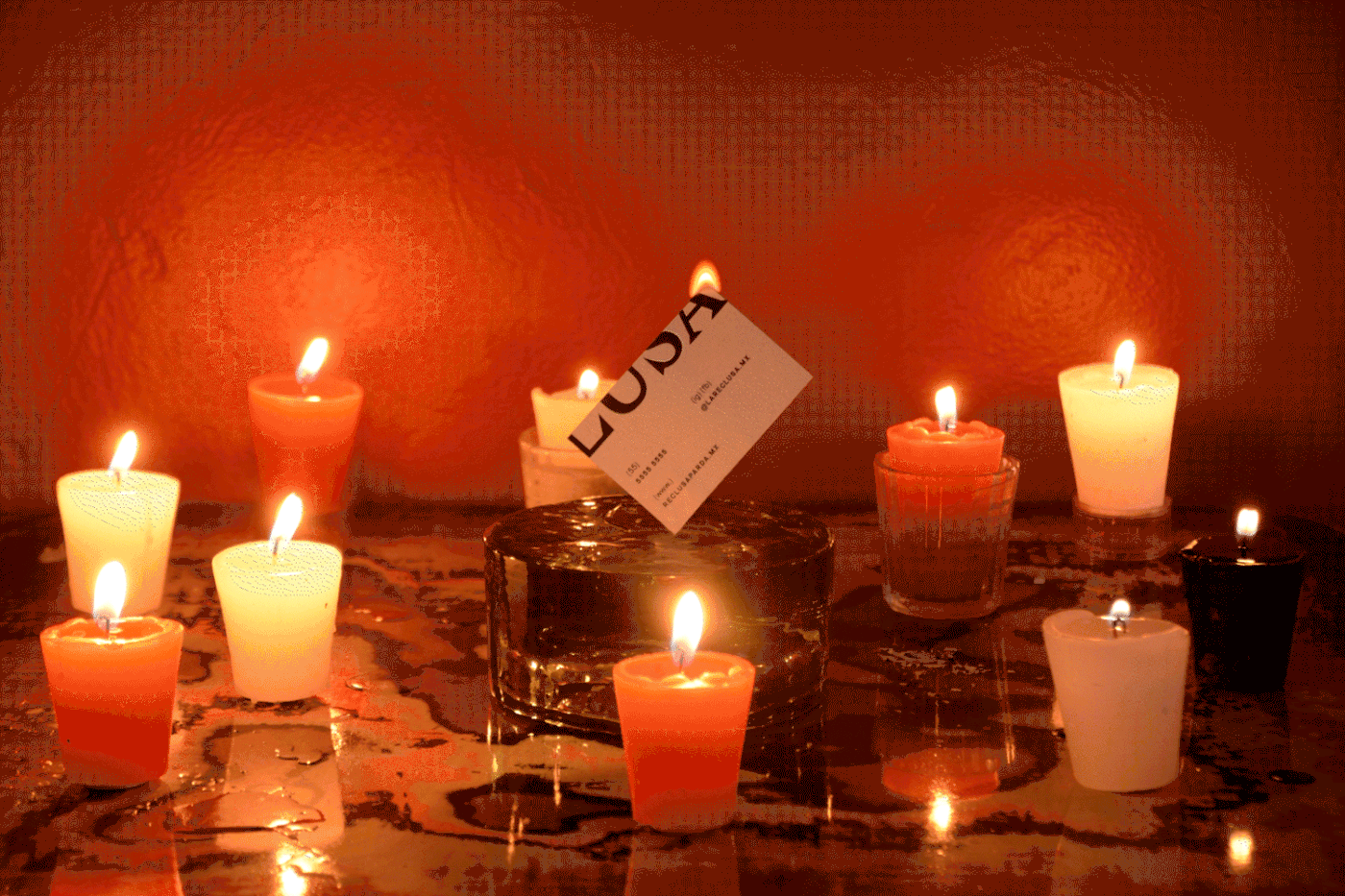
From the outside Reclusa Parda is plain and discrete. It has a monochromatic gray facade made of concrete and steel. On the inside it is cozy and inviting. It has red walls, wooden tables and high rounded ceilings tinted with warm lightning. This contrast between materials and color palettes served us as a reference for the graphic applications which we then translated onto the menu design, coasters, and even matchboxes.
C R E D I T S: Branding Art Direction: Mariela Mezquita / Designer: Israel Hernández
Photography: Mariela Mezquita, María P., Sir.ilo / Styling: Harumi Tanimoto
Photo edition: Leslie Piñón, Harumi Tanimoto / Motion: Luis Romero / Client: Les Terribles Design
T H A N K S 4 W A T C H I N G !


