
Fed-Teaching-Slides
-
以下是我在天津大学天外天工作室新生课程和开发者会议中使用的教材。
幻灯片的设计采用了视觉优先的方法,着重于触发理解的矢量图形和动画。
幻灯片的设计采用了视觉优先的方法,着重于触发理解的矢量图形和动画。
此项目中设计的大多数幻灯片,练习和演讲稿从此成为工作室的标准教材。
Below are my teaching materials used in Tianjin University TWT Studio freshman courses and developers' meetings.
The design of the slides used a visual-first approach,
focusing on the vector graphics and animations that trigger understanding.
Most of the slides, exercises, and speech manuscripts designed in this project
have become the standard teaching material in TWT Studio since.
这些课程是双语的。
请注意,每周的幻灯片中并不包含全部的演示幻灯片,而仅仅是节选。
您可以在我的 Github 仓库 中找到完整版。
Courses are bilingual.
Please note that the slides presented below are not complete, only excerpts.
You can find the complete version in my GitHub repos.
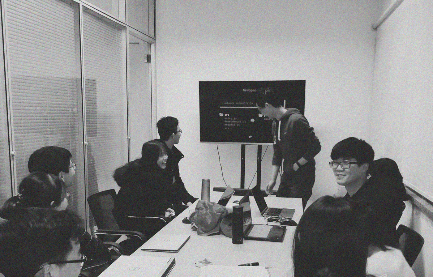
A regular meeting in TWT Front-End Group / 天外天前端组组内会议
Week 1
Getting Started
这是给希望深入参与 Web 开发的新生们设计的第一堂课。
这些新生们通常在学校设置的 C++ / Java 课程中,获得了最为基础的编程经验,
但对标记语言、布局设计语言仍然存在陌生感。
这一周的课程内容,注重消除这种陌生感,
并传达一种 “Web 开发其实很简单” 的信号。
This is the first lesson designed for the newcomers
who want to get involved in web development.
These freshmen are usually elementary in programming languages
after studying C++ / Java courses provided by the university,
but unfamiliar with markup languages and layout design languages, or any language that uses a "declarative" or "imperative" rather than a "programmatic" approach in coding.
but unfamiliar with markup languages and layout design languages, or any language that uses a "declarative" or "imperative" rather than a "programmatic" approach in coding.
This week's course content focuses on eliminating the strangeness,
and convey a signal that web development is easy to get started.
and convey a signal that web development is easy to get started.
在课程设计中,一些策略被运用以将编程语言和标记语言的特性结合起来,使其易于理解,
如对 CSS 的媒体查询和 C++ 中的 if 语句的比喻。
In designing the course, we created a correspondence between the language they are learning at school
and the language they'll be using in web development,
such as the analogy of media query in CSS and the if statement in programming languages.


Week 2
Diggin' Deeper into Layout
CSS 中有物理像素,也有逻辑像素。
为什么会有两种像素?
为什么移动设备的兴起,会使得能够区分这两种像素对开发者越来越重要?
在网页的布局设计中,有一种惯例已经被沿用了 20 年。
为什么会存在这些惯例?它们有什么道理?
为什么它们跟我们在阅读网页的时候的摆头动作有关?
在为非常规设备开发界面的时候,我们如何优雅地打破这一惯例?
我们用图形,用设备宽度逐渐缩窄的动画,来解释科技的演变对布局语言思维的影响。
There are "physical pixels" and "logical pixels" in CSS.
Why are there two different pixels?
Why understanding the difference between these two pixels is becoming important after the increase of mobile device usage?
There are layout conventions that have been used in web development for more than 20 years.
Why these conventions exist?
How does it have anything to do with the swinging movement of our head when reading?
How do we elegantly break this convention when adopting our interfaces for unorthodox devices?
We use graphics, and animations of how layout changes as the width of our screens shrink, to explore how the advance of technologies could change the way that layout languages work.
布局设计很好入门,但它并没有你想象的那么简单。
Layout design may be easy to get started, but not as simple as it seems.


Week 3
Go Interactive
每个入门 Web 开发的人内心都有一种恐惧,面对 JavaScript。这一恐惧很难彻底消除。
但我的经历表明,一旦学习的动机充分,便可以抵消这类恐惧。
但我的经历表明,一旦学习的动机充分,便可以抵消这类恐惧。
首先,我们实现了一个非常简单的逻辑:一段监听用户鼠标点击的代码,并且在监听到后做出相应反应。这一切都很容易学会和理解。
然后,我们开始释放 JavaScript 的能量:你可以监听几乎任何动作,并做出任何反应。
然后,我们开始释放 JavaScript 的能量:你可以监听几乎任何动作,并做出任何反应。
Everyone enters web development is terrified when they first meet JavaScript. It's hard to obviate this fear.
But my experience tells me that strong motivation is the a reliable way to offset it. So how should we introduce JavaScript?
First, we implement a simple logic: code that listens to a mouse clicking on a button, then log a sentence in the console. Both are easy to do and to understand.
Then, release the power of JavaScript: you can listen to almost anything, then do almost anything in your response.
监听,作出反应。
这就是一个带有交互的网页的根本,但却产生了无数种的交互可能。这是 JavaScript 可以带给我们的。
Listen and react.
The two basic elements of an interactive webpage, what JavaScript can inject into our layout, and what can yield endless possibilities.
The two basic elements of an interactive webpage, what JavaScript can inject into our layout, and what can yield endless possibilities.


Week 4
Requests for Data
反直觉的异步操作,棘手的浏览器兼容,跨域问题,
和前端工程师如何与后端沟通、合作,
都会是你在尝试请求数据的时候遇到的麻烦。
我们包含了这些内容。
Counterintuitive asynchronous operations, cross-origin related issues, browser compatibility,
and how front-end engineers collaborate with back-end engineers.
All of these are problems that you might encounter when you try to request remote data.
We've got that covered.


Week 5
MVVM Architecture (Co-authored with Sisi Lee)
你很可能用着 MVVM 框架,但不知道为什么要用它。
我一开始就是这样的。
这一周,我们在介绍如何使用 MVVM 框架的同时,还会深入推理其背景和动机,
用历史的视角和视觉呈现方法。
我们还会讨论其它的设计模式,和它们在前端工业界的应用。
我一开始就是这样的。
这一周,我们在介绍如何使用 MVVM 框架的同时,还会深入推理其背景和动机,
用历史的视角和视觉呈现方法。
我们还会讨论其它的设计模式,和它们在前端工业界的应用。
It's very likely that you're using MVVM architecture without knowing why,
because that's what I experienced.
This week, besides introducing you how to use the MVVM libraries,
we'll explain the background and motivation behind it, from a historical perspective, using a visual approach.
because that's what I experienced.
This week, besides introducing you how to use the MVVM libraries,
we'll explain the background and motivation behind it, from a historical perspective, using a visual approach.
We will also talk about other different design patterns and how they are used across the web industry.
从这周开始,我们的成员应该可以开发一个完整的网站了。
最后一个练习任务,是开发一个功能完备的学校图书馆查询系统。
这将会是他们的成人仪式。
最后一个练习任务,是开发一个功能完备的学校图书馆查询系统。
这将会是他们的成人仪式。
From this week on, the students should be capable of developing a complete website with existing APIs*.
The last exercise is to develop a fully-functional campus library search website.
This would be your rite of passage.
The last exercise is to develop a fully-functional campus library search website.
This would be your rite of passage.
*APIs of the campus library system is provided by dedicated back-end web development engineers of TWT Studio.


Elective
The Front-End Ecosystem


Elective
Vectors on the Web


Elective
Hybird Mobile Application & WePeiyang 4.0


Elective
Computer Networking Basics


本作品采用 CreativeCommons 共享署名 4.0 国际许可协议(CC BY 4.0)进行许可。如有版权事宜,请联系作者。
This work is licensed under a Creative Commons Attribution 4.0 International License. Please contact the author if there are any copyright issues.
This work is licensed under a Creative Commons Attribution 4.0 International License. Please contact the author if there are any copyright issues.
© Jingtao Zhou 2017-2019 | www.jingtao.me


