

behind the lyrics - edition 01 - joy division
This is a personal project where i designed a booklet on the meanings behind the iconic joy division songs. Joy division are my favourite band so this was a huge factor in my ideas and design outcomes.
I started with messing around with type exploration of some of their lyrics such as "lost control again". I started looking at visual poems which is called "concrete poetry" this design style inspired me as i have always been fascinated by type and all the countless different ways of expressing your idea via typography. I adopted the visual poetry style and added my own ideas for it. Songs are just poems.
My final type designs are visually impacting on the reader as its not just the words that tell the story of the song, but now its the layout and composition which give the reader an idea before even reading it. Some are more literal than other and some use deeper meanings which is not instantly shown until you read the song.
I then turned my booklet idea into a brand called "behind the lyrics" who makes small booklet editions on iconic bands all about the meaning of their songs with a fun type based Swiss design style. I have only designed the first edition so far but i am thinking about designing a whole range in the future, so stay tuned.
The bright green is the stand out colour for this edition, inspired by joy divisions substance album cover.


Disorder
Disorder' is a plea for guidance in a confused, dystopia world; 'Atrocity Exhibition' comes from the platform of experience and disappointment in a hellish environment.
The layout of type is a disorgonised path which takes the reader on a windy path of a messy hard to follow guide which referances the start of the song "iv been waiting for a guide to come and take me by the hand".


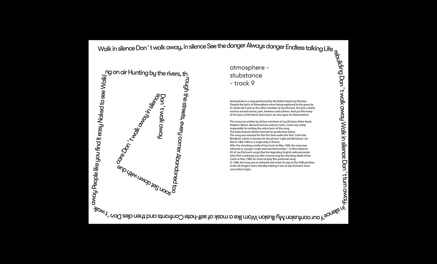
Atmosphere
These lyrics clearly revolve around sorrow, pain, darkness and sadness. And just like many of the lyrics of the band, these lyrics are also open to interpretation. The music video has a moody aesthetic with strange people in sharp black and white hoods, hence the blocked sharp corners as it makes the reader feel UN easy and on edge, similar to the song and music video. The text wraps around a large surface area, this allows everything inside it to act as the atmosphere which is contained by the type in a entrapment way.

Shadowplay
These are the lyrics for shadowplay. The song is about in fear of everyone and trying to fit into sociaty. The layout of type is showing the layers into the mind and the curling layout is resembling someone curling up snd hiding because they are scared. The shadow on this design plays on the word of the song.


Love will tear us apart
Love Will Tear Us Apart is a song performed by the legendary English post-punk band Joy Division. The dark lyrics, which were written by Joy Division singer Ian Curtis, are mainly based on the problems that he was facing with his wife Deborah Curtis due to his extramarital affair with a Belgian journalist named Annik Honoré. The song was one of the last songs Curtis wrote before his tragic death at the age of 23.
The design of this lyric sheet is inspired by the idea of tearing and type falling apart and disconnecting itself from each other like the song.


Isolation
This song is all about being lonley and on your own. This is why i have seperated each line of the lyrics to show the sense of lonliness and isolation. But i have done it in a way where it is still pretty easy to read. Left to right.


