I love 36daysoftype. As with the previous edition, I treated this as an excuse to experiment and find new ways of visual expression, exercise different styles, and learn stuff I'm not yet good at. 🔥
As a result, it doesn't exactly look much like a coherent series, but rather a visual diary of my different visual inclinations.
It's fun to look back at, I learned a ton of new stuff in process, and near the end of it, I felt like I discovered a common thread in all of my work and something that I could call a backbone of my visual style. So – thank you, 36daysoftype, and see you next year!

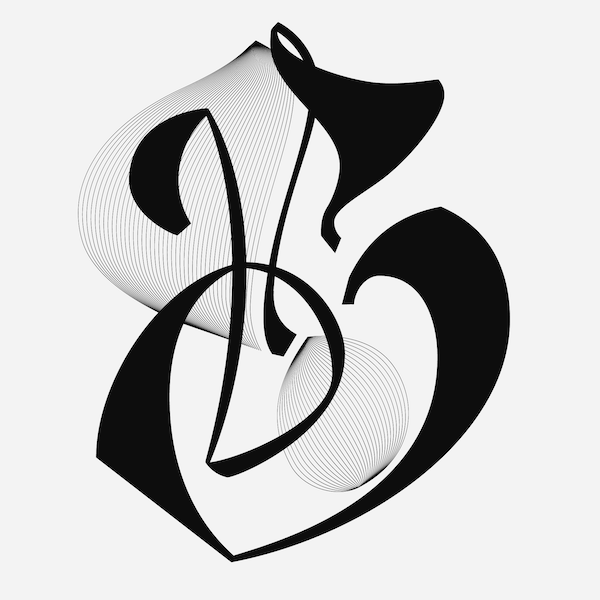
Inspired by the Art Nouveau style lettering I saw on Koloman Moser's exihibtion in MAK Vienna
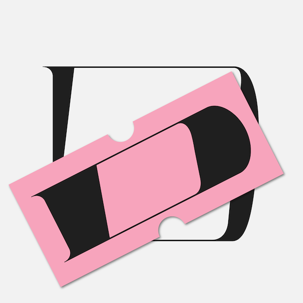
D is for Discount
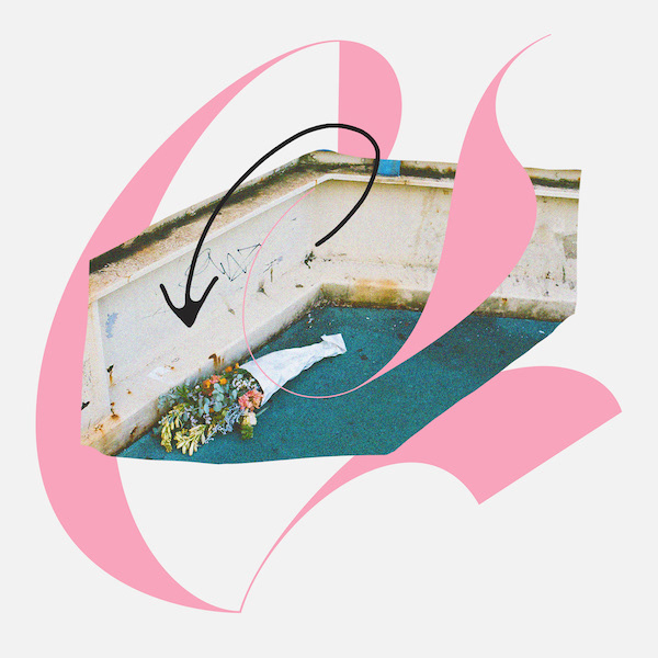
E is for Engagement
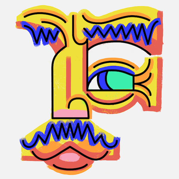
F is for Face (Process video: https://www.instagram.com/p/Bv9YDThFEOA/)
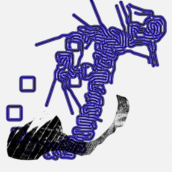
G is for Growth (alternative versions: https://www.instagram.com/p/BwAX4Trlohb/)
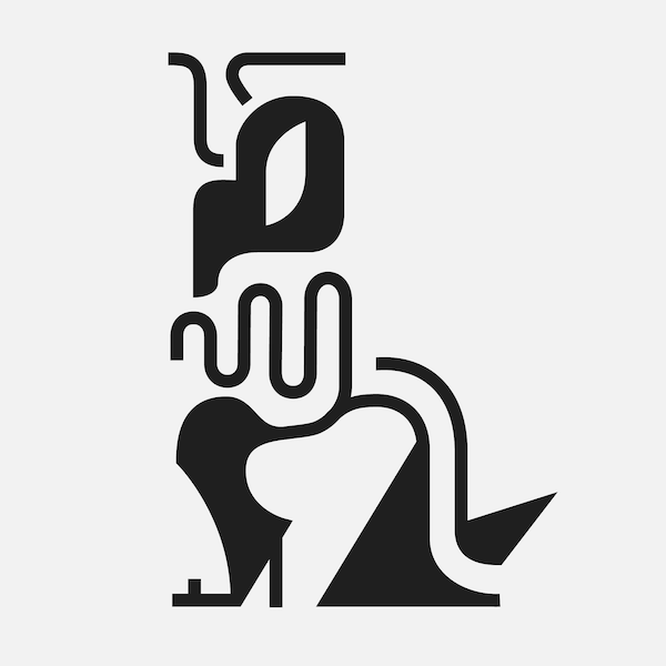
H is for Reptilians (in disguise)

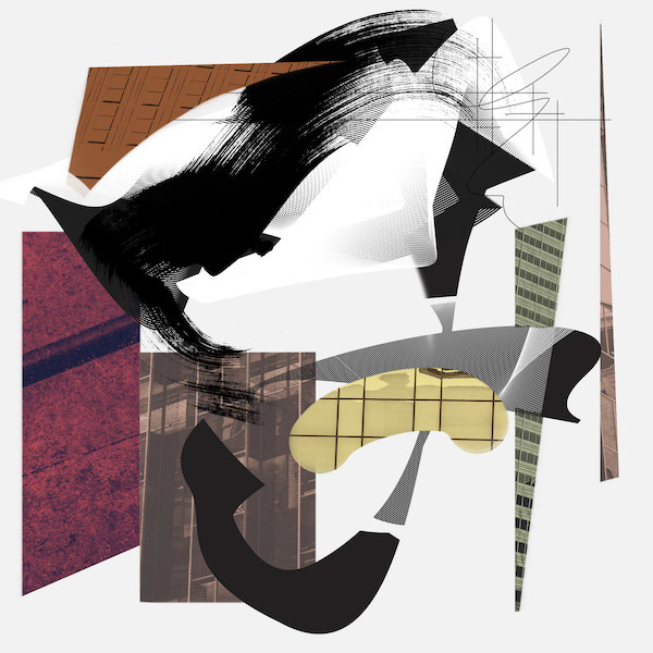
J is for Jazz
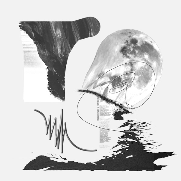
K is for Moon (Księżyc in Polish)
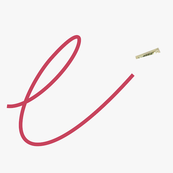
L is for Lewd
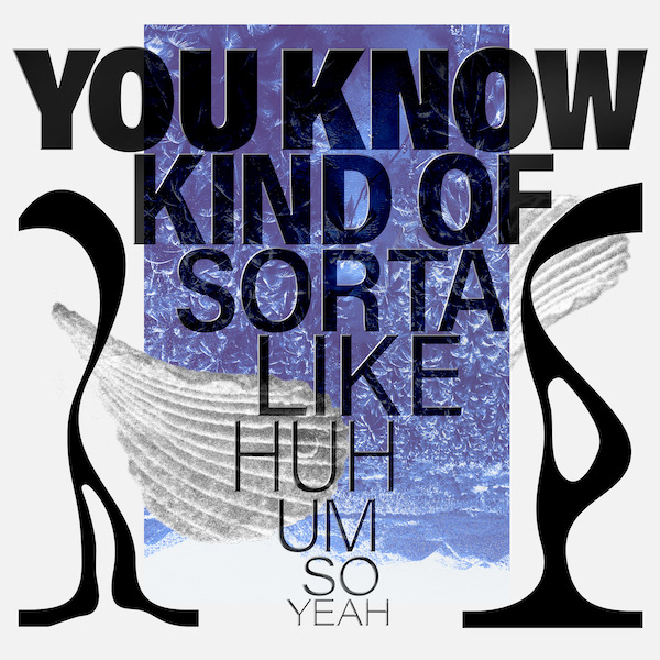
M is for Meandering
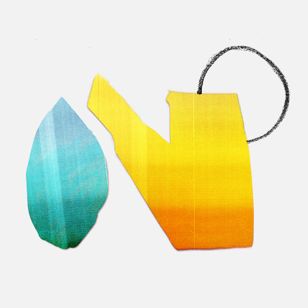
N is for Nurture
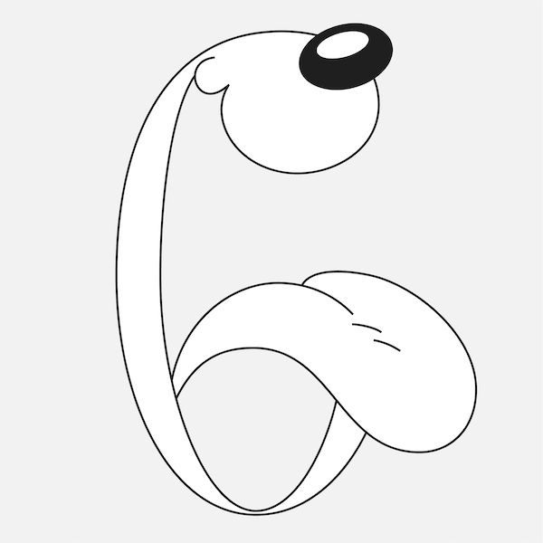
O is for Odie
At this point, I felt like I wanted an additional challenge by doing series. I didn't want to give up on exploring different styles though, so I started doing mini-series of 3 or 6.


Inspired by brutalist fonts and calligraphy


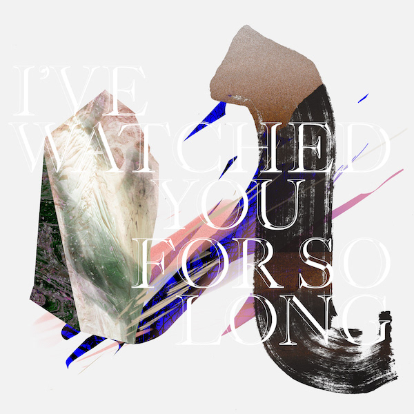
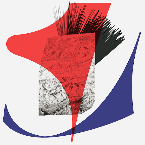
Album cover-esque collages inspired by songs: "More I See" by S Carey, "Tropicana" by Topaz Jones, "Circe" by Ursula Rucker


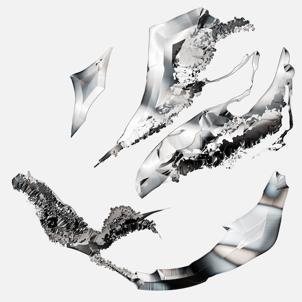


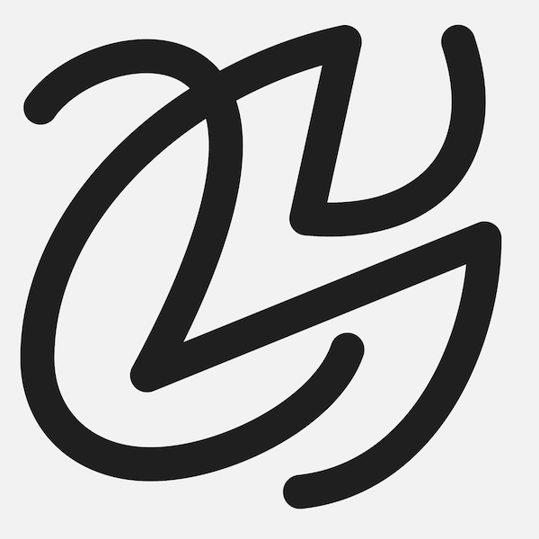
Some of the alternative versions:


See process videos and more notes on my Instagram:
Thanks for watching!


