


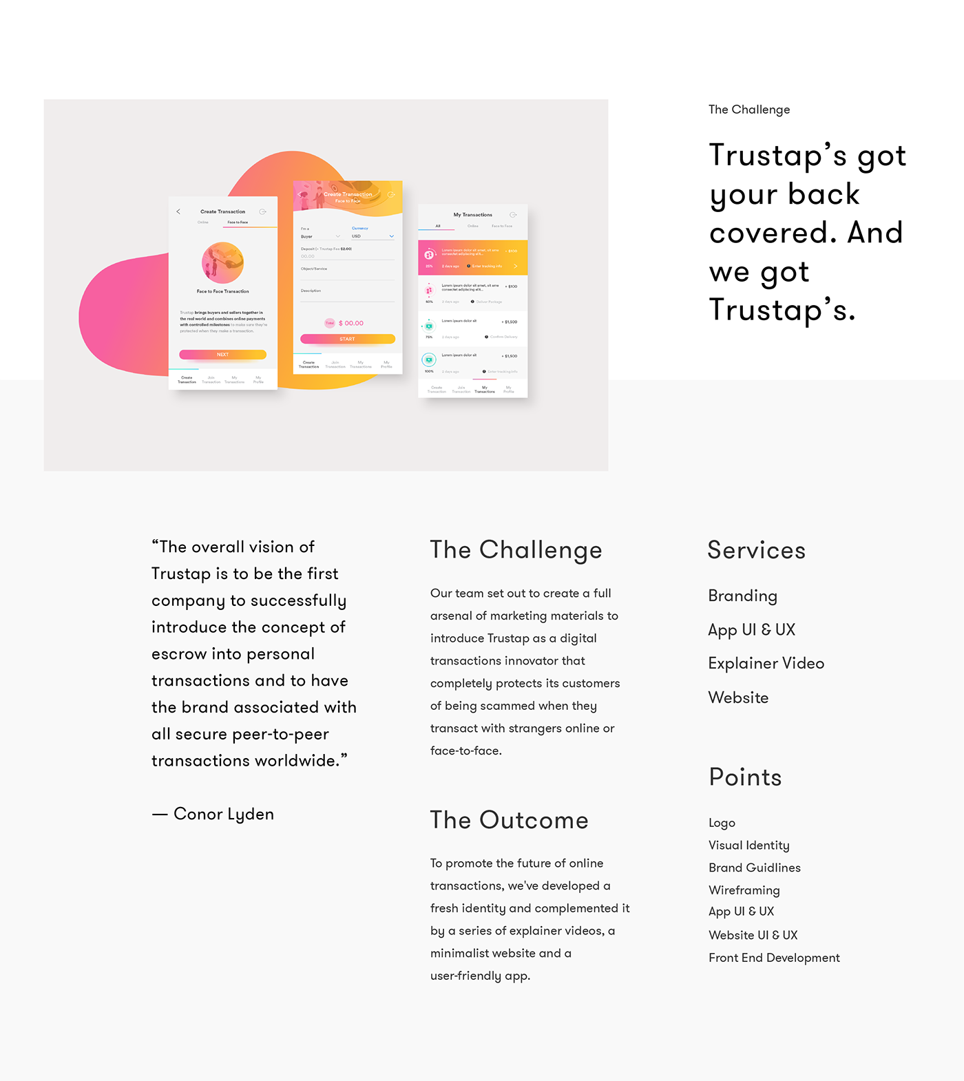
Positioning and Strategy
Trustap keeps personal transactions personal.

Positioning Trustap as the wingman middleman between buyers and sellers.
Based on Trustap's findings, their target audience wasn't aware of their existence and those who were, were reluctant whether they should transact with Trustap or not. The research also revealed people's concern regarding the fees of such transaction platforms.

From a business perspective, the main goal of Trustap was to build partnerships with online stores and marketplaces and enable them to embed Trustap's checkout experience on their website.

Branding
Bringing our heavy artillery into play.
We worked closely with the Trustap team to align their branding expectations with the company's mission. To hold up this quest, we first embarked upon creating a brand identity that would evoke professionalism, security, and peace of mind.

Logomark
We gathered the main benefits of transacting with Trustap, matched them with their object equivalents and developed a custom-made, versatile logo that gives the brand an authentic look-and-feel.

Typography
Our typography choice emerged from the company mission to bring sellers and buyers closer on a risk-free transaction platform.
User-friendly and attractive, the timeless sans serif letterform boosts the qualities of Trustap: easy to use, safe and flexible.

Color
Trustap is about feeling carefree when engaging in a digital transaction.
For this reason, we wanted to find the perfect color balance between the brand message and the team's capabilities.

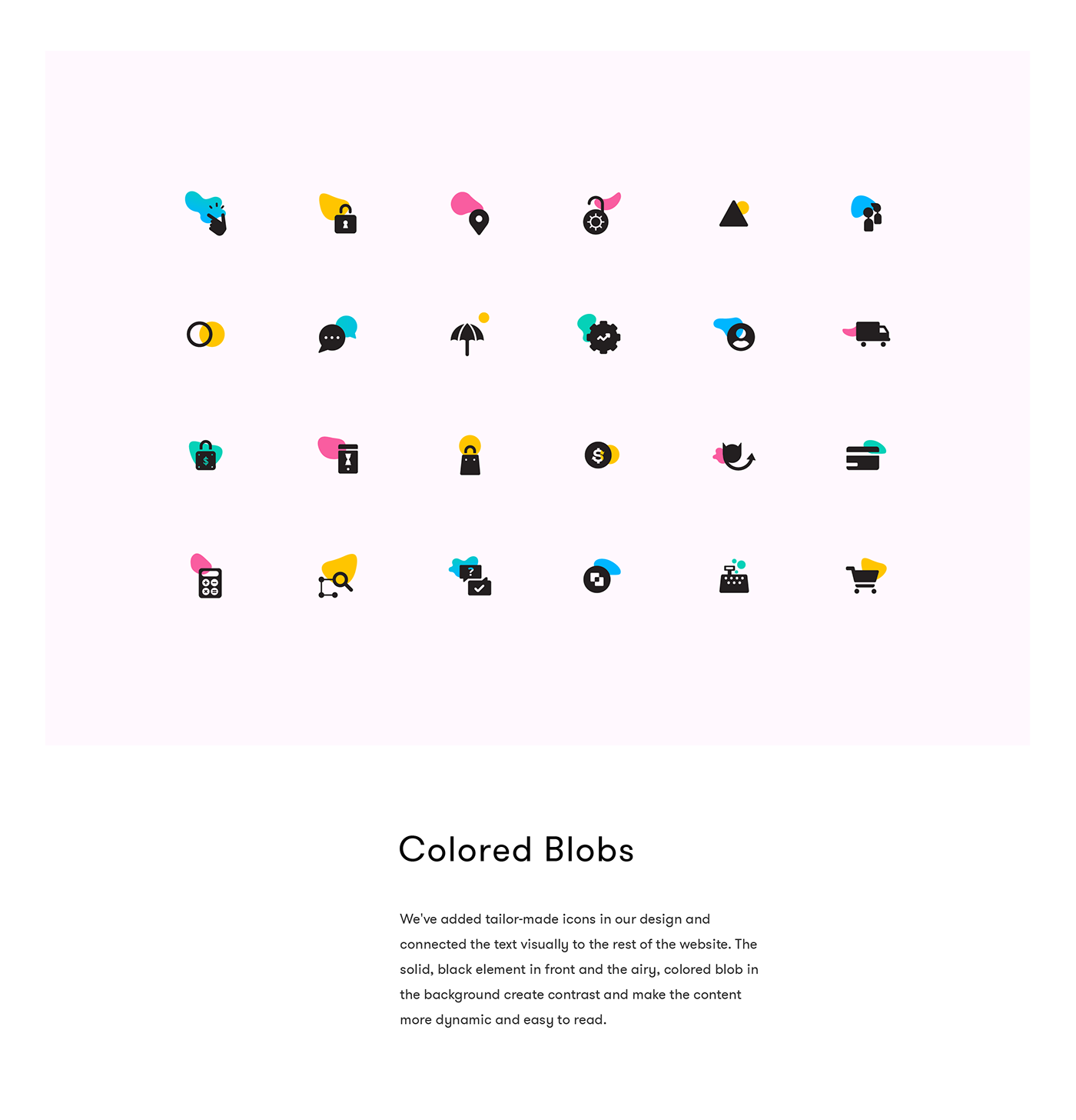
Iconography
We designed a fine set of icons to break the language barriers and use them as a means of communicating the Trustap’s benefits.
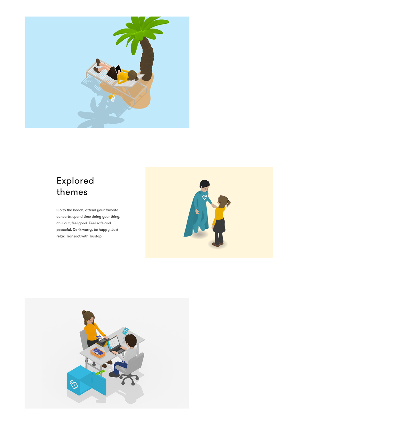
Illustration
The 3D, isometric, fun illustrations offer a vibrant twist to the overall experience, enabling the user to relate with the brand in a simple and innovative manner.
Tone of Voice
Friendly and hip, Trustap is about providing its users with the confidence they need to transact with peace of mind.
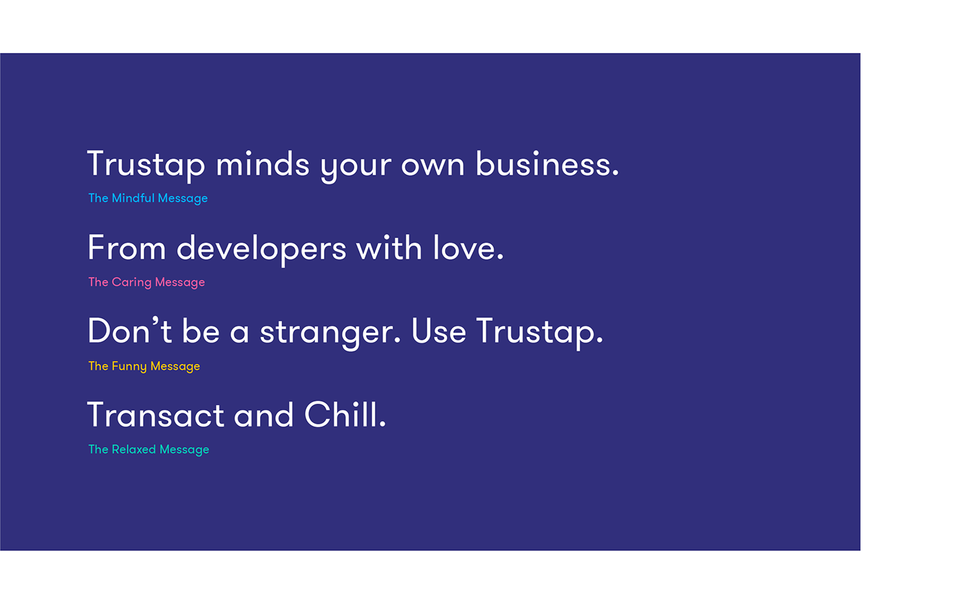
The identity of a brand plays a fundamental role in establishing a strong connection with its audience and keeping their interest going. Cheerful, empathetic and practical, the voice of Trustap is one major component of its personality and fits its overall look and feel like a glove.
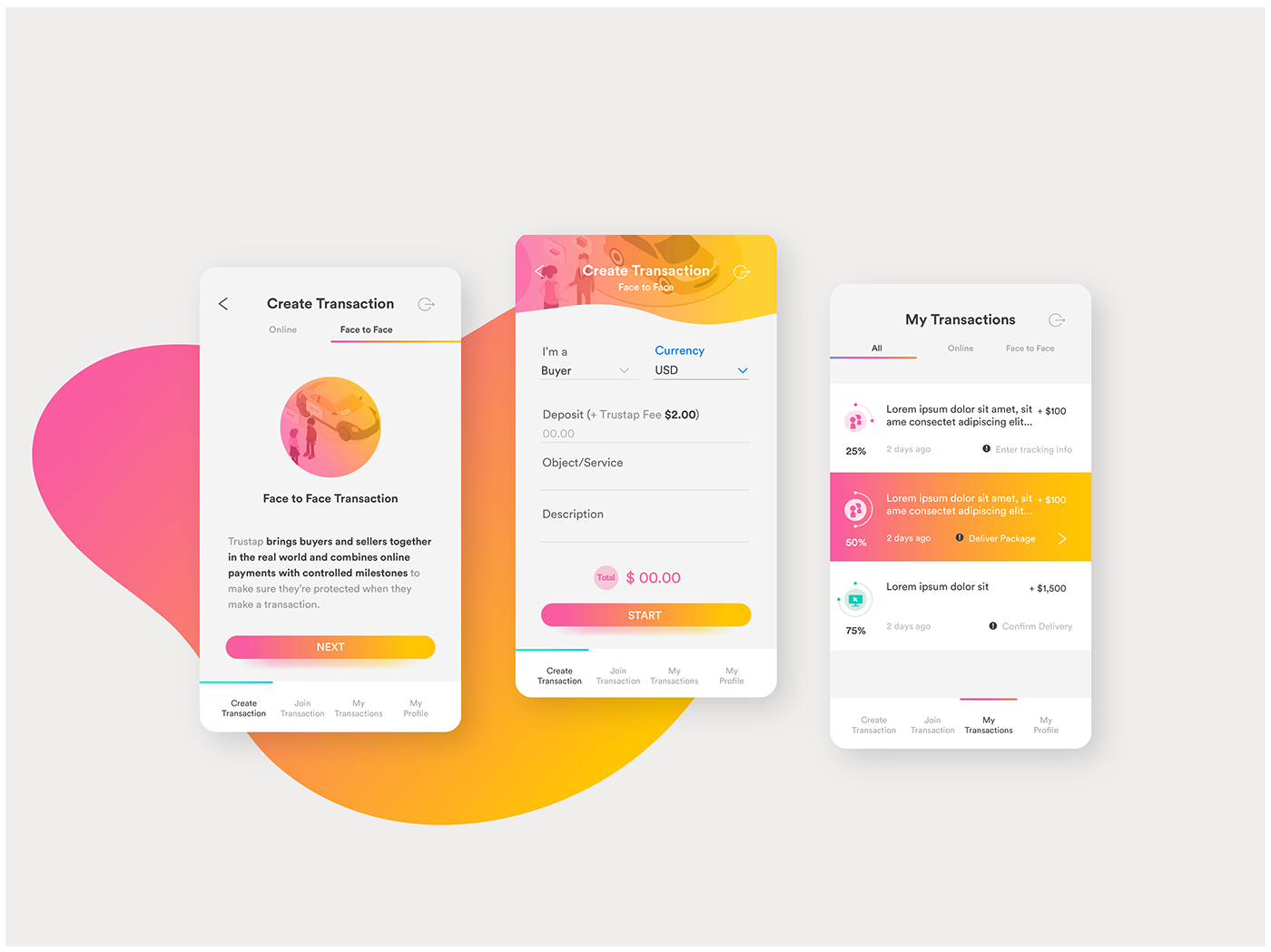
The Platform
Hassle-free digital transactions at your fingertips.
We believe that all apps should be as easy to interact with as one interacts with a very good (looking) friend. The Trustap app is that friend. Due to its charm and practicality, this swanky solution takes digital transactions to a whole new level.

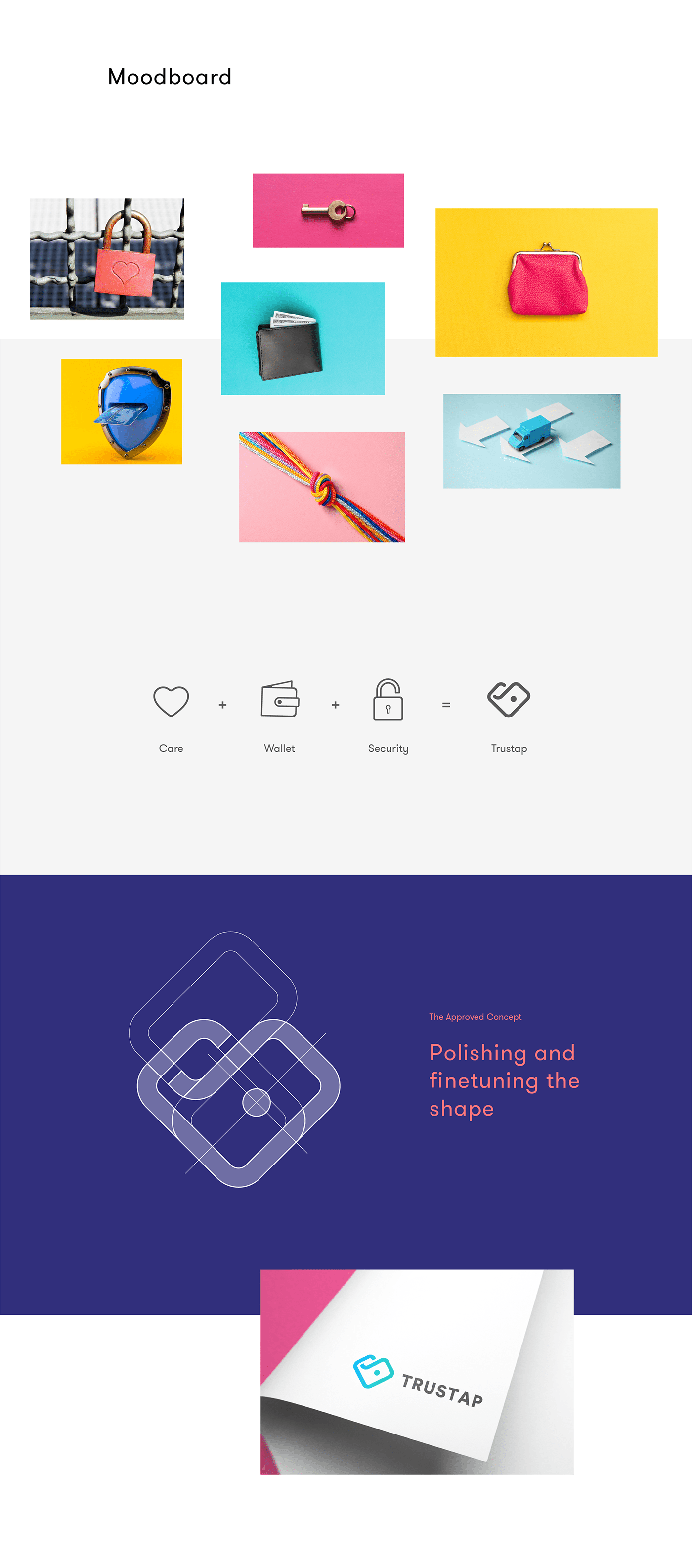
App Elements
The mood board helped us establish the basics and set the mood - no, no that one! - for the entire visual ecosystem: platform, video, website.

We were inspired by everyday things that keep us safe - such as corner cushions - and went for a design rich in vibrant colors, rounded shapes and curves to visually convey the value proposition of Trustap, that of providing safety and peace of mind when engaging in a transaction.
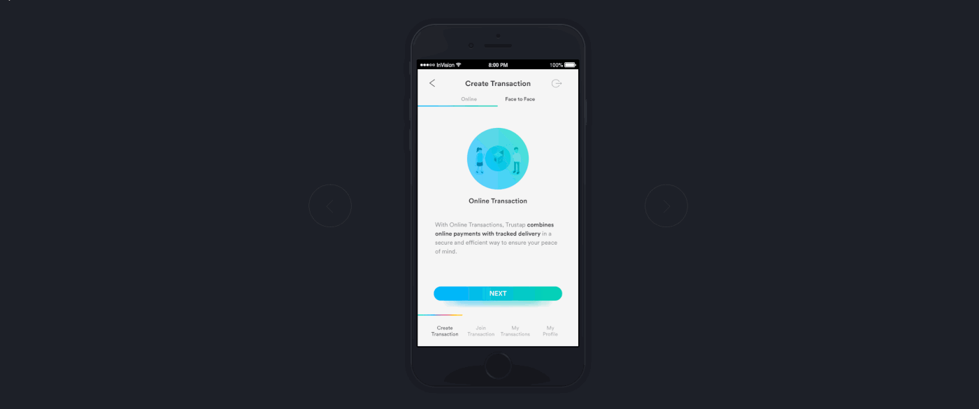
Wireframe
For a safe user journey we developed a smart transaction guide that enables the customer to transact with peace of mind without getting stuck in dead-ends.

Design
Our design addressed two challenges: we employed certain colors to prioritize the actions on the screens and removed all those elements that could have interfered with the user experience.

Colors play a crucial role in rapidly distinguishing between the two types of transactions that are feasible with Trustap. The purpose is to allow the user to associate the blue-green pair with Online Transactions and the pink-yellow one with Face-to-face transactions - this way, the user get familiar with the app on the go, without even realizing it.
Prototype
The Trustap platform is the company’s central piece around which all our efforts gravitate.
The Videos
To each company its own explainer.
Having gathered all branding elements and knowing how Trustap would look and work, we took a step further and set things in motion. Literally.

Scripting and Storyboarding
Storyboarding is one of the bitter-sweet parts of video production.
Creative juices are flowing, ideas are flying, but sadly, only about 10% of them make it to the final version. We must scrub the good, so the great can shine.

Look Development
We wanted to create something light, elegant and fresh.
So we decided to go for a minimalist look, with minimal clutter, flat shading, and hard shadows. We also modeled and rigged the characters with that vision in mind.

Hocus-Pocus Preparatus
What resulted was a series of three animated explainer videos that match the brand, the app and soon-to-be website and created a dynamic context for digital transactions rich in appealing visuals and relevant content.
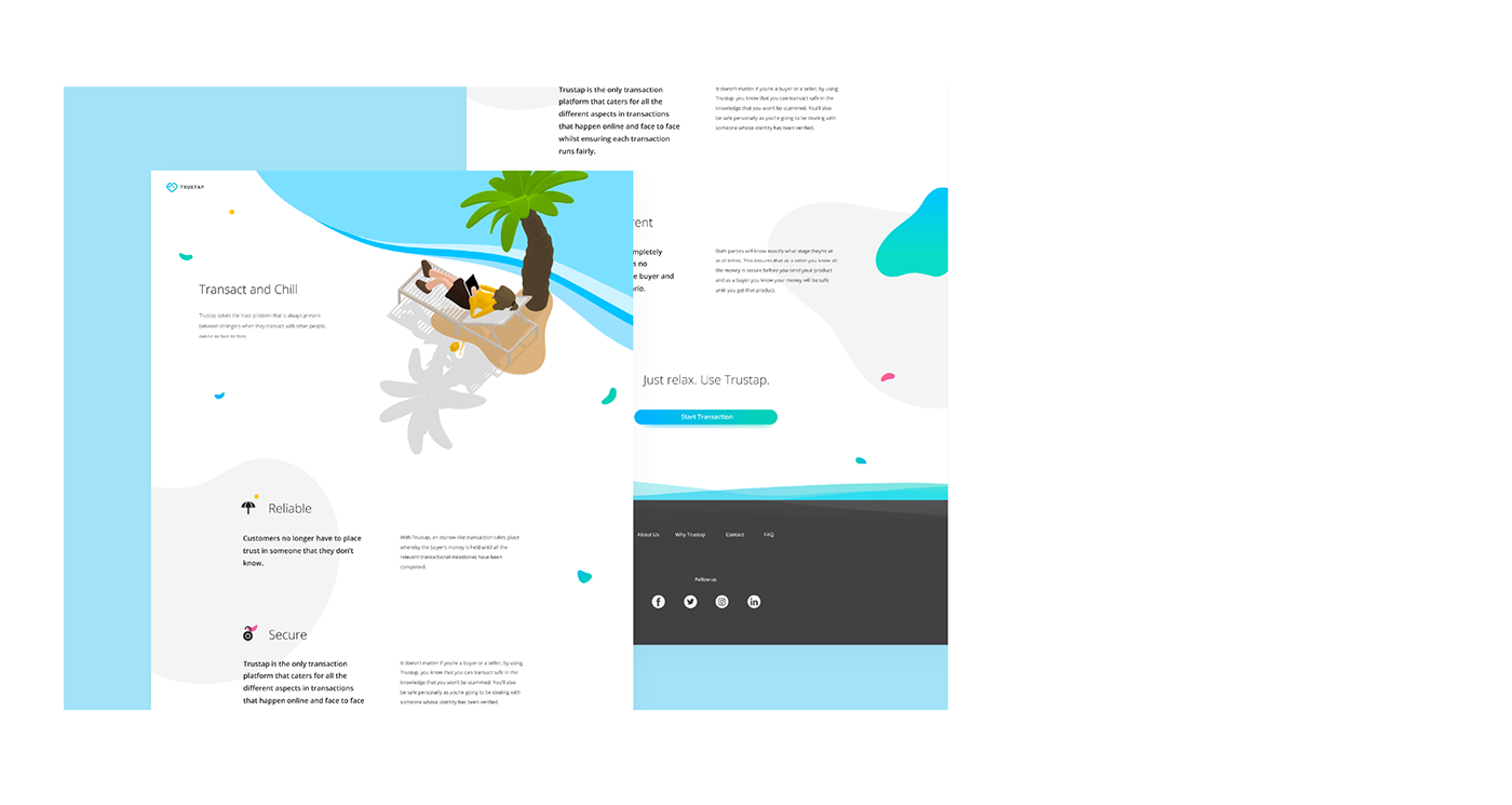
The Website
Carefree user experience for carefree transactions
The website is a collection of well-organized tailor-made content that communicates Trustap's value proposition and key benefits, and provides assistance to everyone who wants to start transacting with Trustap.

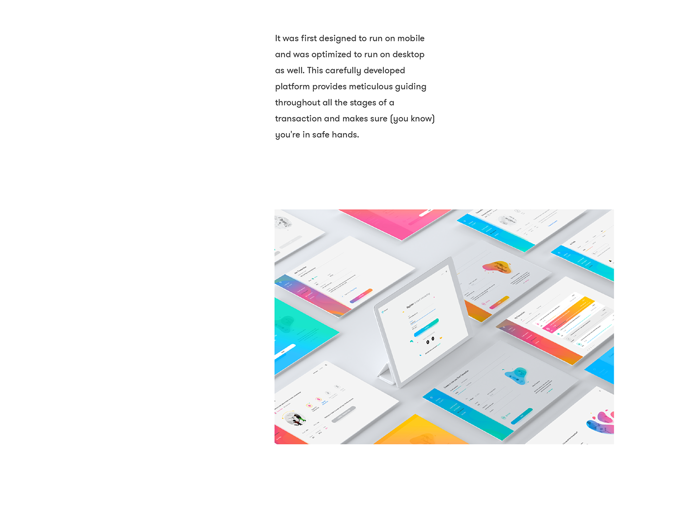
Web Elements
Even though the style of the website was pretty much decided when we figured out the style of the platform, we gathered more assets - interactions, transitions, animations, patterns, layouts - and extended the initial style guide to the web design as well.

Wireframe
We took Trustap's main goal - that of guaranteeing carefree digital transactions - to the next level and set out to design a carefree user experience.

Our greatest challenge was to make the Trustap platform available right from the very start. We integrated the experience of transacting with Trustap on the landing page so that the user can immediately understand what the company is about.
With this challenge in mind, we built the framework of the website, determined the informational hierarchy of the content and decided what went in and what went out, what went where and why.
Web Design & Implementation
We designed the website to leverage Trustap and serve as a visual tool for brand awareness, loyalty and lead generation.

The design contains a carefully selected set of visual elements - vibrant gradients, animated icons, popping headlines, smooth transitions and fun illustrations - that drive interest and generate a positive state of mind.
End Result
Knowing that the main objective of the website was to showcase Trustap as the most secure P2P transaction platform, we designed a website to gather them all.
We scraped up all elements that surround the Trustap environment - visual identity, explainer videos and platform, not exactly in that order - and all objectives - functionality, looks and wits - and unveiled the fun and carefree side of digital transactions .


