
NEON ANGEL 3:
GHOST WHITE
FAUX MOVIE POSTER [ACTON GLOBAL]
INTRODUCTION
Inspired by Kyle Lambert's work in Stranger Things, I wanted to take on a project that involved hand drawn illustration and Adobe Photoshop; I wanted to follow Lambert's process in making his artwork. The project is based on products in ACTON Global, where they sell micro vehicles like electric skateboards and offer electric scooter fleets systems. In a new office space, the place needed some character. Accompanied by other faux movie posters, I created artwork for the "last installment" of the franchise, Neon Angel 3: Ghost White. Here is a brief description of my process:
Artwork is drawn with Procreate/iPad Pro; edited through Adobe Photoshop
1 BRAINSTORM / ROUGH SKETCH / MOCKUP
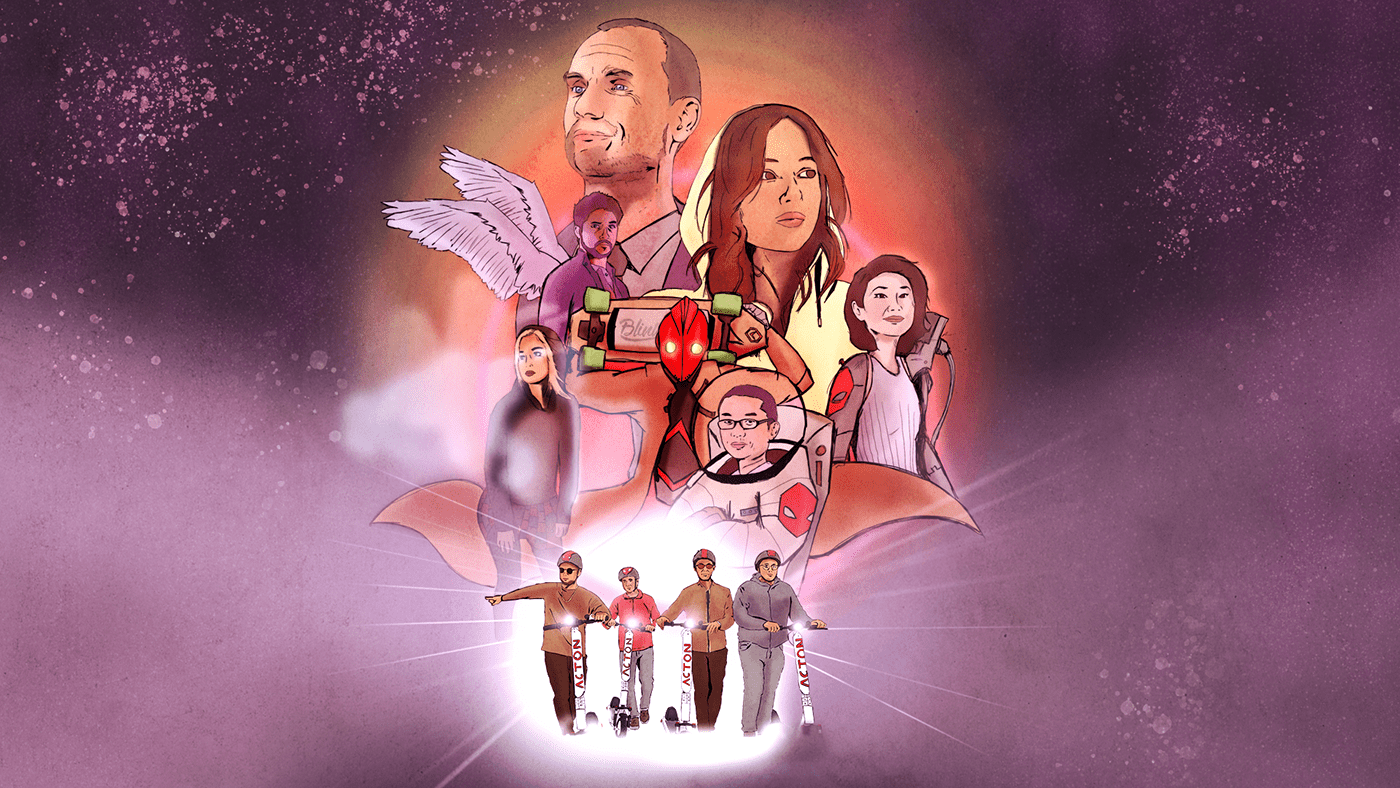
The first stage was to figure out the overall composition — what kind of characters I would want to put in to help tell the story, and how they would pose. I was inspired by multiple classic movie posters, including Star Wars, Indiana Jones, and of course, Stranger Things.
So naturally I had the coolest character in the center, the big boss having the highest visual hierarchy, and the overall interesting supporting characters to help keep balance visually.
With a quick pencil sketch, I took a picture of the drawing and imported it on my iPad Pro. Then I collected images from people at work, talents I've worked with, and Tony Stark for the most science fiction character on the poster. Except for Iron Man, the images used were from previous projects. The images were also imported to the iPad Pro/Procreate app.


2 SKETCH / LIGHT SHADING
With the Procreate App, I sketched the poses and figured out the lighting/shading of the poster. Through the sketch was where I gave great thought to how to alter images to match the science fiction elements. Our character underneath the robot is now an astronaut, the black hooded girl is now a specter, and our CEO is now a "Furiosa" type of character, etc.
Planning out the light/shading was a new step for me; before I would improvise the lighting after the coloring phase. But this early step really helps me visualize logical placements of light/shade when using back light as the main source of the project's light.


3 INKING / COLOR / TEXTURE
Once the concept is finalized, then, with the Procreate App, I draw out the full details with ink. Once the details are drawn, I fill in the characters with the first shade of color. After coloring, I transfer the project from Procreate to Adobe Photoshop.
Photoshop is where I develop the shading, add more detailed textures and elements to the characters (adding smoke/glow to create the specter character for example) and build the initial background colors.


4 SPECIAL EFFECTS / COLOR CORRECTION
In Photoshop, I add the lighting effects and dusts of stars effects with the brushing tool and gradient tool.
To help develop these lighting effects and create subtle retro aesthetics, I learned through this tutorial: https://www.digitalartsonline.co.uk/tutorials/photoshop/how-to-create-lighting-effects-photoshop/.
After adding special effects, it still needed color correction; I wanted to have the 80's science fiction aesthetic, so I went with pinker tones and bright colors to accentuate that neon glow. I also gave the poster less contrast, faded color to help convey the retro aesthetic.


5 FINISHING TOUCHES / TITLES
In the final phase, I placed the title, copy and logos onto the poster. Based on the company's branding, "NEON ANGEL" is in Gotham, while the title "GHOST WHITE" is in Goudy Old Style, a font that helps sell the retro effect.
Again, I was inspired by the Stranger Things title and wanted that for this movie poster. I learned how to create the VHS/Betamax title effect through this tutorial: https://www.digitalartsonline.co.uk/tutorials/photoshop/create-1980s-type-effects/#1
After placing the title, I place the logos onto the poster and made some minor adjustments (tweaking character's compositions, adjusting glow's brightness, contrast, etc.) to help convey "movie poster".


RESULTS?
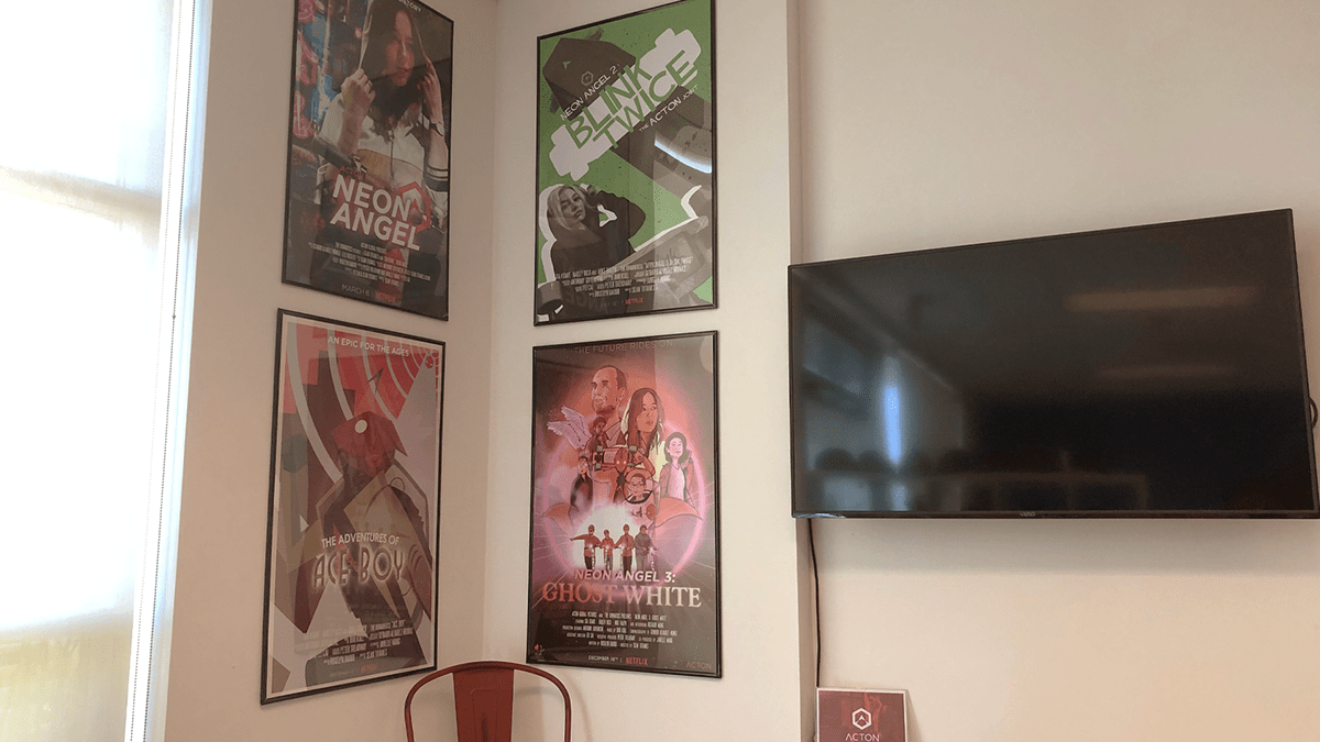
It is now printed, framed and up on the wall, along with the other poster projects I've done with ACTON. A lot of positive feedback with the team and overall excited for the new artwork for the new office. The company's branding encourages science fiction elements for their overall look, mainly the "Cyberpunk" movement, and I believe the collection of movie posters promotes the aesthetic.
The posters gives a jovial but professional, and are great ice breakers for customers/clients that come in for daily meetings.
This was an overall successful project!
This was an overall successful project!
Check out my portfolio here:
Follow my LinkedIn:
Follow my Instagram:


