Time Landscaping is a Toronto based company providing landscaping, outdoor renovation, and driveway construction services. The owner contacted us for a branding project, wanting to stand out from the competition. Previously, Time Landscaping did not have a logo, the company was simply using only its name in marketing and advertising. With our assistance, the company was able to help its clients interpret its brand visually.

To capture the brand's namesake, we decided to use clock hands to represent the concept of time. "Time" as a word is very flexible as it is associated with a multitude of sayings, so there was quite a bit of room for us to play with.
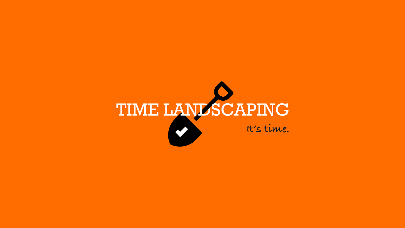
The checkmark symbol, which also serves as clock hands, combined with the slogan, all serve to convey a sense of readiness: as if an item off of a checklist is waiting for the customer to check off.
In coming up with the slogan, "It's time.", we wanted to convey a sense of readiness to undecided customers who may be unsure of the exact time they would like to begin their landscaping project. By suggesting that it is time for them to make the decision, naturally Time Landscaping will appear as the obvious choice. The cursive font also contributes to this effect, the handwriting aspect of it suggests it could be something the customer jotted down in their notebook: telling themselves that it in fact is time.
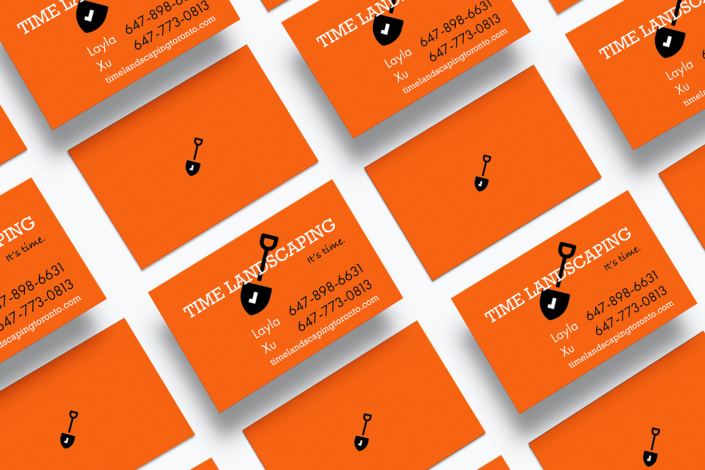
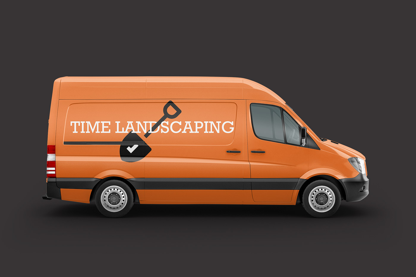
The brand's colour is inspired by the neon orange safety vests the crew and other construction professionals wear. The colour makes you think of building and constructing. It is also vibrant, demanding attention whenever you come across it. Combined with the shovel, the overall design really makes it apparent what the company is about, and that is the whole point of branding: helping consumers easily understand the identity of the company.