
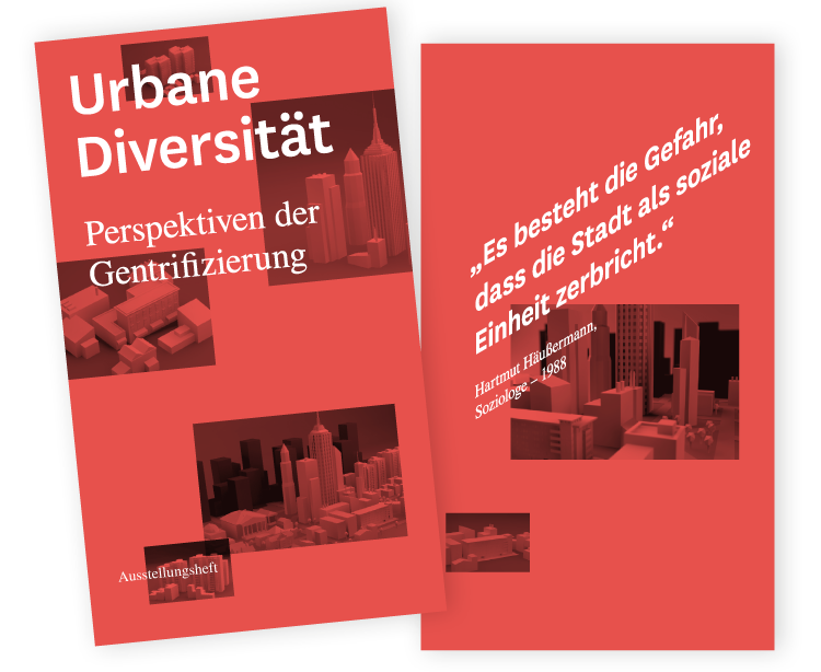
Urbane Diversität - Perspektiven der Gentrifizierung - FH Salzburg
Urban Diversity
perspectives on aspects of urban planning
perspectives on aspects of urban planning
[ case study ]
conference and exhibition in Austria, Salzburg (2013)
project at university of applied sciences Salzburg
Visual Communication, Strategy Matthias Tratz
Conception, Technics, Programming Patrick Berger
Conception, Technics, Programming Patrick Berger
▪ supported by ▪
Lighting, Sound Ariane Pellini
Projectmanagement Stefanie Bachmair
Photography Herbert Ettlinger, et al.
▪ teaching staff ▪
supervising lecturer Markus Hanzer, FH-Prof. Birgit Gurtner
▪ media ▪
http://www.designmadeingermany.de/2013/49346/
description
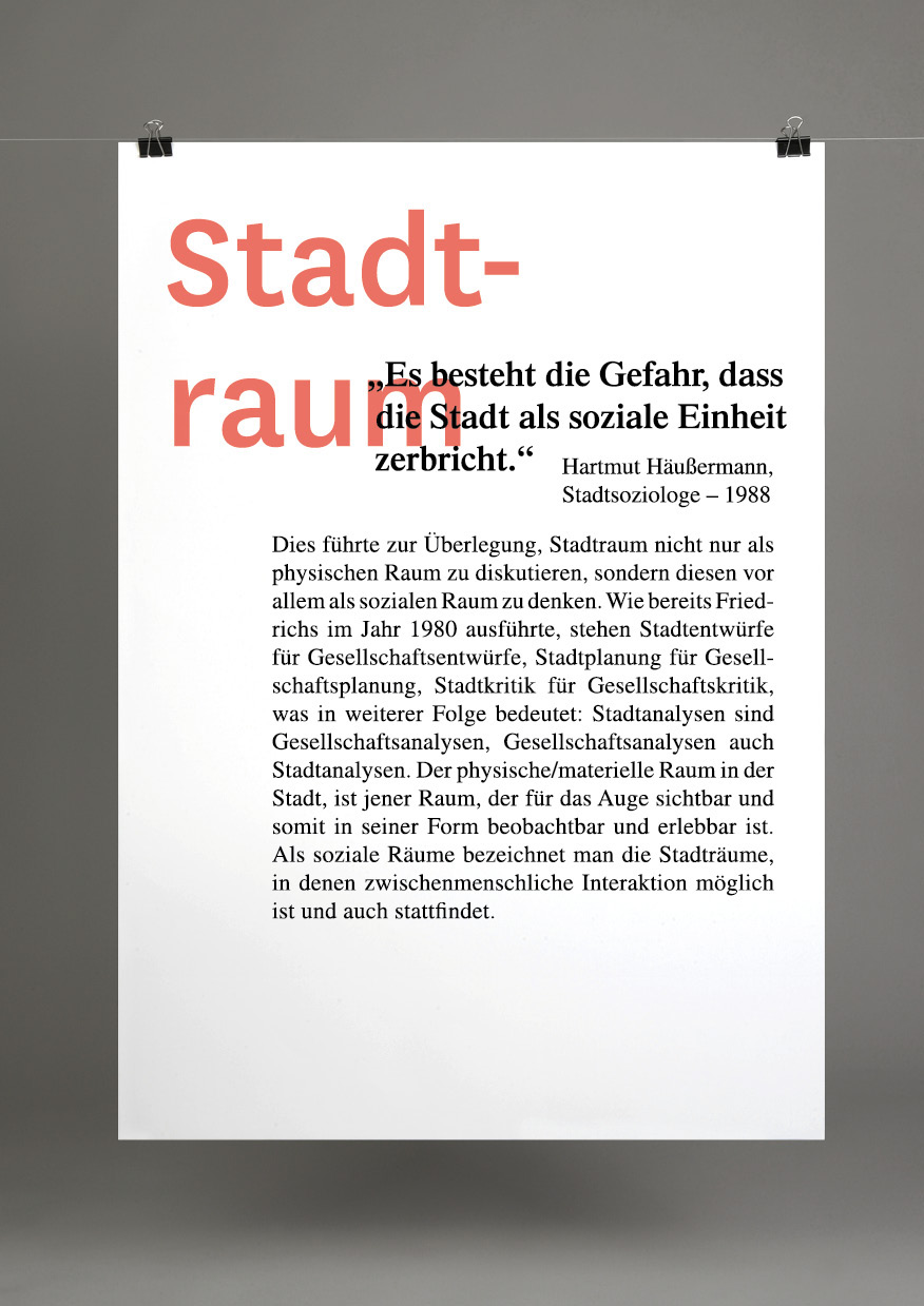
Problem
More and more people live in cities by the year 2050 there will be about 70% of the world population. The increasing density creates new tensions in the cities. Gentrification describes a complex process of repression in social, cultural or geographic terms.
Idea
Interactive exhibits allow an intuitive and personal approach. The aim is to give visitors models to deal with the issue and can also become active. In collaboration with sociologists and architects six main actors were identified in the city, which determine the process.
Relationships and dependencies between different groups in urban space will be presented. Via headphones people give insight into how their life is determined by their housing situation. The installations are completed with information signs on media discourse, interventions, and solutions for long-term development.
Solution
The treatment of this process can serve as a conceptual model to facilitate communication by awareness of the issue. A premise is this sustainable development in a broad sense. As is evident in the research, the media reception of the subject increases progressively, it occurs in the field of specialized research and direct concern to a larger discourse.
Please Note
There is no political position represented in the project, there are only aspects of this complex process shown without any prejudice, with the aim to create a common understanding.
visual communication
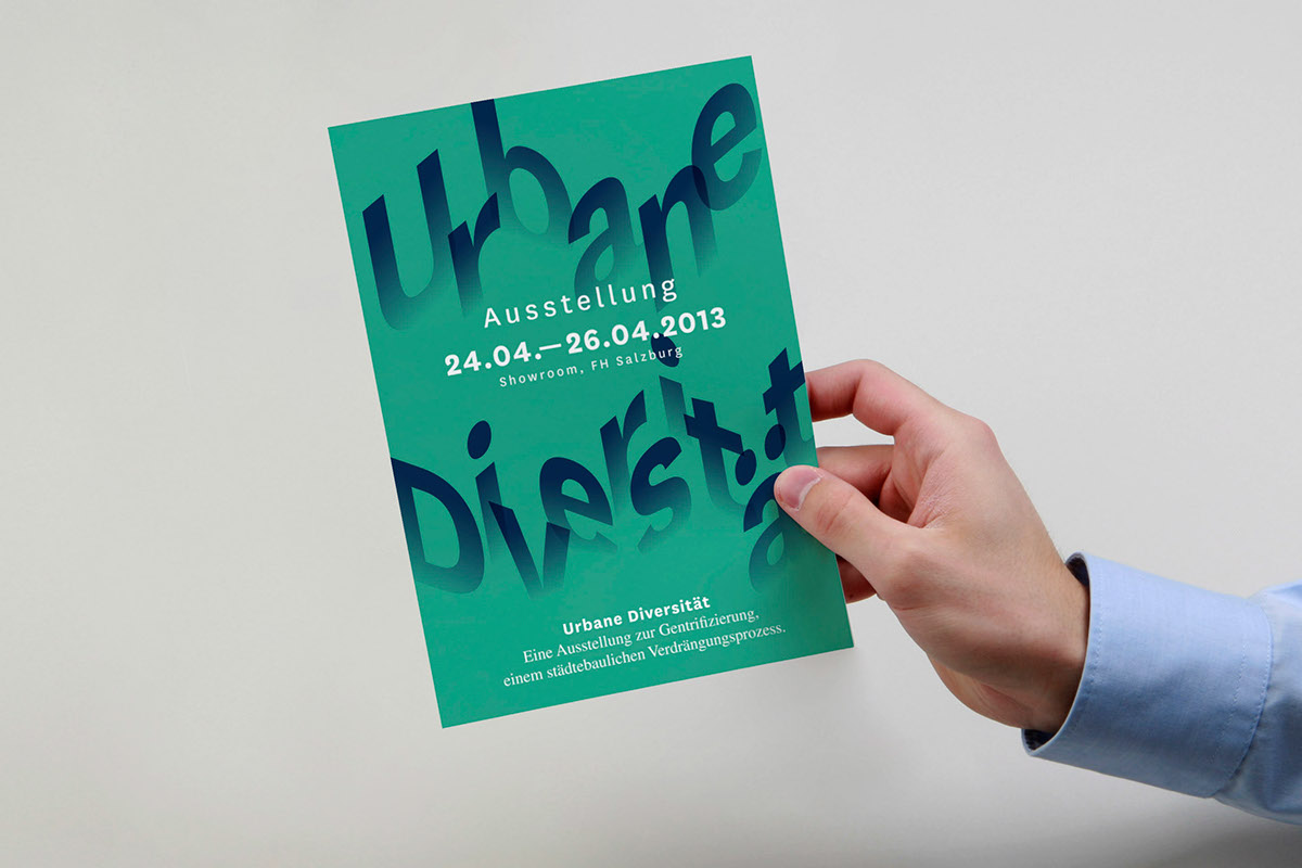

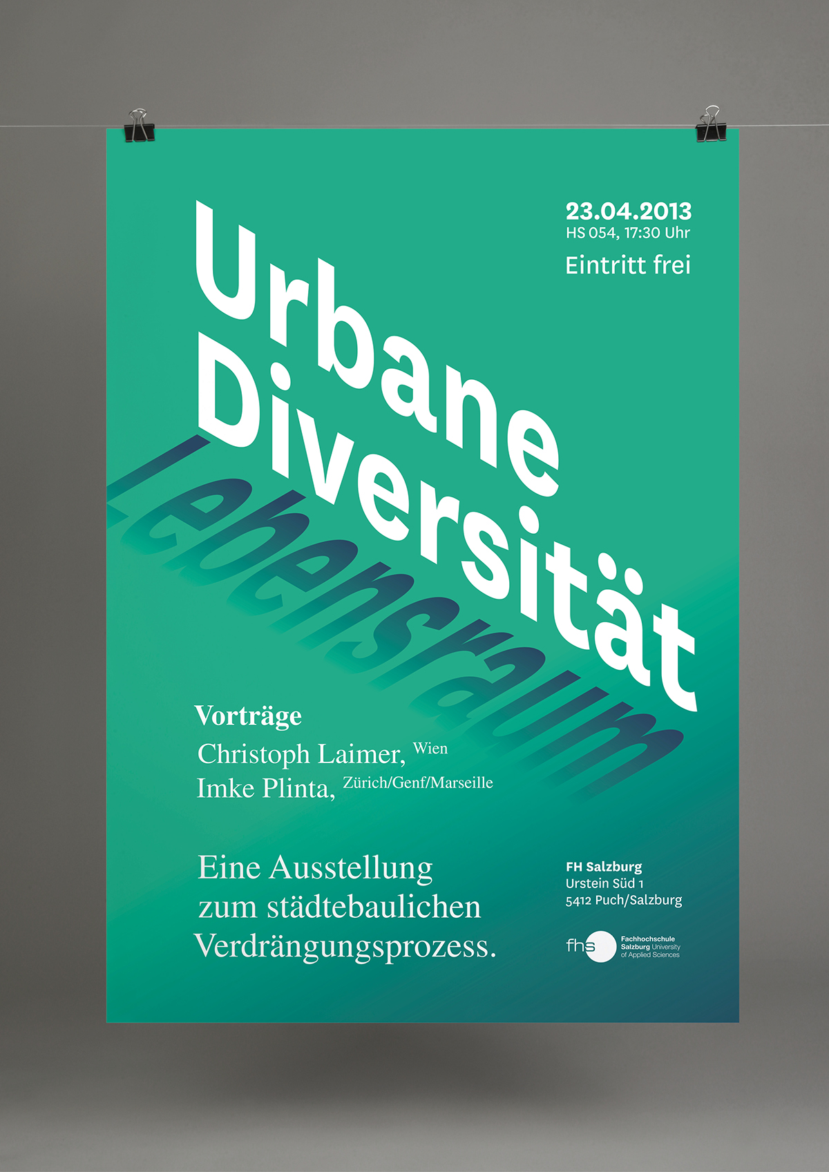
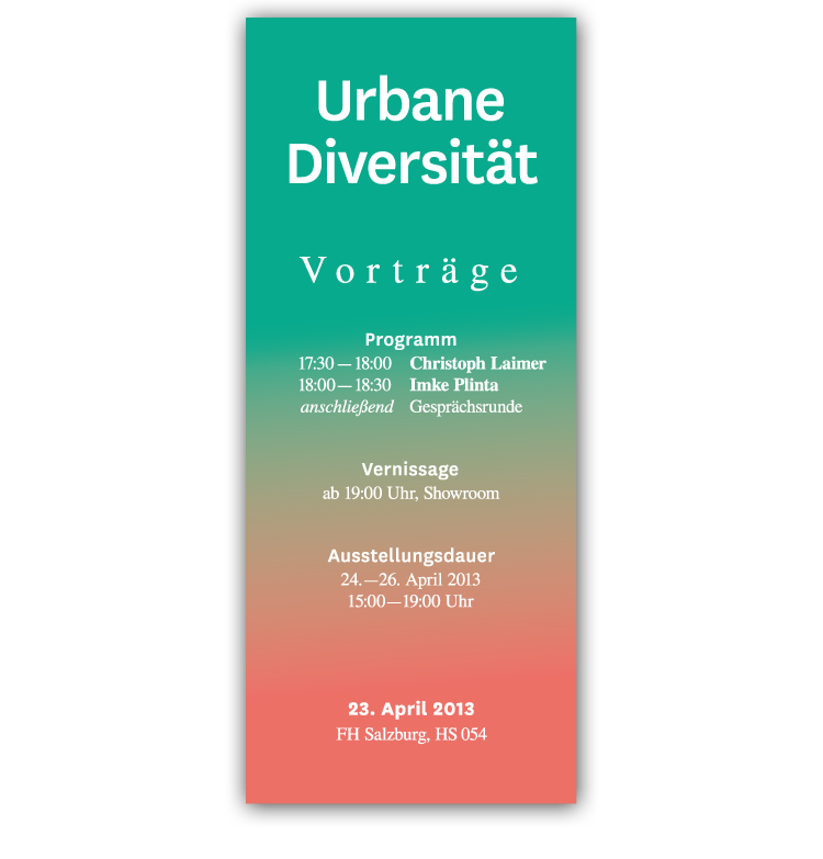
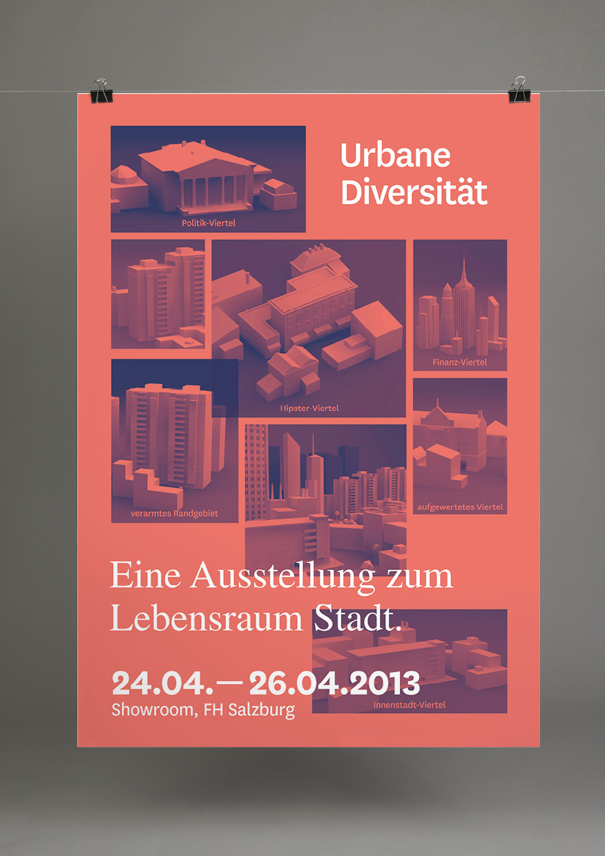
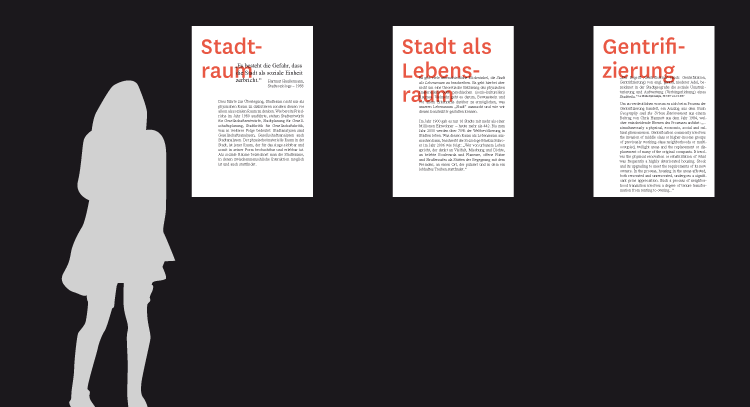
exhibition broschure


give-away postcards, posters, stickers and bags


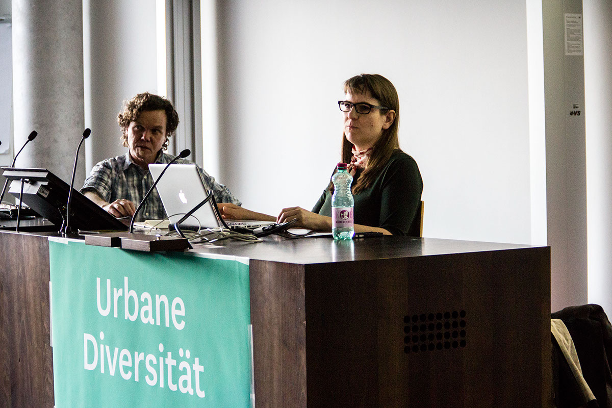
opening lecture ─ referents
Christoph Laimer, Wien
— Chief Editor of the Journal of Urban Research dérive
— dérive - a quarterly published since the summer of 2000 in Vienna and sees itself as a platform for interdisciplinary research on urban. The treated fields ranging from architecture, urban and landscape planning, regional planning and visual art to geography, sociology, politics and media studies and philosophy. Be addressed global issues, which are dealt with in the local context and to provide information about the current urban development.
Imke Plinta, Zürich/Genf/Marseille
communication designer; CAS Civic City, MAS Designculture
— working on conceptual solutions on urban space, urban use
— lecturer at HEAD Genève, MA course espace et communication
— lecturer at HEAD Genève, MA course espace et communication
(mandate for project signage)
— guest Critic at the ETH Zurich, D-Arch
— co-founder and Managing Director of City Civic Association
— guest Critic at the ETH Zurich, D-Arch
— co-founder and Managing Director of City Civic Association
(led by Ruedi Baur and Baur Vera Kockot)
— coordinator of the CAS Civic Design (HEAD, Genève)
— coordinator of the CAS Civic Design (HEAD, Genève)


exhibition
The exhibition begins with a brief introduction to the topic urban space, increasing urbanization and the resulting relevance to the process of gentrification. In addition, the term gentrification is explained and outlined its core problem. In the next exhibit of media discourse in the form of newspaper articles and additional forms of communication as well as the topics to be presented to cycle the "gentrification". The installation of touch-City makes six different main actors within the city comprehensible. About the Press with different quarters prevailing interest groups information is displayed. By simultaneously touching two quarters, the mutual effects can
represent. Thus the visitors / interior are brought closer to intuitive relationships. House tells the story in interviews and discussions, the reality of life of different income groups in terms of living conditions and environment. In conclusion, possible solutions and advanced materials provided as suggestions for driving - in the form of posters, postcards, brochures or magazines.
represent. Thus the visitors / interior are brought closer to intuitive relationships. House tells the story in interviews and discussions, the reality of life of different income groups in terms of living conditions and environment. In conclusion, possible solutions and advanced materials provided as suggestions for driving - in the form of posters, postcards, brochures or magazines.
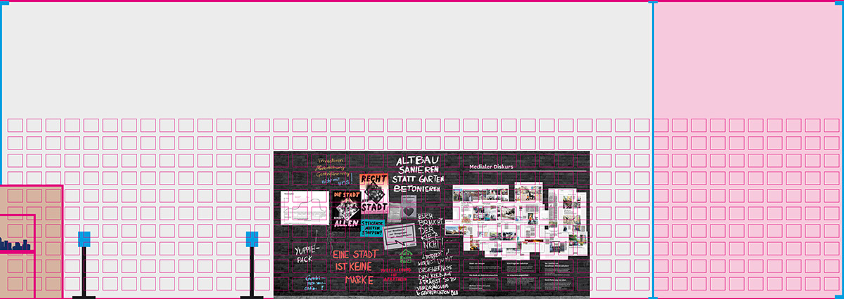
structure of the exhibition
1. topics introduction
2. topics discourse (press, media and in the cities)
3. touch-city
4. story-house
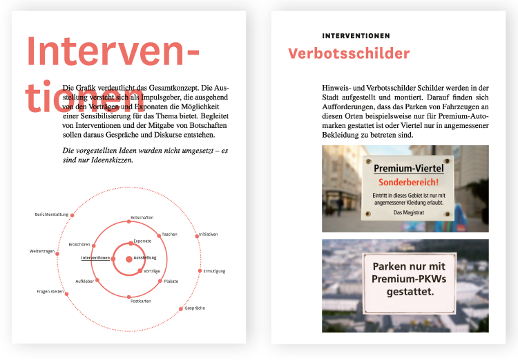
5. interventions
6. approaches to the subject and enclosure of materials
1. topics introduction
2. topics discourse (press, media and in the cities)
3. touch-city
4. story-house
5. interventions
6. approaches to the subject and enclosure of materials


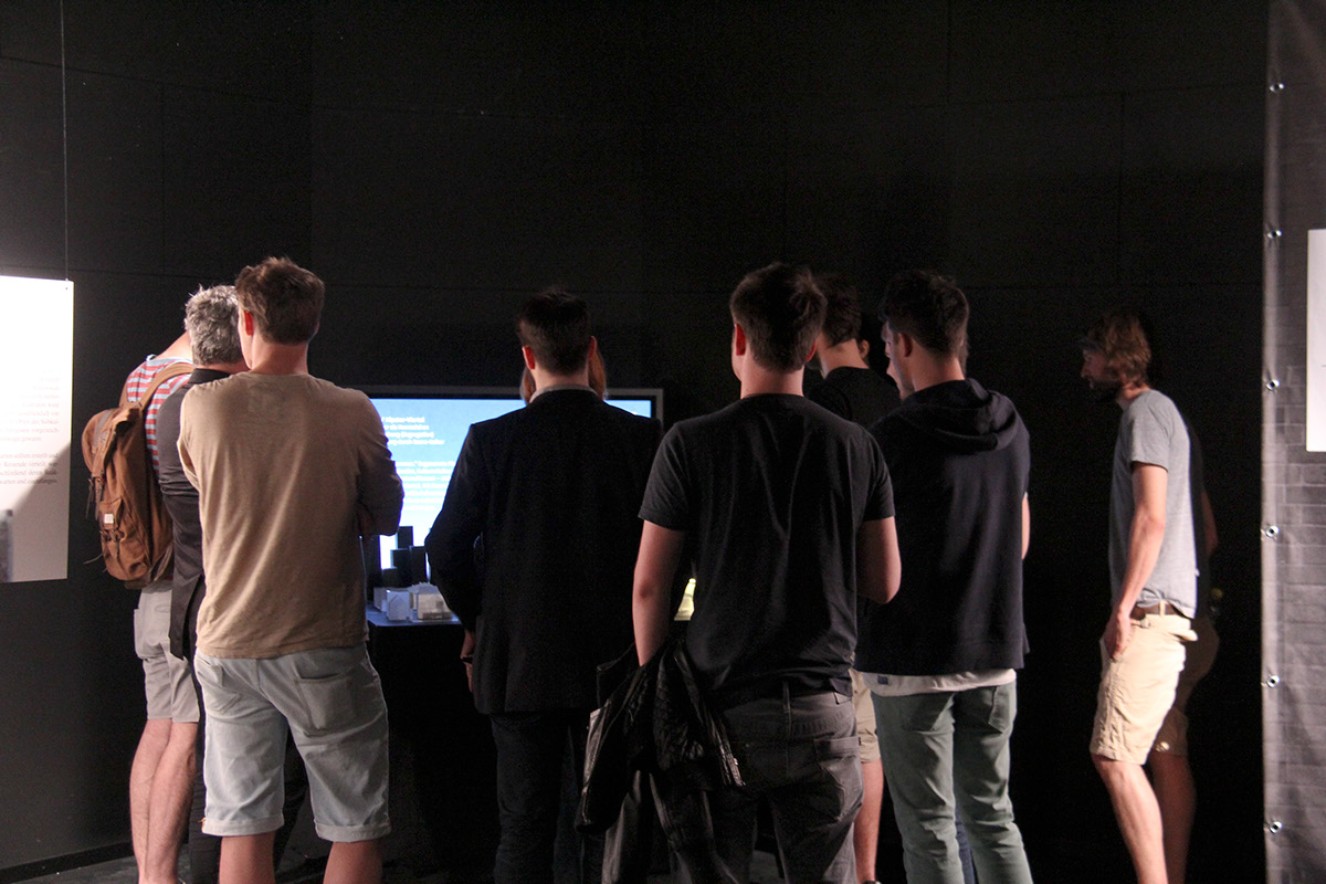
touch-city (interactive prototype)


story-house


questions and possible solutions


give-away material at the last point of the exhibtion
(posters, broschures, postcards, newspapers)


exhibition grid


research and conception
Considerations of the design implementation
The current discourse on society and politics question existing forms of communication. A key point here is the authenticity. For visual design this means that it can not fall back on the established design schemes, as they are used by the large corporations as part of a corporate identity and a corporate design.
This corporate identity, however, is often a pure staging, it is advertising, and occasionally also a subtle manipulation. Therefore threatens the danger of illusory, the distrust causes and the credibility of the company into question.
This corporate identity, however, is often a pure staging, it is advertising, and occasionally also a subtle manipulation. Therefore threatens the danger of illusory, the distrust causes and the credibility of the company into question.
A critical and inquiring mediation approach is at first query perspectives or worldviews. The basic question concerns not only design, but also the entire society : " [ A]lthough in the private sector are fraud and waste widespread. Countless engineers, accountants and sociologists who have been trained at the expense of community, wasting their talent on a daily basis in order to perfect the curves of a engine bonnet, the hocus-pocus of a package or the filter of a cigarette [...] The financial success of a company always has priority before the social utility of what it produces." (translated, Halimi 2012)
Therefore different visual expressions of various movements were explored and analysed.
protests Mai 1968, france

source: CulturAlternativa

source: formes vivres

source: formes vivres
protests Occupy 2011, different locations

source: Wikimedia

source: Wikimedia

source: wikimedia

source: OccupyLondon
problem areas
— often no structured visual communication, difficulties to understand
— no clear communication possible
— The movements often do not use the media in a sufficient way to communicate and convey their messages. An argument, which is already Jean Baudrillard accused the '68 movements.
— often no structured visual communication, difficulties to understand
— no clear communication possible
— The movements often do not use the media in a sufficient way to communicate and convey their messages. An argument, which is already Jean Baudrillard accused the '68 movements.
exception
— Occupy London used the same logo and uniform font by Jonathan Barnbrook to generate a visual coherence.
— Occupy London used the same logo and uniform font by Jonathan Barnbrook to generate a visual coherence.
elections e.g. USA

source: Ragesoss - wikimedia

source: Jakehonig - wikimedia
problem areas
— very uniform appearance
— very much attuned to the aspect of corporate design
— tendency towards distrust of such PR campaigns
— very uniform appearance
— very much attuned to the aspect of corporate design
— tendency towards distrust of such PR campaigns
conclusion for visual communication concept
— breaking the strict corporate design - imagery
— but the design must not be arbitrary, or be purely self-reflexive
— clear communication must be maintained
— breaking the strict corporate design - imagery
— but the design must not be arbitrary, or be purely self-reflexive
— clear communication must be maintained
visual communication
The goal was to enable a value-neutral mediation. Using the representation of the understanding to the actors and interests to be sharpened in this process.
Premises of the concept
— No strict corporate design, but a flexbile visual grammar (typography, color, shape).
— Visual design framework, based on a conceptual positioning, which is reflected in typography, color and shape.
— Clear communication abilities. The message is a central component and therefore must not be defaced by a too intrusive or "dadaist" design.
verbal key-positioning
─ diversity
─ motivation → transfer to visual communication
─ clearness
─ motivation → transfer to visual communication
─ clearness

Methodology by Nikolaus von Heiseler to check the context and direction of terms.

word marks


fonts


colors and secondary colors


form language

picture language


conception of title and content

documentation and making of


bibliography (for visual communication)
Abdullah, Rayan/ Hübner, Roger (2002): Corporate Design. Kosten und Nutzen.
Mainz: Verlag Hermann Schmidt Mainz
Finke, Tim/ Manger, Sebastian/ Fichtel, Stefan (2012):
Informotion - Animated Infographics. Berlin: Gestalten Verlag
Halini, Serge (2012): le Monde diplomatique 11/2012, Deutsche Ausgabe
Hesse (1996): doing. Corporate Identity. Was kommt als nächstes.
Newsletter Nummer 2. Düsseldorf: Hesse Designagentur GmbH, S2ff.
Kugelberg, Johan/ Vermès, Philippe (2011): Beauty Is in the Street:
A Visual Record of the May ’68 Paris Uprising. London: Four Corners Books
Mast Claudia (2010): Unternehmenskommunikation. Ein Leitfaden.
Stuttgart: Lucius & Lucius Verlag GmbH
Müller-Brockmann, Josef (2008): Rastersysteme für die visuelle Gestaltung.
Grid systems in graphic designs: Ein Handbuch für Grafiker, Typografen und
Ausstellungsgestalter. Sulgen/Zürich: Niggli AG Verlag
National Geographic (01.2012): Zukunft Stadt. Wie wir morgen leben werden.
Hamburg: Gruner + Jahr
PAGE (01.2008): Die Erfolgsformel, S.18ff.
Grandry, Pieterjan (2012): Crapisgood. In:
http://crapisgood.com/about, aufgerufen am 10.09.2012
http://crapisgood.com/about, aufgerufen am 10.09.2012
secondary sources
Gautier, Damien/ Gautier, Claire (2009): Mise en page(s), etc. Manuel.
Paris: Édition française Pyramid NTCV
Schwarz, Ulrich/ Bertron, Aurelia/ Frey, Claudia (2012): designing exhibitions.
ausstellungen entwerfen. A Compendium for Architects, Designers and
Museum Professionals. Kompendium für Architekten, Gestalter und
Museologen. Basel: Birkhäuser
Willberg, Hans Peter/ Forssman, Friedrich (2005): Lesetypografie.
Mainz: Hermann Schmidt Verlag
Thank you for watching!
With ✍ from
Austria & Bavaria
Austria & Bavaria


