MultiMediaArt & MultiMediaTechnology
corporate identity, corporate design, strategic design
corporate identity, corporate design, strategic design
[ case study ]
visual communication and strategy for studies in Austria, Salzburg (2011)
This work shows only a draft and was not implemented.
project description (300W)
Problem / Situation
The communication structures of the two studies MultiMediaArt and Multimedia Technology should be simplifed. The affinities of the various departments and the cooperation between the studies should be visually comprehensible and avoid misunderstandings. On the basis of research on existing potential and internal workshops a positioning was found and formulated as a corporate identity. Also a additional umbrella brand was removed.
Idea
Core of the visual concept is to inform about the work of the students, the events and opportunities offered. The appearance provides the necessary infrastructure. Therefore a strongly to typography and color language related design was choosen. The two studies which share curricular courses should express their own character via typography and operate without clichés. Both studies are equal and positioned independently.
Solution
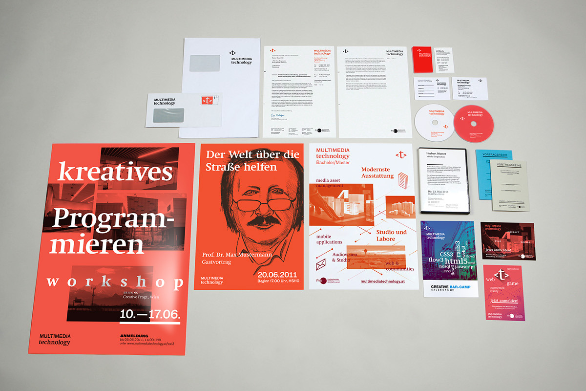
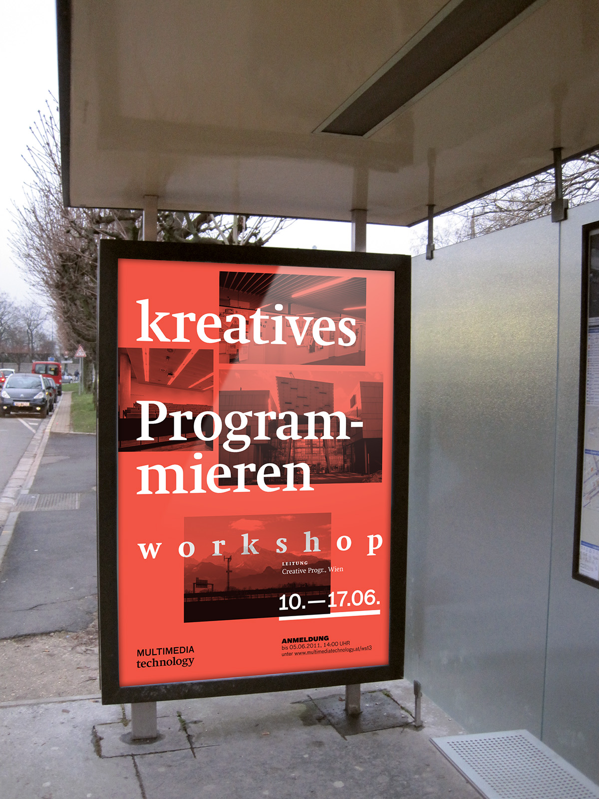
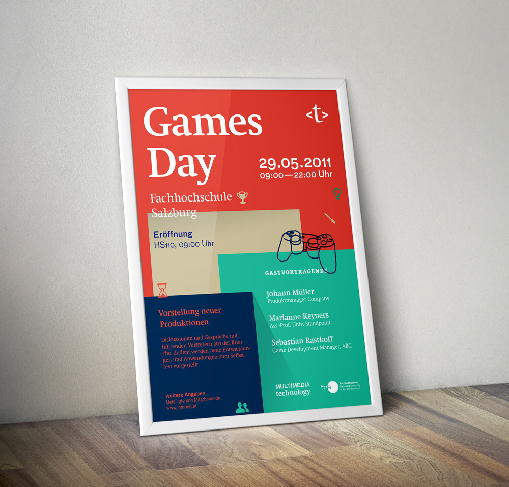
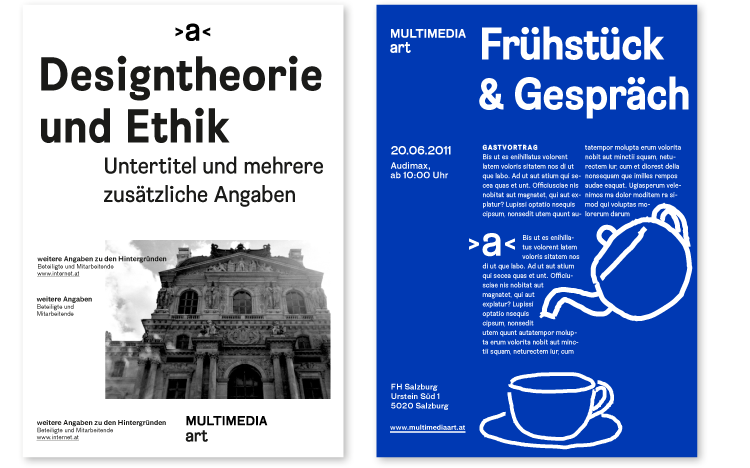
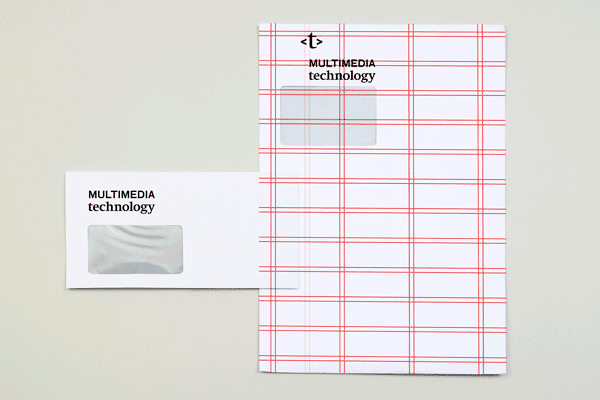
The graphical implementation is based on the concept of meta-level. The appearance is not to push too much in the foreground. For the technically oriented programming study (technology) an intense orange-red was chosen to interest women for it, among the previous sterotype turquoise blue. The creatively-artistic study (art) received an intense royal blue in return. In addition, each study has based on its short logos and own typeface a particular grid, which enables the independence emphasize on otherwise similar documents.
The graphical implementation is based on the concept of meta-level. The appearance is not to push too much in the foreground. For the technically oriented programming study (technology) an intense orange-red was chosen to interest women for it, among the previous sterotype turquoise blue. The creatively-artistic study (art) received an intense royal blue in return. In addition, each study has based on its short logos and own typeface a particular grid, which enables the independence emphasize on otherwise similar documents.
corporate design position
— The corporate design serves prior as framework and stage.
— Application of a clear and long-term design within a modular set.
— Publication of the universities potential via the activities, work of students and events.
➡ concept of the meta level
— Application of a clear and long-term design within a modular set.
— Publication of the universities potential via the activities, work of students and events.
➡ concept of the meta level
current status

copyright at university of applied sciences Salzburg (2011)
corporate design — application


corporate design — conception
verbal key-positioning
─ authentic
─ independent → transfer as a basis for corporate design (typography, colors, forms)
─ active
─ authentic
─ independent → transfer as a basis for corporate design (typography, colors, forms)
─ active
corporate design premisses
— The corporate design serves as framework and stage.
— Application of a clear and long-term design within a modular set.
— Publication of the universities potential via the activities, work of students and events.
— Application of a clear and long-term design within a modular set.
— Publication of the universities potential via the activities, work of students and events.
derivation of the short logos
The abbreviations MMA or MMT are not comprehensible for externs. So the two M for (MultiMedia) were arranged in a new way and build know for art guillemets as a emphasis and for technology the typical containers used in programming.
The abbreviations MMA or MMT are not comprehensible for externs. So the two M for (MultiMedia) were arranged in a new way and build know for art guillemets as a emphasis and for technology the typical containers used in programming.

corporate design — elements
word marks


fonts

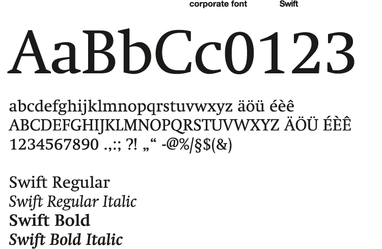
The two studies share the FF Bau and the Minion, which are both considered as neutral in their appearance in relation to modern oder traditional fonts. The corporate fonts of MultiMediaArt and MultiMediaTechnology thus are more characteristic and special.


MultiMediaArt uses the B-Grotesk to combine all their specialisations as CommunicationDesign, Film, Computer Animation and Audio Design.
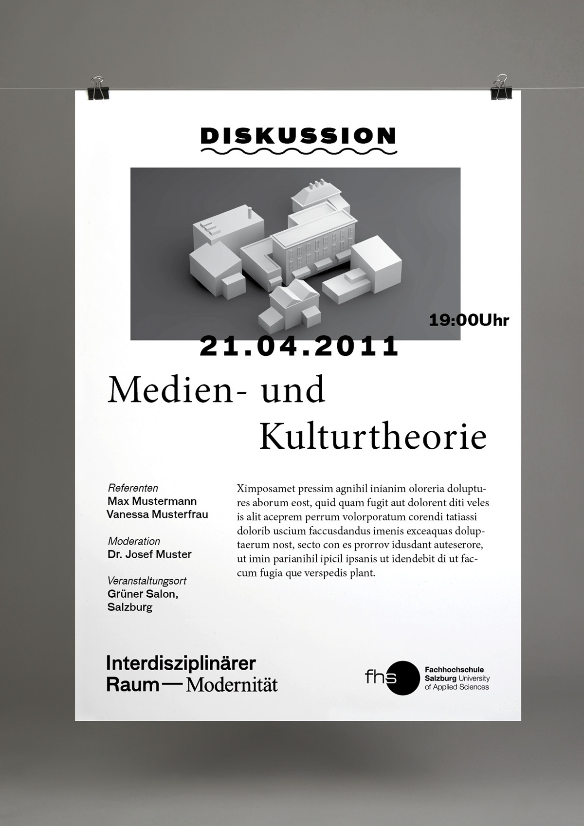
MultiMediaTechnology uses a clear serif font to avoid any cliche which is associated with studies in the field of technology or programming. The serif font should even more point out the special orientation considering the society in this studies.

main colors

secondary colors

special grid


use of forms

research and competition analysis

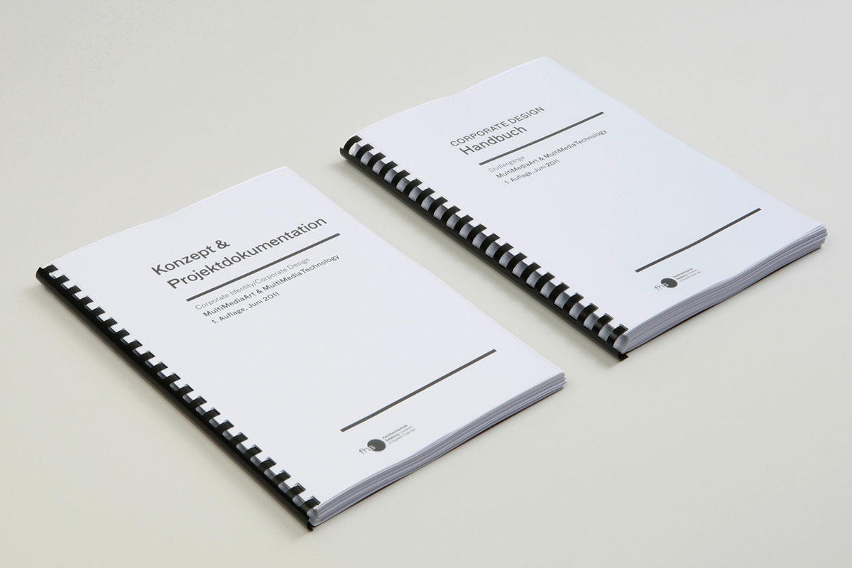
documentation and corporate manual

Thank you for watching!
C R E D I T S
▪
▪
Creative Direction, Conception
Support, Illustration
Sebastian Mrazek
Sebastian Mrazek
Austria & Bavaria
❤

