For a healthy smile
—
—
Client – Zahnarztpraxis Kariger & Hufnagel
Agency – Lockstoff Design
Agency – Lockstoff Design
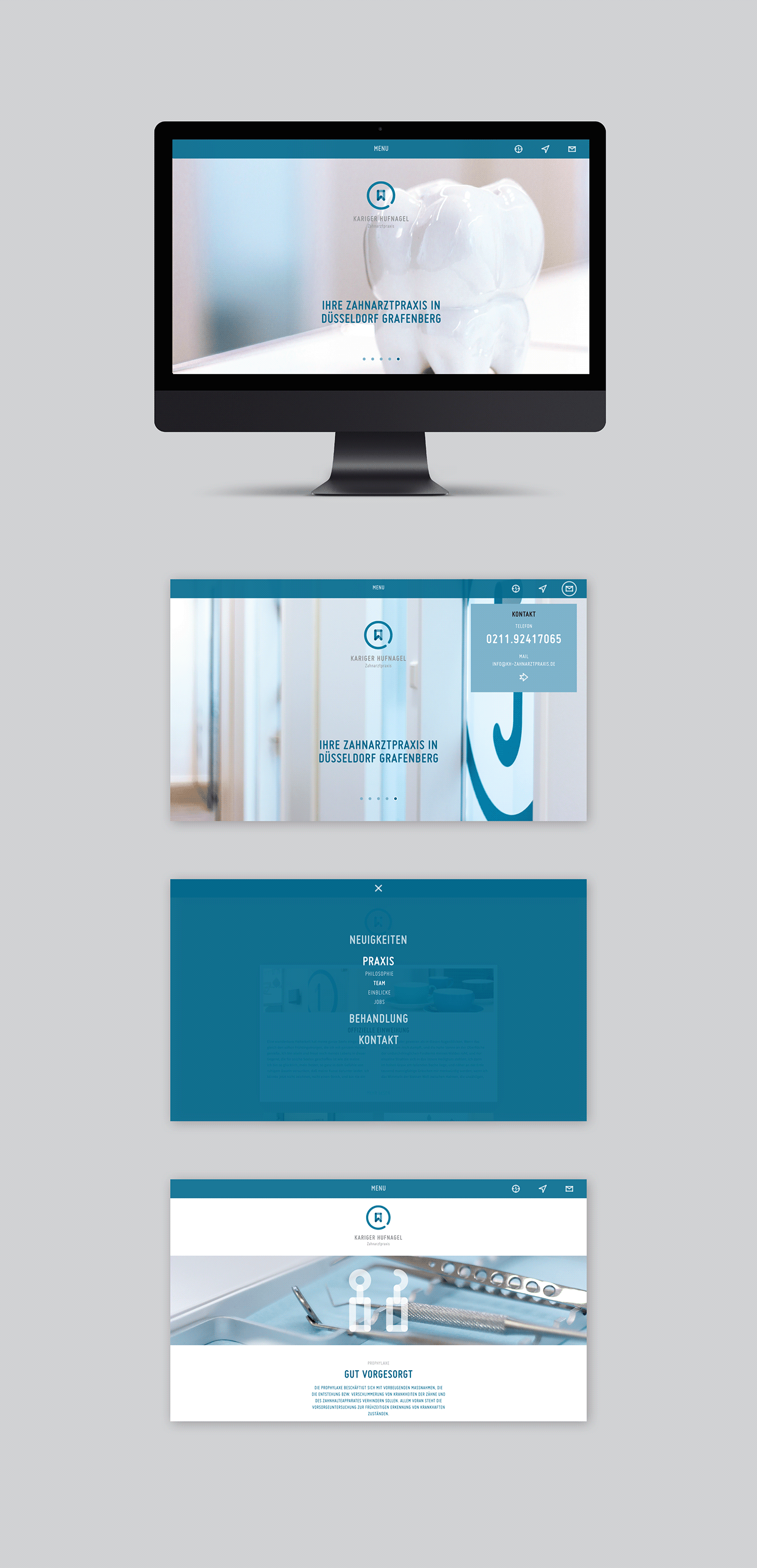
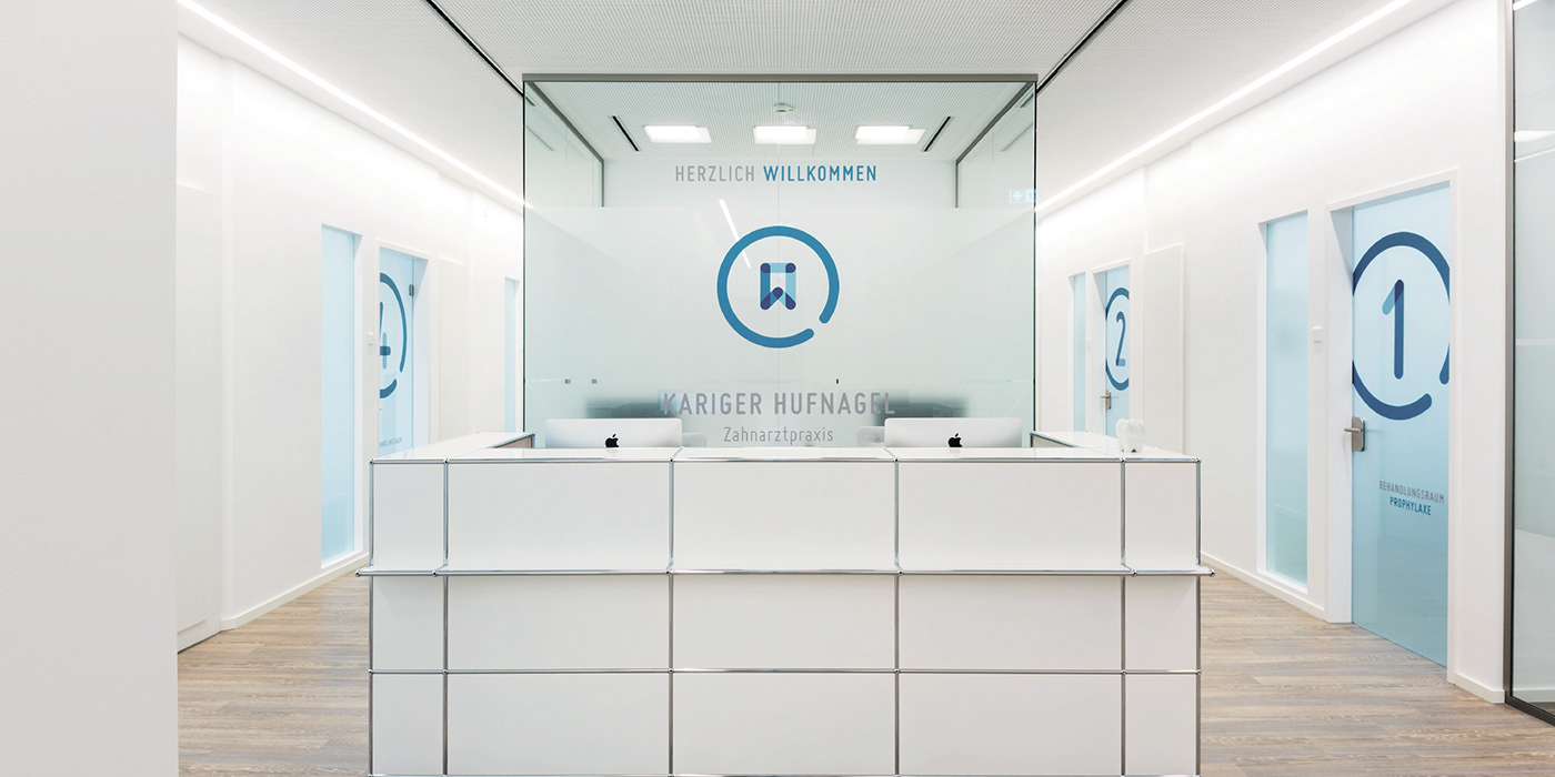
The corporate design of the dental practice Kariger Hufnagel communicates competence and professionalism close to the patient.
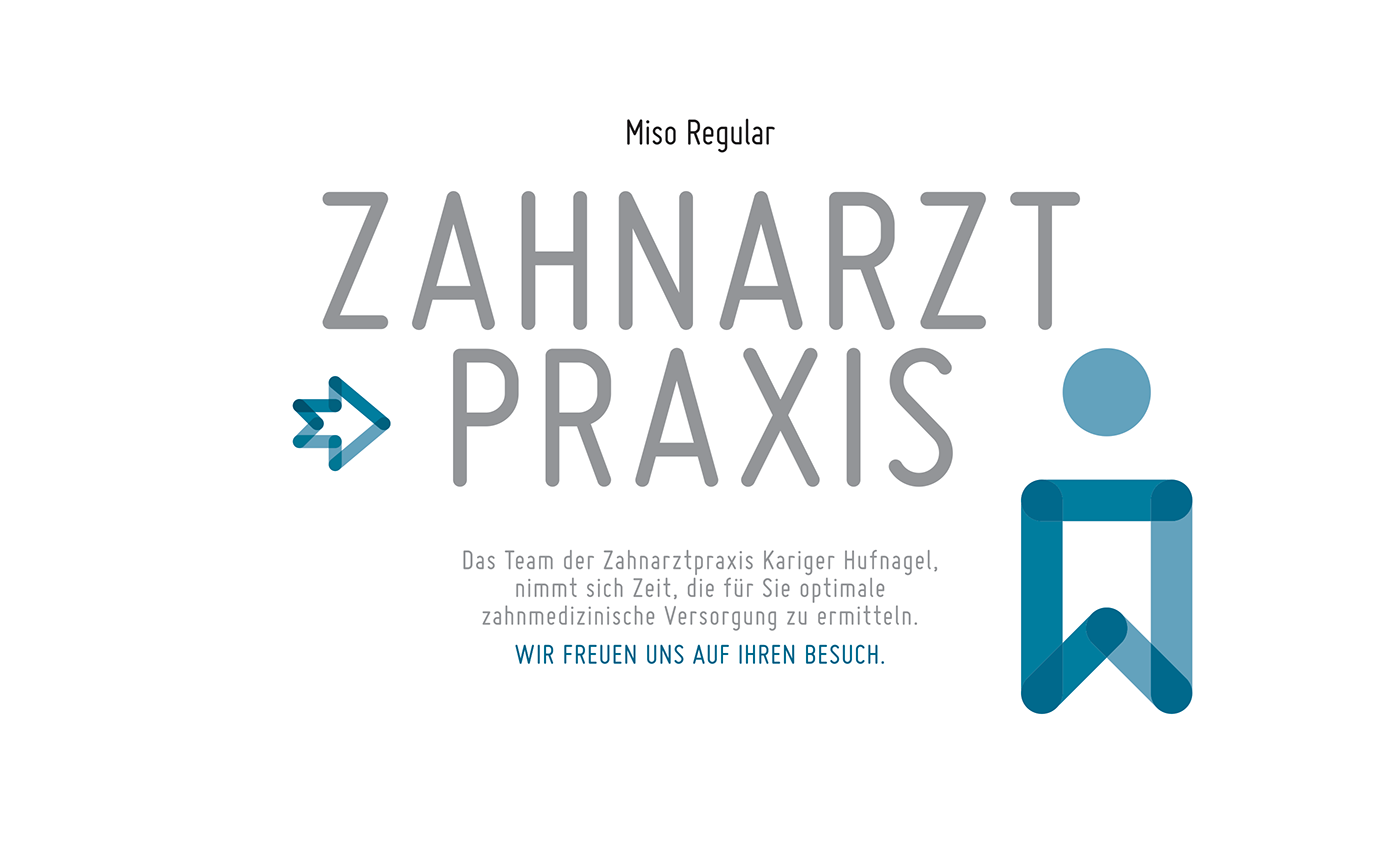
The brand mark shows an abstract illustration of a tooth. Transparent and overlapping areas symbolize the open-mindedness of the dentists and their work very close to the patient. Rounded corners and lines express sensitivity. A circle provides the frame like the practice does. A clear typeface which uses letters with round corners too, harmonizes with the brand. The blue color offers professionalism and spreads an air of peace and conveys trust.
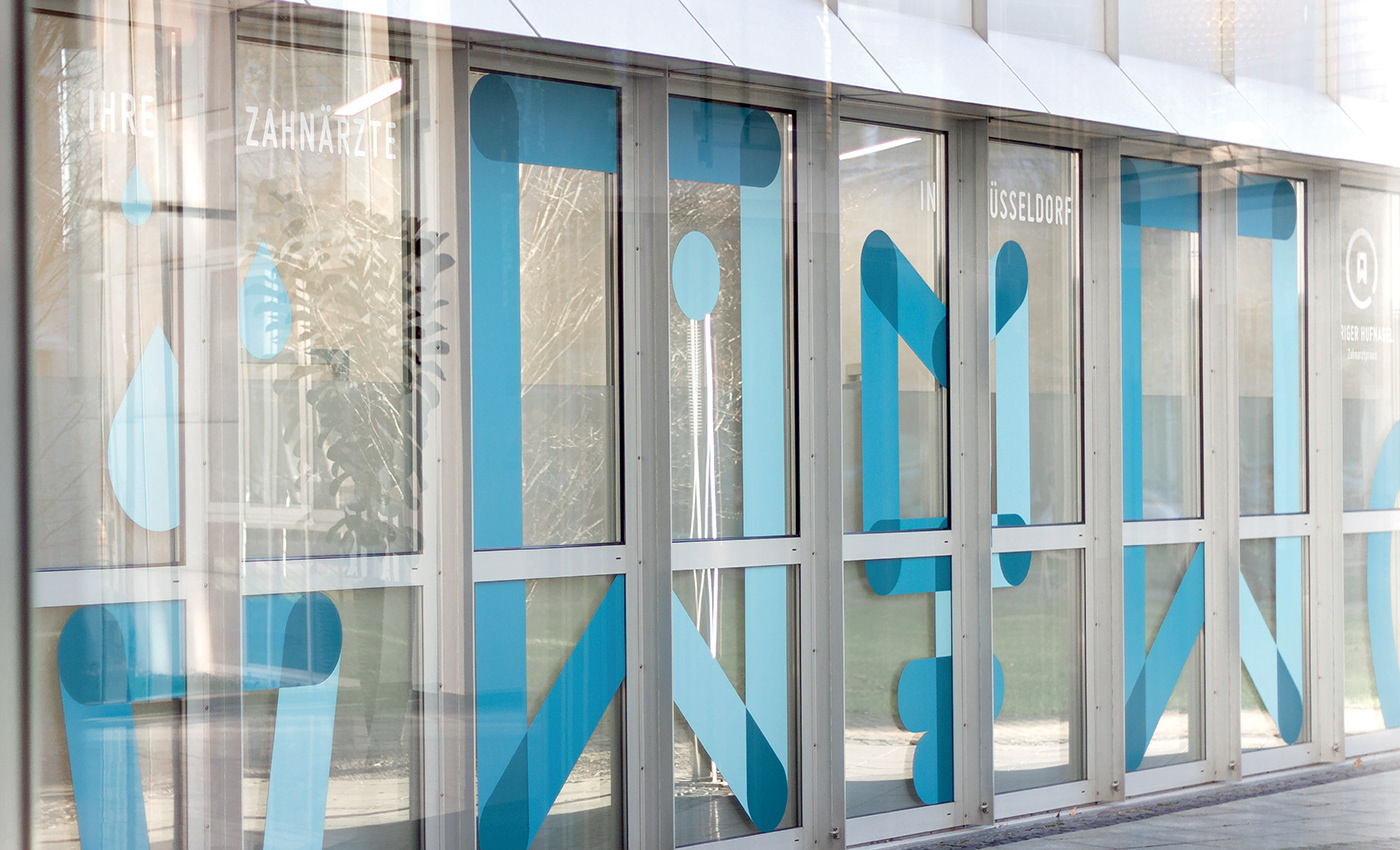
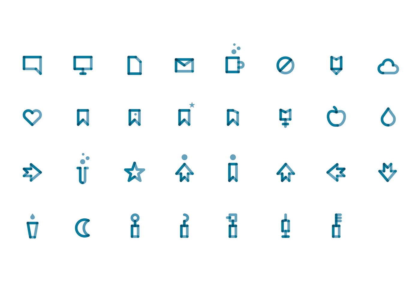
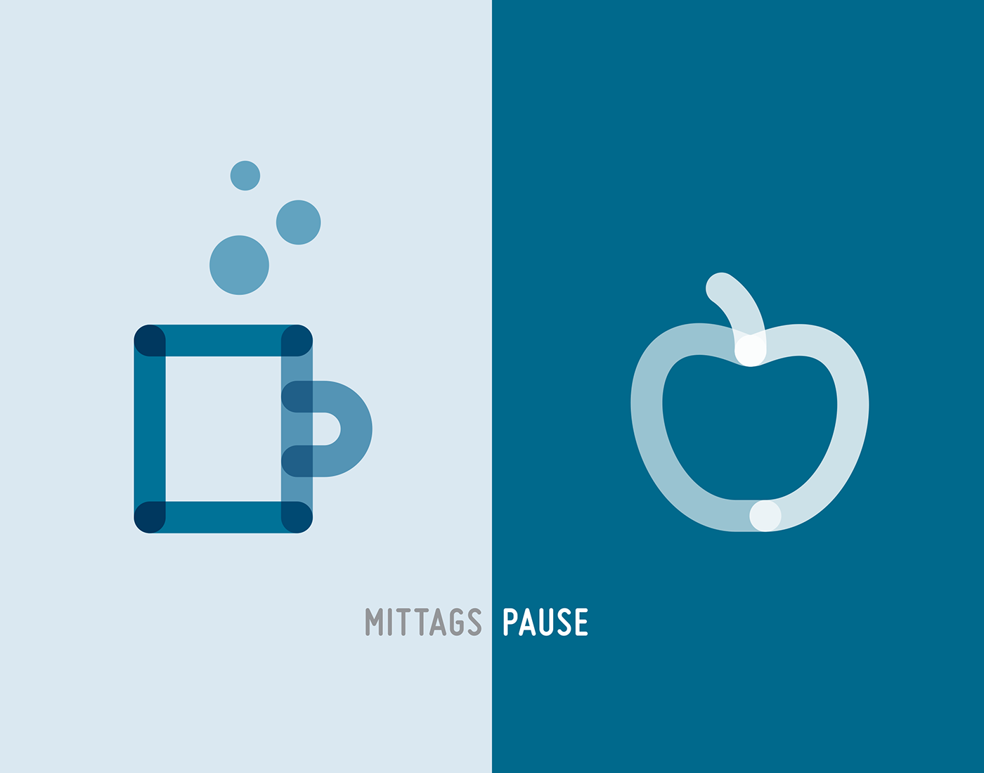
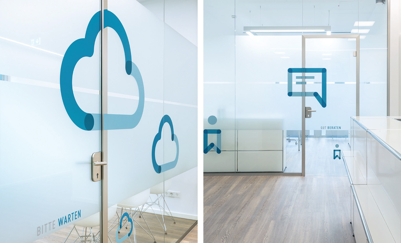
In addition, a series of pictograms visualises the services of the dentist and creates an additional image plane. They arouse curiosity and already stand out from a far distance.
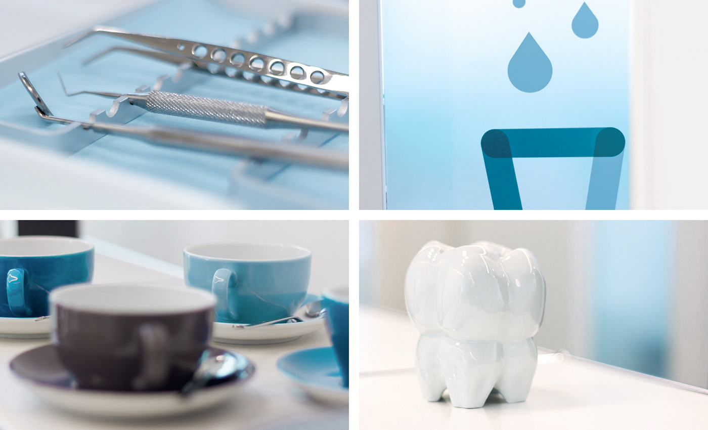
The patient is invited to feel comfortable and to visit the dentist with a smile.
The patient is invited to feel comfortable and to visit the dentist with a smile.


