THE WORDMARK IS DEAD. LONG LIVE THE NEW LOGO.
After years of treating the mother/umbrella brand as basically a transparent poncho to be worn over the top of the more vibrant, known brands, it was time to do justice to Instructure.
To what?
Instructure. Say it ten times fast. Or slow. Whatever.
To what?
Instructure. Say it ten times fast. Or slow. Whatever.
It's a mouthful. So, the first order of business was to take this 11-letter behemoth and slim it down. From Proxima Nova to Rift. It's a game of inches, as they say.
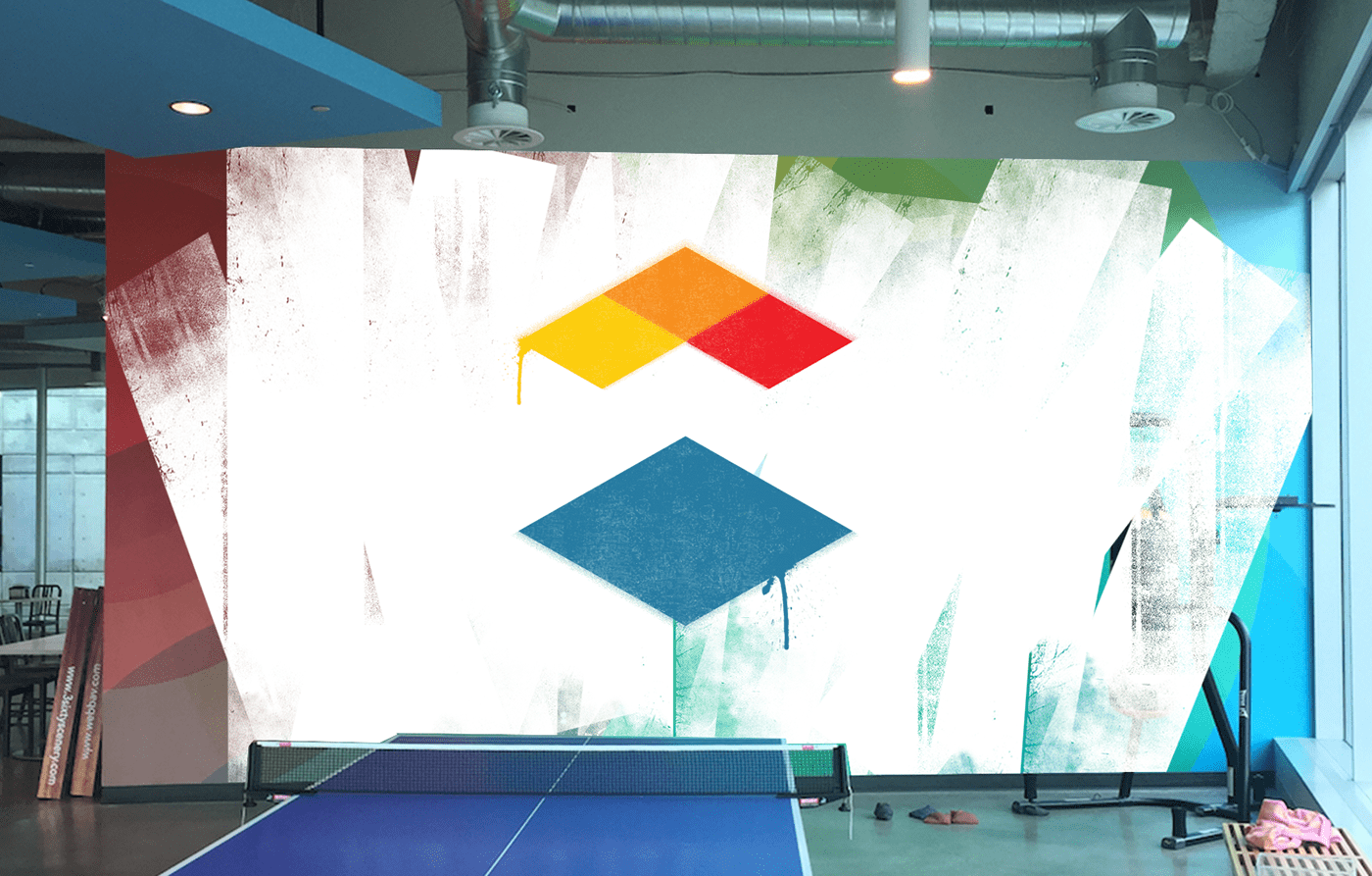
Then, our designers went to town and landed on a fine mark that embodies the optimism inherent in lifelong learning, that illustrates the three-way relationship between our software and our customers and their students/employees, that hearkens back to our first product (Canvas) and its signature color (Canvas red), that has a foundation of learning and upward movement towards the hopes and dreams of those who use the software.
Or maybe it just looks nice and that's enough.
Here's a launch video designed and animated by Scooter Meyer, whose logo ultimately won the cage match.
We commissioned a mural to be tagged over the previous Instructure branding.