Background
The regional marketing team saw an opportunity to introduce a new feminine care brand into their portfolio to reach innovation/technology rejecters. Specifically, in Latin American regions, there was a whitespace opportunity to reach these consumers with a more “natural” brand story. Cultural indications showed that the affluence of chamomile provided a distinct benefit to the skin and could sustain a new proposition in this market.
The Process
The Design Opportunity was to create an Experience rather than a brand.
Phase 1 | Category audit, strategic development and alignment in opportunity areas – Analyzed current brands to assess category graphic language to ensure distinctive positioning for the new brand. Deconstructed competitive visual equities to understand the regional communication and iconography.
Phase 1 | Category audit, strategic development and alignment in opportunity areas – Analyzed current brands to assess category graphic language to ensure distinctive positioning for the new brand. Deconstructed competitive visual equities to understand the regional communication and iconography.
Working closely with Marketing and Research team, we defined the strategic target and brand positioning to ensure an aspirational, unique and clearly distinctive point of difference from other brands in market.
We initiated the new brand concept, which tested with extreme success, allowing our target to feel more feminine, pampered, good about herself and more confident.
Concept package design to define natural visual cues and symbols
Phase 2 | Design expression board, look/ tone/ feel and design guidelines – The main ingredient story and point of difference is chamomile; the design creation included a deeper understanding of the chamomile plant, products and properties. At this stage, it became clear that to create a multi-sensorial Brand, adding scent and touch was important while crafting the equities to achieve our objectives successfully. A vibrant color was crucial to create awareness and to communicate the concepts of Natural, Healthy, and Sunny Disposition. Additionally, to make nature more proprietary, the creation of the World of Naturella needed to be unquestionably distinct and stand out at the shelf.

Naturella Brand Character: Natural, Healthy with a Sunny Disposition
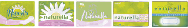
Phase 3 | Brand Identity, packaging and qualification – A bright green environment defines the Naturella Brand. The logo was designed to express femininity and the characteristics of a healthy and natural world. Chamomile flowers, handwritten logofont, friendly green background further reinforce vitality of the natural environment. Versioning colors are bold and saturated which symbolize energy. The use of floral pattern is an important asset of the brand look, because it visually depicts the packaging with the “world of Naturella” represented in TV advertising. It combines the photographic and illustrative chamomile flower design, which is a key visual for the brand.
Brand statement “Natural protection that is good for your skin.”
Other assets like chamomile scent and “soft touch“ made the brand truly multi-sensorial. The scent can be subtly perceived when the product is open and on-shelf scent left the aisle fully perfumed attracting consumers.
Brand Identity and packaging

Phase 4 | Brand architecture development, global deployment and production roll out – Naturella grew quickly, after its launch. Brand Architecture efforts were needed to solve the demand of the new line extensions – thin pads, liners and tampons, and further adjacencies like soaps and deodorants were explored. Brand identities were polished, and 5-year growth plan was created for the long-term aesthetic vision to keep the brand competitive, flexible and timely. As the Global Design Manager, I worked closely with regions for successful adaptation and execution of global brand positioning, including visual identity guidelines and supervised packaging, advertising, in-store materials, and marketing promotions and events.
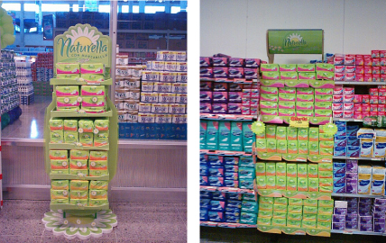
In-store display and Brand block

Advertising, in-store stand and packaging shelf trays


