BRAND REFRESH
FOUNTAINHEAD FINANCIAL
"When I first engaged Paul our company had outgrown its original brand. The logo, fonts, etc. were stale and didn't convey the authority that we had earned in the financial industry. Paul literally breathed new life into our existing identity and reminded us that you don't have to completely overhaul your brand identity to make a huge impact on brand perception. Our executive team couldn't be happier and we'll most definitely be engaging paul again for future projects."
Matt Craig
Chief Marketing Officer
-------------------------
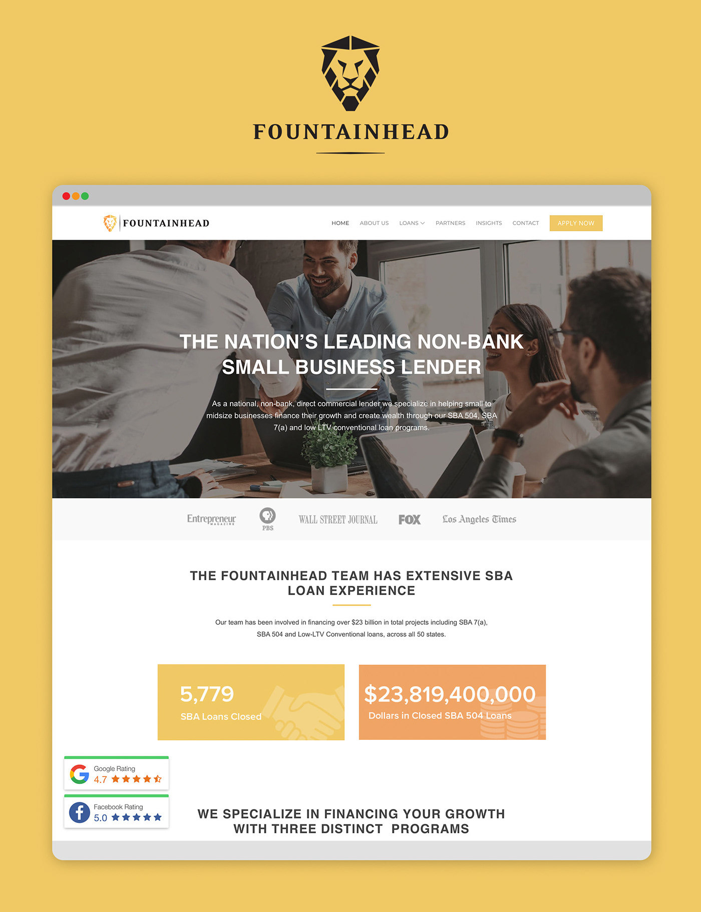
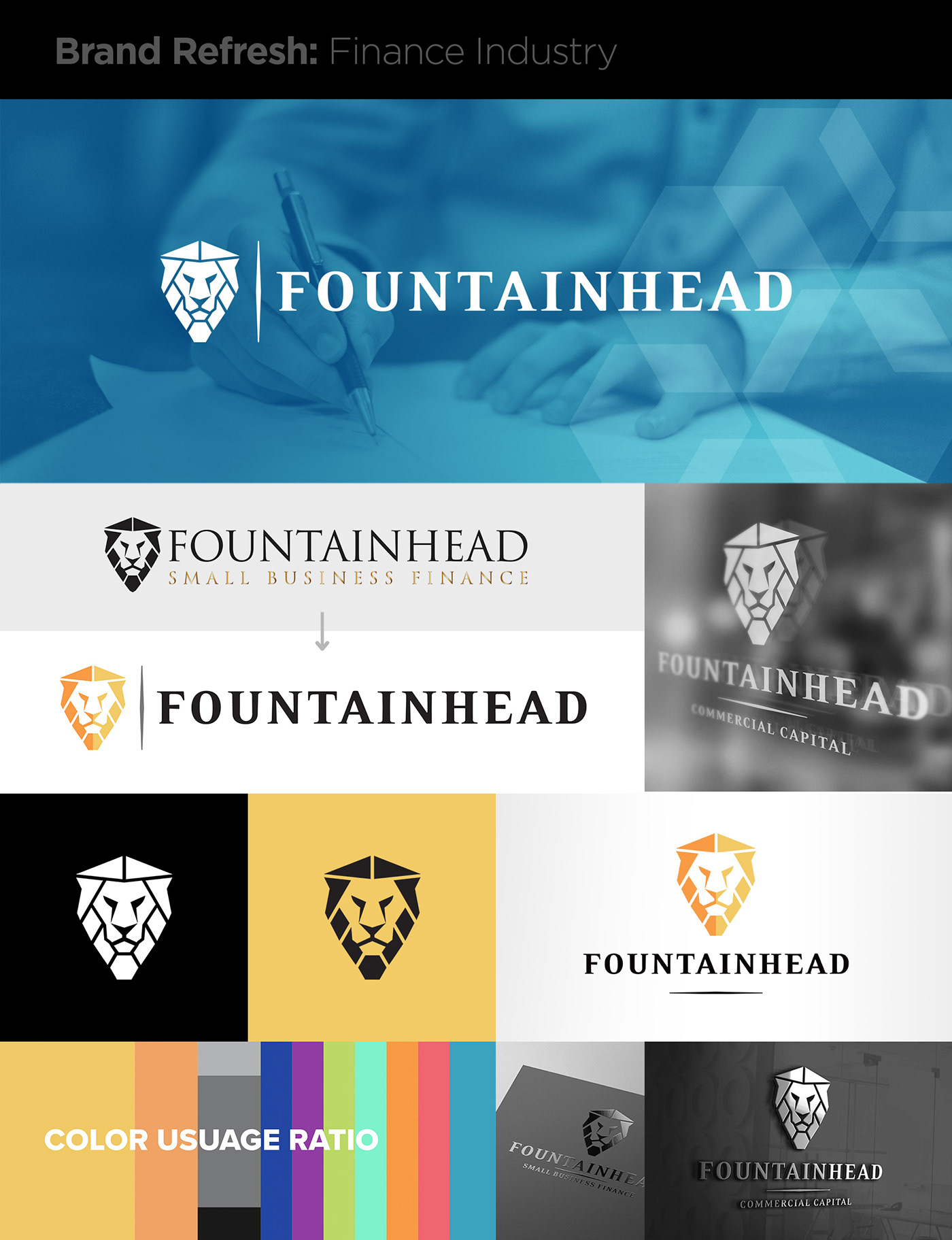
Fountainhead was already a thriving and established Finance company. They just needed to refine the branding that had become fractured and no longer represented them well.
I started with fixing the Lion icon that already had equity in it. I fixed it by refining the vector file, unifying the angles and shapes, and creating a version that worked well when reversed on a dark color.
Not all logos work well when reversed in one color on a dark color. Especially if they are representative of something real like a face or image.
The font also needed to not only look more refined, but it needed to balance the strong shapes and weight of the icon. The typography also needed to scale better. If a logo uses lines that are too thin, they will break down when scaled on a small application or be problematic when embroidered on a shirt.
The client finally had a logo that matched their authority and a scalable visual brand that would grow with them.
The final deliverables were:
• Refined and refreshed logo
• New brand fonts and pairings
• Brand guidelines to manage brand integrity
• Logo build-out with all iterations and file types