Black Ink is a retail consulting firm. They have the ability to analyze sales data and inventory reports in such a way that allows their customers to more accurately predict buying patterns, manage inventories and avoid costly merchandise mark-downs — thus increasing cash flow and profitability. The target demographic was young urban professionals in their late 20s to early 40s.
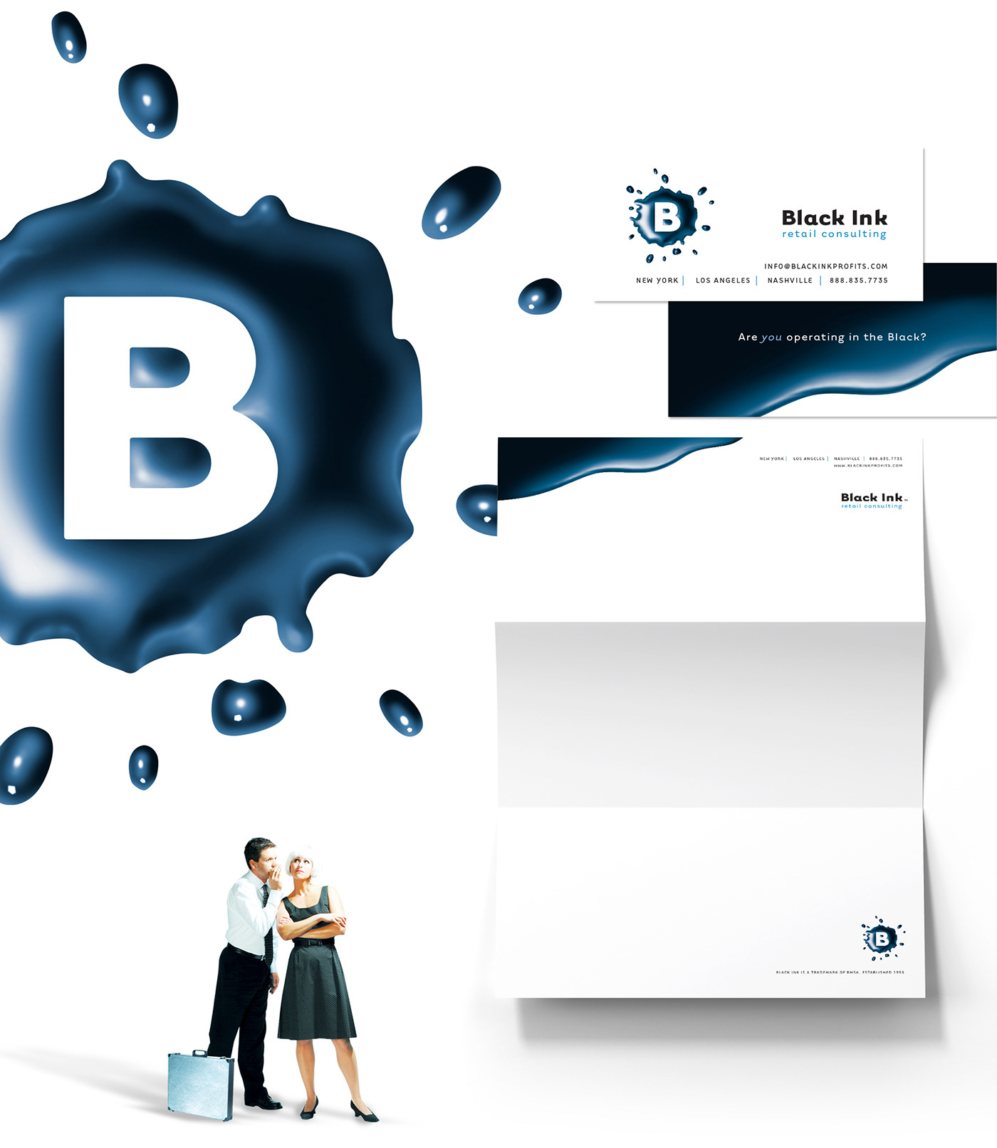
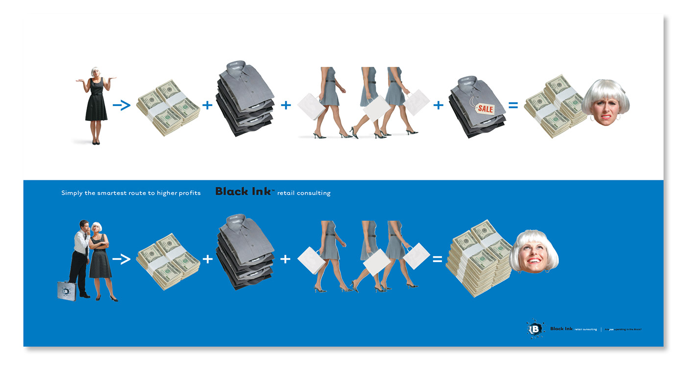
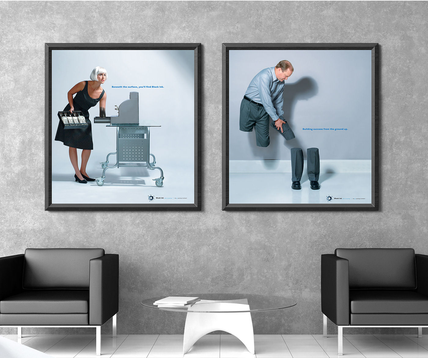
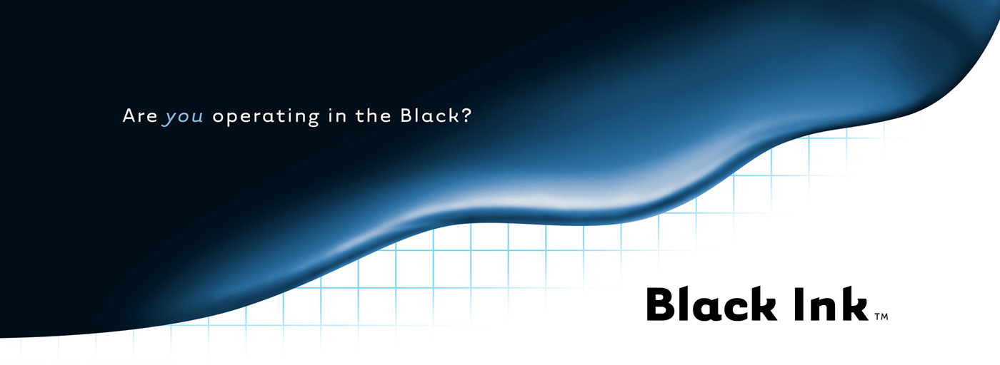
The name Black Ink is simply perfect for the retail consulting industry. It’s exactly what their clientele continually aspires to. Our design solution centered around an influx of black ink, which is being graphed to reveal ever-increasing profits. The positioning line developed is “Are you operating in the Black?”. The logo is naturally a splatter of ink. Simple, yet quirky photographic compositions were also created to help drive home key sales points. The overall resulting brand is both dynamic and edgy — the perfect complement to the perfect name.
The name Black Ink is simply perfect for the retail consulting industry. It’s exactly what their clientele continually aspires to. Our design solution centered around an influx of black ink, which is being graphed to reveal ever-increasing profits. The positioning line developed is “Are you operating in the Black?”. The logo is naturally a splatter of ink. Simple, yet quirky photographic compositions were also created to help drive home key sales points. The overall resulting brand is both dynamic and edgy — the perfect complement to the perfect name.