vfarma – Specialty Pharmacy
MÉXICO
Vfarma is a closed-door specialty pharmacy that sells and distributes medications exclusively to people suffering from chronic degenerative, or terminal diseases. These types of patients require complex, expensive, and sometimes unavailable drug treatments. Vfarma provides a safe, accessible, and reliable way to acquire medicines and helpful orientation from one of their specialized Care Managers.
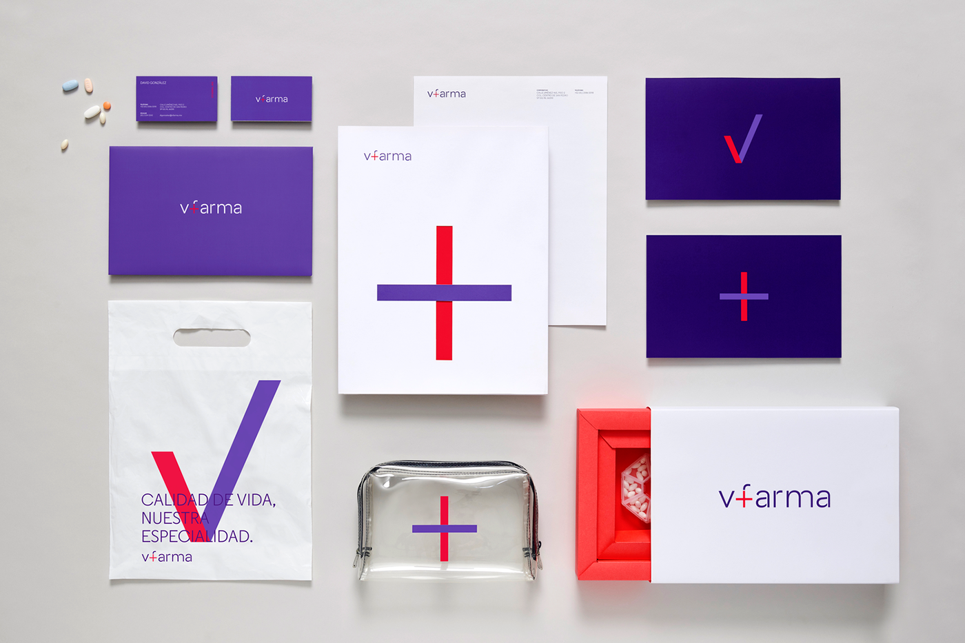
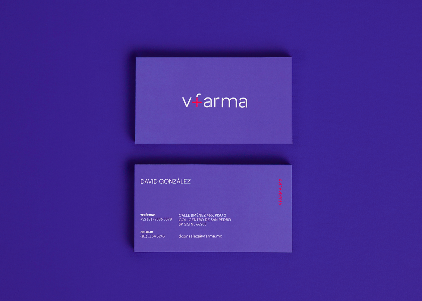
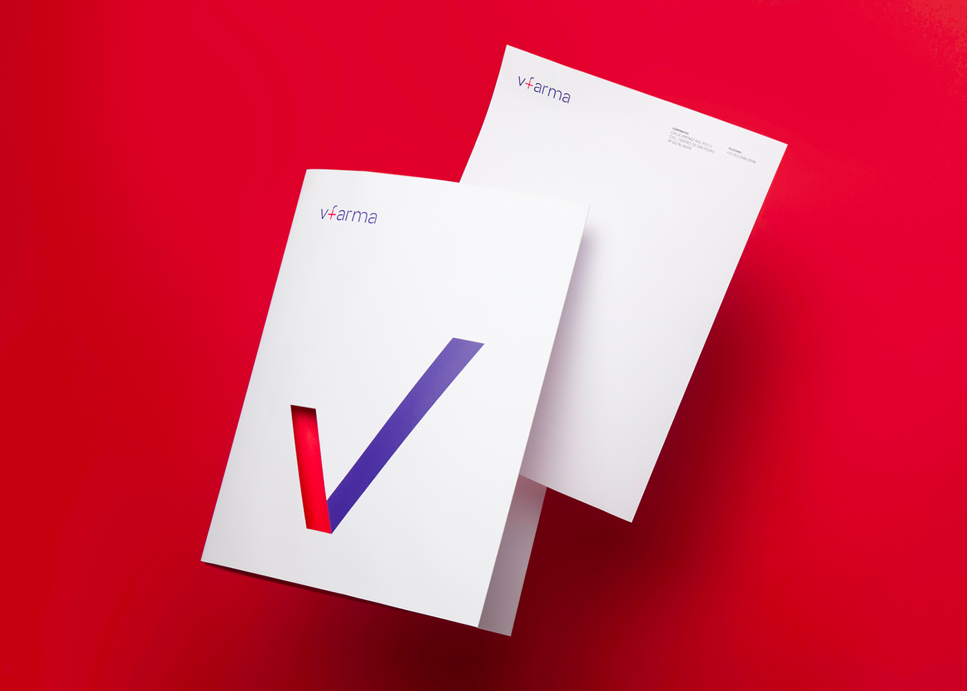
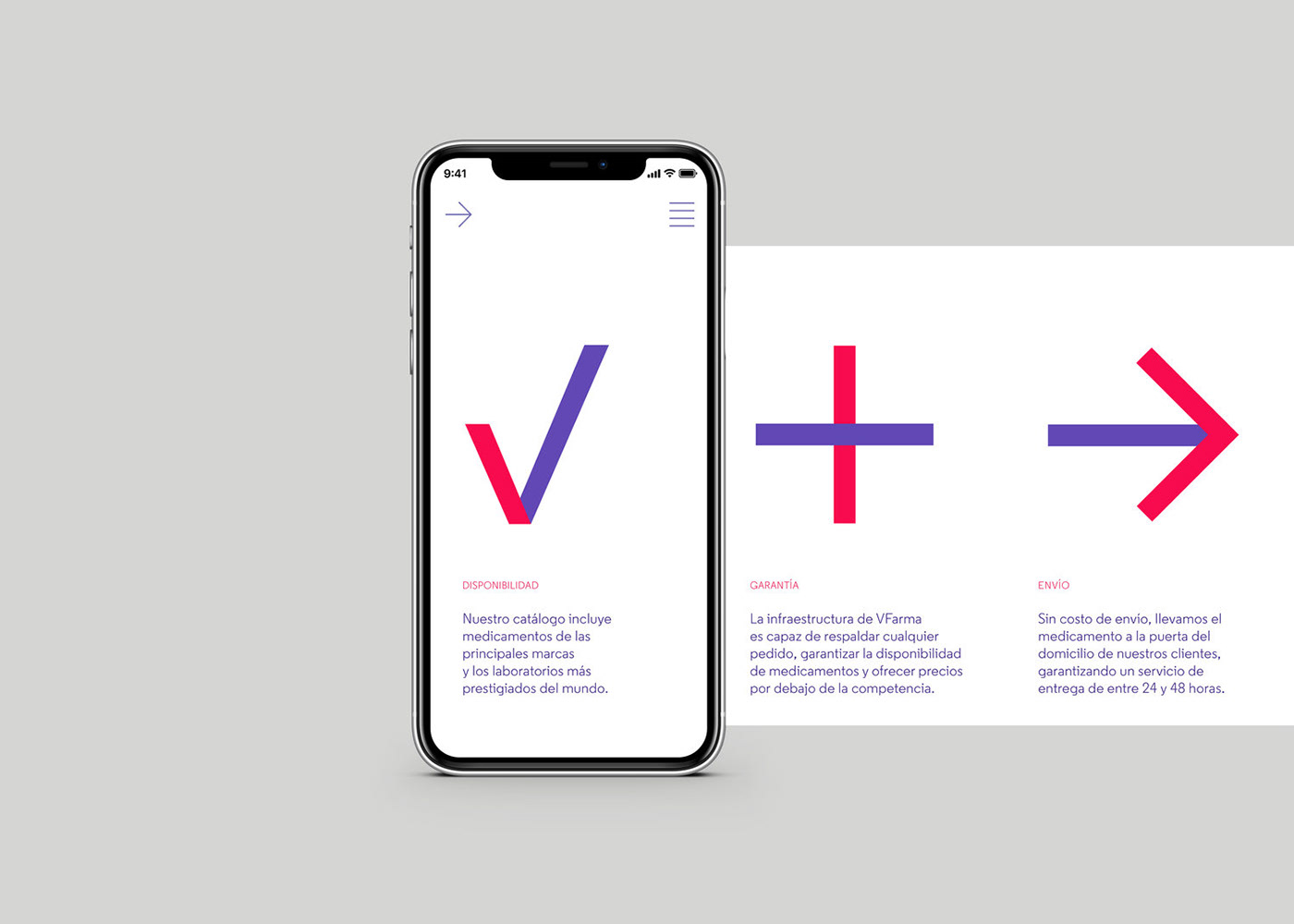
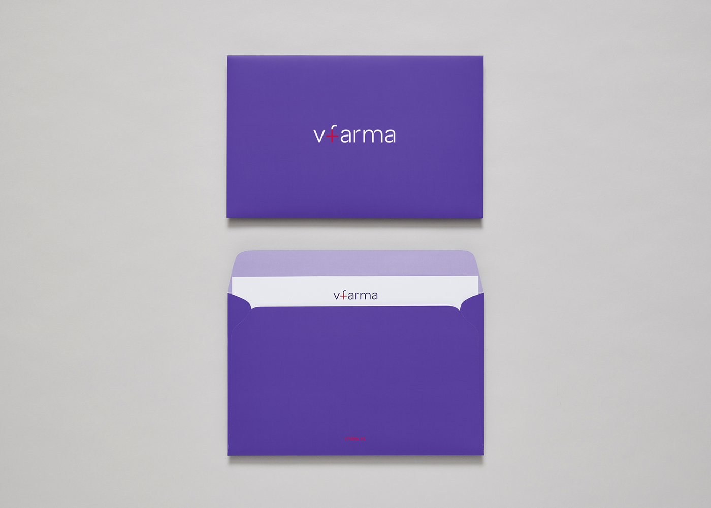
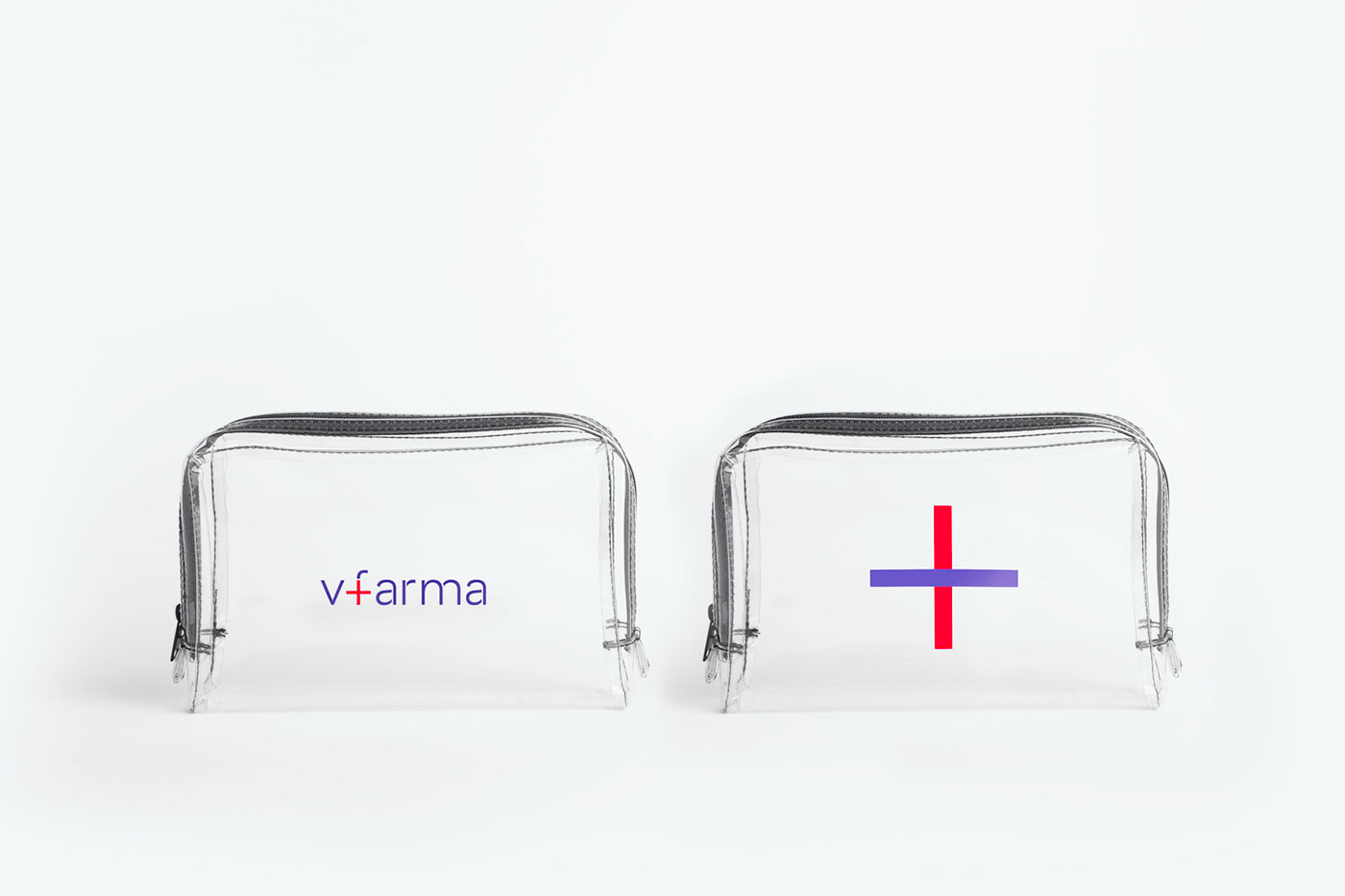
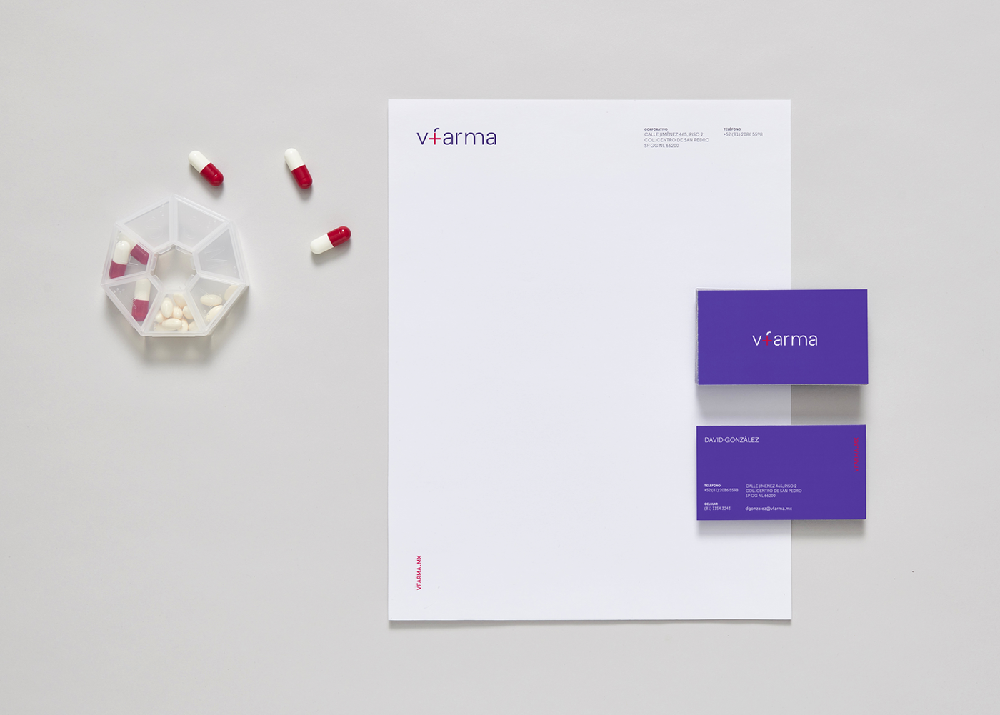
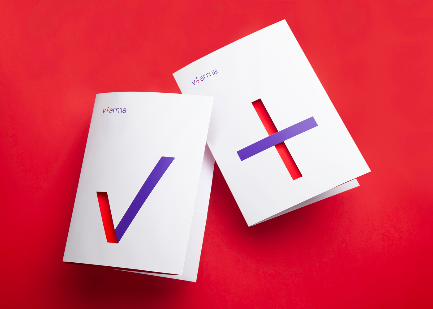
We created an integral, clean-cut brand system, with stationery, welcome kit and marketing materials. Vfarma’s logotype includes a “+” symbol, placed within the letter f. The image can be interpreted as a cross, the internationally recognized emblem for medicine, or as a plus sign, associating the brand with the concept of addition and, therefore, with the improvement or enrichment of patients’ lives.
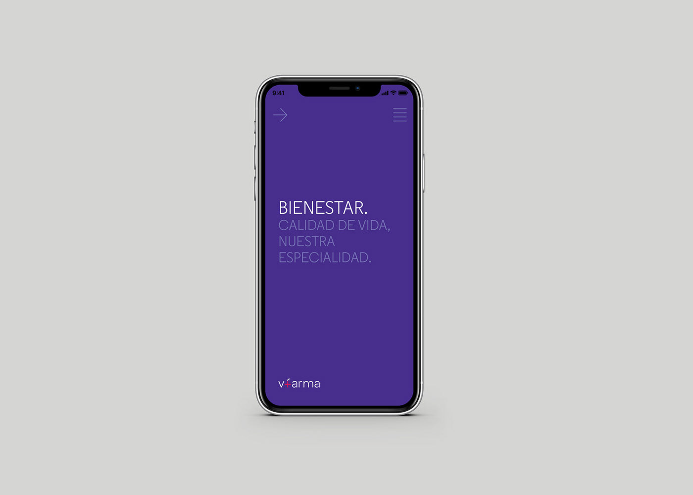
The checkmark icon is an unequivocal representation of the brand’s effectiveness in satisfying the care and medical needs of every patient; it means Vfarma is trustworthy, it’s always there. We completed the brand system with a warm and friendly purple palette, a distinctive color choice in an industry dominated by blue and green hues.
Finally, as part of Vfarma’s overall brand communication, we created the advertising catchphrase “Quality of life, our specialty”. This slogan is always preceded and complemented by a word associated with positive emotions we would like the patients to feel during their treatment: love, happiness and joy among others.