“I don't like this job, I just like to create something more beautiful.”
-白鳥部屋 SHIRATORI HOUSE
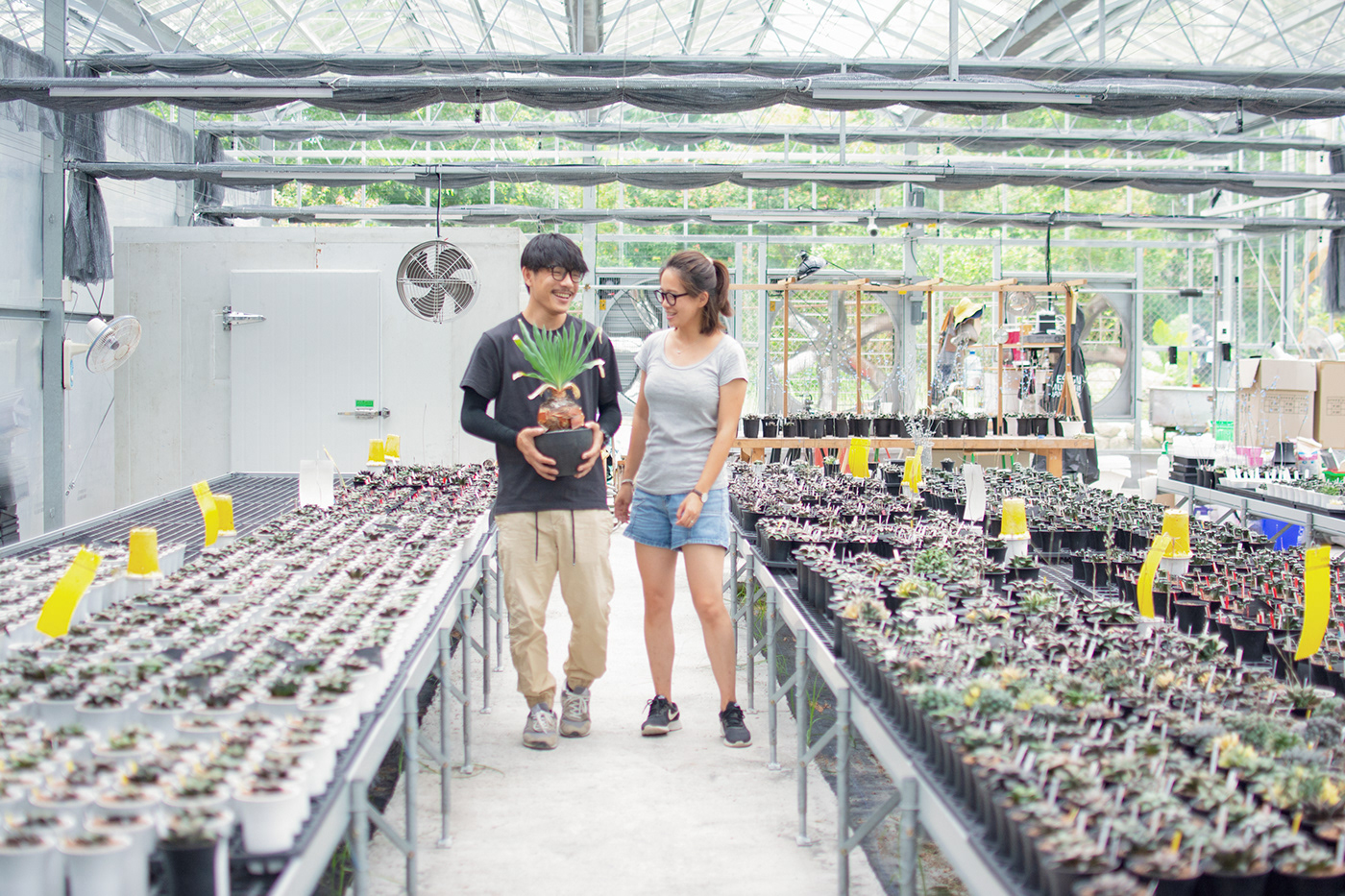
白鳥部屋,創立2014年,業主是一對植物生活家夫婦,園區內以實生百合科(Haworthia)為主,所謂“實生”就是從配花至播種、培育一手栽培,每一株都是獨一無二型態、花色,培養植栽對於有著建築系背景的白老闆則是另一種對美學的詮釋,創造使生活更有希望。
> 關於標誌
剛開始接到訴求就是“帥”這詞,當時有點納悶但又好像了解什麼(?),透過一段了解,帥的背後應該就是“實生”了吧。都是培育,實生比起拆側芽、砍頭花的時間相對來的長,但市場上獨有的花色型態也是這樣產生的,我想這樣應該也是一種堅持的“帥”。
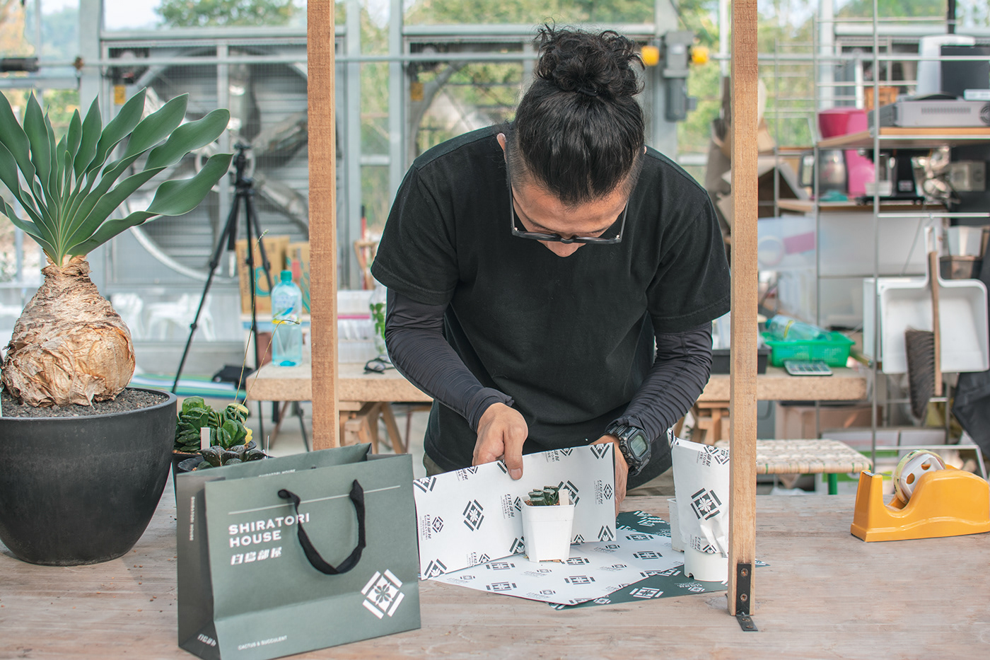
所以我們以關鍵字“實生”設定出“植盆紋”的概念,以容器乘載植物型態表現,在這容器框架內我們創造無限可能的美。
考量到標誌的使用,小到花牌,大至旗幟,識別部分相對關鍵,所以在標誌做了留白的負空間處理,即使所小到標準字模糊,標誌也是相當清楚辨識,外圍框架的缺口設計是使人留意的巧思。
We created the concept of "Plant Pottery" based on the keyword "seedling" to express the form of plants through containers and achieve unlimited beauty within the container's framework. To ensure the logo's identification in various uses, from small plant tags to large banners, we incorporated negative space into the design. The outer frame's notch design is a clever detail that catches the eye.
We created the concept of "Plant Pottery" based on the keyword "seedling" to express the form of plants through containers and achieve unlimited beauty within the container's framework. To ensure the logo's identification in various uses, from small plant tags to large banners, we incorporated negative space into the design. The outer frame's notch design is a clever detail that catches the eye.
> 關於標準字
標誌與標準字皆結合植物特徵在細節裡,個性的關鍵字為“年輕感”、“不過於老氣的文化感”,所以做了傾斜與明體筆畫的粗細特徵,即使壓低字體架構,重心部分提高,看起來比較有精神。
The logo and logotype both incorporate plant features in the details, with the key personality traits being "youthful" and "culturally relevant without being too outdated." Therefore, the logotype is designed with italicized and bold strokes, even with the font structure compressed and the weight shifted upward, it appears more energetic.
-
2018
-
Credits: 白鳥部屋 SHIRATORI HOUSE
Art Director: Bc Huang
Graphic Design: Bc Huang
Photography : Bc Huang
-
-