哈茶,在山东话中间就是喝茶的意思。原来的山东淄博“爱上哈尼家”是一家做蛋糕类的烘焙店。hacha+哈茶加提供puls的概念,将中国茶文化融入西方面包的搭配中,让欧包与茶的搭配自然而理所当然。
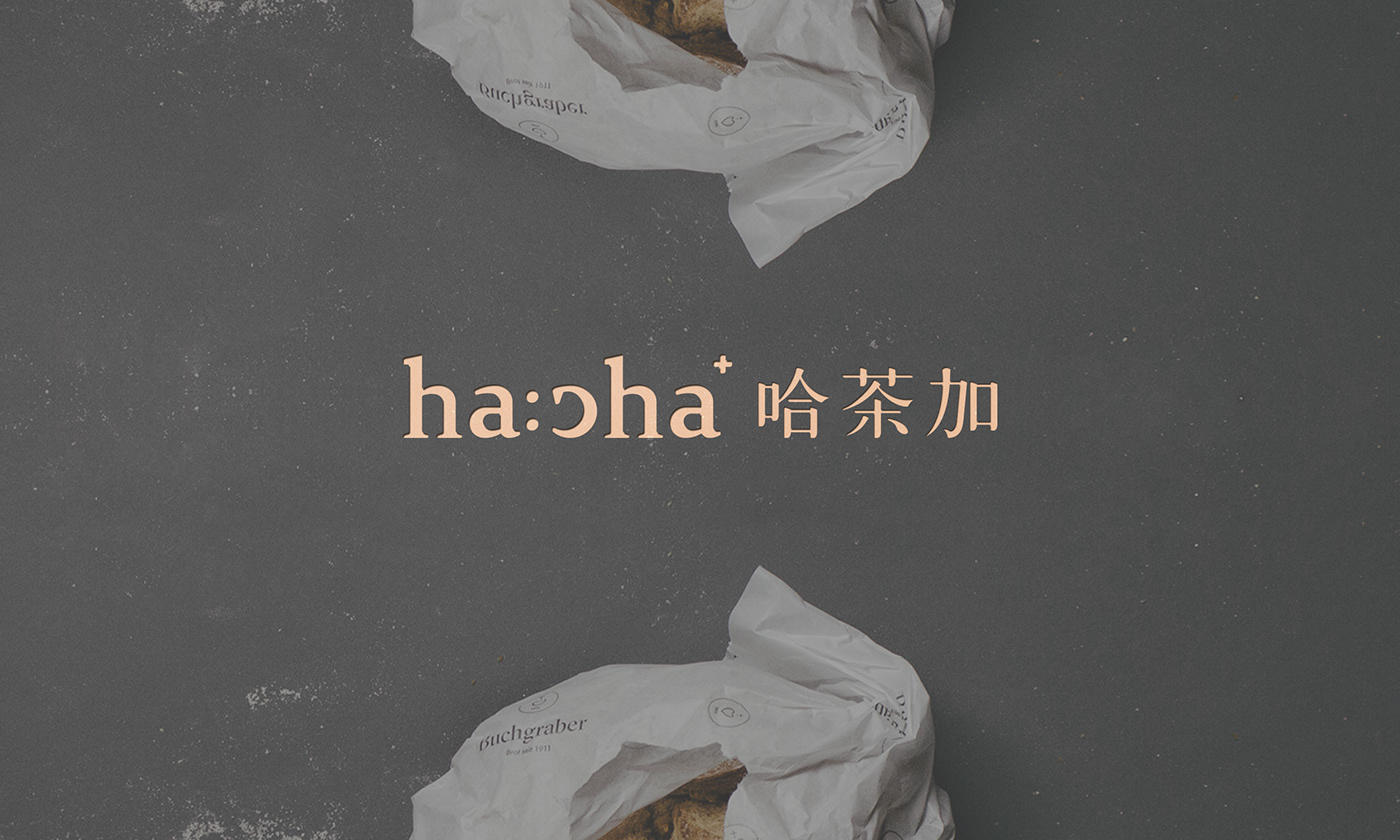
标志将英文与中文字形重新绘制,简约而不简单,将字母“c”翻转成笑脸,增强品牌记忆点。在英文结尾右上角融入+号,让英文与中文合并过渡时有所区分。
品牌的物料延展设计中,同时融入插画人物,让原本高冷的品牌变得具有亲和力,同时也是增强了品牌传播力。
Hacha, in the middle of Shandong dialect, means drinking tea. The original Shandong Zibo "falling in love with Hani" is a bakery that makes cakes. Hacha + Hacha provides the concept of puls, which integrates Chinese tea culture into the Western bread mix and makes the mix of Oubao and tea natural and natural.
The logo redraws the English and Chinese characters. It is simple but not simple. It turns the letter "c" into a smiling face and enhances the brand memory. In the upper right corner at the end of the English language, a + sign is added to distinguish the transition between English and Chinese.
In the material extension design of the brand, illustration characters are integrated, which makes the original high-cold brand become affinity, and at the same time enhances the brand communication.
客户 山东淄博爱上哈尼家食品有限公司
软件 Adobe Illustrator、Adobe Photoshop
设备 Canon EOS 5D、imac pro
时间 2016年11月
软件 Adobe Illustrator、Adobe Photoshop
设备 Canon EOS 5D、imac pro
时间 2016年11月


