

Introducing the new Toronto PATH Logo & App Re-design (Concept)
The Toronto PATH is an underground walkway linking 28 kilometers of shopping, services, and entertainment. Started in the 1980's, the Toronto PATH is considered to be one of the largest underground shopping centres in the world. Since then, it has evolved into a modern underground city connecting Toronto's business district.
Toronto PATH Logo Re-design
With the new Toronto PATH Logo design, elements from the previous logo have been used to re-create a new visual identity. Inspired by its choice of colour and mapping, the new logo was made to mirror the modern interior look of the PATH today.
Toronto PATH Mobile App
Despite its growth and development in the recent years, not every Torontonian is aware of the city that lies beneath the very pavement they walk on everyday. Currently, there is a lack of cellular connectivity underground making the PATH not mobile friendly.
This Mobile App Concept is a Hybrid Application, allowing for users to utilize the app with or without a cellular connection. There is an online database that can be easily downloaded to your phone allowing you to have access to the PATH's Directory and preset directions. Easier Navigational signage within the PATH to assist users travel underground.
This Mobile App Concept is a Hybrid Application, allowing for users to utilize the app with or without a cellular connection. There is an online database that can be easily downloaded to your phone allowing you to have access to the PATH's Directory and preset directions. Easier Navigational signage within the PATH to assist users travel underground.
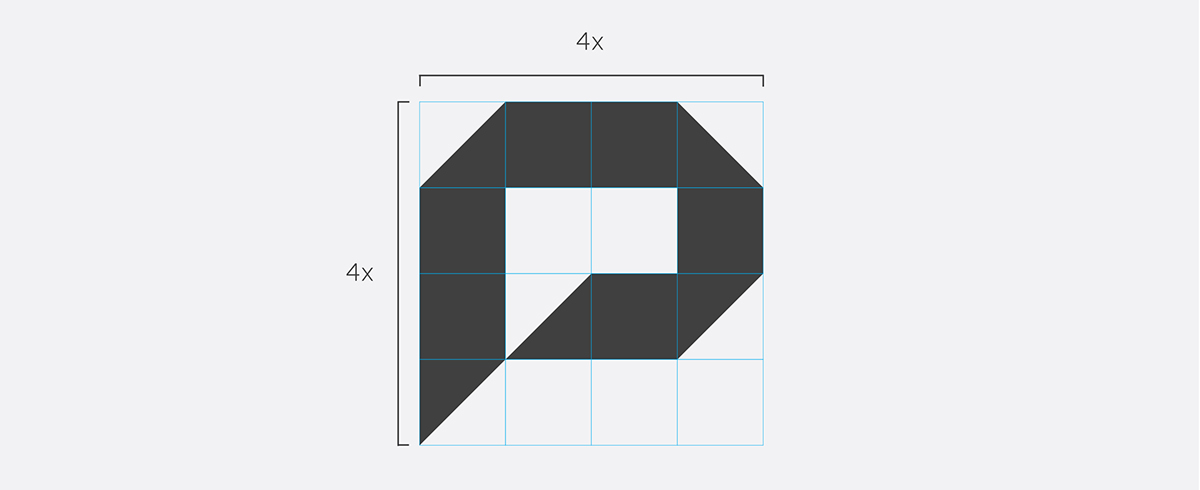
Logo Construction

Logo Colours

Typography

Logo Orientation

Signage

Mobile App


