


Client: «Bentzien & Brocksiepe» is a funeral parlour with multiple branches.
Job: identity, stationery, corporate website >, retouch, text and pr, for keeping the living in mind and putting people in the spotlight
Job: identity, stationery, corporate website >, retouch, text and pr, for keeping the living in mind and putting people in the spotlight

▲
Logo
The major objective was to achieve a positive and optimistic view on ones life and death. Therefore, the logo must work for all of the religions. To interpret the symbolism remains up to you.
▼

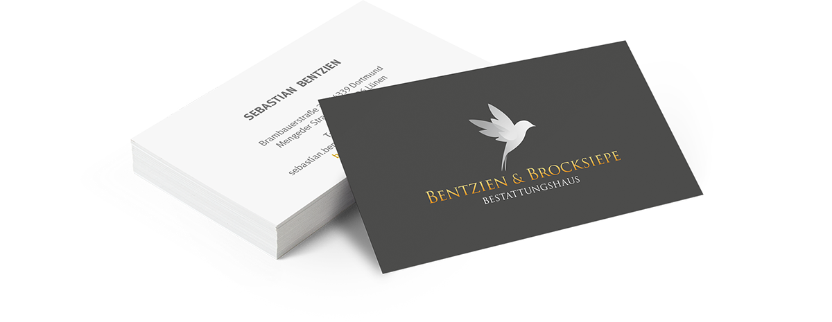
Stationery
According to one of Dieter Rams' (Braun) rules of design, we gave the appearance as little design as possible, because the logo with it's symbolism stands for itself. The dark grey symbolizes the funeral business, and white stands for the optimism and freedom. That's all.
▼


Website
CMS parallax website with customer login and service area, lots of call to action tools, and some animations. In all of our texts and pictures, we put the people in the spotlight (that's because our customer's job is for the living …). bentzien-brocksiepe.de >
▼

Hey, thanks for watching.
I'd also like to explore your work – so please drop me a comment.
I'd also like to explore your work – so please drop me a comment.


