
Art.com Icon Identity System– Refresh
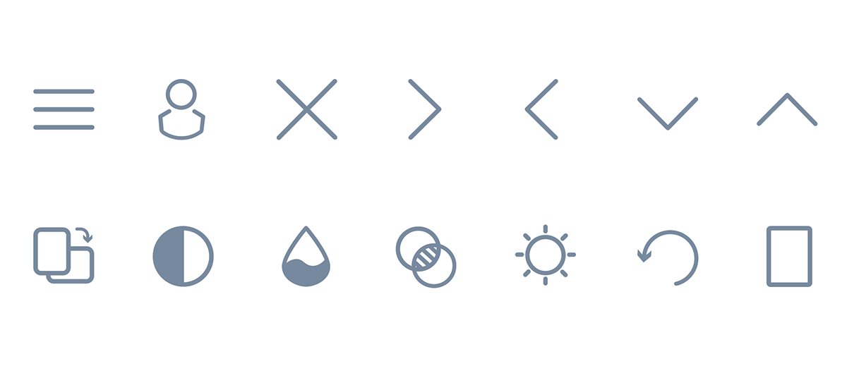
I was on contract at Art.com and brought in as a UX/UI product designer. During my time there, I had the opportunity to work on their website and also their mobile app. I worked closely with the lead designer and other UX designer on developing a better system of icons. When I started there were only a few that had been designed and developed into their mobile app (both iOS and Android native), and those were designed in-house. I noticed that a lot of the icons needed were taken from various online sources and I wanted to work on making the icons visually consistent. I took the initiative to standardize all the global icons by keeping the lines to a consistent stroke and also using a max width and height to design the iconography (below).

Bespoke Icons
In addition to creating a standard size and weight to existing icons (those made before I started my contract), I also would have requests to create new iconography for the product. I had fun with these as Art.com is not just a company that sells art, but also furniture and home furnishings. I wanted to reflect the contemporary aesthetic by using modern icons influence by what's currently popular in the home market. The icons below show the various sizes used in a filter set when a user is browsing for various sizes of art. Since the term "mini" is vague and including dimensions doesn't always bring context, I wanted to show it in simple spatial scale with these icons. I also went on user testing website and tested it with six users for their feedback. The results from the testing was overwhelmingly positive and these were ultimately supported to be pushed for development by our product manager.
I also wanted to mention that the concept of these were worked collaboratively with product management (they had good design ideas too). A couple sizes went through various iterations, so I showed both versions below.


Project Outcomes
The final icons were tested on a user testing site and validated as improving the customer's perception of what "giant" art would look like spatially compared to "mini." I was able to go back to product management and have their support in working with development and having them uploaded to the website. Before that actually happened, I was pulled into a different contract within a completely different industry, so I was not able to personally oversee the icons being deployed on their retail site.


