In this project I had a chance to create three different risograph prints portraying Scottish Cultural Identity. The whole project was very exciting as Scotland was a country of choice for myself to live in and I feel like falling in love in it over and over again every day, so really enjoyed doing the research for the project. The other exciting thing about the project was learning about a completely new to me printing technique which is Risography. Now you have a chance to learn about it too!


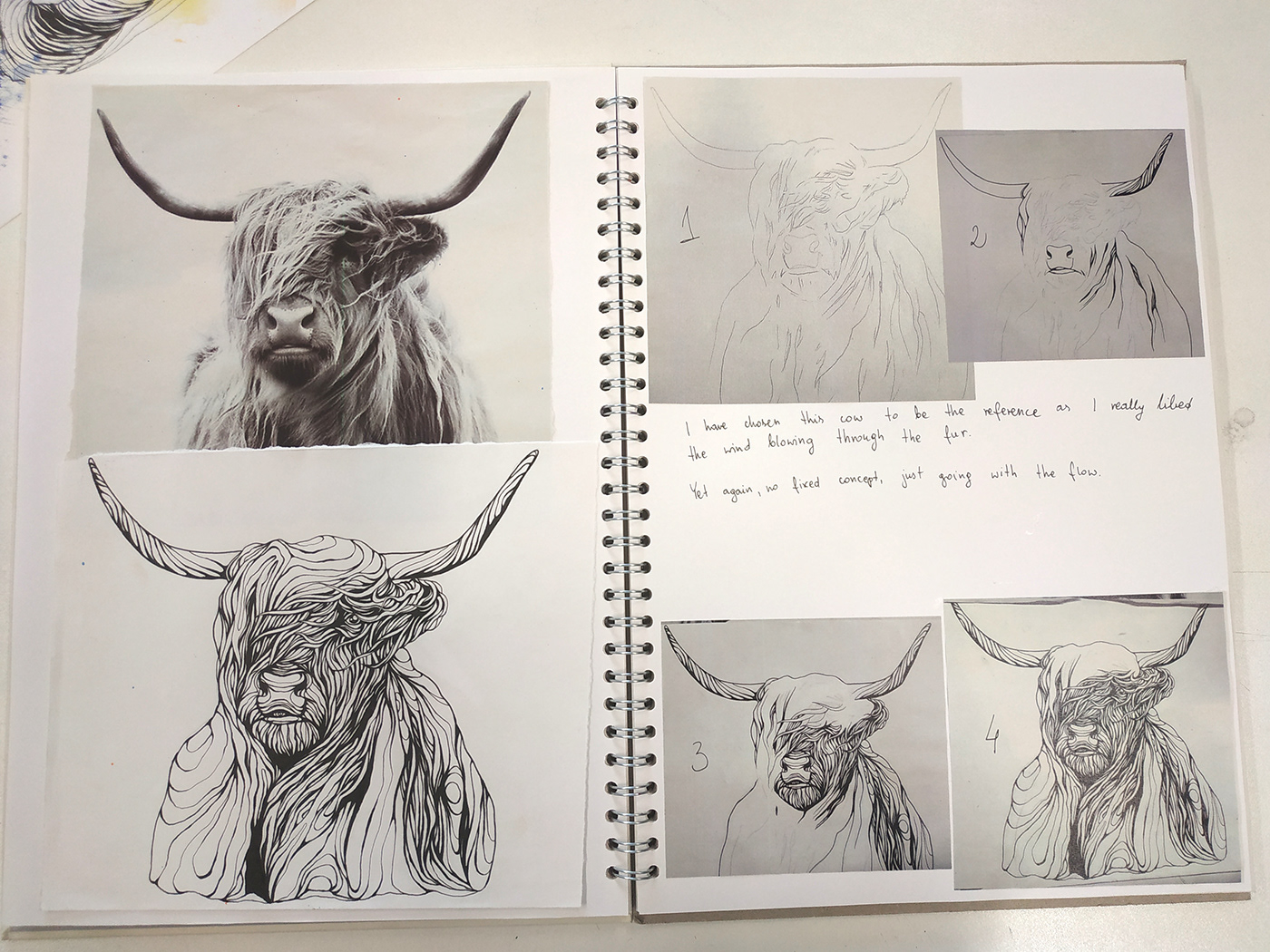
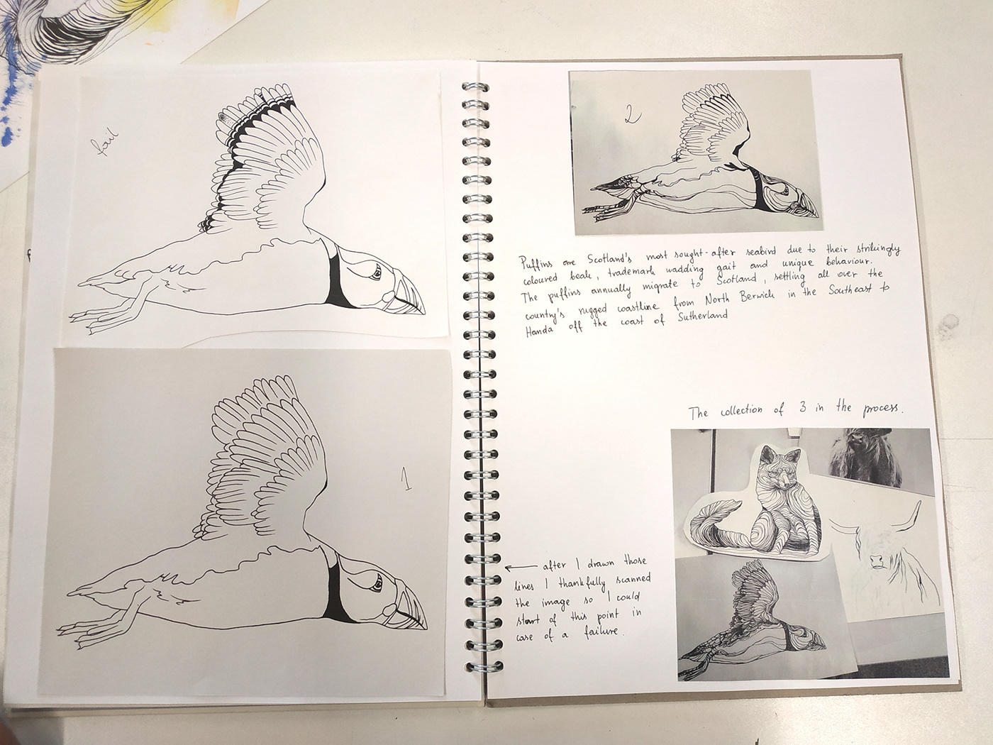
In most of the researched risograph works I could see areas of block colours, vectorised shapes and filling within the lines. I love working with watercolours and flowy shapes so I decided to use them for this project as well and see how it would work. I have always really liked drawing fauna so went for animals most commonly seen in Scotland and of course I had to find a way to include a Scottish flag somewhere within the work. From few different images I narrowed my selection to a Fox, a Highland Cow and a Puffin. My inspiration for linework was Hannah Frank’s work which I had a pleasure to admire in Glasgow University Chapel this spring. I loved how she was using long straight lines with some protrusions to define shapes and lots of little lines and details to fill in various areas and the background. I particularly liked the high contrast and clarity in her work.


We were asked to use at least two colours but I used all that were available (ordered from the lightest which is also an order of printing – yellow, orange, fluorescent pink, blue, black) to see as much colour blends and colours overlapping as possible. All in all, I had 5 layers to play with, four layers of colour and one layer of linework. I prepared all the components analogue way. I painted watercolour splashes with of undefined shapes in those four above colours, all separately on a 300 gsm CASS ART acid-free and cold-pressed (which made it visibly textured) watercolour paper with WINSOR&NEWTON COTMAN WATERCOLOUR STUDIO SET of 48 HALF PANS – my favourite watercolour set. When the colours were ready, I could go on with the linework for animals. I started of a very simple pencil sketch and drew the lines with some UNI PIN WATER AND FADE PROOF fine liners of different thicknesses (0.8 mm for protrusions; 0.4 mm, 0.2 mm and 0.1 mm for lines). After everything was ready, I scanned all the components, vectorised the linework in Adobe Illustrator and put everything together in Adobe Photoshop. Once that was done I prepared all the separate colour layers for riso printing ad saved them as ADOBE PDF files paying attention at accordingly naming the files to avoid any misleading (for example MY NAME FOX YELLOW), which gives us 3 images, each of 5 layers so 15 files. Thanks to the curtesy of Ms Laura Bowie I had them printed in no time.


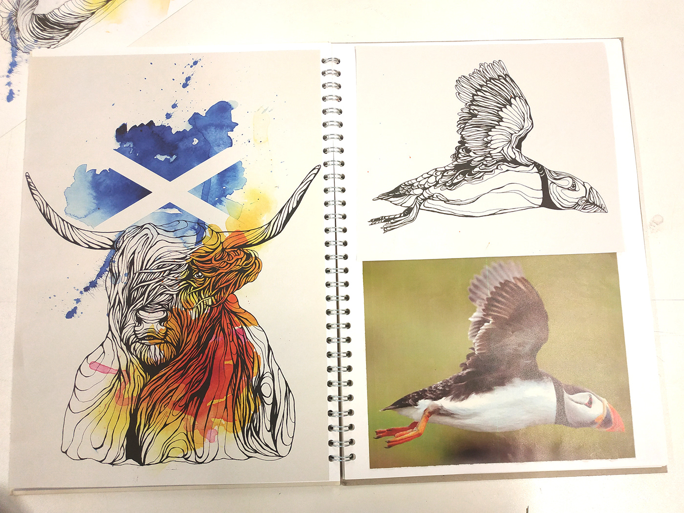


I am very satisfied with all the work I did and the whole process. I like the composition in my work, how the watercolours are spread and fading away in some parts and cropped along the animal’s outline in other parts. I think it gives it even more definition and lets to pay more attention to the Scottish flag. I am happy with the complicity of the design and the amount of work it required from me – that only made it more satisfying. I also do like the changing tone in the watercolour splashes defining its shape. What I don’t like is the colour blend. It’s not enough of it in my opinion. Instead of doing single areas of colour I could have done one main and few little ones ensuring there will be more tones and colour blends. The other thing is that I struggle to think in a minimalistic, simply, blocky way and this is something that I will definitely try to do next time.


