
Art Nouveau Poster Design
Spring 2019
ARTIST: Matthew Burge
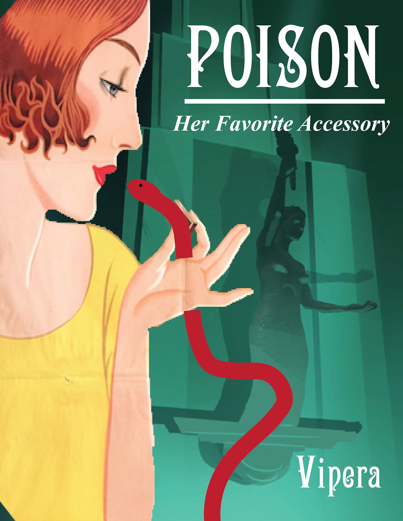
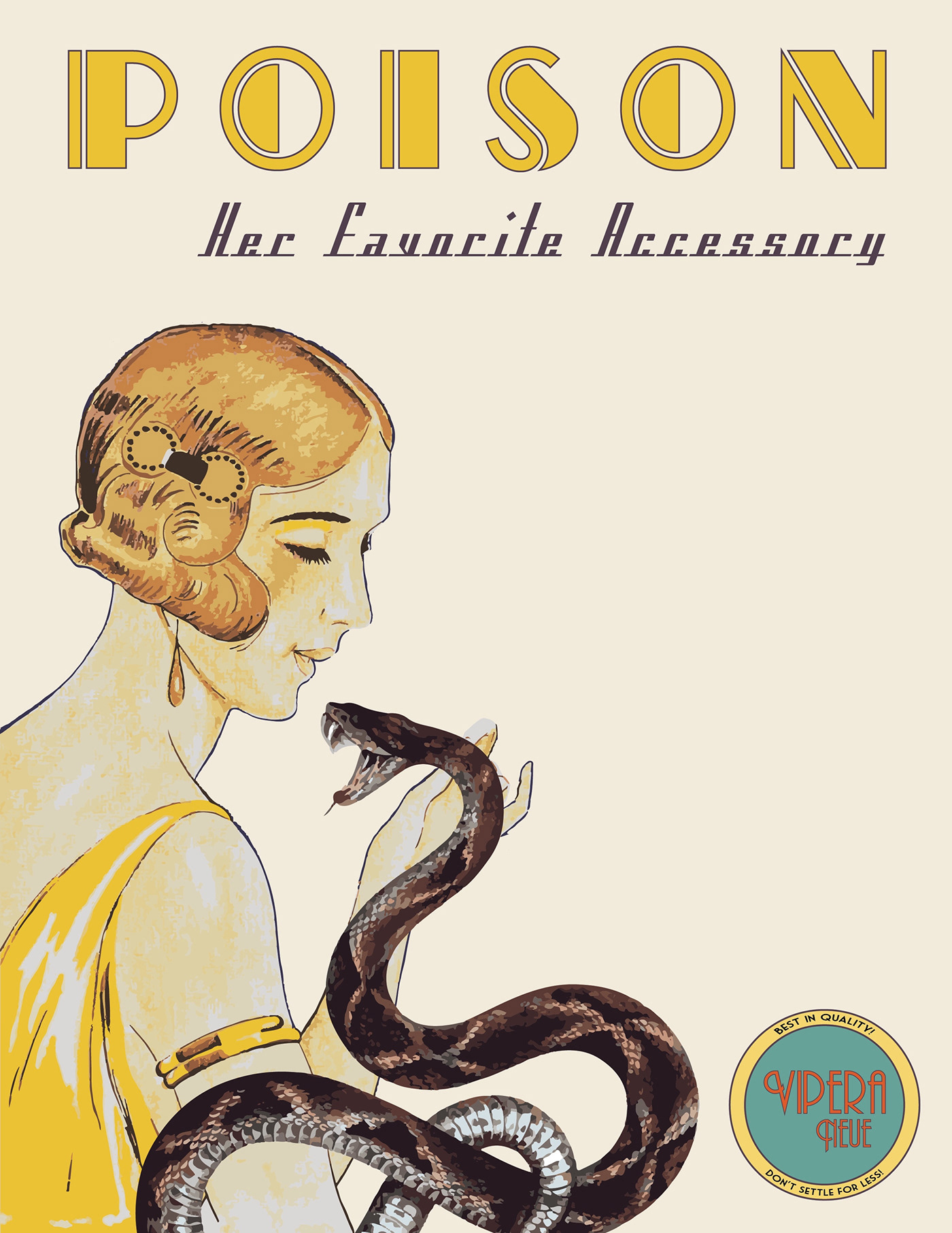
TITLE: Poison by Vipera
MATERIALS: Super Heavyweight Matte Paper, Wood, Glass
DATE: 2019
SIZE: 24 x 36 inches
TITLE: Poison by Vipera
MATERIALS: Super Heavyweight Matte Paper, Wood, Glass
DATE: 2019
SIZE: 24 x 36 inches
This was created for a future exhibition at the Florida Gulf Coast University art gallery. The project was to take typographic and design elements from the university's archival collection of 17th and 18th century books on seafaring and create an original piece.
This was completed in collaboration with a fellow creative writing class, whose job was to examine the same seafaring books and write short stories based on the visual elements.
Our ultimate task was to base our work on our own inspiration gained from examining the books and on the creative short stories that the other class produced.
For my piece, I took primary inspiration from the short story Vipera, and chose to include a line from the story as the main feature of the poster. The visuals were primarily inspired by Art Nouveau advertisements of the early 19th century.
Evidently the poster went through many iterations before the final result was realized. It started as more of a rigid Art Deco style before evolving into the flamboyant "New Art" style seen here. Enjoy exploring my design process and the various iterations of the poster!
Concept Art
This is the quickly thrown together mockup concept that I began with to explore the layout and feel.
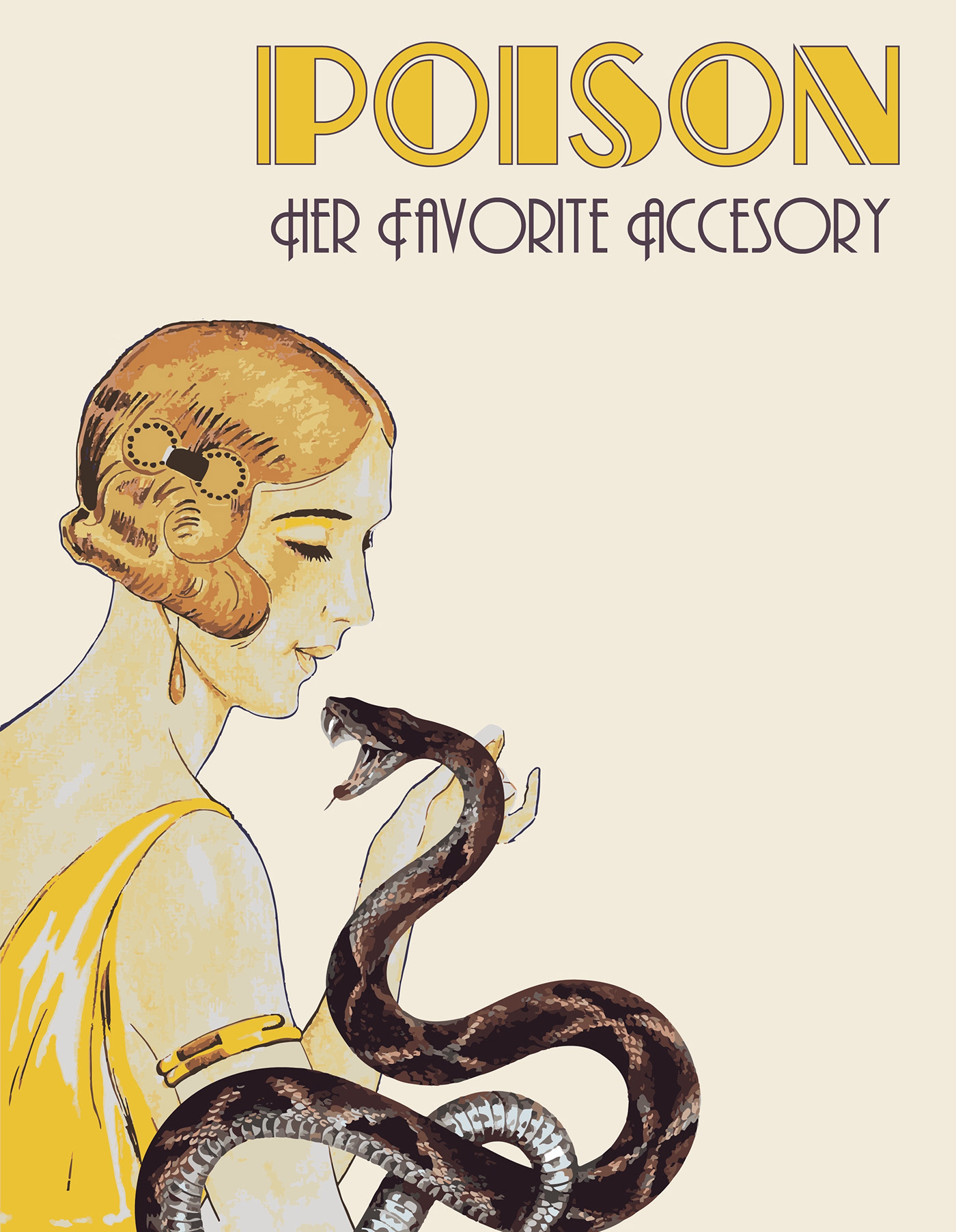
Version 1
The early iterations of the design relied heavily on Art Deco influences. Until Version 9, the woman and snake elements are stock photos used as stand-ins until their actual illustrations could be completed. And don't worry, "Accessory" would eventually be changed to its correct spelling.
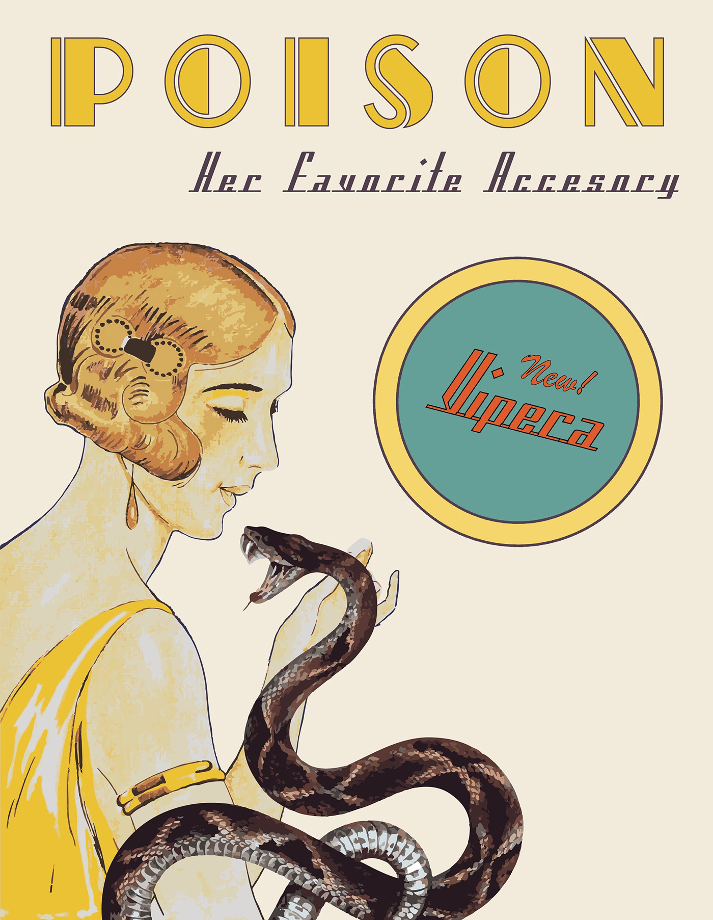
Version 2
Incorporating the name of the short story was a fun task, as I decided to make it the name of the product and/or company. The logo would change drastically before achieving the final result. There was a change in the typeface for "Her Favorite Accessory" here as well.
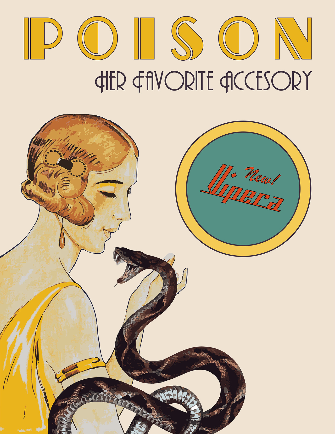
Version 3
Back to the original typeface for the sub-header and a change in the poster paper color.

Version 4
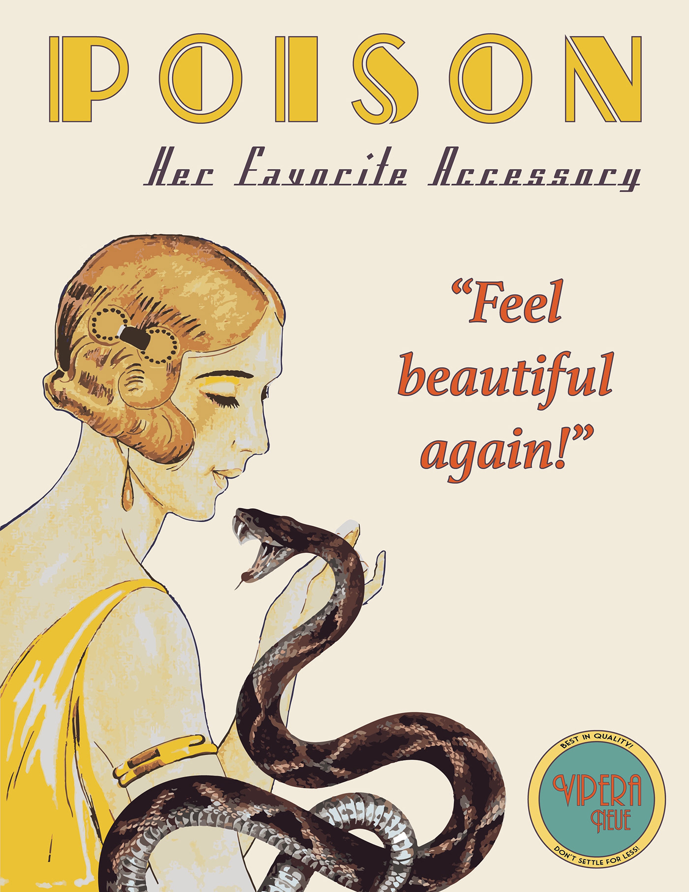
Changing the placement and design of the Vipera logo. I also started experimenting with typical kitschy phrases that were found on ads and products of the time.
Version 5
Very slight repositioning of the type.
Version 6
Adding in a prominent phrase that was not part of the short story's text to hone in on the advertisement quality of the poster. This was eventually eliminated.

Version 7
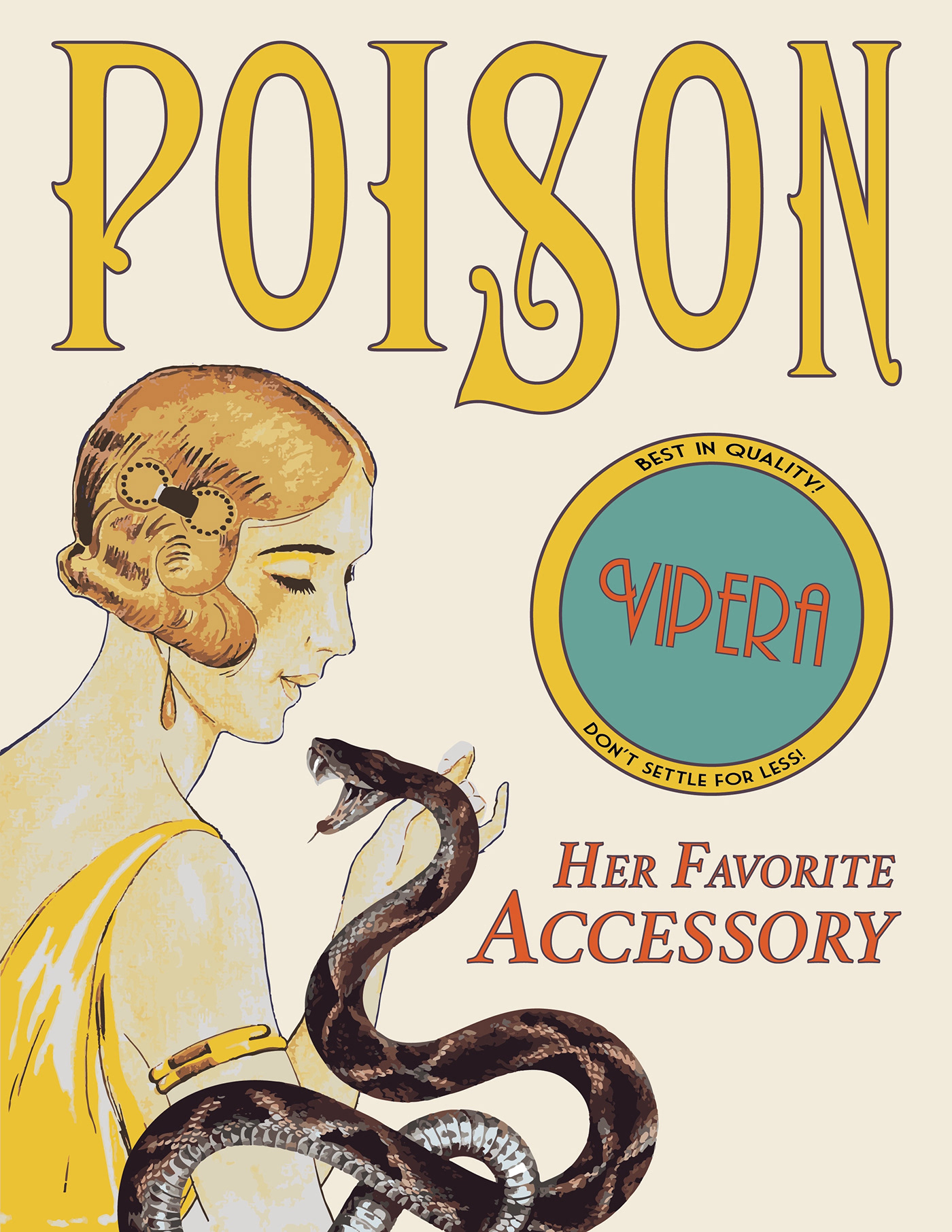
The first prominent shift away from Art Deco to Art Nouveau. This involved implementing a completely new typeface for "Poison" and for "Her Favorite Accessory".
Version 8
Another new typeface added with subtle manipulations to the letters. Repositioning of Vipera logo and sub-header.

Version 9
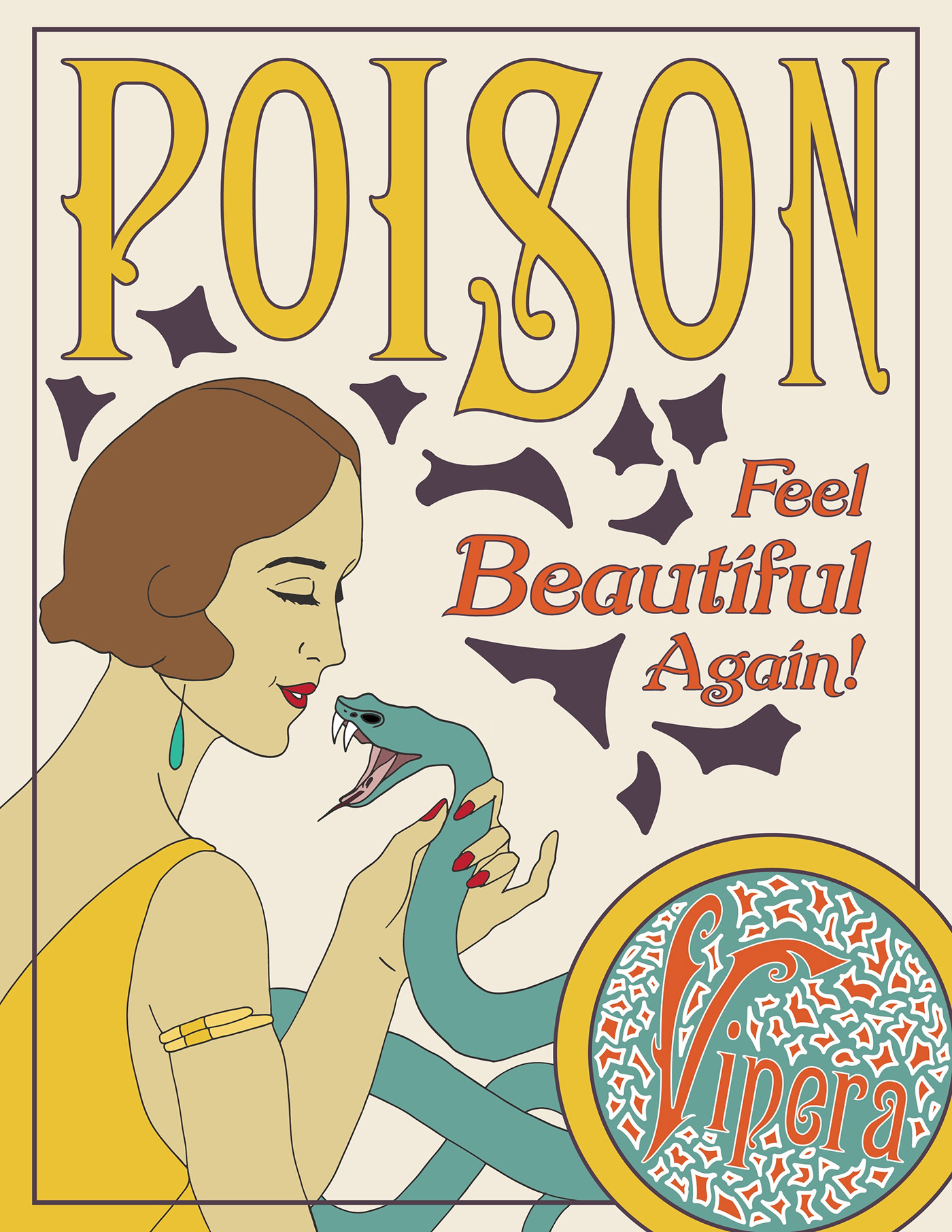
This version is the "ultimate decorative edition." I wanted to bring in the organic forms and decorations so often found in Art Nouveau ads of the time. Also introducing the brand new Vipera logo! The final and most beautiful version of the logo, also implementing a brand new typeface (that actually consists of two different fonts) and the intricate decorations found in the rest of the poster. I also temporarily eliminated the second half of the phrase, "Her Favorite Accessory".
Version 10
This is the second-to-last iteration of the poster. This one has three significant changes.
1) The woman and snake. All previous versions of the woman and snake had been stock stand-in photos so that I could focus on the intensive illustrative elements last. The snake is now a flat green in order to blend with the Vipera logo to give the illusion that it is coming out of the logo. This choice fits with the ad theme of the work.
2) Stripped down decoration. The Version 9 ultimately had way too many decorations floating around, and I needed to strip them back. I deleted all of the designs and re-drew the ones seen here, so that they would be in perfect harmony with each other and with the spaces they were occupying.
3) The border. A small but essential design element added in last minute but to great effect. It hems in the poster so that all of the elements are stylishly contained yet also furthers the Art Nouveau aesthetic as a defining design element of the posters of the time.

Version 11 - Final
The final iteration of the poster submitted to the gallery. This one brings back the complete original line from the short story and is fitted to its originally intended 24 x 36 inch dimensions.


