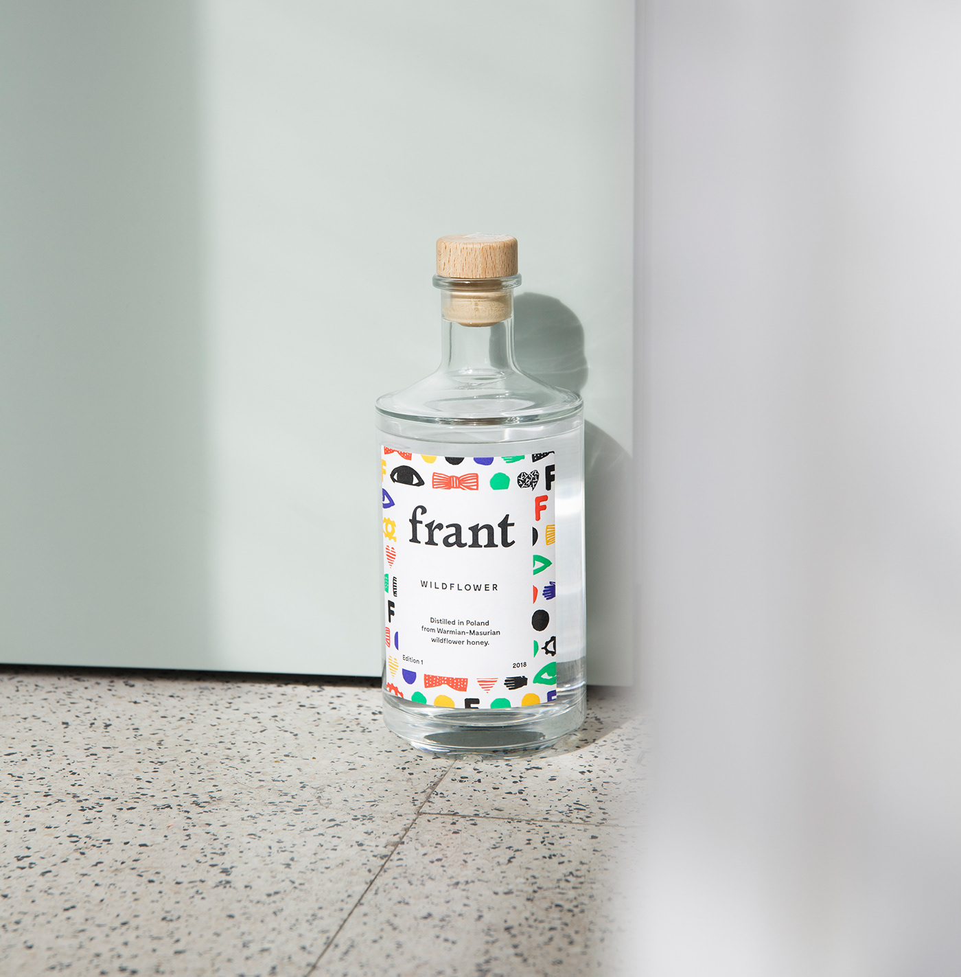
Is it vodka?
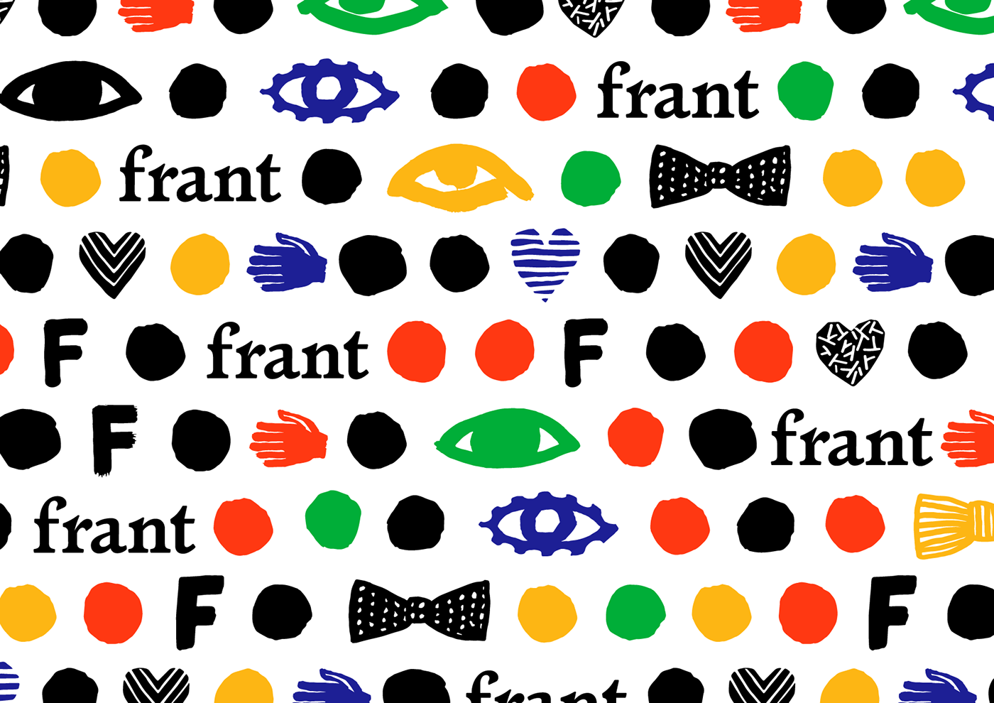
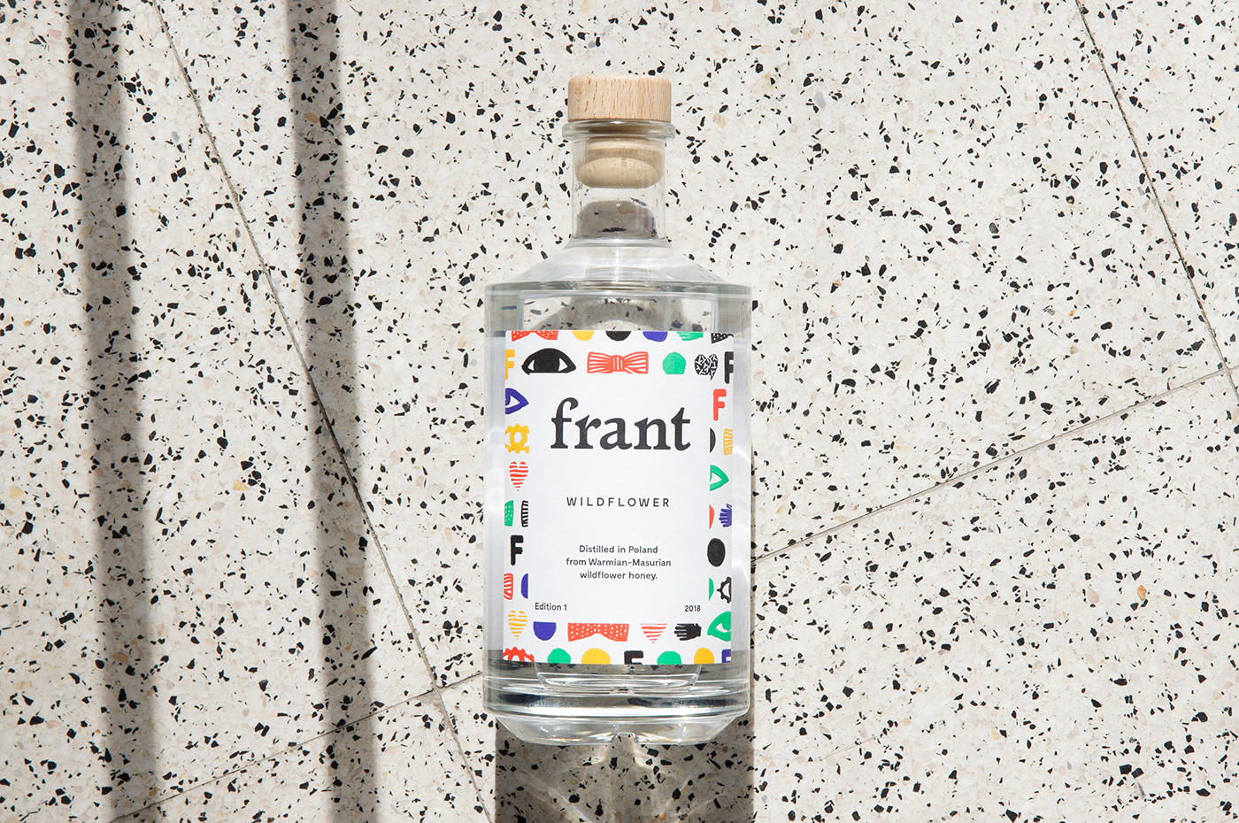
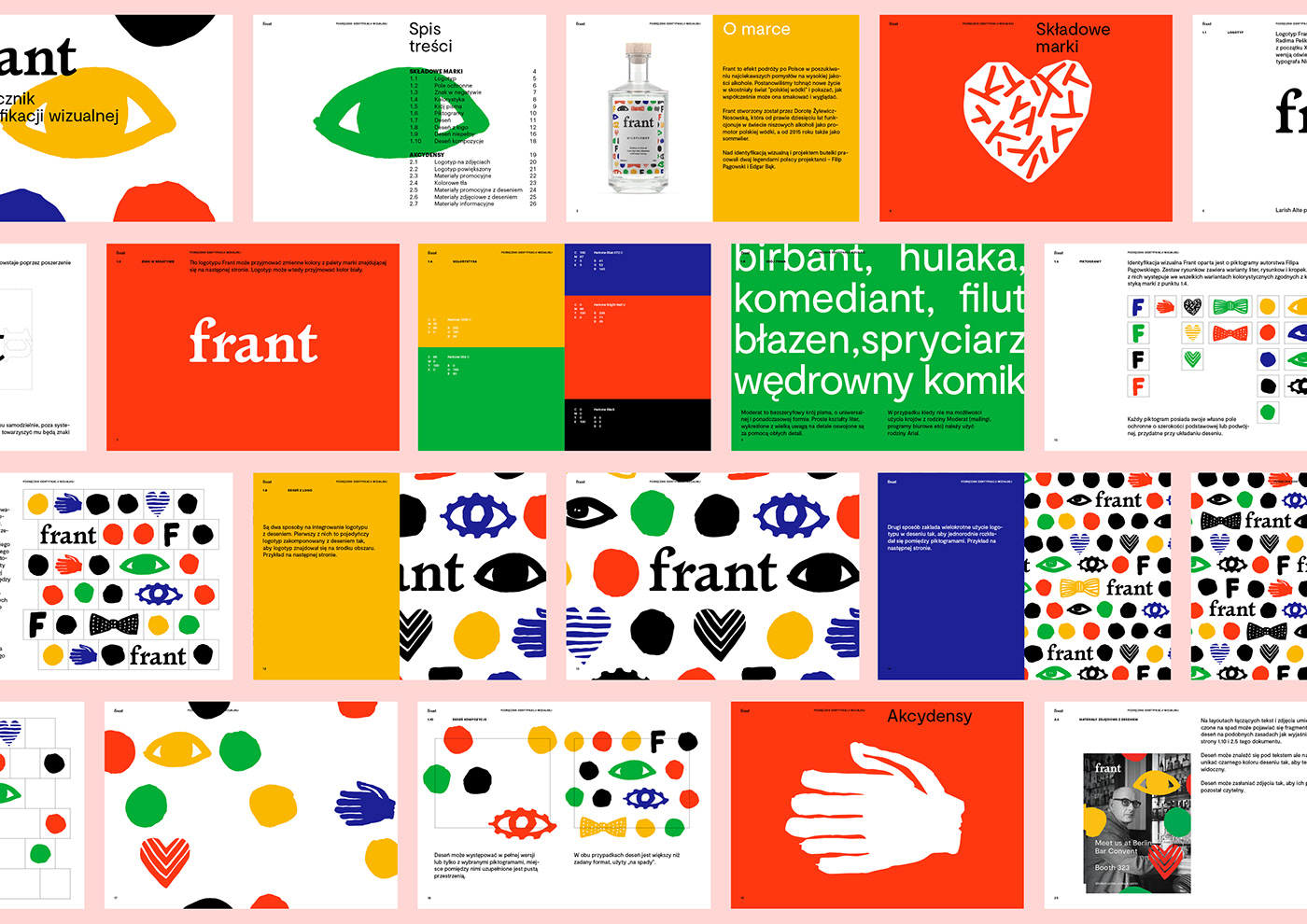
Filip Pągowski prepared a set of illustrations for the Frant brand. Based on the pattern he created, we designed the brand’s logo and its visual identification.
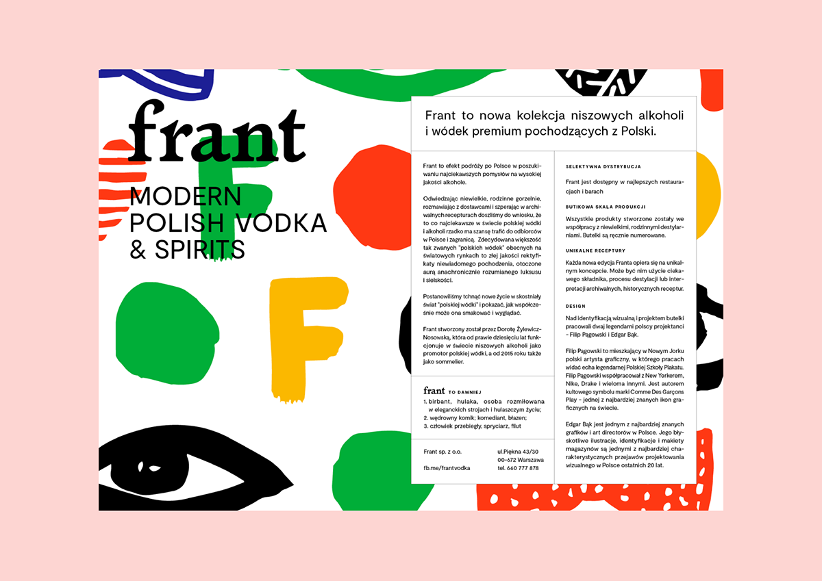
The world of Frant is a convergence of colors and forms unlike anything witnessed in the world of strong alcohols thus far. Compared with the dignified, aspirational visual world of Polish vodkas, Frant signifies youth, courage, and unpretentiousness.
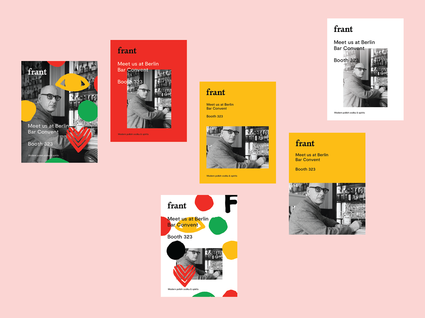
The system we created allows to fashion countless combinations of communications, both varied and perfectly recognizable. We envisioned a space for various forms of promotion and the capacity to extend the brand’s portfolio with additional variants. The design elements can be scaled and freely combined with graphics and photos.
Creative director: Wojtek Nosowski
Illustration: Filip Pągowski
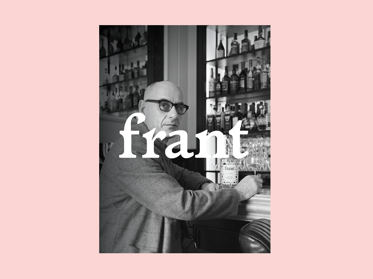
Photo: Michał Matejko
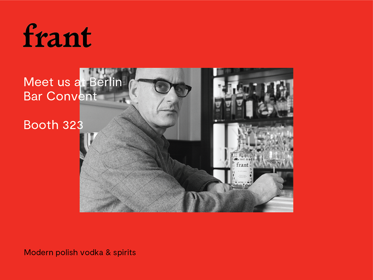
Visit: frantvodka.com