

How might we improve the Browse Workout experience across all cardio consoles as we expand our content offering—while keeping the same look and feel and limiting dev and QA efforts?
Overview
The Team
3 UX/UI Designers
3 Devs
1 QA
Roles
I led UX strategy, research, ideation, testing, and mentored two associate designers. Associate designers delivered final UI, redlines, workout data, content, and assisted with research, synthesis, prototyping, and testing.
Timeframe
Business alignment: 1 week
Research: 1 week
Research: 1 week
UX Design/Data Model: 2 weeks
UI/Content Delivery: 4 weeks
Prototype testing: 1.5 weeks
Alpha and Beta testing: 4 weeks
Dev and QA: two-week sprint cycles, totaling ~6 mos.
Opportunity
We started with a complex flow that had some redundancies and extra clicks. Content is siloed in different areas under naming patterns that may not be clear to exercisers. If we borrowed from well known entertainment browse patterns, we could start to pull all content into a single page for a move visual experience that scales, while making room for featured content.
Initial State


From MVP to Future State
Beginning with the treadmill experience, initial direction includes eliminating the extra browse page, taking exercisers directly to all workout content. We can standardize access to setup options, allowing exercisers to log in, connect accessories, or set up their default preferences at any point before their workout begins.
As workout content continues to grow, so will the need to add features like tagging, filtering, personalization, customization. This also presents us the an opportunity to break down the wall between workouts and entertainment content to create seamless access to any content anywhere.

The Weeds
Solutions will need to take into account several variables:
• Multiple base types
• Screen size/resolution
• Multiple brands under one umbrella
• Workout types and quantity
• International translations (26)
• Facility customizations
• Corporate partner agreements
• Logged in experience
• All user types
• Existing build complications
• Android Lollipop constraints
• Aging hardware
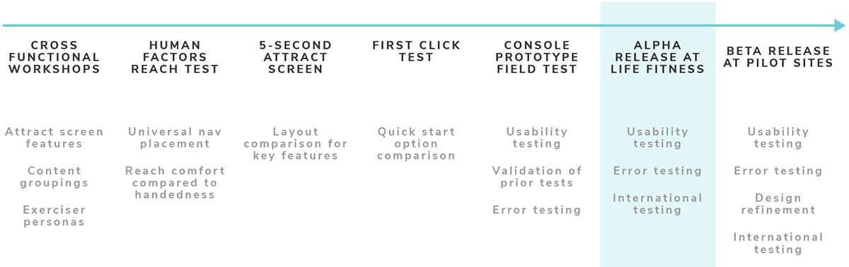
Validation Pathway
Our research and testing plan for this project was organic and a pilot for building out a formal research practice. We began by aligning with business goals and existing research, checking on existing design decisions by performing a reach test, lean user testing with high fidelity comps, and finally some field testing with a functional console. We are about to launch into alpha and beta testing at select international locations.
Business Alignment
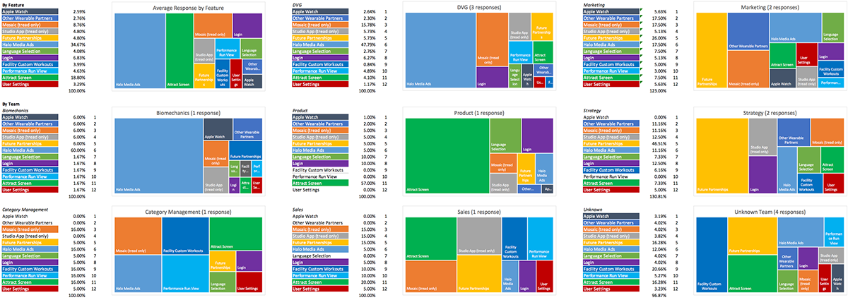
Based on submissions from our cross functional workshop, we were able to find basic alignment over feature prioritization on the highly sought after real estate on the console Home screen.
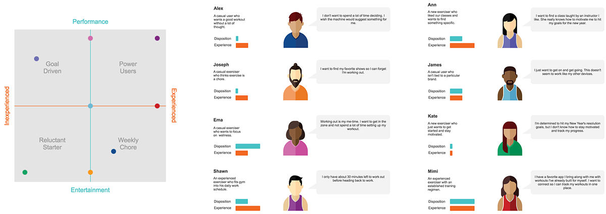
From prior research and user statements pulled from multiple teams, we were able to identify a basic user pattern that we measured on two axes: experience level and disposition toward exercise.
Competitive and Lateral Research
We reviewed 10 brands that specialize in entertainment and fitness content. We found that each major brand has been converging on a YouTube model. Categories are based on tagging and analytics. Content is constantly tested with users and optimized for better engagement.
Ideation
The console team went through two rounds of ideation and desk research over a two week period. After some medium fidelity testing, we converged on a home screen menu that separates primary and secondary actions from general settings navigation, the introduction of a top bar universal nav, a large feature area with cards below. We introduced micro icons and confirmation modals as a way to give exercisers more information about a given workout and give clear confirmation on when the machine would begin moving.
Below is a sample of concepts leading to the final solution. Screens include the Home and Browse pages as well as other touch points connecting the new experience to the existing one.

User Testing
We took consoles into two corporate offices and three local gyms and conducted a task analysis and questionnaire with ~25 participants. While we had a strong positive response to our content and browse patterns, we learned that we need additional scrolling affordances to help console users find additional content. We found that our personas can be expanded to at least four axes instead of two, adding in variables like ability and curiosity.
With our broad international user base, it's clear that we will need to expand on our MVP to improve accessibility and overall experience for all of our exercisers. The next phase of updates to the browse experience will include more robust personas and exploration into simplifying choice for exercisers who want to just get on and go through improving things like Quick Start visibility and the ability to access all content from within a workout. We'll explore multiple view options for exercisers who want to stay focused with minimal stats or exercisers who don't wear their reading glasses at the gym.
Final Screens
The new Home screen side panel has a clear hierarchy and simplified choice structure. The primary and secondary options will ultimately lead an exerciser to the Browse experience. Based on testing, we removed some of the visual noise in the default ads on the Home screen.
The browse experience is now in a single page. Exercisers still have access to all of their settings. We highlight two content features at the top of the screen and have introduced a simple algorithm to display popular workouts followed by our standard workout groupings below. Goal workouts and Fitness tests are now displayed more visually with icon overlays to indicate the goal or test type. The data was redesigned to accommodate our future state plans of rolling out more complex algorithms along with filtering to build out a more customized browse experience at the gym and logged in user levels.


