Azura Visual Identity
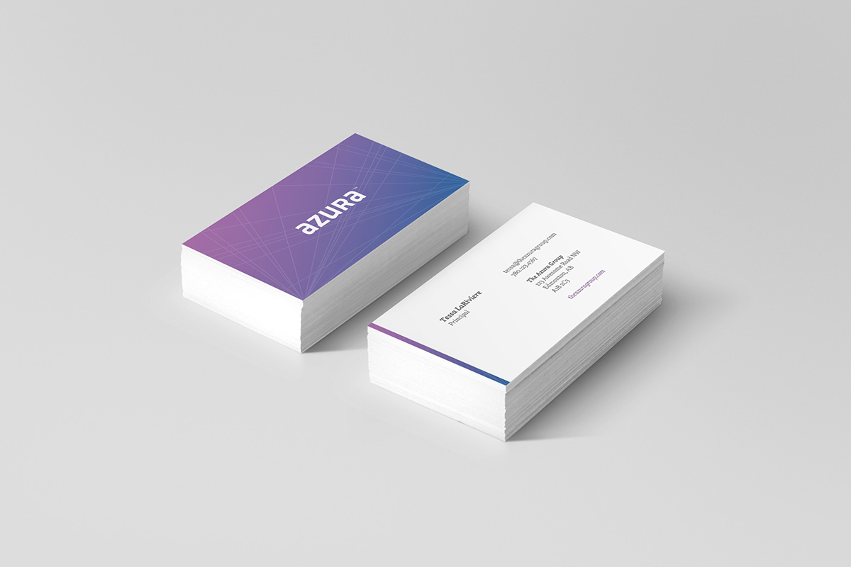
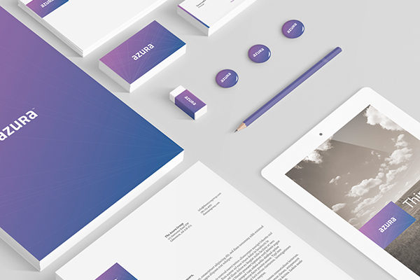
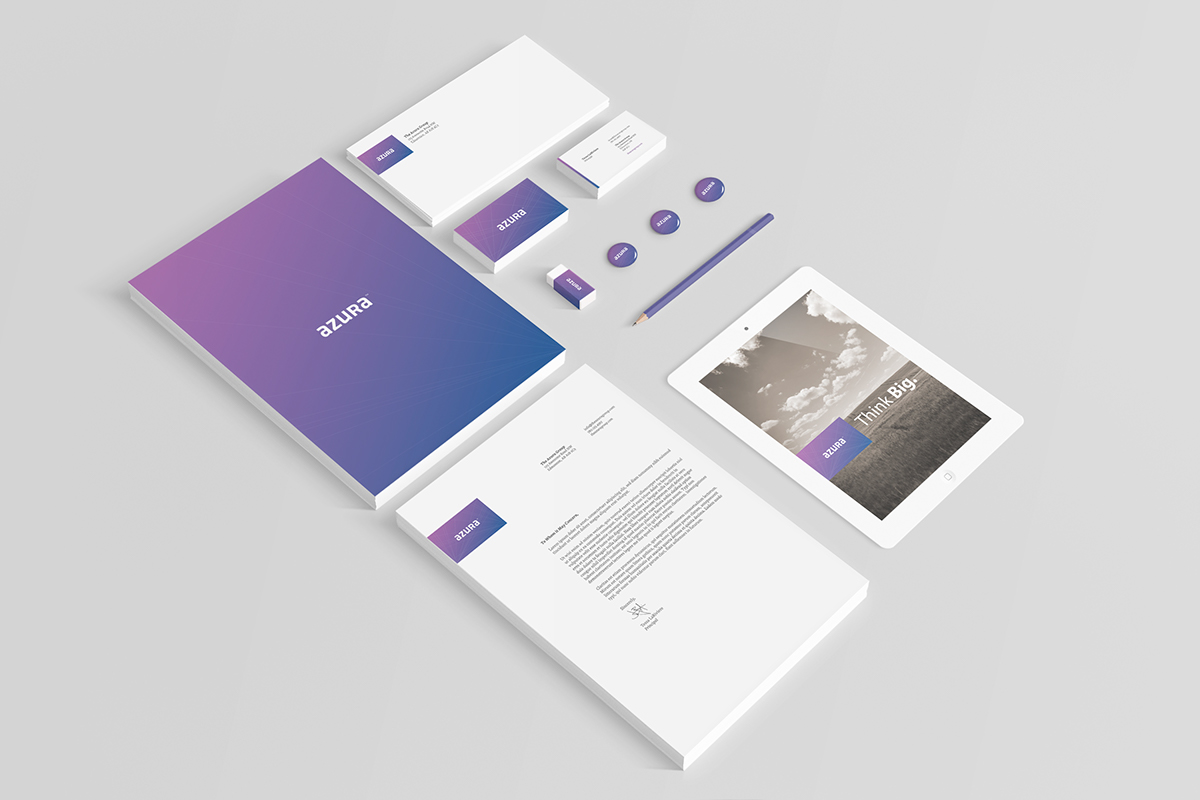
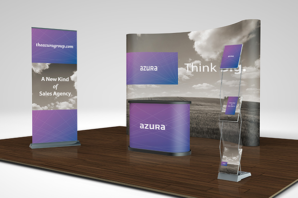
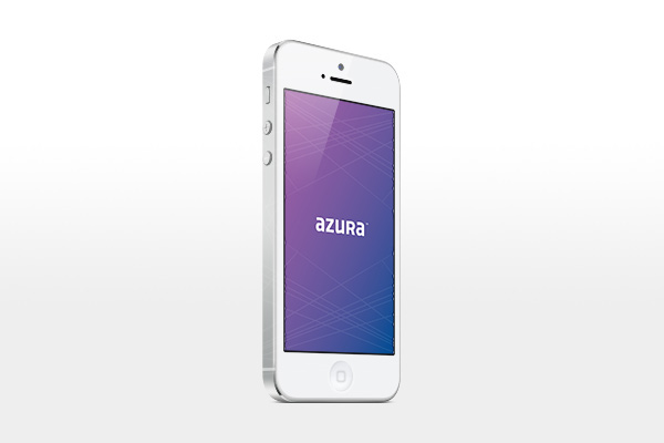
Paper Leaf was hired to create a new visual identity for an existing sales agency who were undergoing a name change and shift in market focus. As the gift sales market is saturated with overtly traditional and muted identities, we took their identity in a different direction: creating an inviting, modern, custom wordmark paired with a striking purple and white colour scheme.
The system as a whole is tied together not only by the unique colour, but by the linear "ray" pattern seen behind the wordmark in the main logo. These rays are meant to inspire "big thinking", with a basis in the root word "Azure" that the company name is based on. Some viewers may also see the rays making the letter A.
At the end of the day, this concept wasn't used.


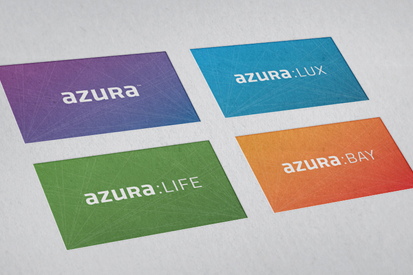
Showcasing potential for brand line extension.