
Bild builds on the features of Trade Gothic Bold and Trade Gothic Condensed No. 20, outliers in Jackson Burke’s famous midcentury grot. These weights are clunkier and narrower than the rest of the family, with echoes of Benton’s Alternate Gothic and ATF Railroad Gothic. Started in 2012 at the suggestion of Sam Berlow, Bild’s dense texture, narrow proportions, and straight-sided letterforms make it structured but not rigid. Bild now sets a damn fine headline in three new widths, from Narrow to Extra Condensed. Now available at Font of the Month Club »
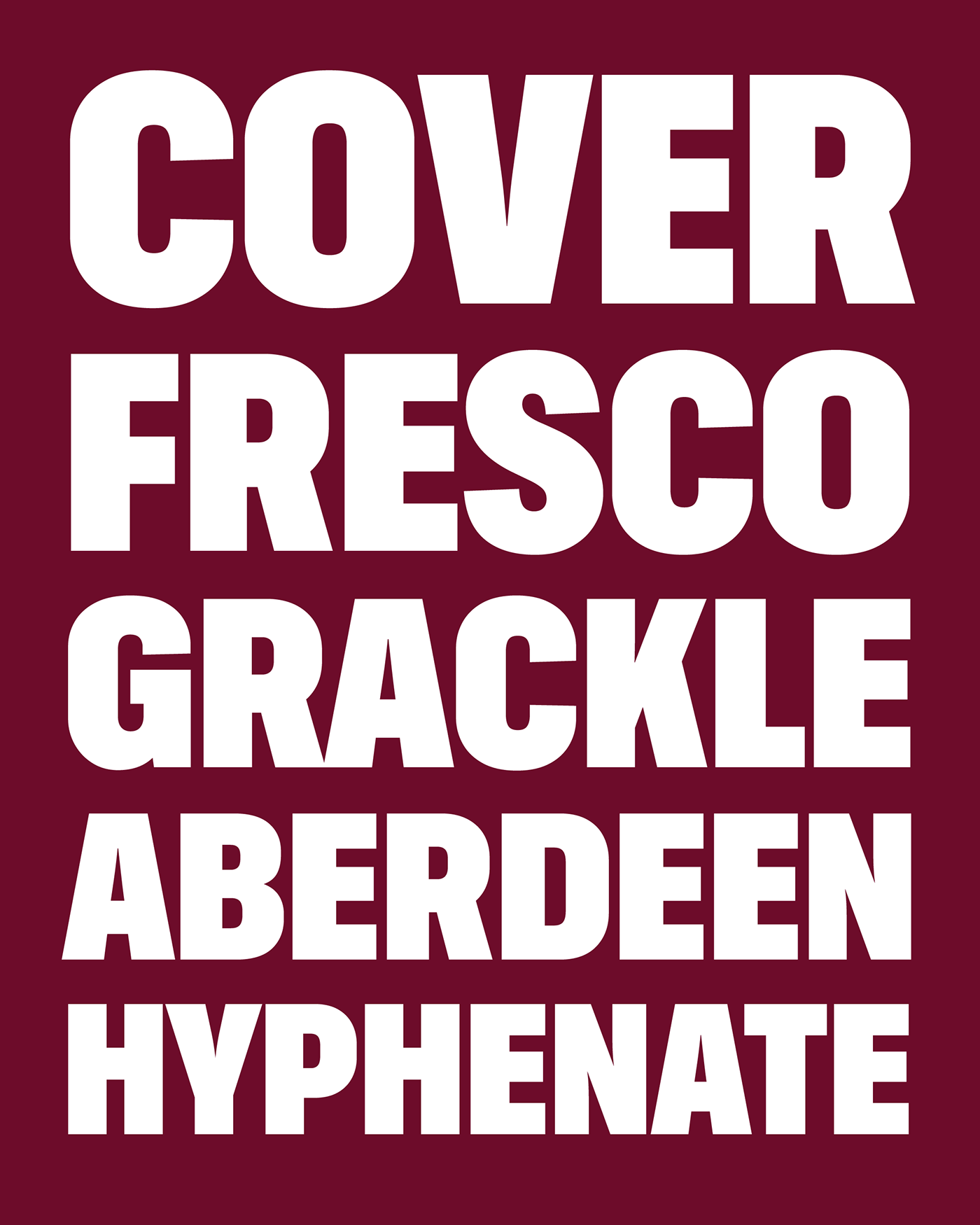
Bild Narrow Black, uppercase

Bild Condensed Black, uppercase

Bild Extra Condensed Black, uppercase

Bild Compressed Black, uppercase

Bild Narrow Black, U&lc

Bild Condensed Black, U&lc
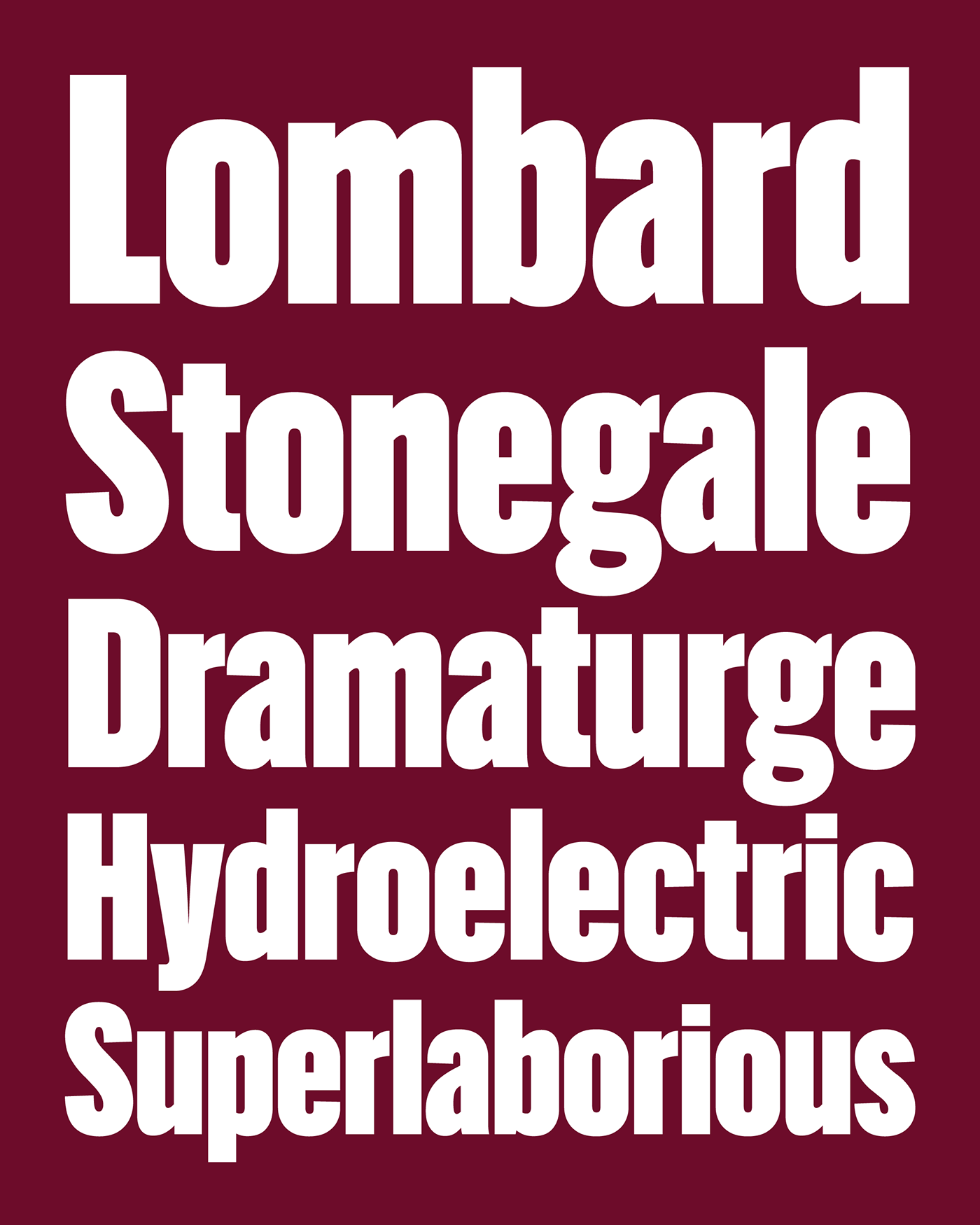
Bild Extra Condensed Black, U&lc

Bild Compressed Black, U&lc

