Data Visualizations Vol. 1
--
A selection of my favourite data visualizations that I've created over the past two years.
See the full project here
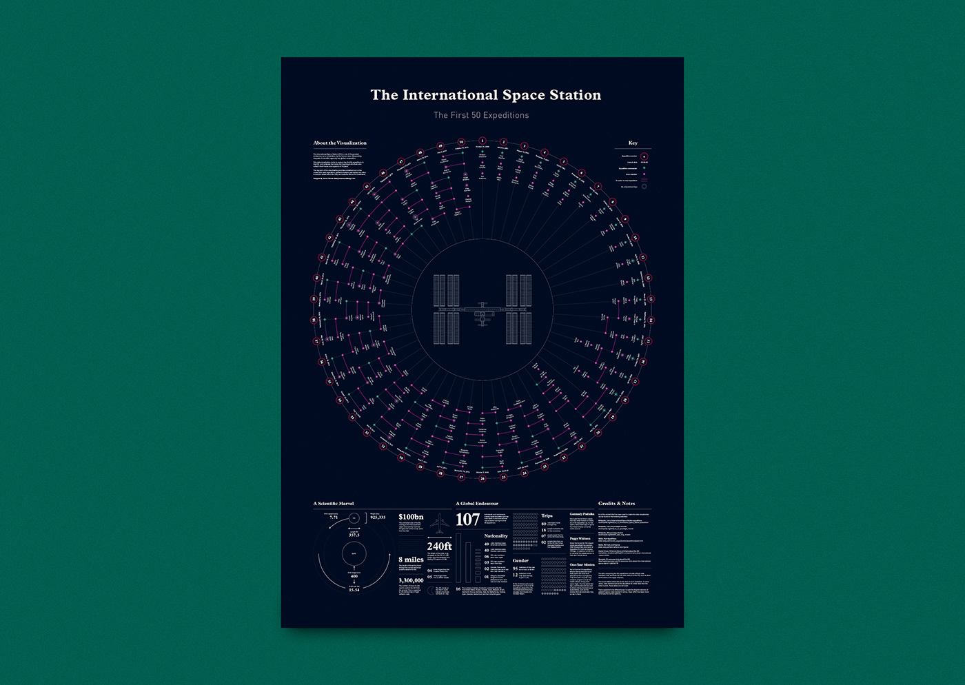
In 2017 I created my first data visualization, charting every astronaut that lived on the International Space Station since its launch. Since then I've designed numerous data visualizations, been longlisted in the Information is Beautiful Awards three times, and have created data driven work for clients like WIRED, the BBC and Norwegian Airlines.
I love using design to communicate complexity as engagingly and beautifully as possible. In a world of dwindling attention spans, I think data rich visualizations provide the perfect medium through which to convey important issues, complicated ideas and nuanced stories.
Below are some of my favourite projects I've worked on over the last two years. These include the ISS data viz mentioned above, an exploration of animal extinction over the last century, and a recent piece I did for WIRED mapping the UK tech scene.
--
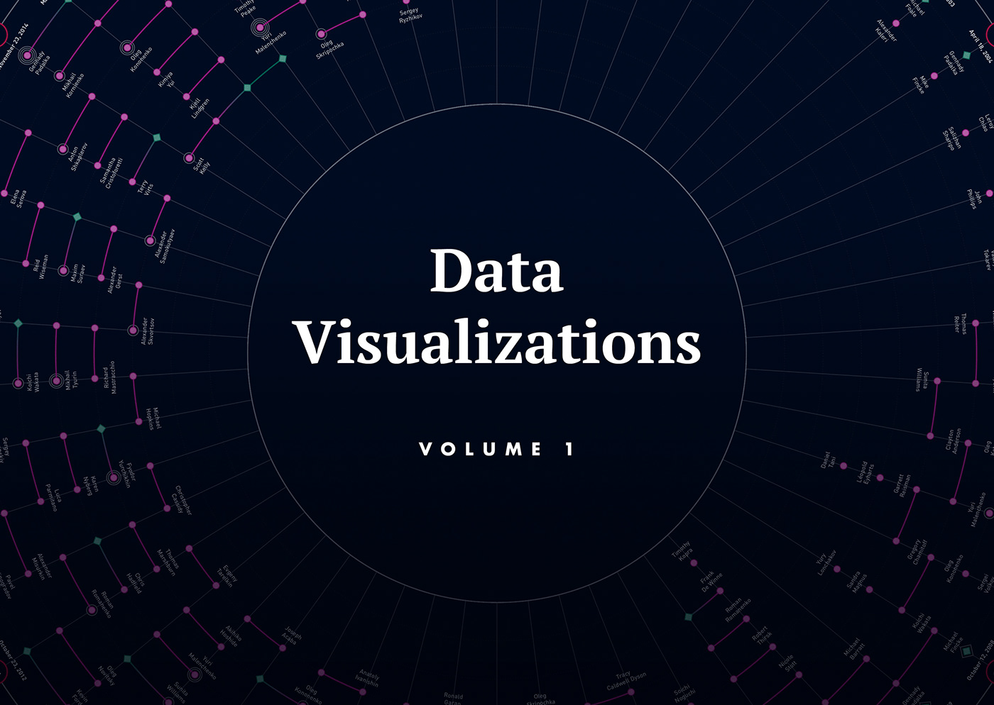
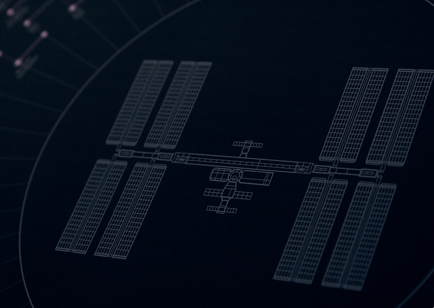
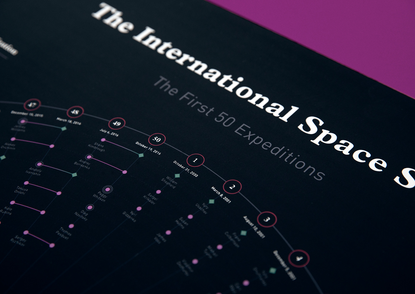
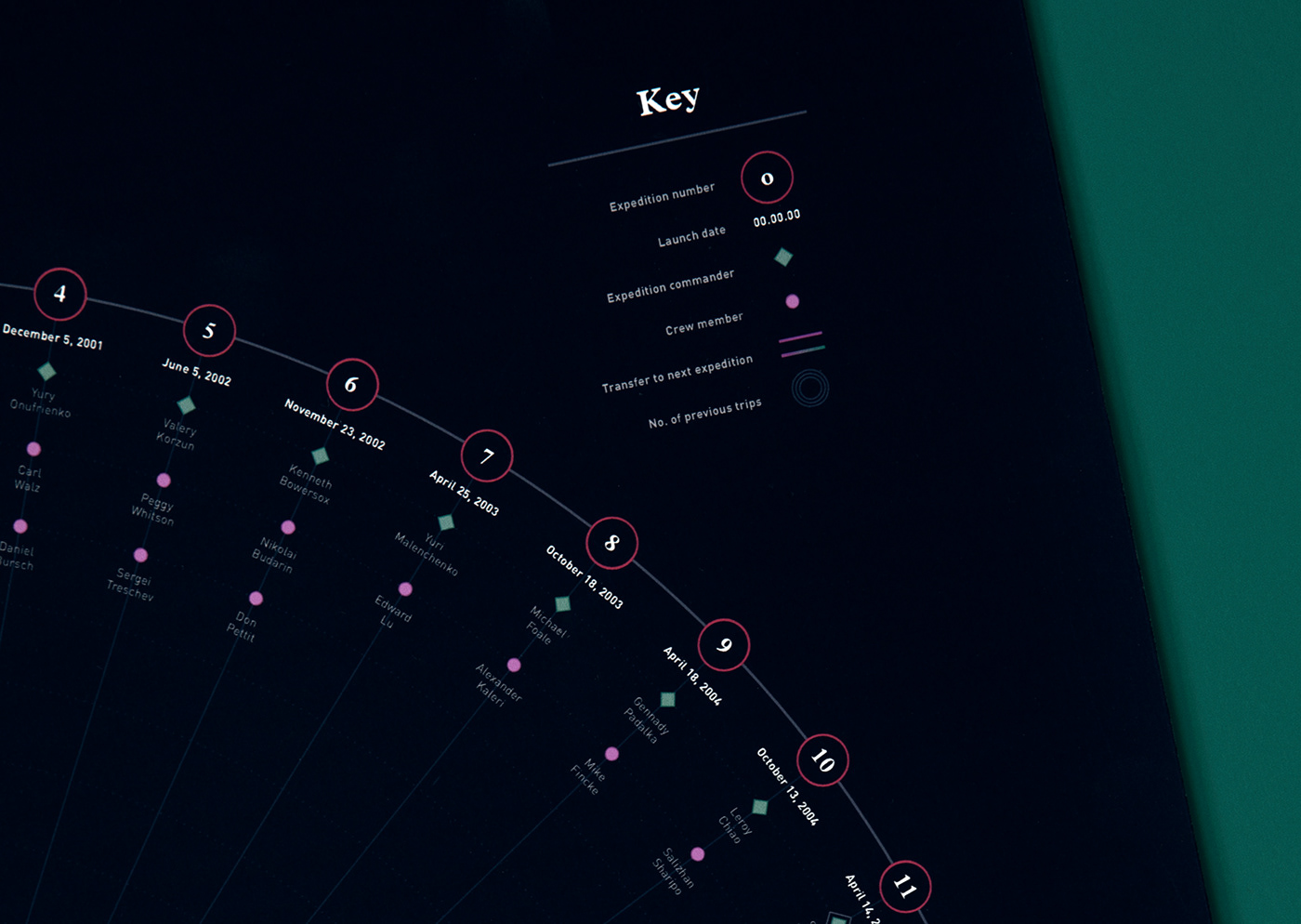
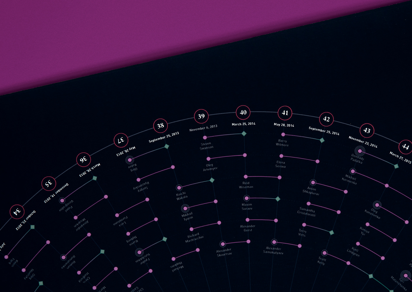
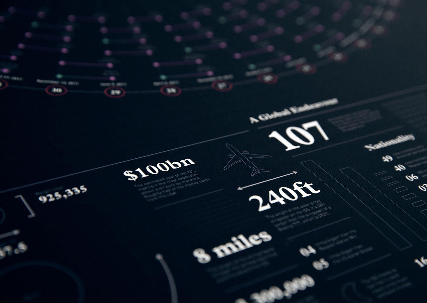
No. 1 / The International Space Station: The First 50 Expeditions
Longlisted in the 2017 Information is Beautiful Awards
Celebrating the brave and inspiring individuals who called the International Space Station home over a period of 16 years.
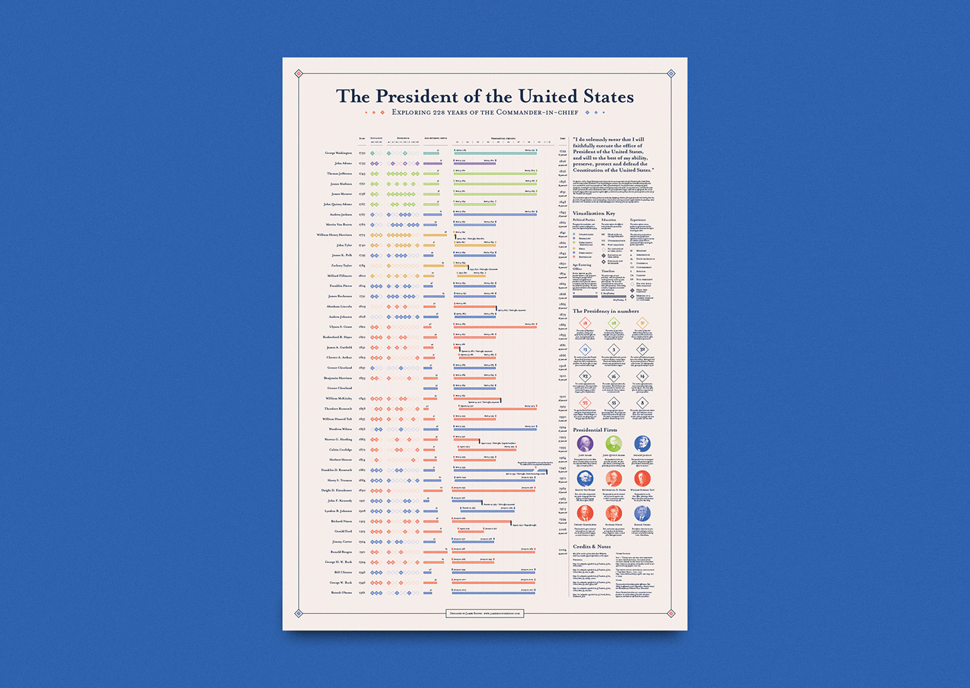
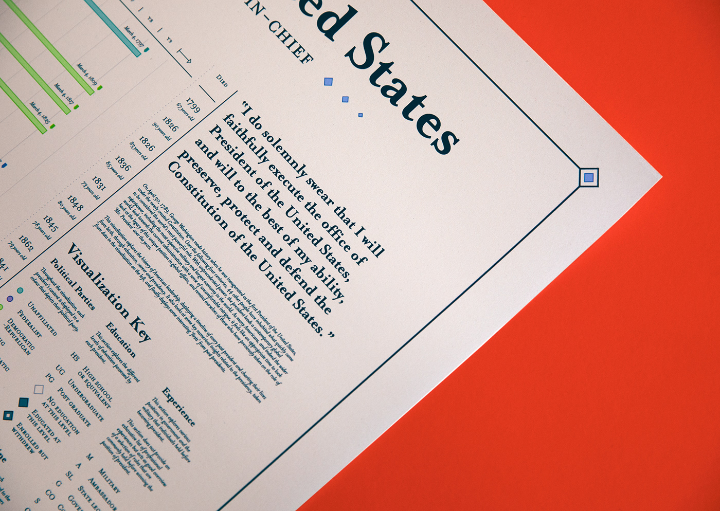
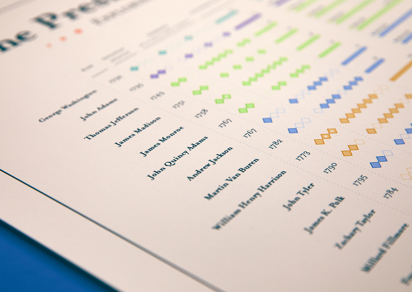
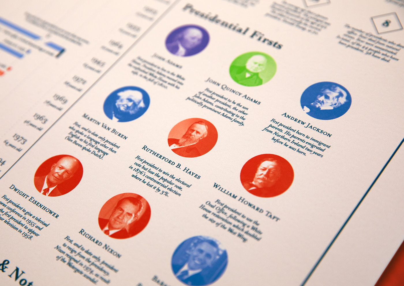
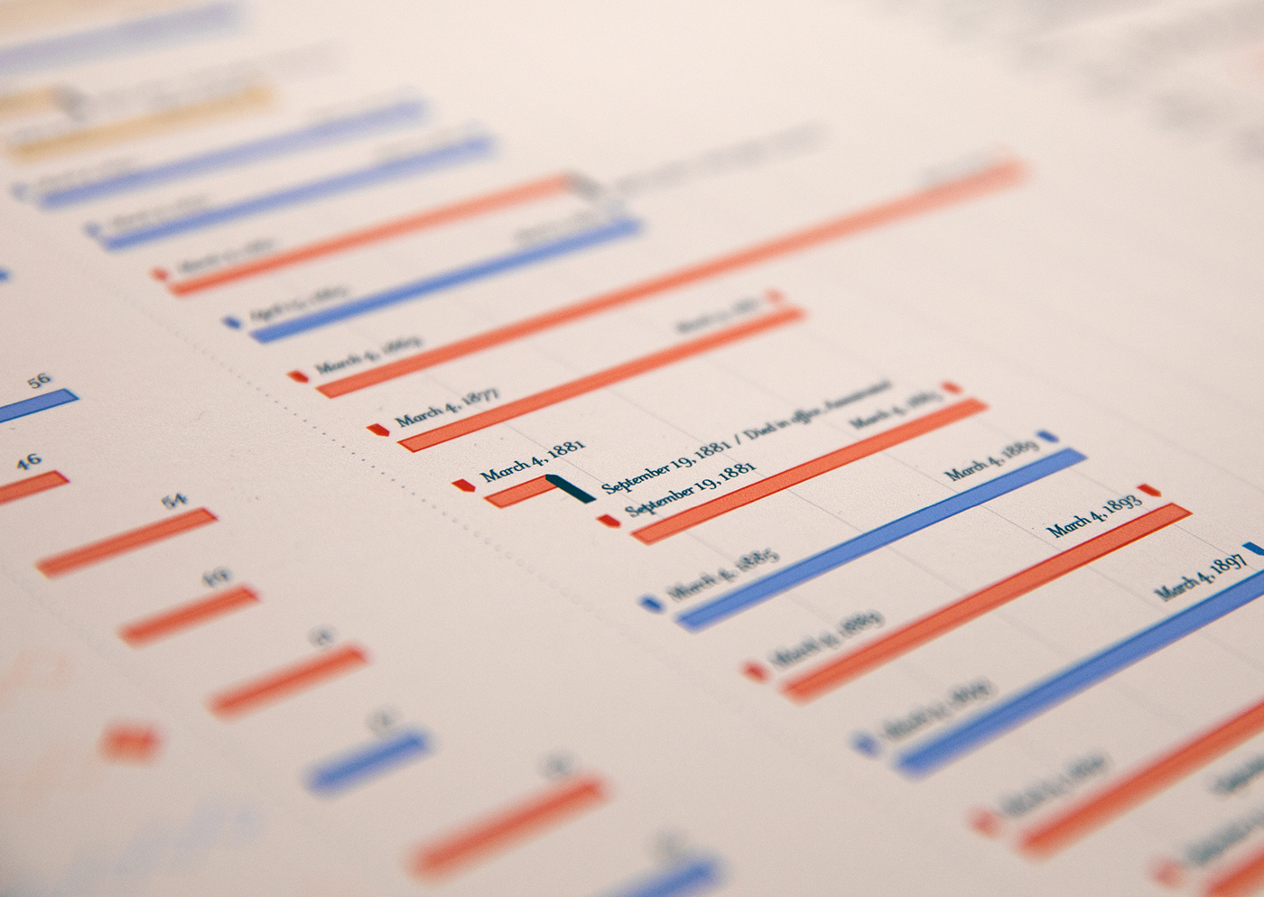
No. 2 / The President of the United States: Exploring 228 Years of the Commander-in-chief
Longlisted in the 2017 Information is Beautiful Awards
Exploring the history of American leadership, displaying a timeline of every past president and charting their lives from birth, through education, career and presidency.

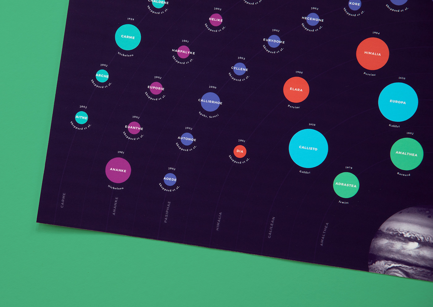
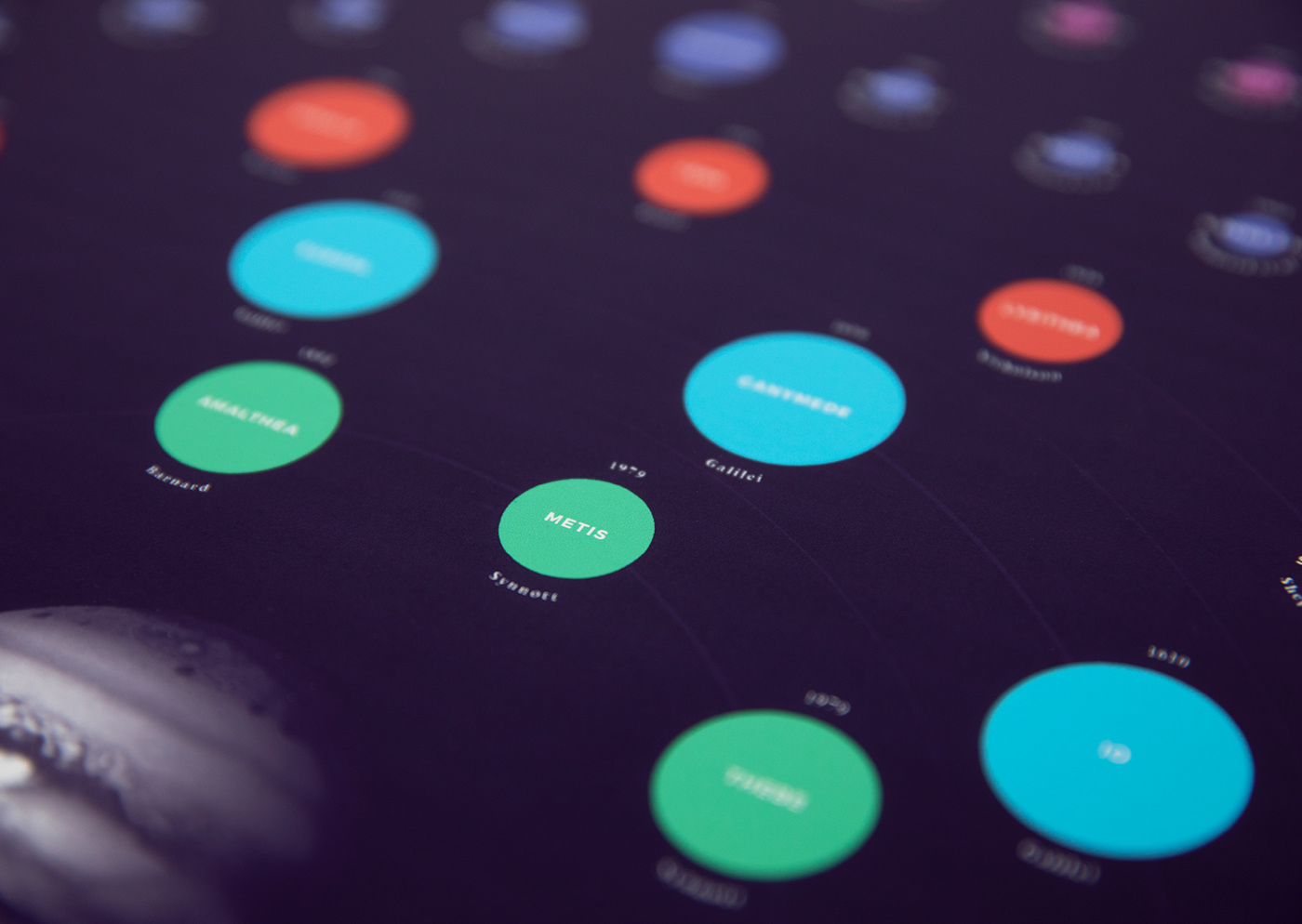
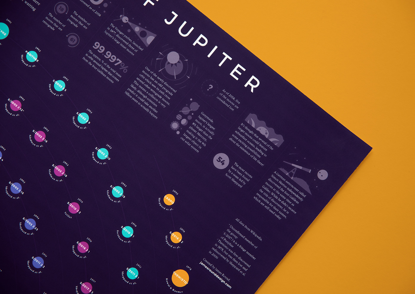
No. 3 / The Many Moons of Jupiter
Mapping every currently known moon of Jupiter, each featuring the year of discovery, discoverer and a representation of scale.
See the full project here


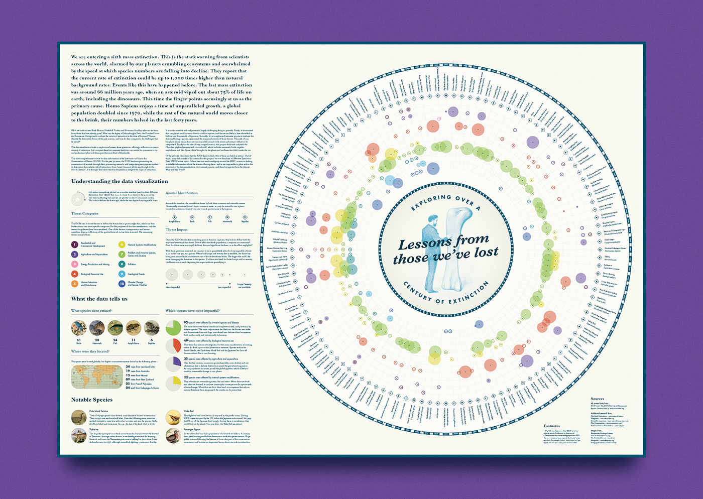
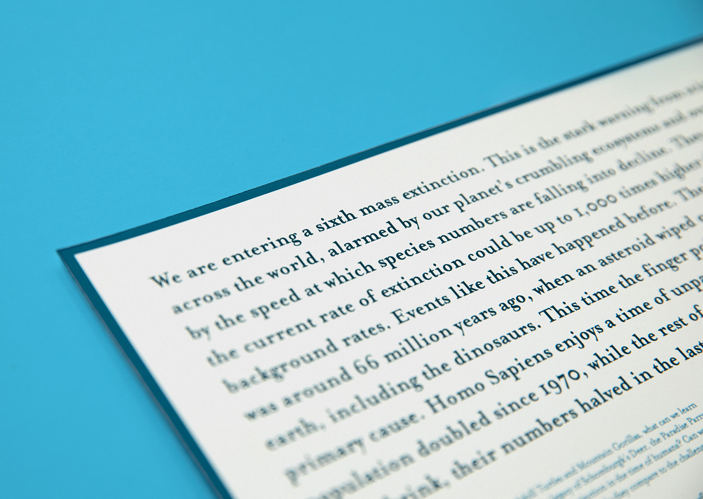
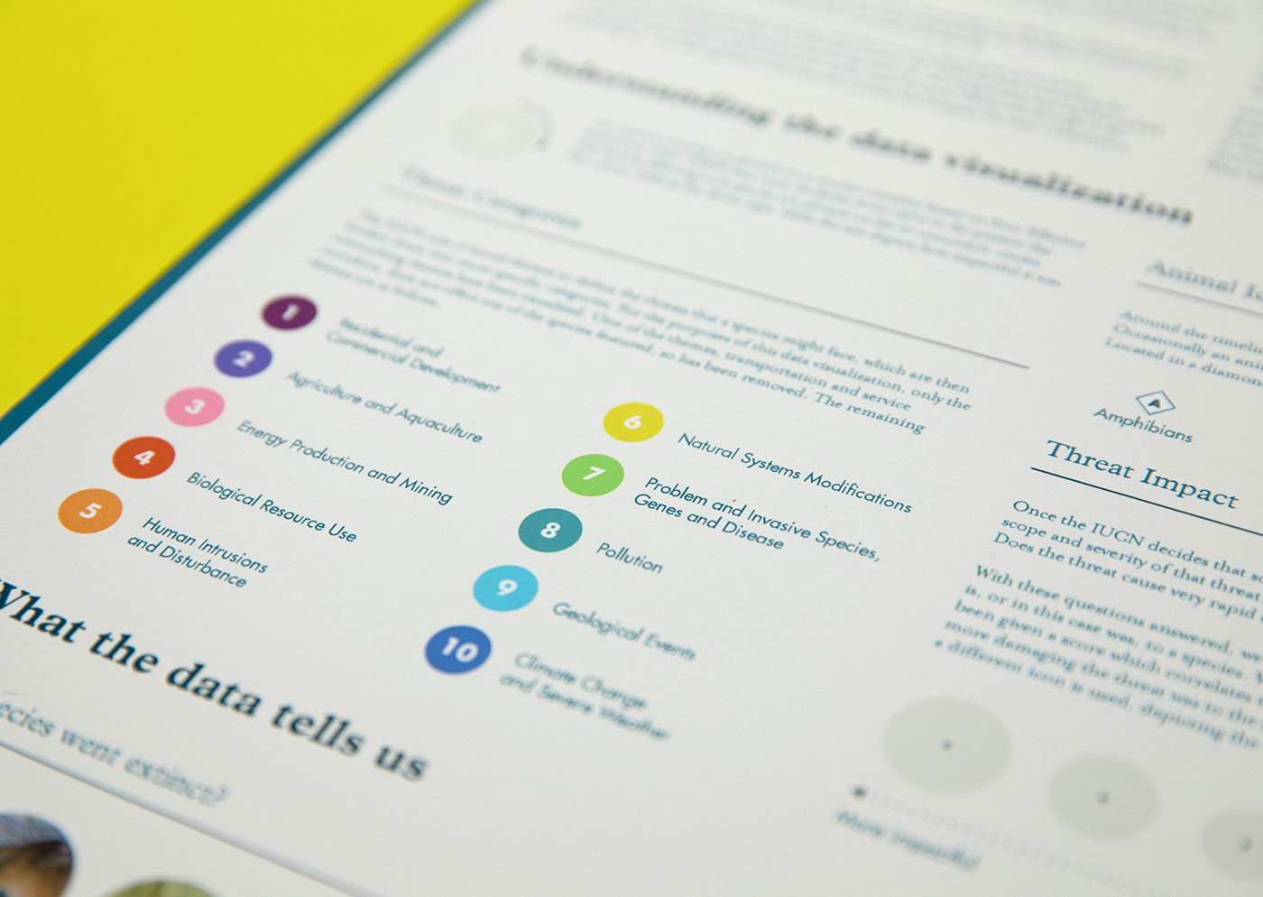
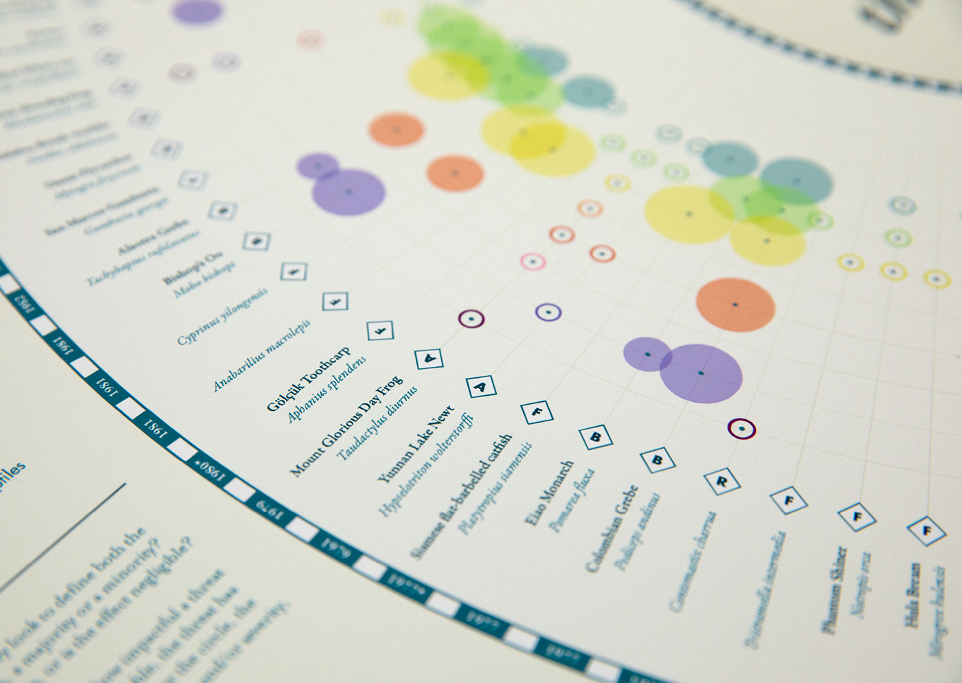
No. 4 / Lessons From Those We've Lost: Exploring Over a Century of Extinction
Longlisted in the 2018 Information is Beautiful Awards
Can we identify the destructive forces of the past century, and how do they compare to the challenges that lie ahead?
See the full project here


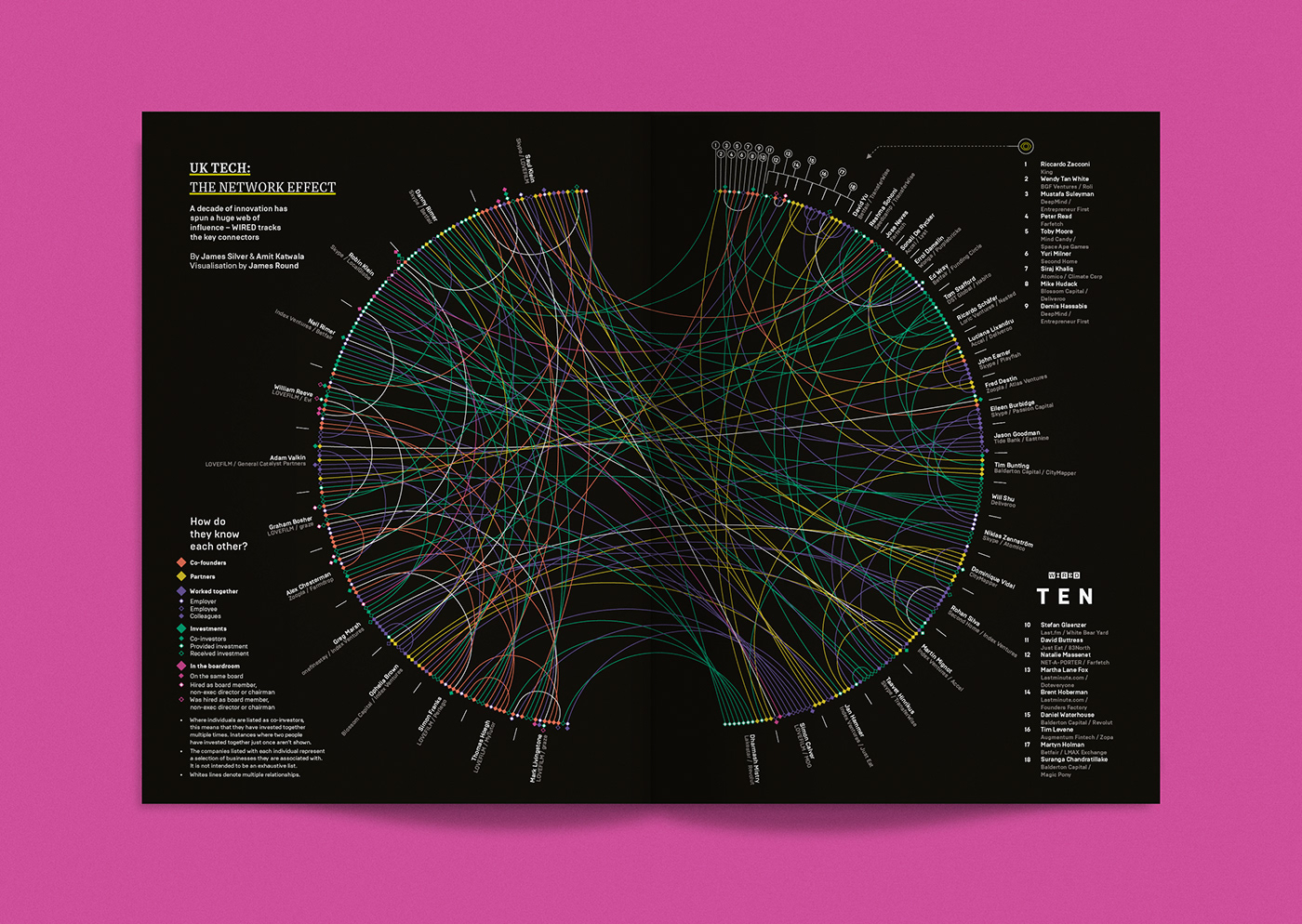
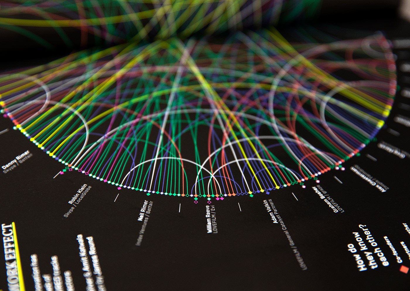
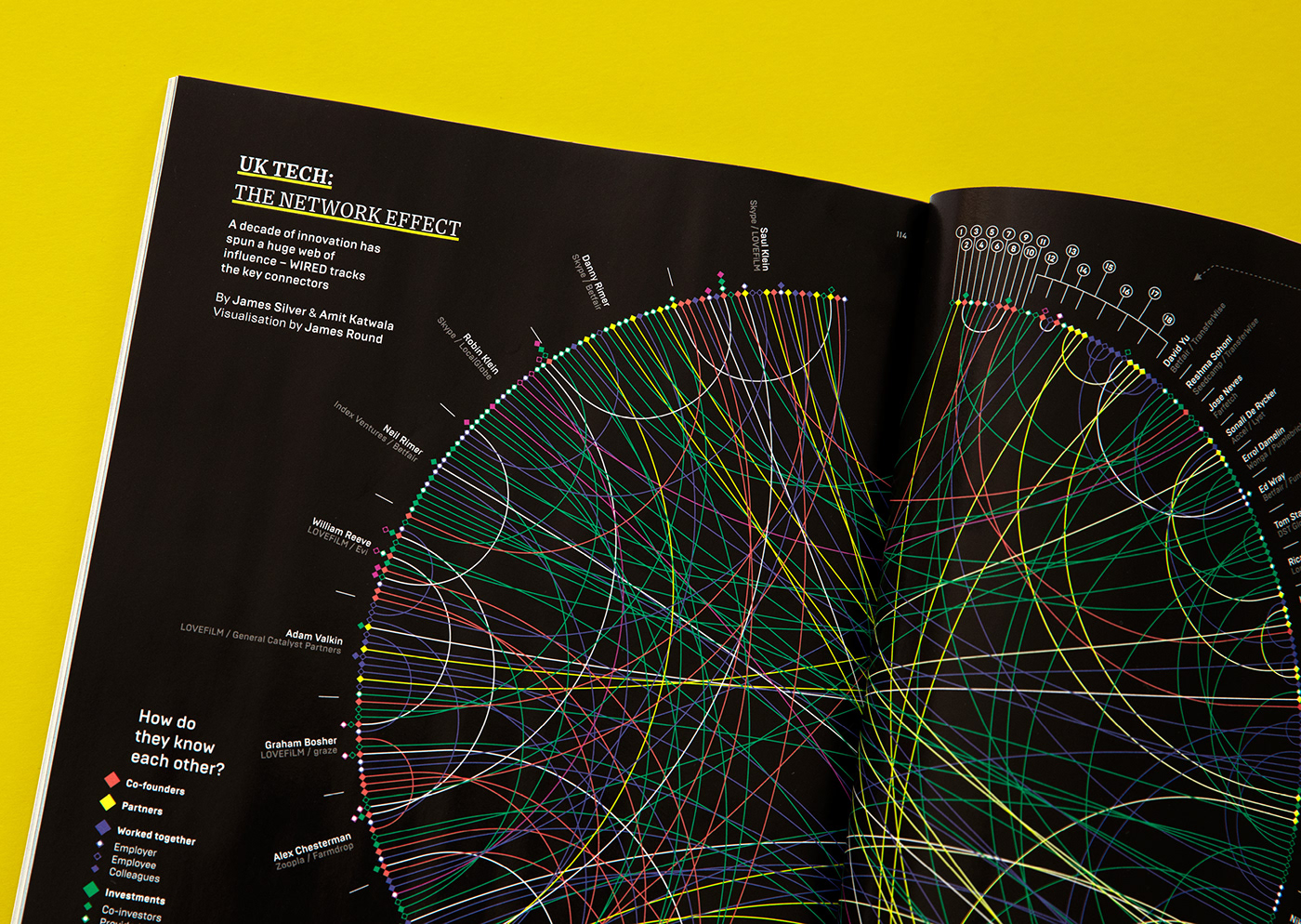
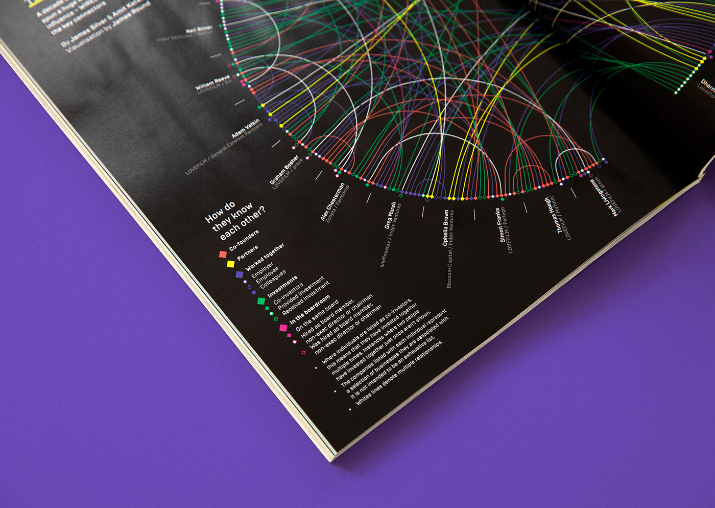
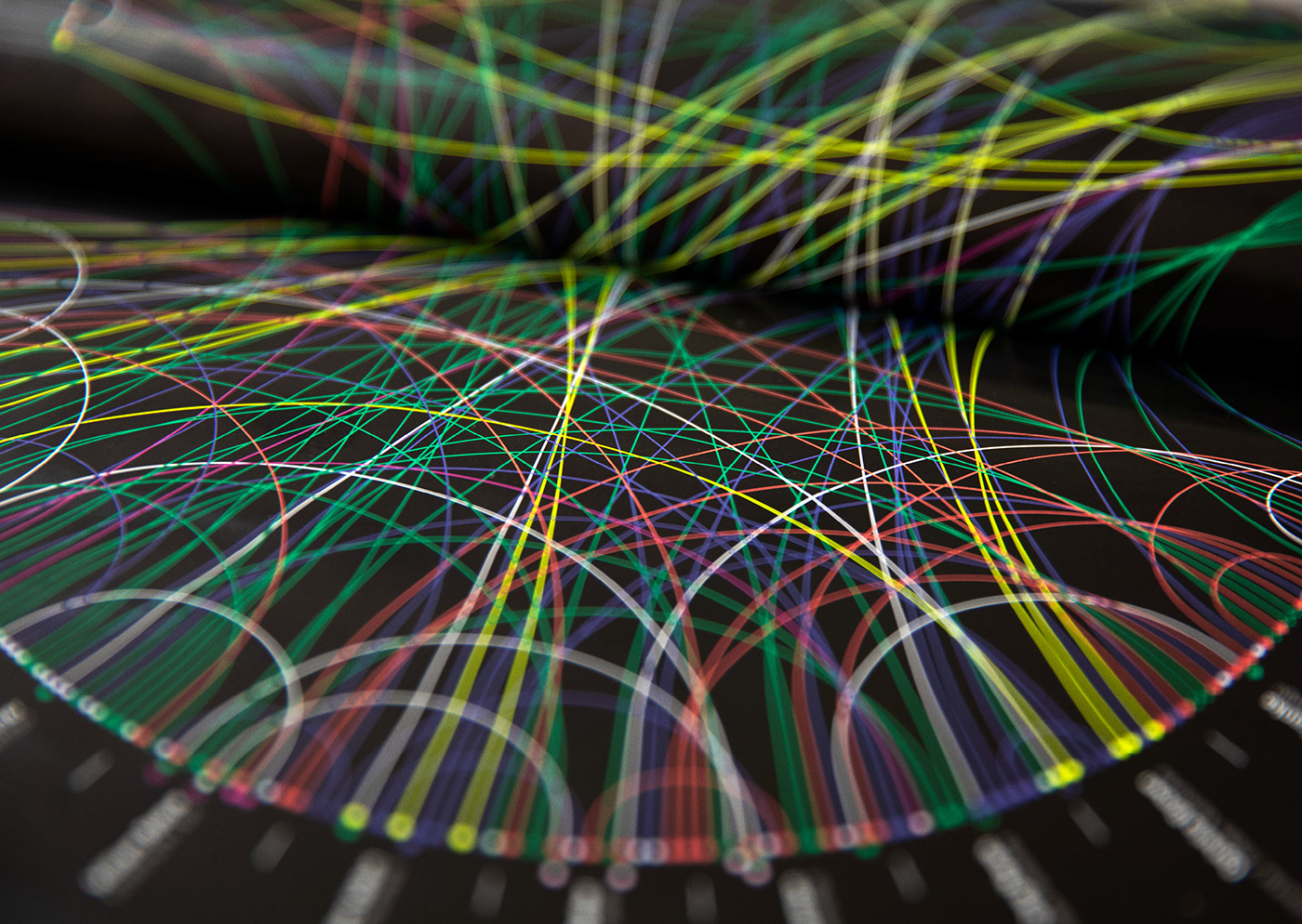
No. 5 / UK Tech: The Network Effect
Client: WIRED UK
A complex data visualization plotting the relationships between the biggest names in the UK tech scene.

Thanks for looking!