


Turn subtitles on: English & Portuguese
Fontes Humanas: Reserva’s new typographic voice.
Reserva’s brand speaks loud and clear in every touchpoint. There was only one missing element to make it unique: their fonts. There has been many rebrands in the fashion world recently, most of them choosing a simplified approach (especially in the logotype). The intention is to become more universal, but the result is too neutral and at times, insipid.
Reserva's fans and followers know for a fact that the brand speaks with a lot of personality. Neutrality is not at all part of its DNA. Rebelious and energetic is more like it. The issue, then, is how to make this attitude shine through the fonts it uses for communication.


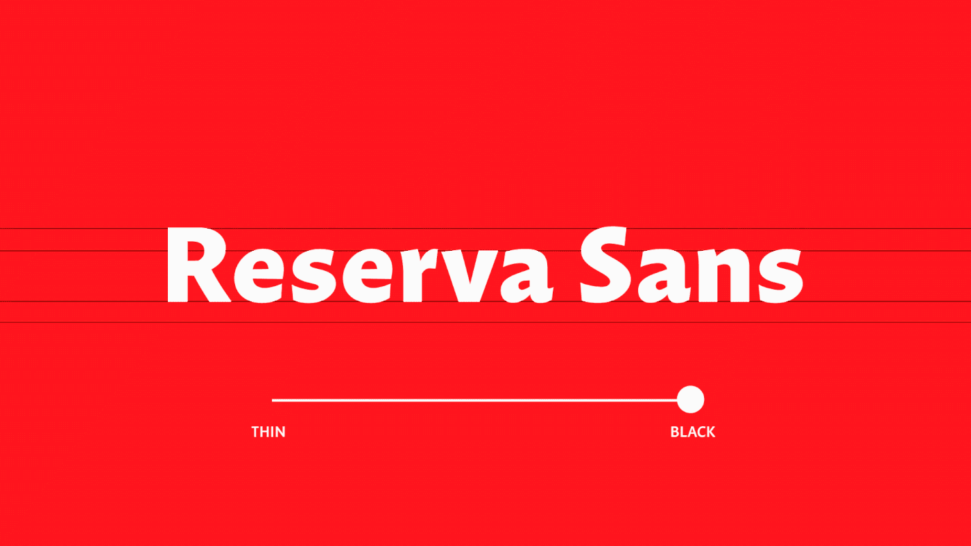
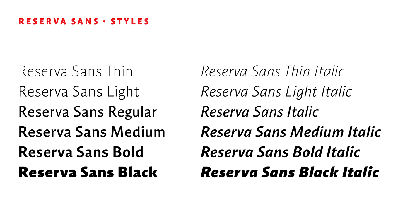
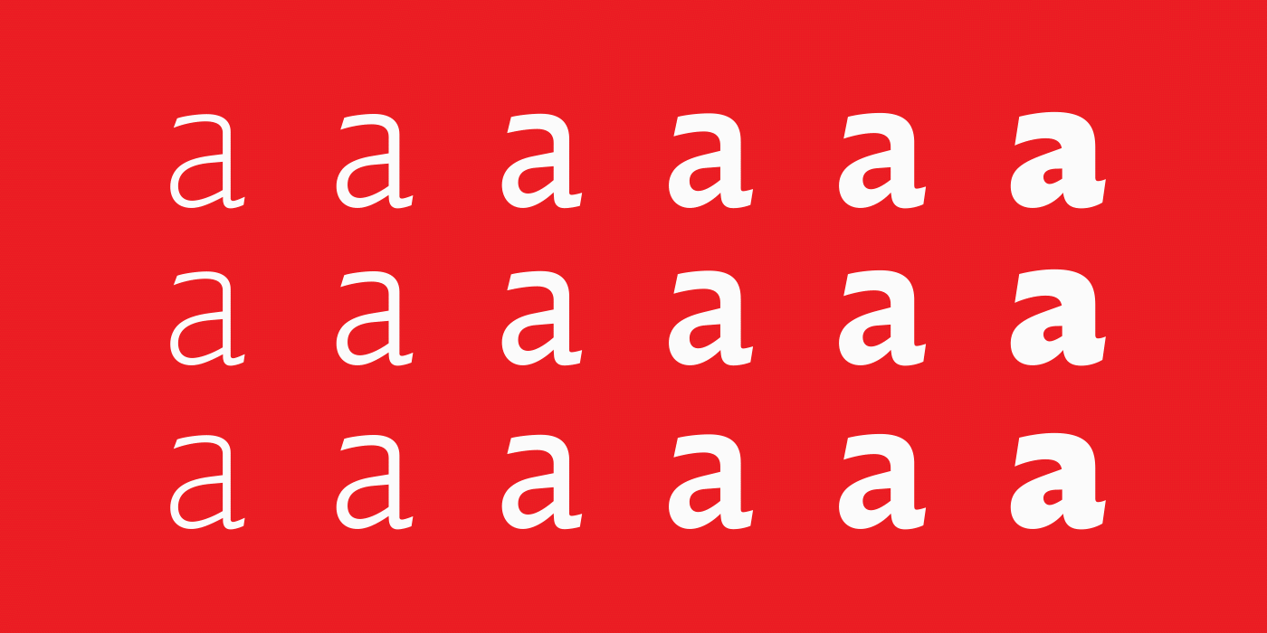
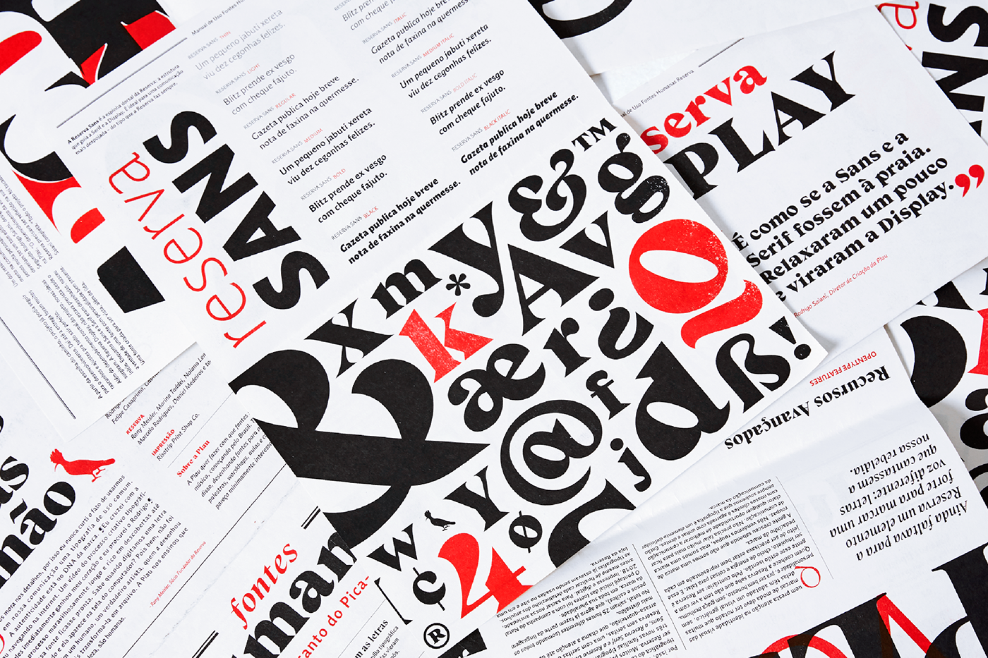
Reserva Sans
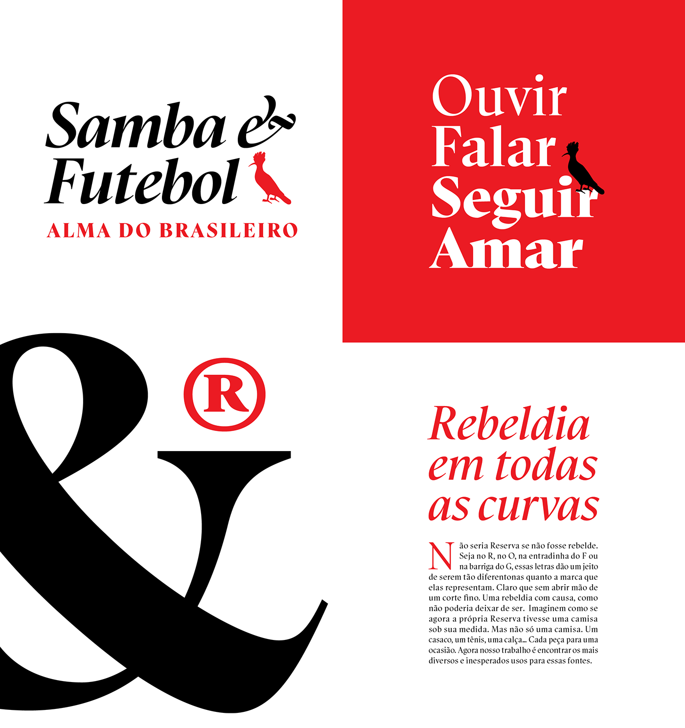
Reserva Sans is the backbone of the project; the ductus that guides the Serif and Display faces. It’s perfect for a straightforward and relaxed conversation — the right tone for the brand’s day-to-day communication.


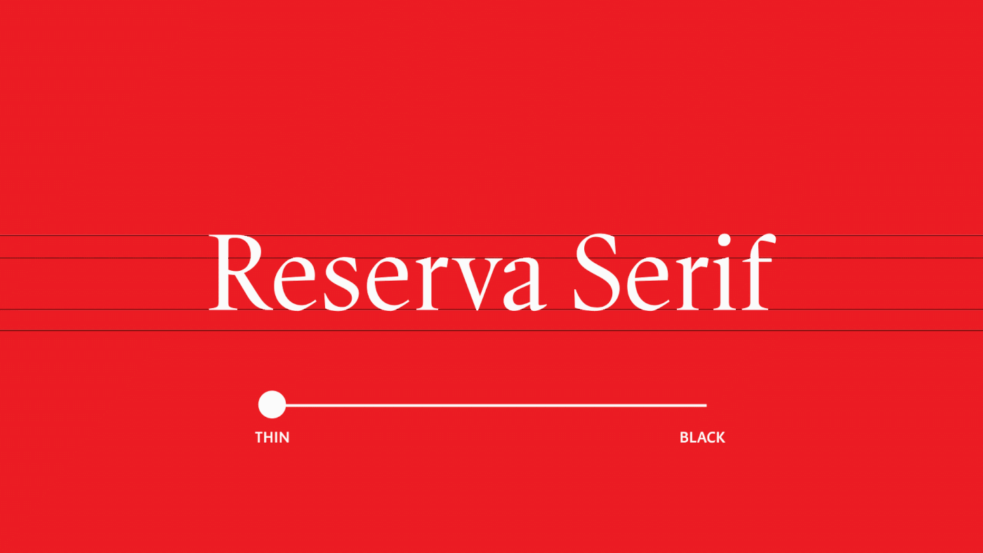
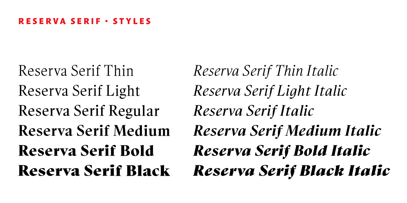
Reserva Serif
Even though serifs are usually associated with formality and seriouness, in the case of Reserva Serif, it can be just as fun as its Sans version. The serifs are thin, which means they are better for composing titles (from 18 points on). Also, the bolder it gets, the more personality it shows.

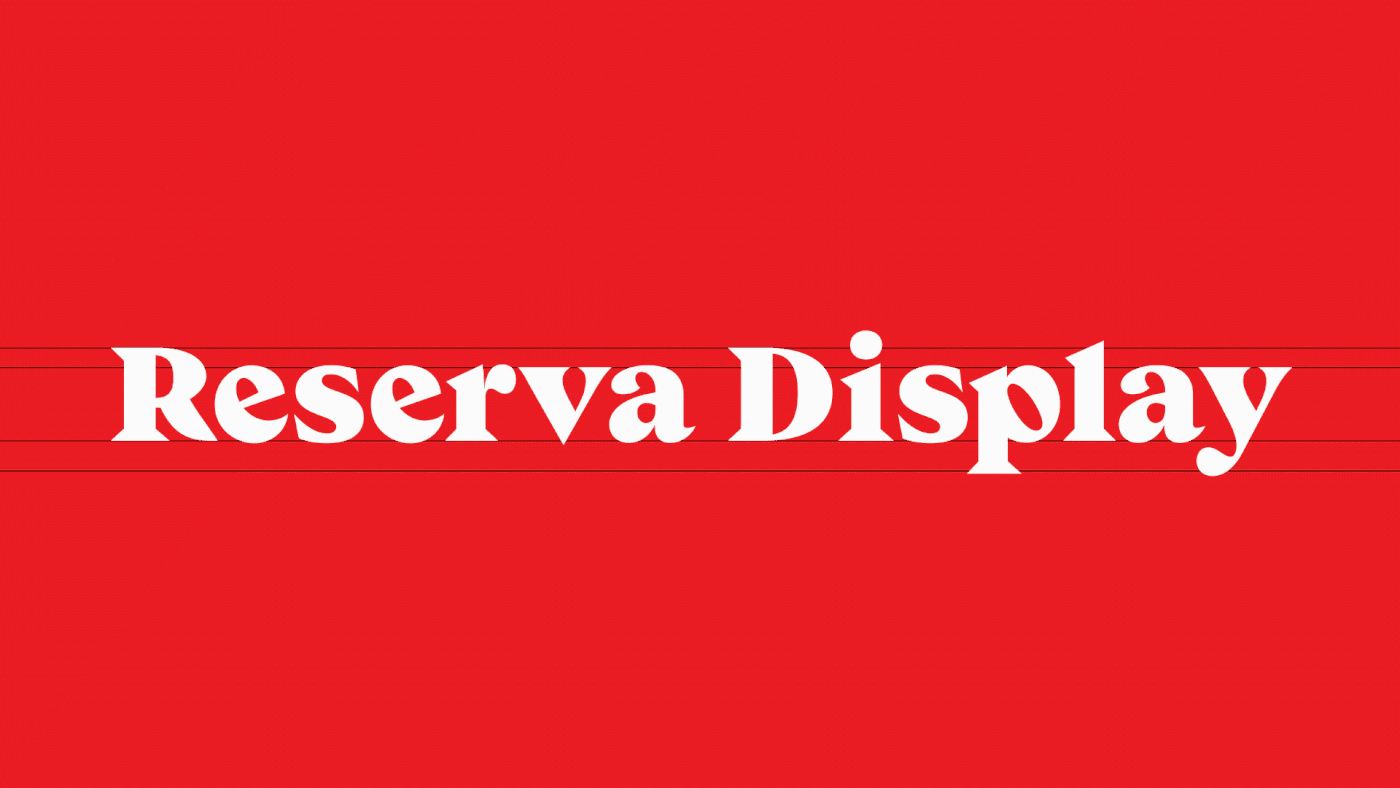
Reserva Display
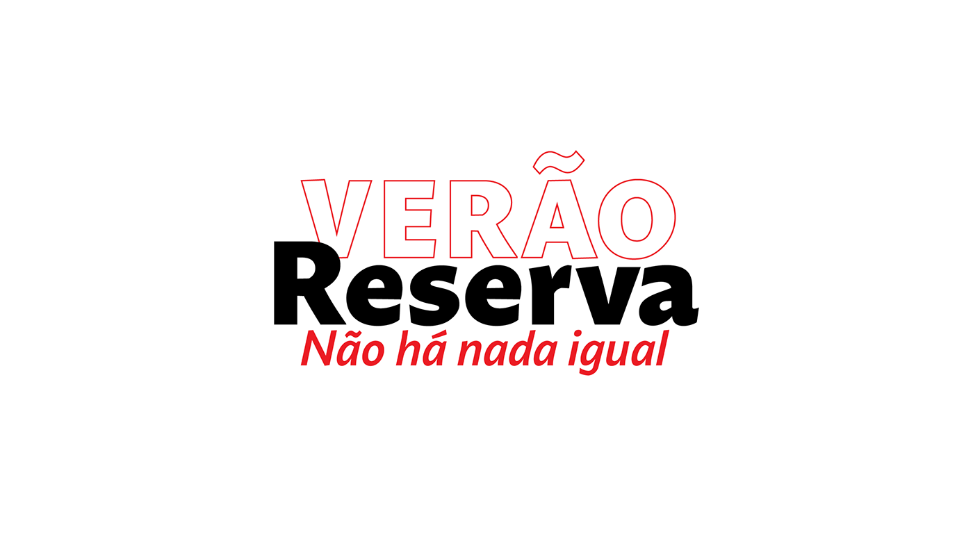
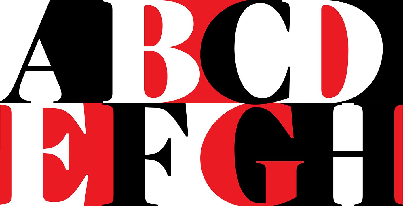
There are fonts to be read and fonts to be seen. Reserva Display is made to be seen: bold, quirky, expressive and a bit 70s, with different layers of personality if you set it all caps, lowercase of both. Reserva Display is like the Sans and Serif pair relaxed a bit and went to the beach. Loose, carefree and made for applications like block letters, shop windows and wherever impact is needed.


Applications
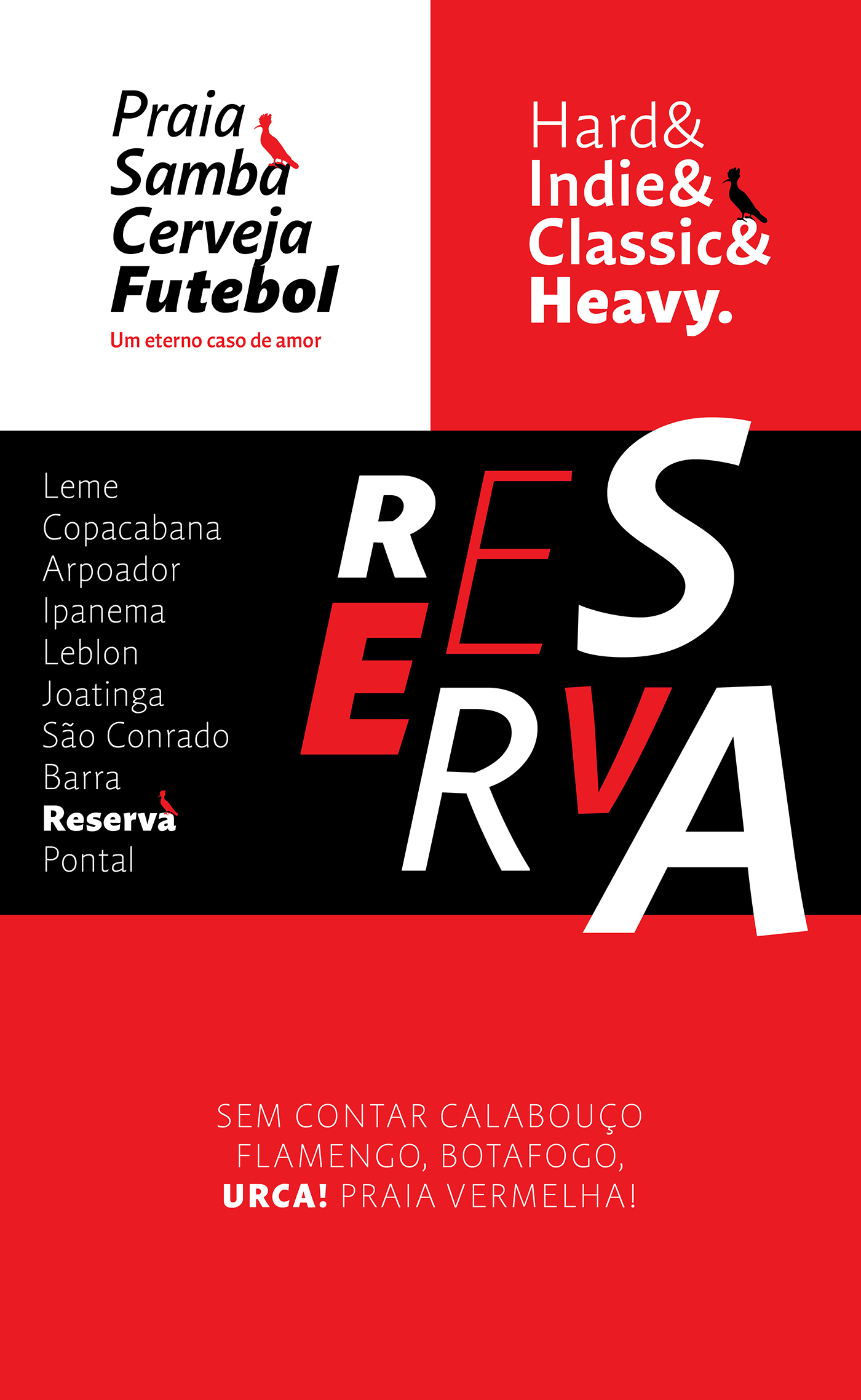
The letters began surfacing on everything Reserva touched, from motion design to storefronts and more, courtesy of the talent of Reserva’s design team.
Three typefaces, one typographic palette: legible, elegant and diverse. Versatile voices for a versatile brand.


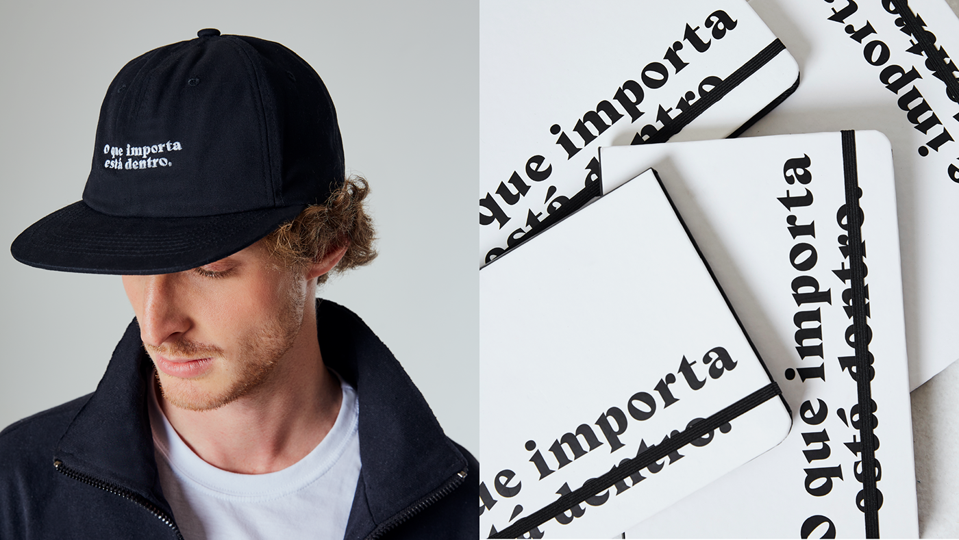
The collection
As a way to celebrate the launch of the new typefaces, Reserva designed a fashion collab with four pieces: T-shirt, Notebook, Tote bag and Sports Cap. We couldn't be more thrilled to see this collab hit their site, communication and stores!

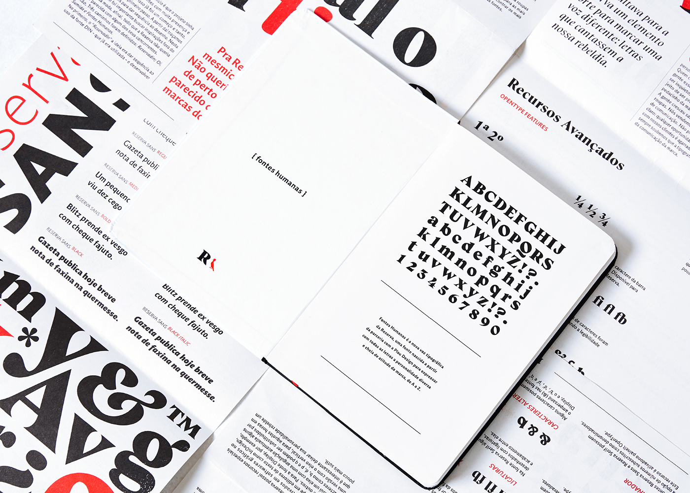
Handbook
We made a typographic manual to show the story and features behind the fonts.
Riso-printed in jet black and Red, the publication embraces the organic quirkiness of Riso.
Riso-printed in jet black and Red, the publication embraces the organic quirkiness of Riso.


Credits:
Copywriting
Rony Meisler, Rodrigo Saiani and Valter Costa
Type Design
Rodrigo Saiani
Editorial Design
Ana Laura Ferraz, Carlos Mignot and Gabriel Menezes
Graphic Design
Rodrigo Saiani, Lucas Campoi, Carlos Mignot, Ana Laura Ferraz, Felipe Casaprima, Gabriel Mesoma, Aline Caruso and Valter Costa
Photography
Marcelo Cavalcanti and Valter Costa
Motion & Video Editing
Carlos Mignot
Reserva Team
Rony Meisler, Marina Taddei, Naiana Lemos, Icaro Santos, Marcelo Rodrigues, Daniel Medeiros and all Reserva team
Printers
Risotrip Print Shop Co.


