Yacht 21 is a branding project that was done back in 2010 during my Advance Diploma years in
Design School.
Yacht 21 is a beach bar located in Palawan Beach, Sentosa Island, Singapore. It is known for its unique beer, wine, spirits and chill out avenue for people to unwind and rejuvenate their senses. It caters to services such as house parties, ladies nights, birthdays and the likes.
Yacht 21 is not only for relaxation, for tranquility, for inspiration for entertainment but for everything in between. It is a beach hideout where sun worshippers come out to play. Making memories, meeting people from all walks of life.

Logo
The company’s logo design uses logotype with a champagne glass symbol to replace the letter “Y”.
This is to give the company a unique identity that the target audience would easily remember and recognized. The design outlook depicts a laidback, calm and refreshing image of the company through the use of the corporate colors blue and light green

Letterhead

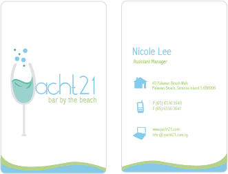
Company namecards designed in two colors.


Envelopes

Envelope template

Complimentary Slip

