Covers and Binding
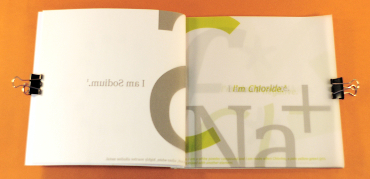
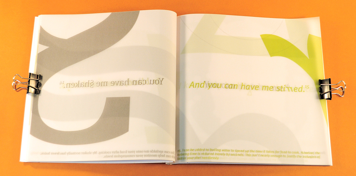
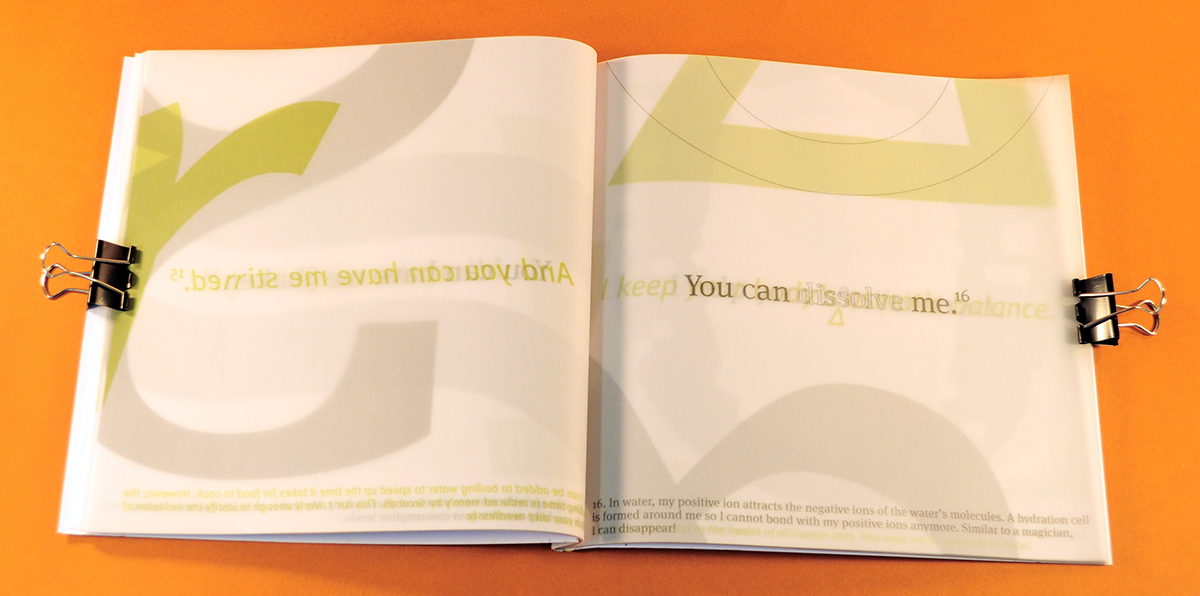
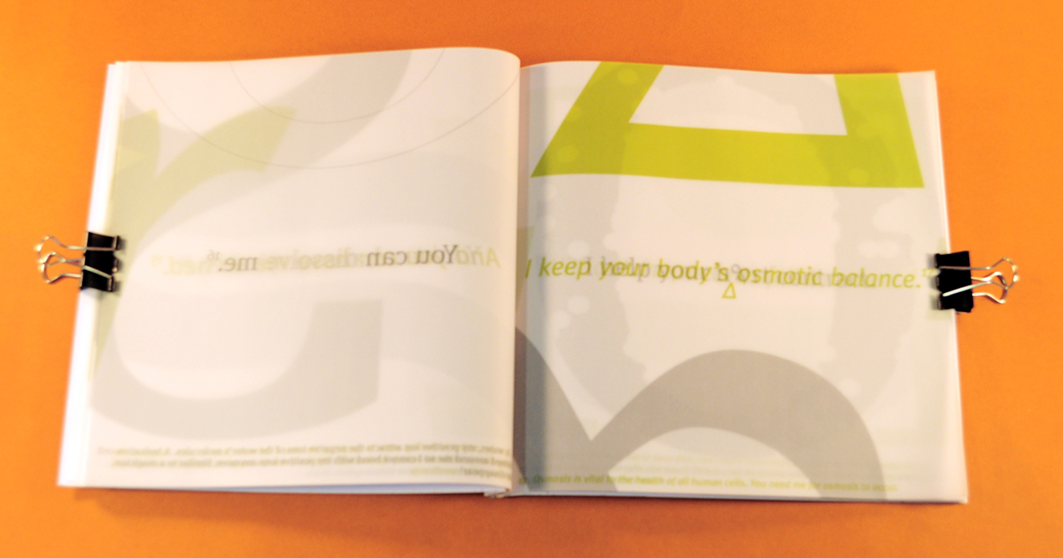
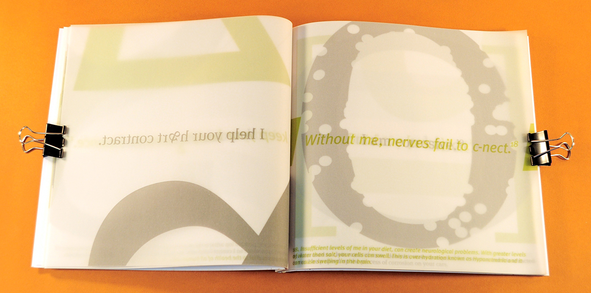
As the book is salt itself, the cover is a perfect bound bright white stock of 240gsm, with the ‘S’ cut out as it would be on a shaker.

Colour and Style
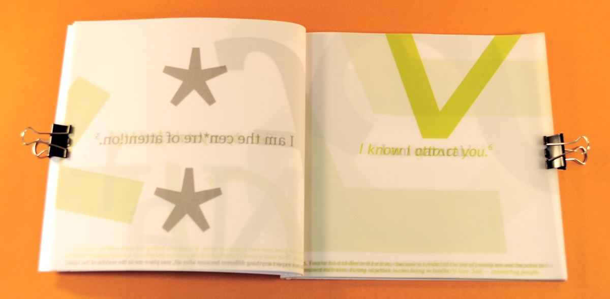
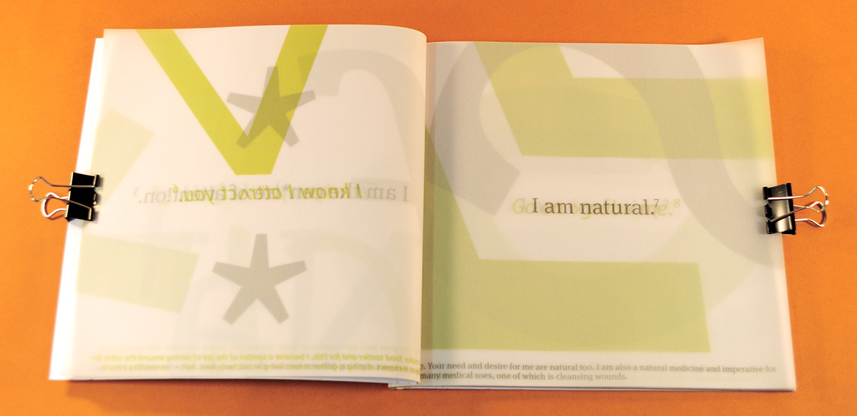
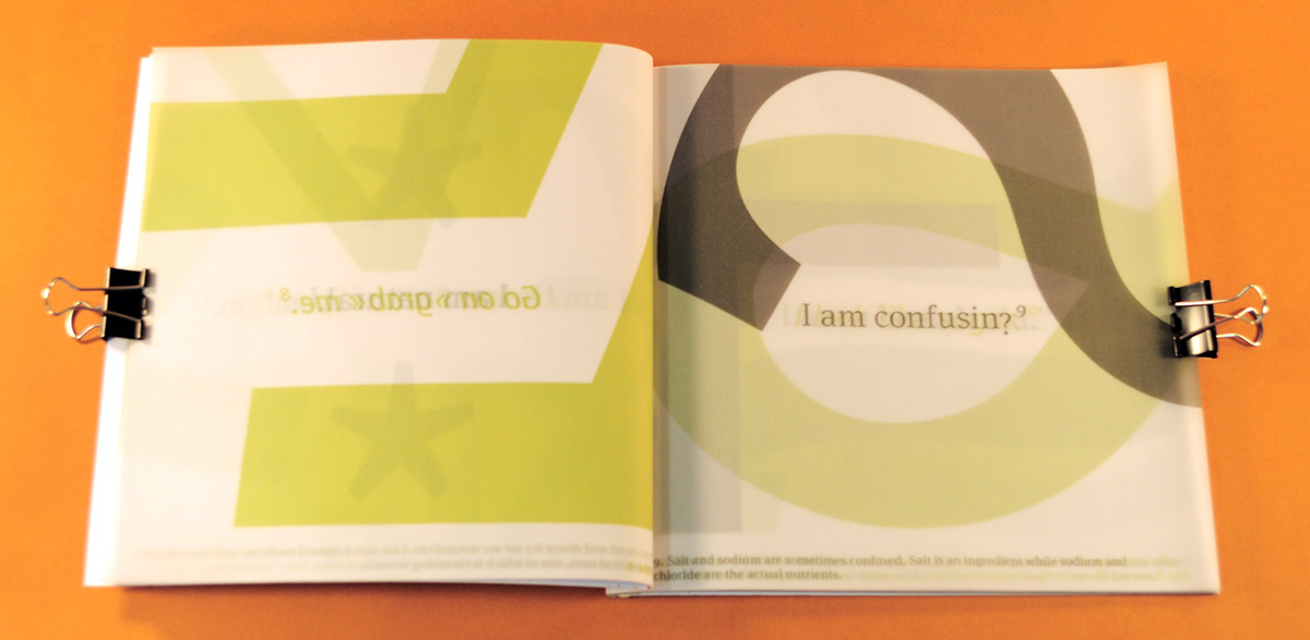
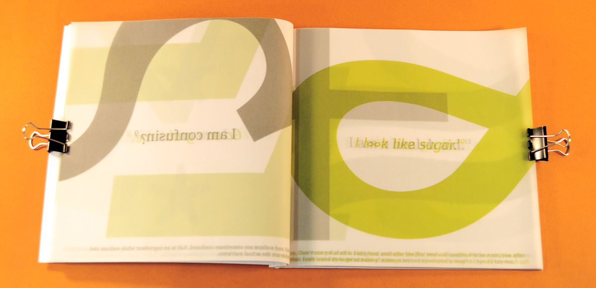
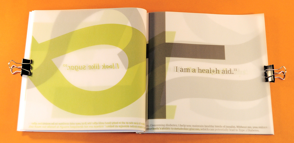
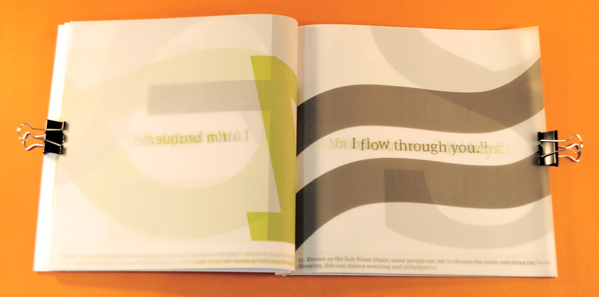
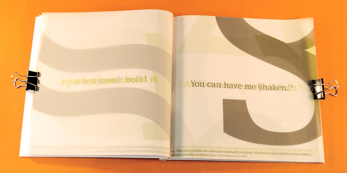
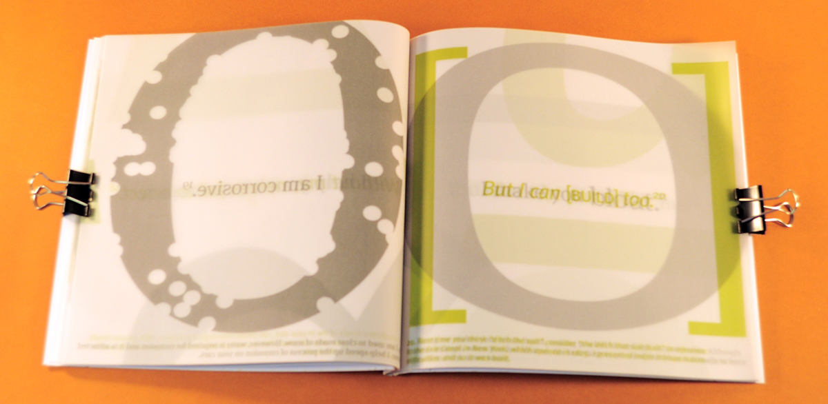
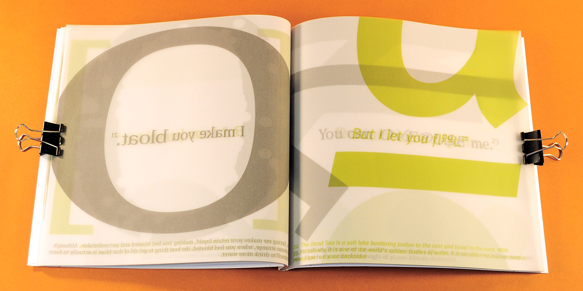
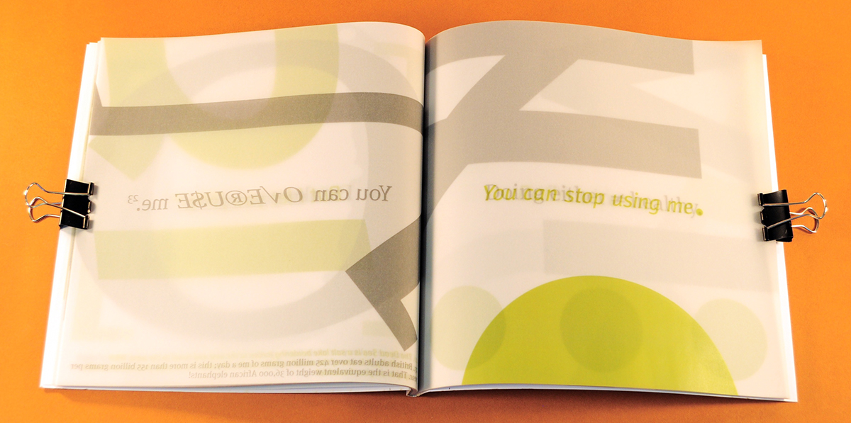
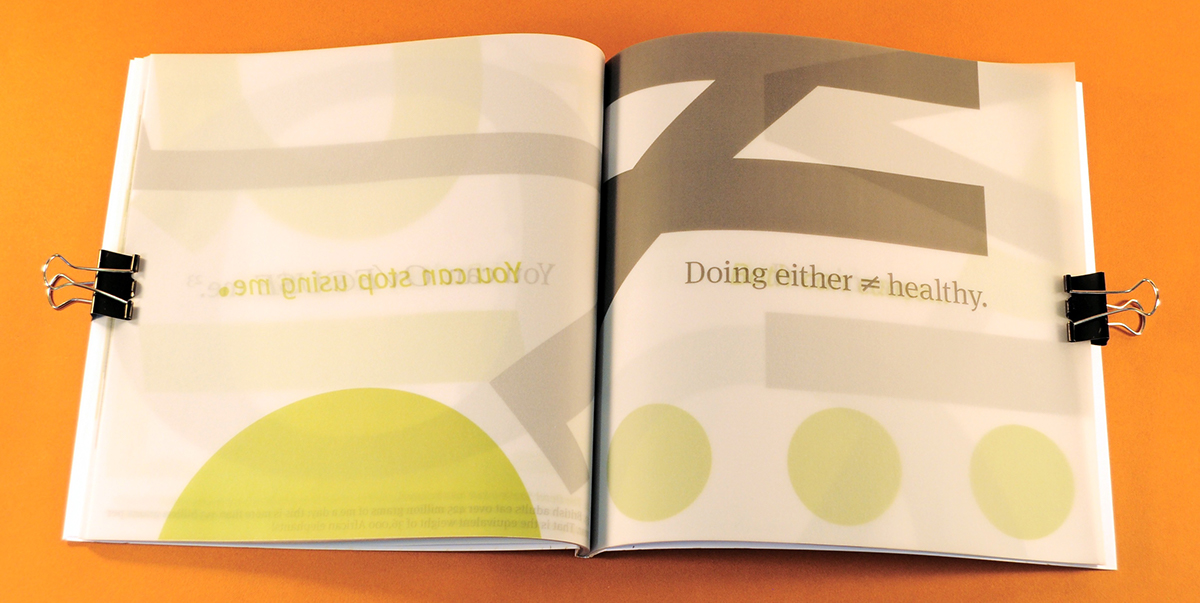
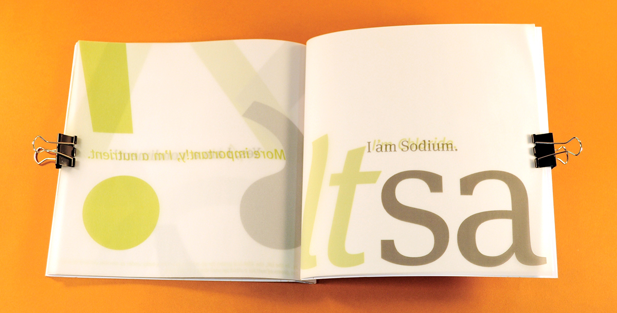
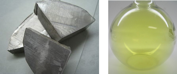
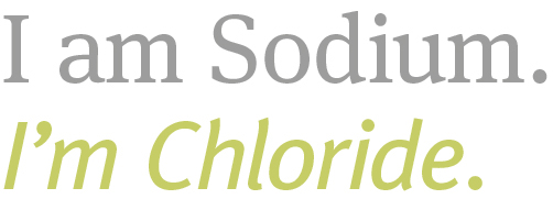
In its raw state, Sodium is a soft metal and Chloride originates from the green gas Chlorine. The Roman and Italic reflect these qualities as do the colours.
Typographic Choice
Like a font family, salt is made up more than one personality. The typeface for Sodium is Meta Serif Book Regular and Chloride is Meta Plus Book Italic. The tone of voice varies as Chloride abbreviates words and Sodium does not.

Echo Effect
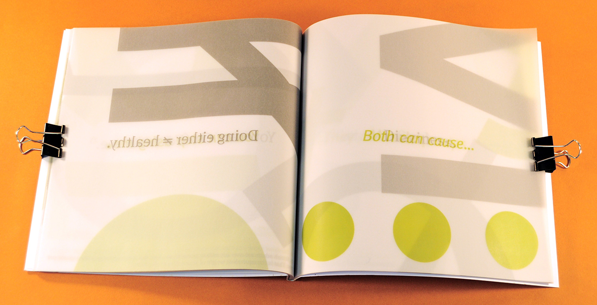
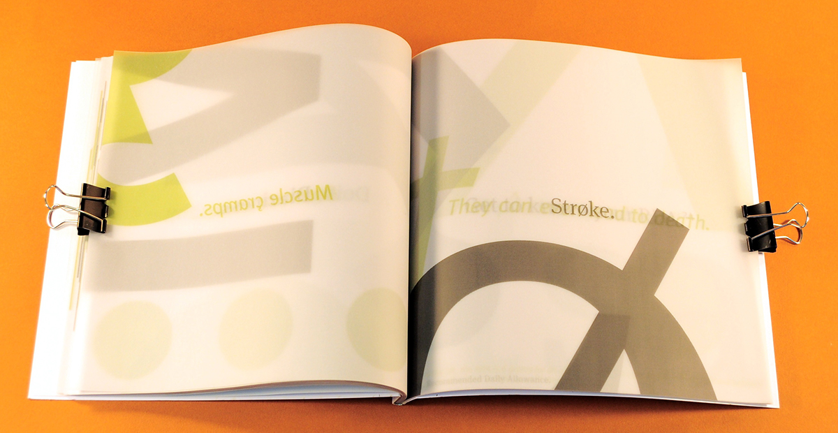
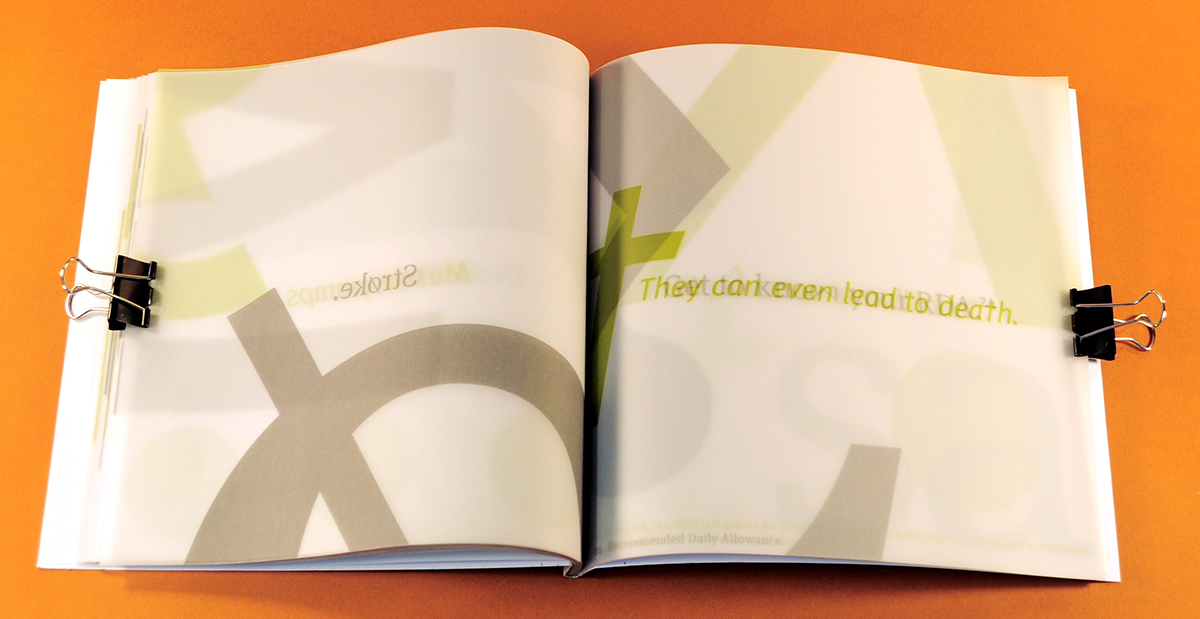
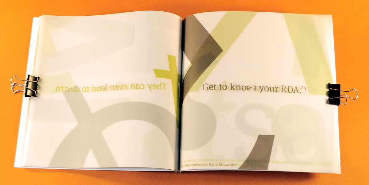
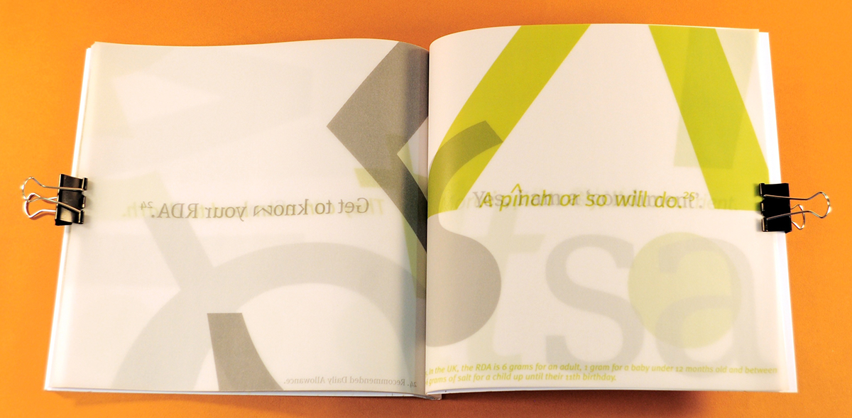
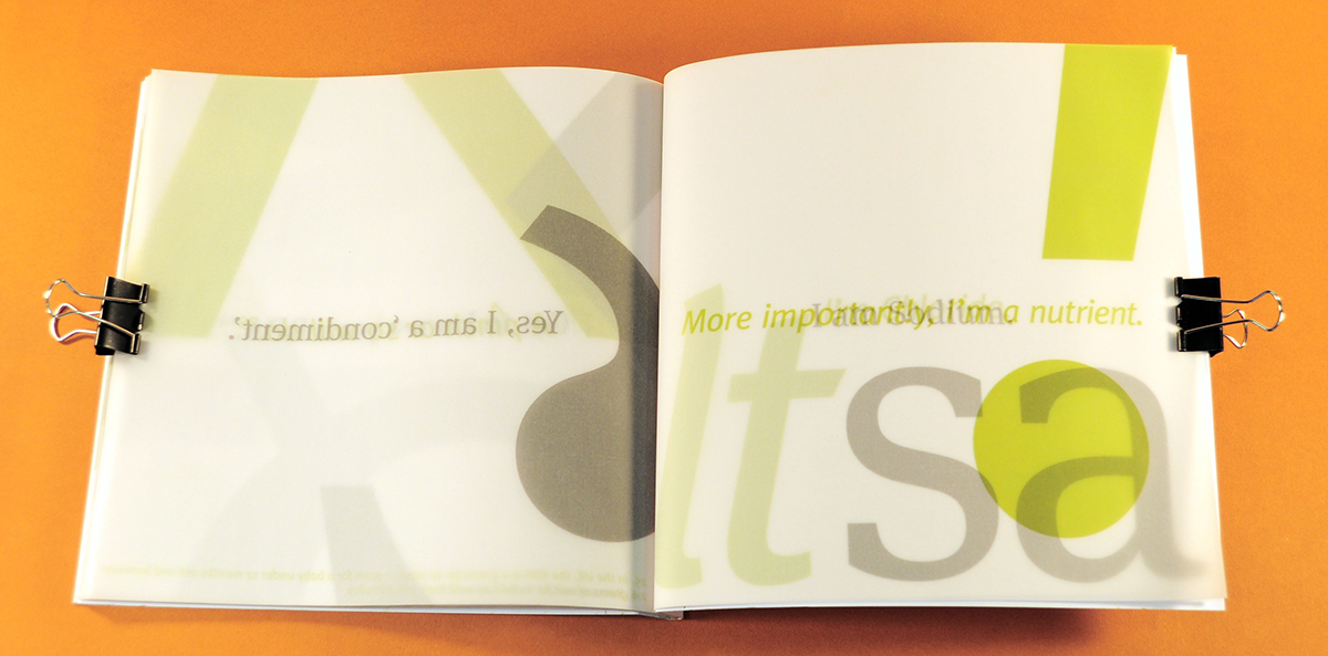
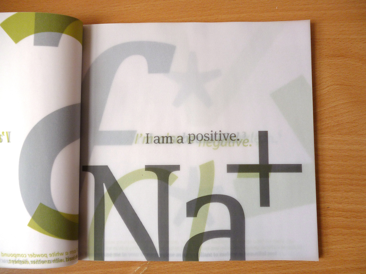
Tracing paper allows the voices to echo through the book, adding a greater sense of visual hierarchy to the piece – multiple pages can be seen at once, but the colour of the one being read is more prominent. It also enhances the sense of two voices lingering as they would in a person with several personalities.
Hierarchy
Scaling up key elements of each sentence provides further hierarchy to each page. Looking through the book, these elements give it more movement, like salt being shaken from the container. The pages read as Sodium, Chloride, Sodium, and so on to reflect the scientific name.
Footnotes
These are used to incorporate any interesting facts about salt that relate to the message. This informs the reader about other aspects of salt and aids in making the main content more memorable.