

Marque
The name is the expression of delight or amazement often used in gossip. It reflects amazing taste and the health aspect is emphasized by 'goodness'.

Colourscheme and Typeface
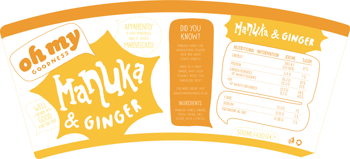
The unique selling point of the brand is the different exotic superfoods so the colours reflect this, making them the heroes of the designs. Using three tones adds hierarchy and it also expresses the range of volumes used when gossiping, be it a quiet whisper or a loud exclamation of excitement or amazement. The typeface used is Vermilion for its friendly, quirky and full of personality feel.


Truly Flavoursome Tubs
The burst flavour bubble reflects energy and excitement. A burst bubble represents truth or to be more precise, the act of revealing a truth. This emphasizes both the honest and the genuine characteristics of the brand.

Message in a Tub
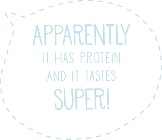
This fun little message confirms that it really is great in taste and reflects the thought of the consumer after having indulged the ice cream every time!

More Fun
Another fun detail is added to the barcode, making it another voice that confirms to the consumer that what they are about to enjoy will make them feel good. It is also cheeky in reference to the scan feeling good!
This fun little message confirms that it really is great in
taste and reflects the thought of the consumer after
having indulged the ice cream every time!

Baobab and Vanilla


Acai and Chocolate


Spirulina and Mint


Manuka and Ginger


Online Goodness
The website layout is also dominated by the superfoods themselves. The logo and navigation remain static on the bottom and change colour in harmony with the flavour that scrolls into view from the right.
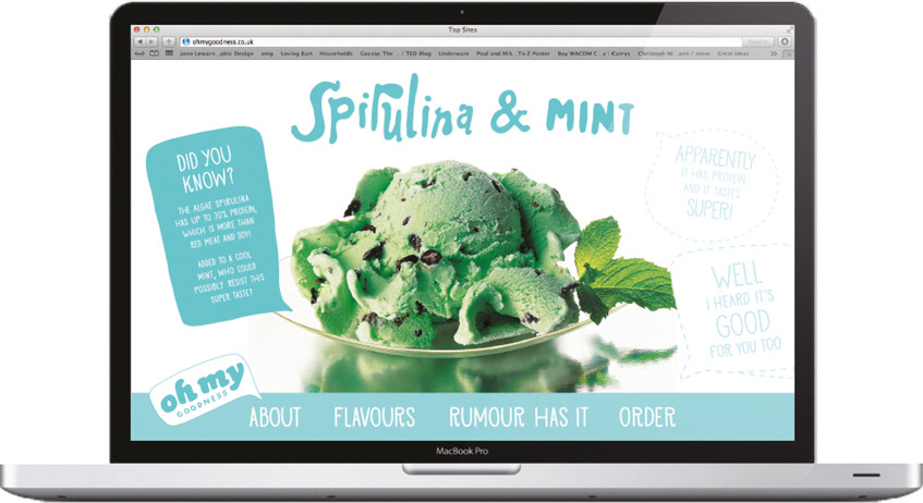
Image courtesy of: http://www.swarthoutimages.com

Image courtesy of: Christina Austin and BuffyandGeorge.com
available at http://buffyandgeorge.com/blueberry-maple-ice-cream


