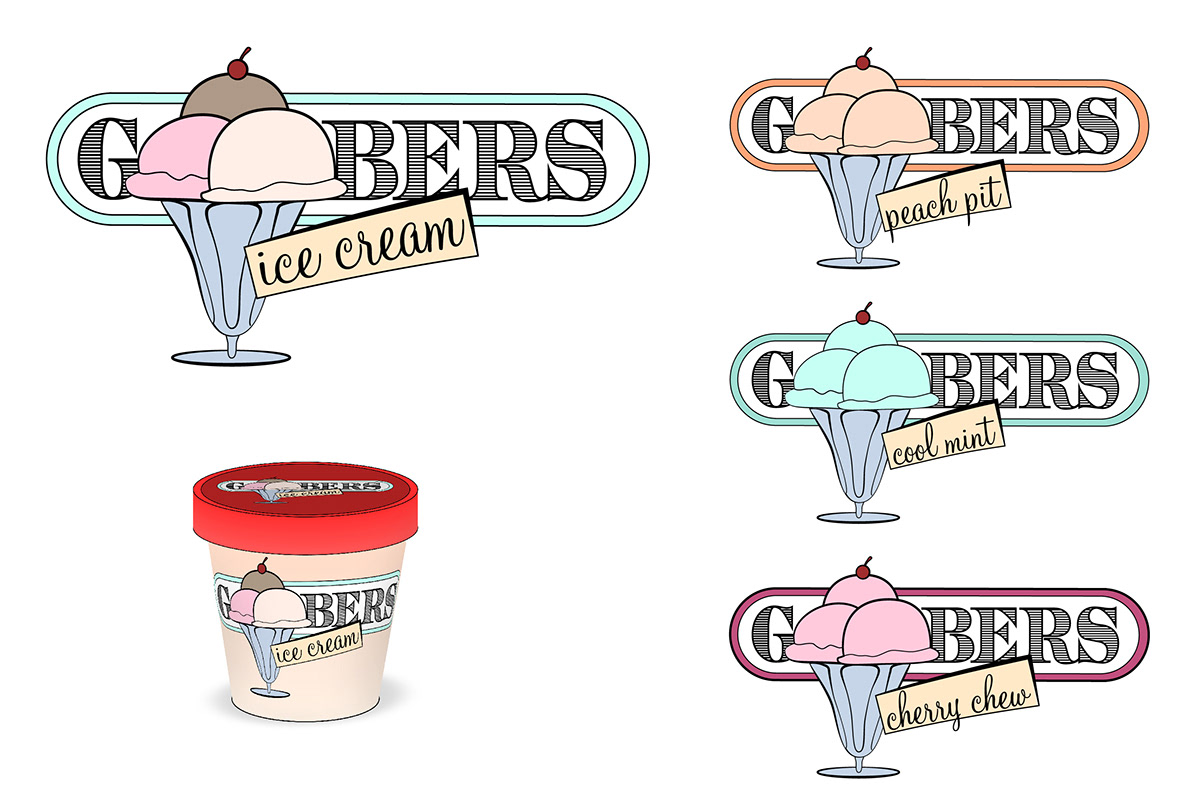
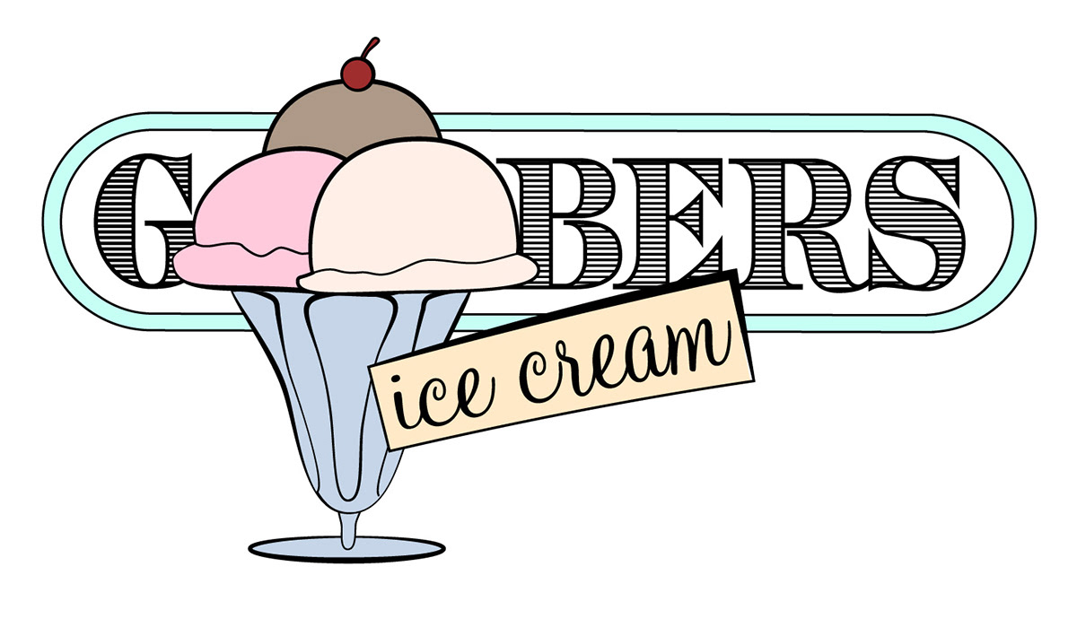
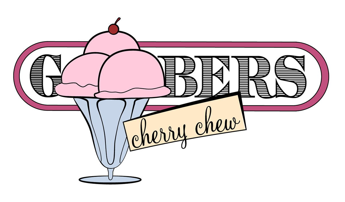
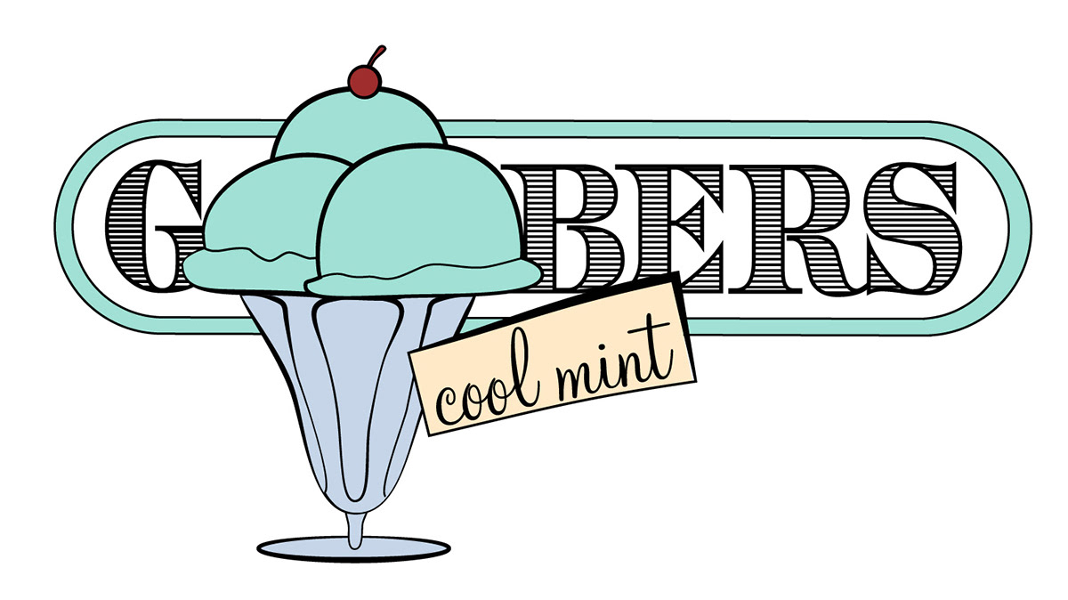
Goober's Ice Cream
This identity was designed as part of a design history class. The objectives were to create an identiy for an ice cream company using the industrial period styles in order to reflect a sense of quality and history. I combined the layering methods and points of 'breaking out' to generate depth, an etched typeface to further reference the period, and colors and shapes referencing the 50's and 60's to reference the fun of ice cream.