

Redesign of German-based solar energy company Solon SE. The main goal was to establish a clear image language and brand hierarchy, using a color system to identify the different business fields of the company. The iconic shape of the logo informed the design system.
Logo Redesign, adjusting Proportions & Typography

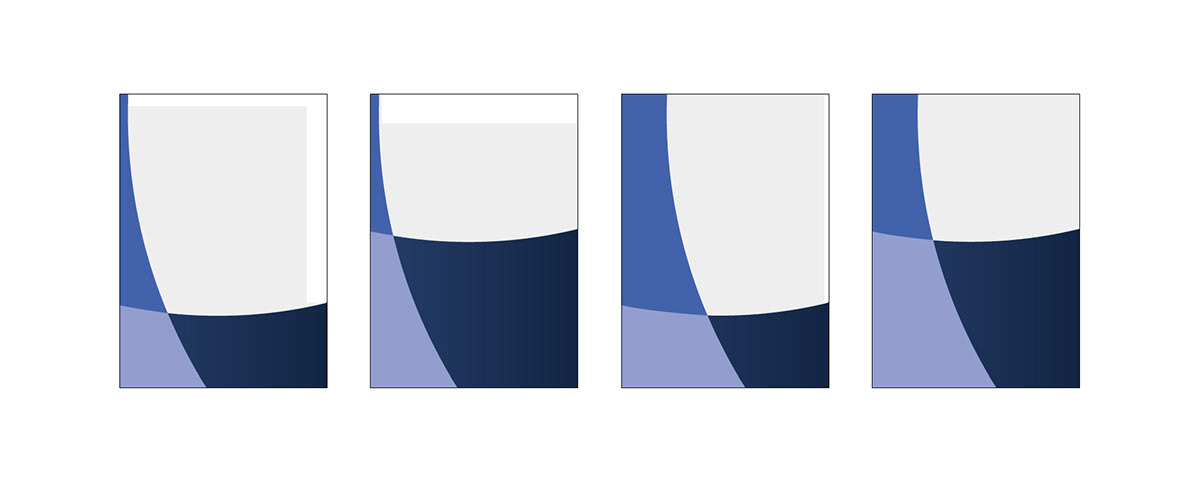
Image Language & Color Matrix defined by the four Brand Values

Color Matrix

Close up of the new Logo & Claim

Sales Brochures using the flexible Design System


Website

Client: Solon SE
Agency: MetaDesign
Creative Director: Thomas Klein
Senior Designer: Philippe Intraligi
Agency: MetaDesign
Creative Director: Thomas Klein
Senior Designer: Philippe Intraligi


