
Let’s imagine the world of convenient components that works properly in every environment. Browser, mobile and etc. A kit of components which you only have to deploy and enjoy. No issues, bugfixes, routine or specifications mismatch. That's the ultimate product we’re aimed to. A kit of React components that works as it should in every possible case. Where every little design detail is under attention and control. Today we’d like to showcase you a Section of Inputs.
Your team deserves better components
If you wish to accelerate your development process, take a look at Setproduct Material-UI theme. The biggest collection of robust ReactJS components that saves months for your devs team. Take a look!
What’s new and customized
1️⃣ Improved smooth micro-interactions for better Inputs performance. Based on Fade effects with proper timings for onHover, onFocus, onKeyPressed and other events
2️⃣ Variety of styles to fit better for serious and complicated desktop interfaces where saving space is a must: Filled, Outlined and Dense inputs are available
3️⃣ More new statuses were added, such as Validated input and DataEntered. The last helps the user to recognize the number of inputs which are already filled with data previously (more explanation and details below)
4️⃣ Clear from data feature. You can use icon-supported style to remove entered data within a single click.
TL/DR
Don’t wanna read? OKAY, then watch:
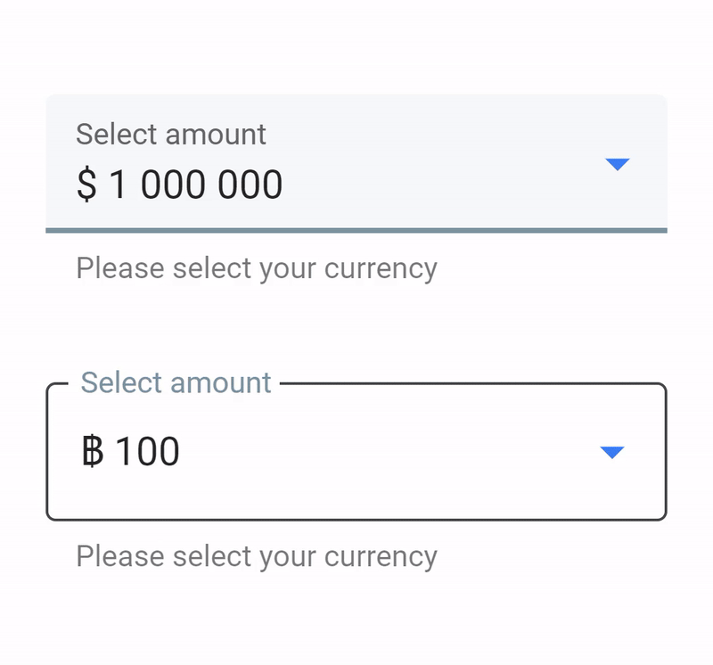
Filled Inputs
By default, it’s recommended to use for mobile and desktop interfaces. While mouse pointer is hovered placeholder text and underline toggles highlighted with primary Blue color. After focusing the bottom line appears from left to right direction and become bolder and intense. We’ve retouched some of the details according to our design vision.

Outline Inputs
A kind of elegant and feather inputs. We set the border animation smoother than by default. Moreover, a new custom style was added — outline inputs where’s the caption always fixed. Because observing it in some cases is important for a user while filling forms.

Dense Inputs
We’ve aimed to provide more components to build serious web applications, that’s why dense style is required as well to save desktop space. You’re free to pick and choose between Filled and Outlined.


Dropdowns
Mostly are defaults, but we’ve highlighted the popover within a gradient and reflex shadow. And it’s easy to set a new color for the both of it.
Search
Of course, we want to have all the components on hand as many as possible. There are a few custom styles for Search components and it’s ready for production. Comes served with some microinteractions.

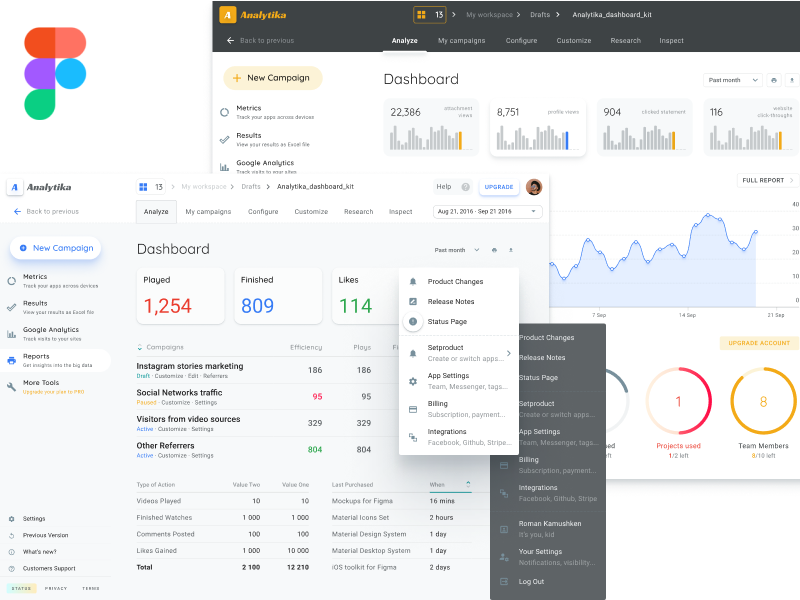
Figma Design source files
In the final package, there are high-quality Figma design sources included. Made as design components, the content of design files absolutely matches to CSS styles we’re providing for Material-UI React theme. This design kit comes powered by defaults, so we recommend to set just your own colors and fonts and you’re ready to go.
Check out the Demo (for preview purposes only)
Groups
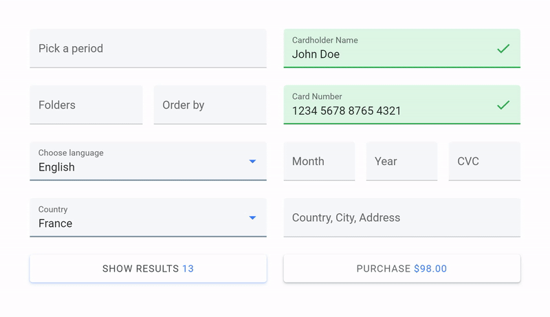
Inputs groups are provided for representing the data entering flow. And it also accelerates the process being crafted into Material Desktop Grid. You can see here how inputs with data entered became marked with more intense fill. This is a new custom statement for the cases when you’re going to fill a lot.
DataEntered custom style
When the data is entered each input is checking for content and keeps highlighted, if true. This is how DataEntered style appears for better recognition of Text Field which contains at least one symbol entered. Thus you can recognize faster the number of Inputs you’ve already passed through.

Thanks for reading this
Are you ready for a better web application?
Take a look at Setproduct ReactJS theme, if so…
👏👏👏


