

Spawnpoint Selection
Screen Redesign
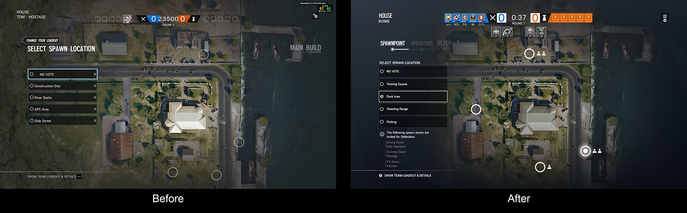
I redesigned part of the Spawn Point Selection Screen to improve the information we show the player when they interact with this screen.
In the original version, the only information shown to the player was the spawn point location.
When redesigning it we enhanced the information that players recieve (as long as the visual appearance) so they can make a better decision in this step of the flow of the game.
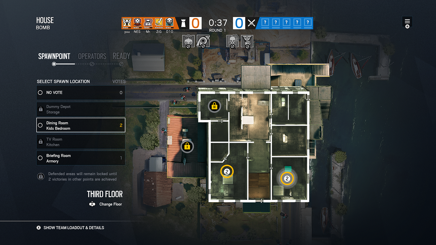
Spawn point selection redesign
Here are some examples of the many iterations the locked icons went through.
They needed to show the number of rounds that those elements would remain locked, and it needed to be easy to read both for PC players that sit close to their screen, than to console players that play from a screen a couple meters away.

Lock iterations

Different lock states
To comply with my non-disclosure agreement, I have omitted and obfuscated confidential information in this project. All information shared is my own and does not necessarily reflect the views of Ubisoft.


