Autea
Logo, Visual Identity, Print Design, Web Design
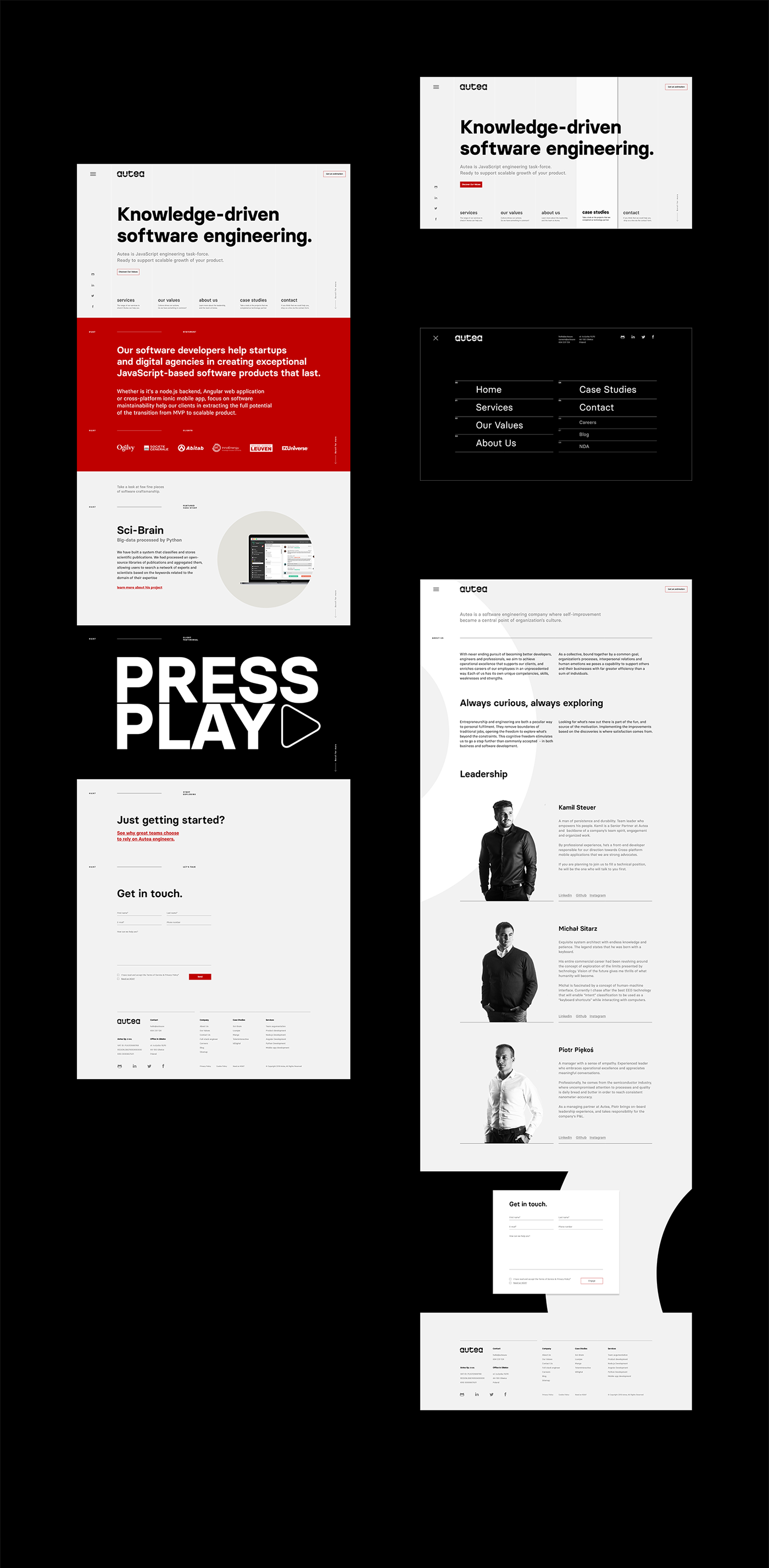
Autea is a software engineering company where self-improvement became a central
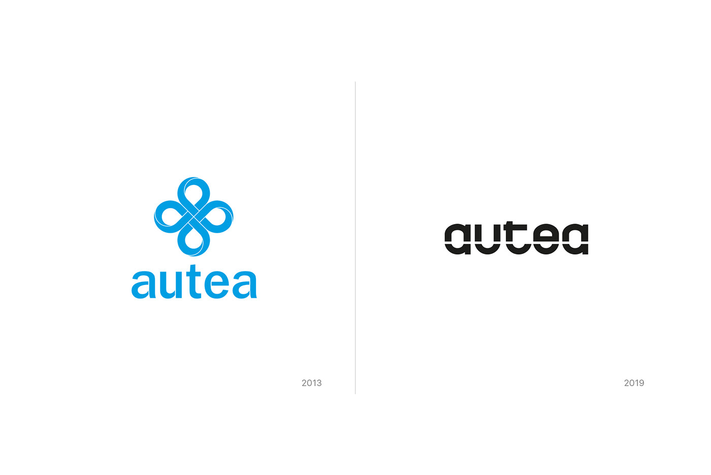
point of the organization's culture. The first visual identity emphasized the company's origin, which was strongly associated with the behavioral therapy of autistic children.
point of the organization's culture. The first visual identity emphasized the company's origin, which was strongly associated with the behavioral therapy of autistic children.
The scope and profile of the services provided, however, has evolved all the time and as a result, after a few years, the company has evolved into a software house providing scalable solutions for technological start-ups, as well as big data and AI solutions.
It was for this reason that there was a need for a thorough rebranding. One that would assume a complete change and build from scratch a new identity, allowing the right way to communicate a new range of services, as well as new goals and ambitions.
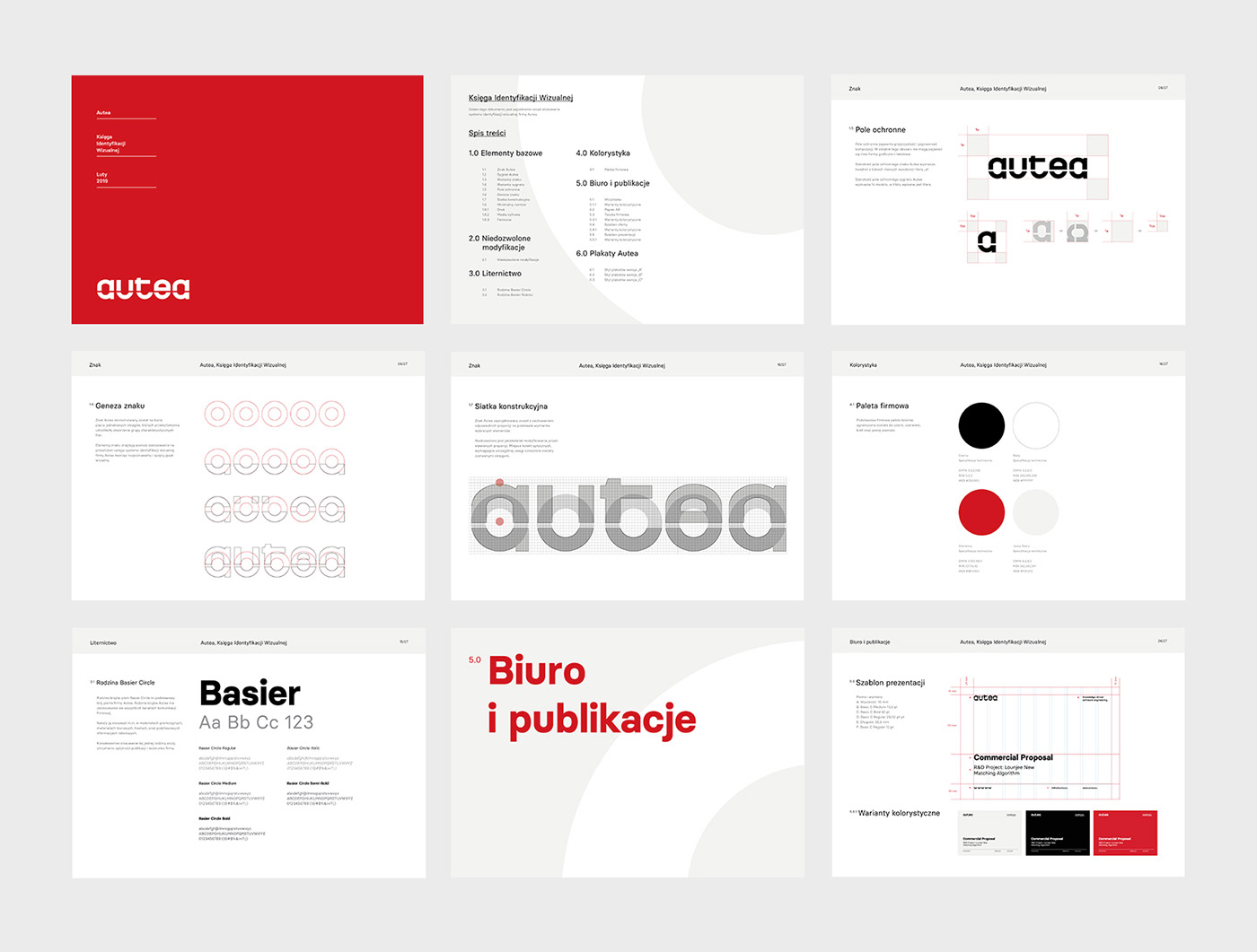
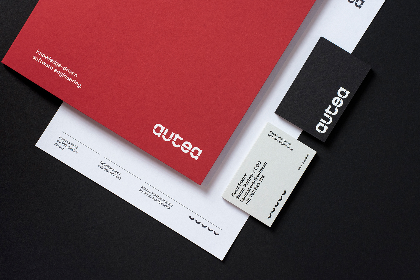
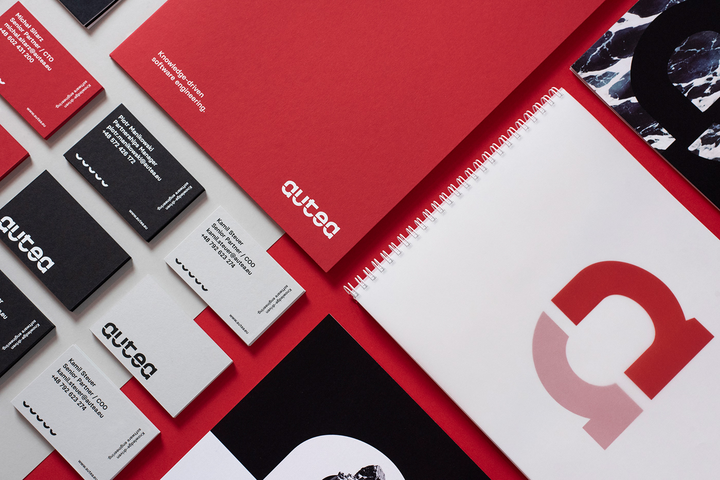
The Autea sign was constructed on the basis of five identical circles, whose transformations made it possible to create a group of five homogeneous letters.
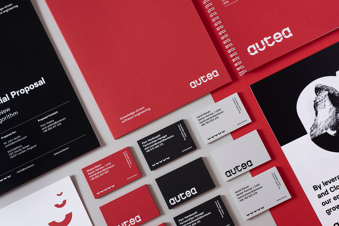
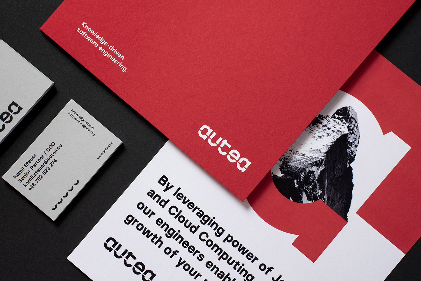
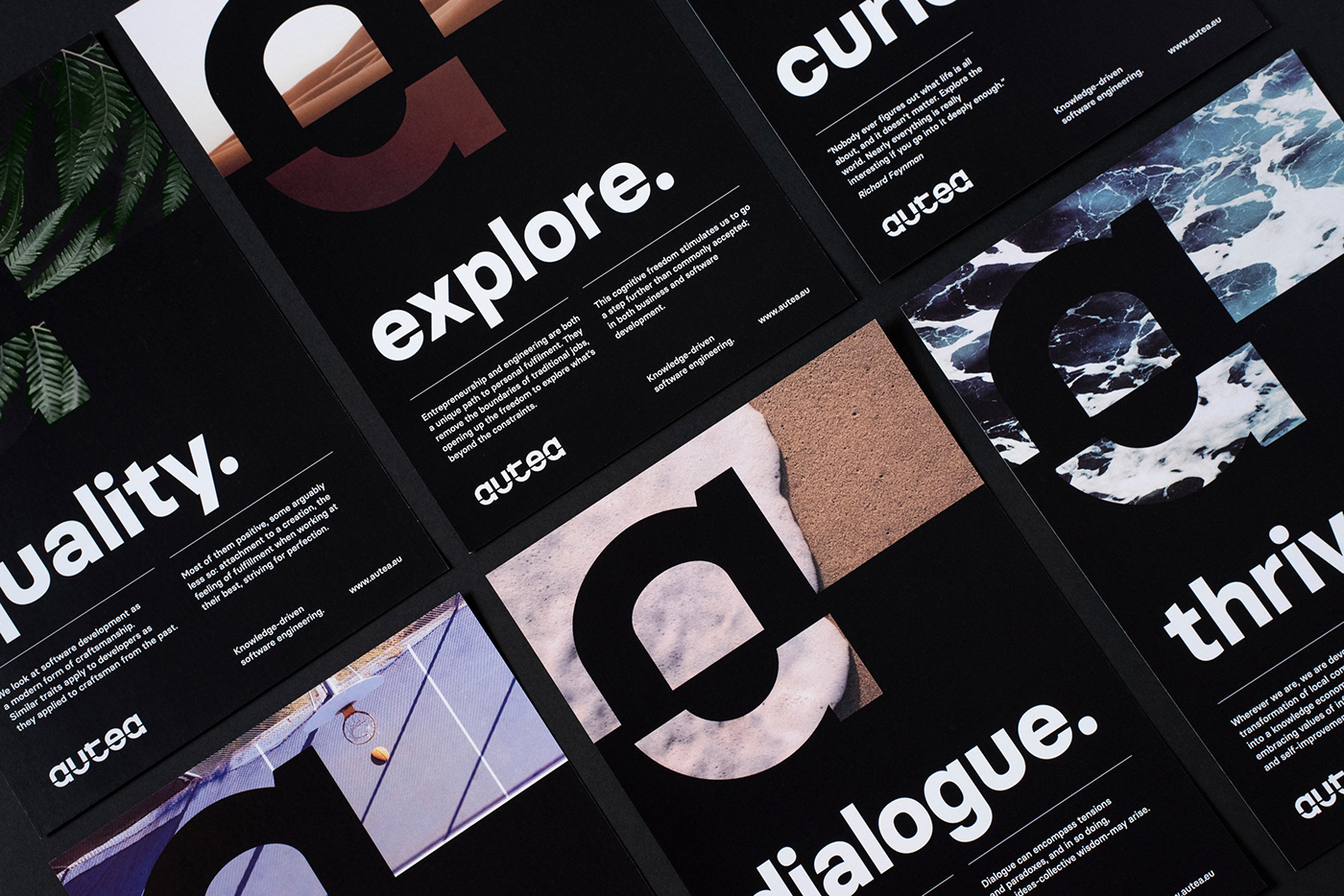
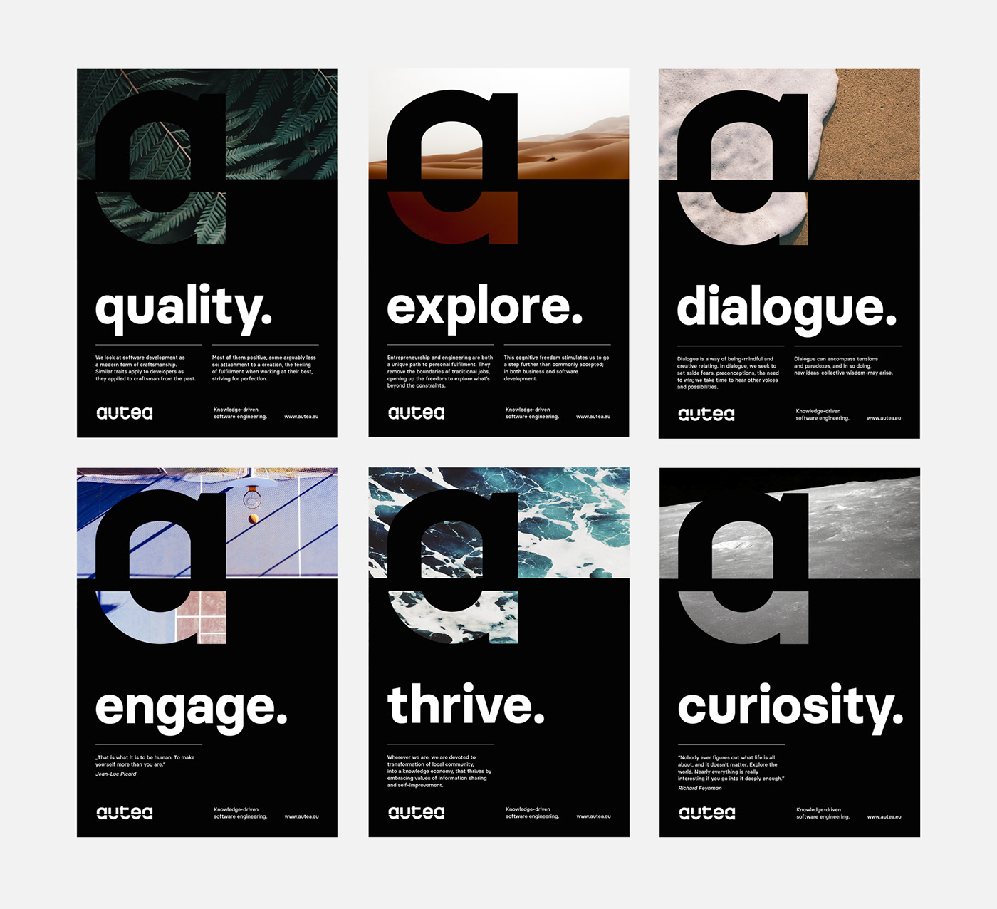
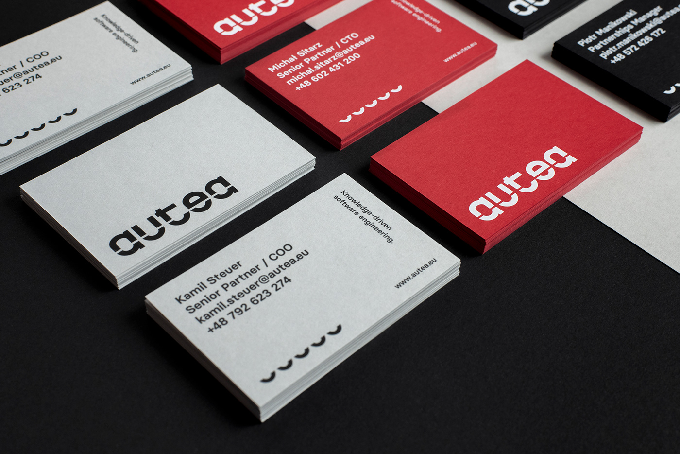
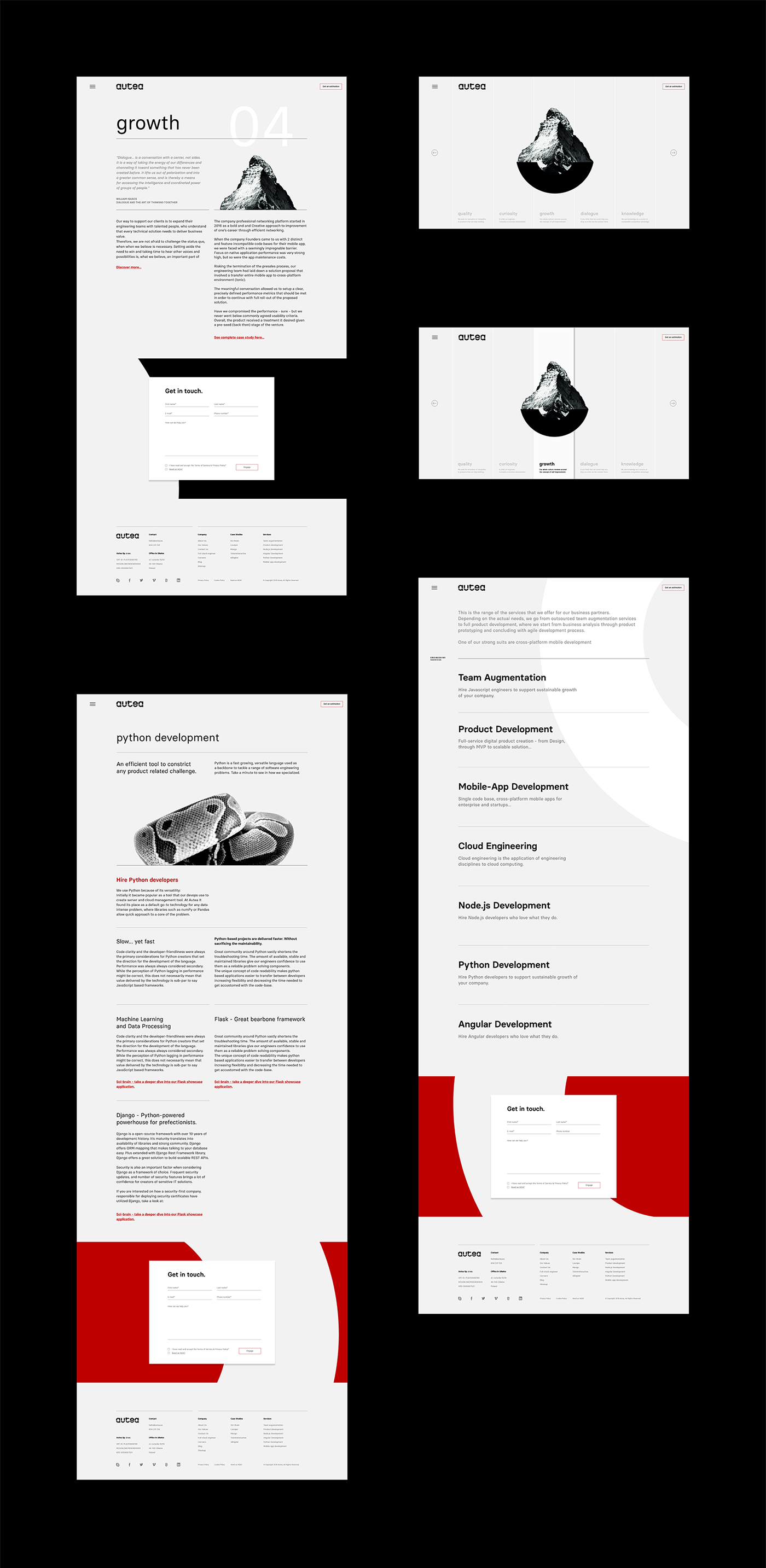
Elements of the symbol find a wider application throughout the whole visual identity system creating a recognizable and coherent visual language. The intersection of letters in the logotype allows manipulation of its individual elements, using them autonomously in various variations. The color palette has been limited to black, gray and red. Red, although not the most obvious choice for this industry, is intended to signal boldness, directness, determination and change.
Elements of the symbol find a wider application throughout the whole visual identity system creating a recognizable and coherent visual language. The intersection of letters in the logotype allows manipulation of its individual elements, using them autonomously in various variations. The color palette has been limited to black, gray and red. Red, although not the most obvious choice for this industry, is intended to signal boldness, directness, determination and change.
Stationery photos: Axela Frank
Web development: Autea (currently under development)