Identity Poster - For Color
_____________________________________________________________________________________
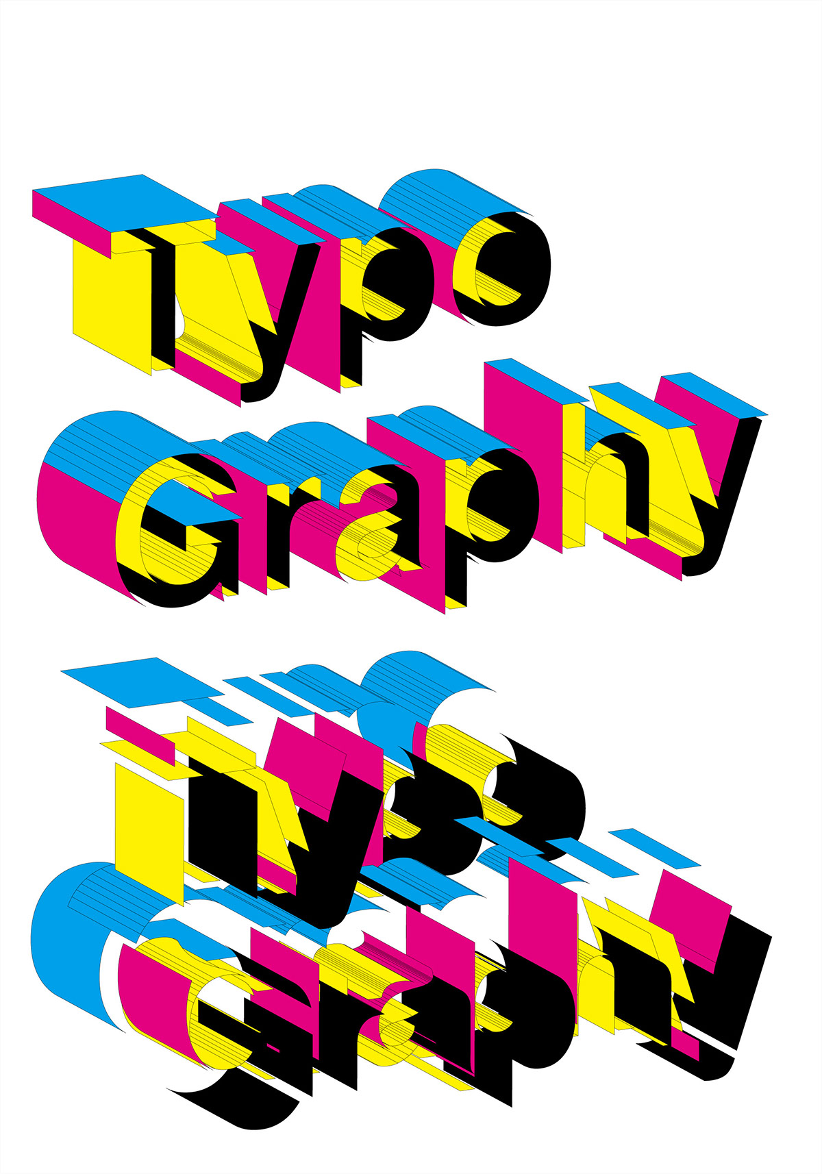
This is a poster designed for CHOI-SYSTEM Design Studio, which is good at the design of certain kinds such as TYPOGRAPHY.
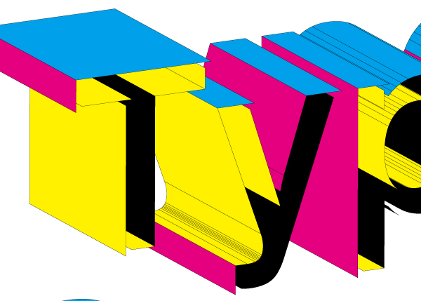
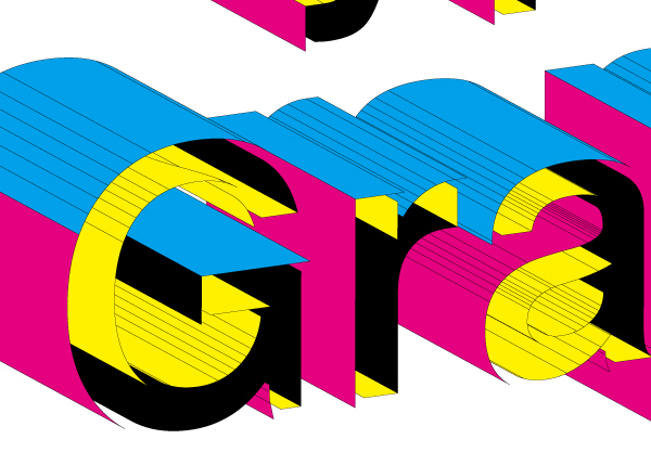
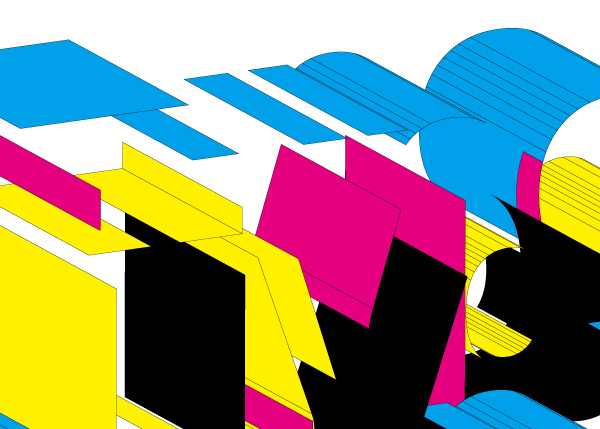
My understanding to TYPOGRAPHY is not only the letterform and format of the picture, but also the printing technic, which is more important. Since thousands of different colors are mixed and blended from the four basic colors that are C, M, Y and K in different propotions, at the beginning of the design, I tried to emphasize the Four-color Pinting is an indiscerptible part of TYPOGRAPHY in a sententious and intuitionistic manner to recall the recognition to the traditional printing technic of people, especially in the numerous and jumbled imformation age. So I made the surfaces of each letter constitute by C, M, Y and K four colors in the principle of Four-color Pinting to express the mix and blending of colors during the process of printing. Then unique cells are splitted on the basis of letterform to express the relationship between the design of letterform and format.
Coincidentally the English pronunciation of Four-Color is similar with For Color, and the Four-Color C, M, Y and K are the foundatiion of all colors in the printing technic. That is why it is called For Color.