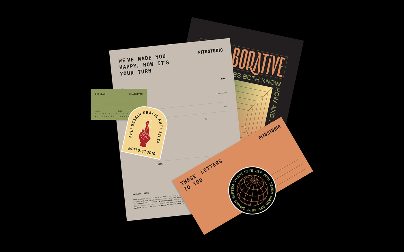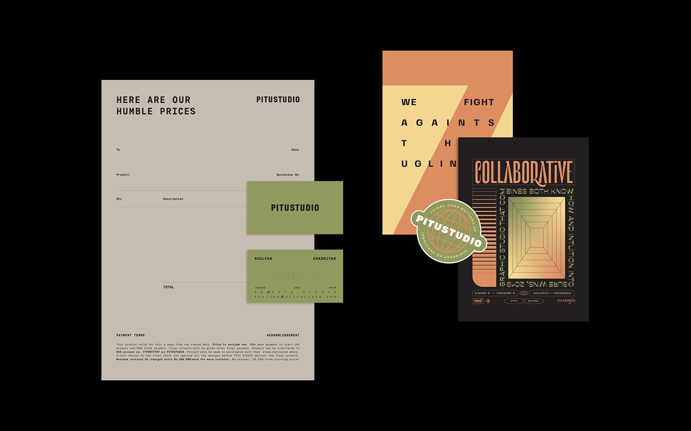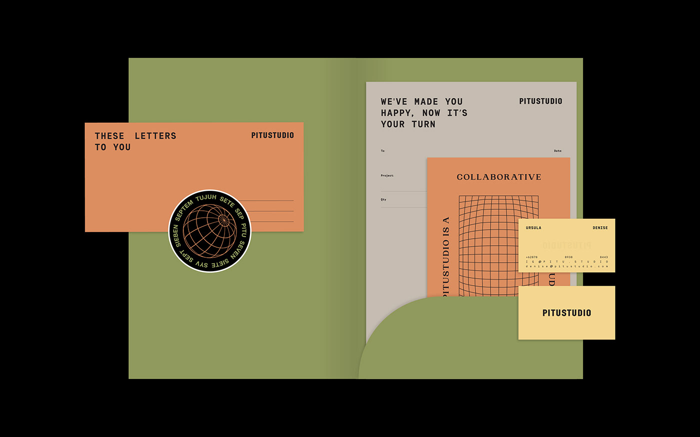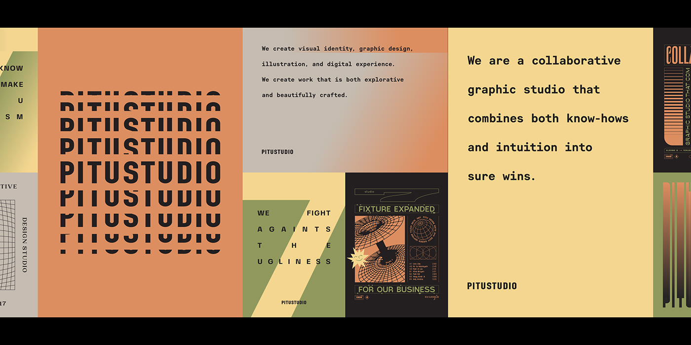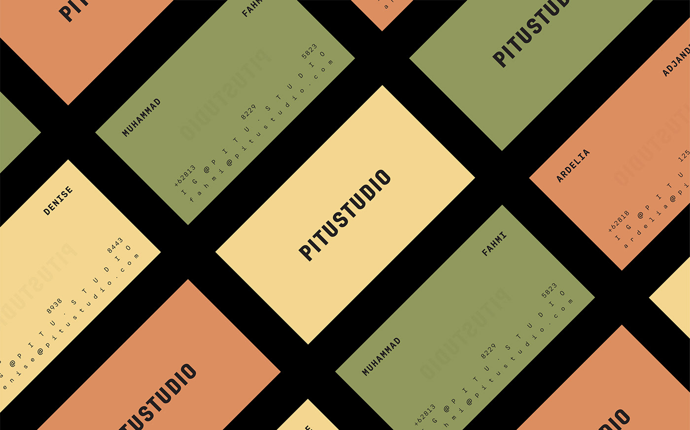
PITUSTUDIO
(Brand Identity - Indonesia)
/pi.tu/
(num)The number 7 in javanese.
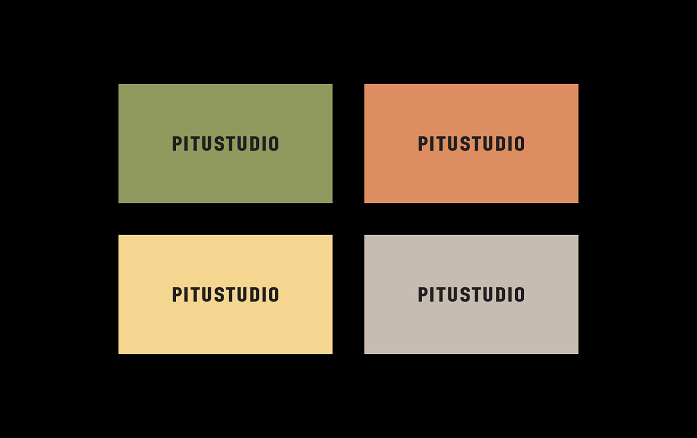
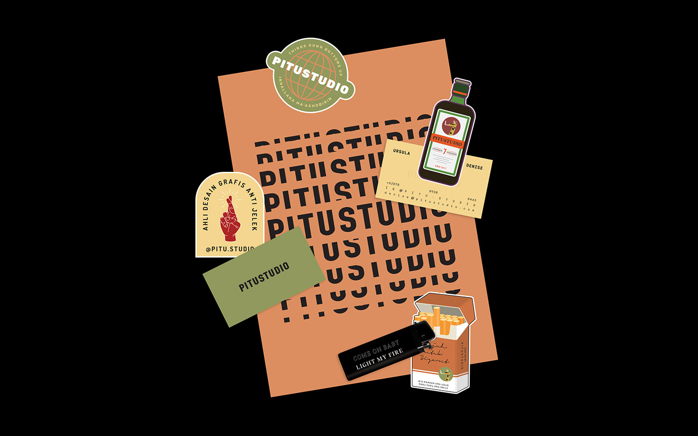
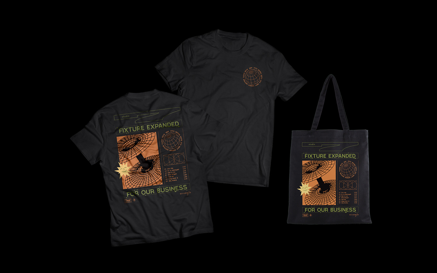
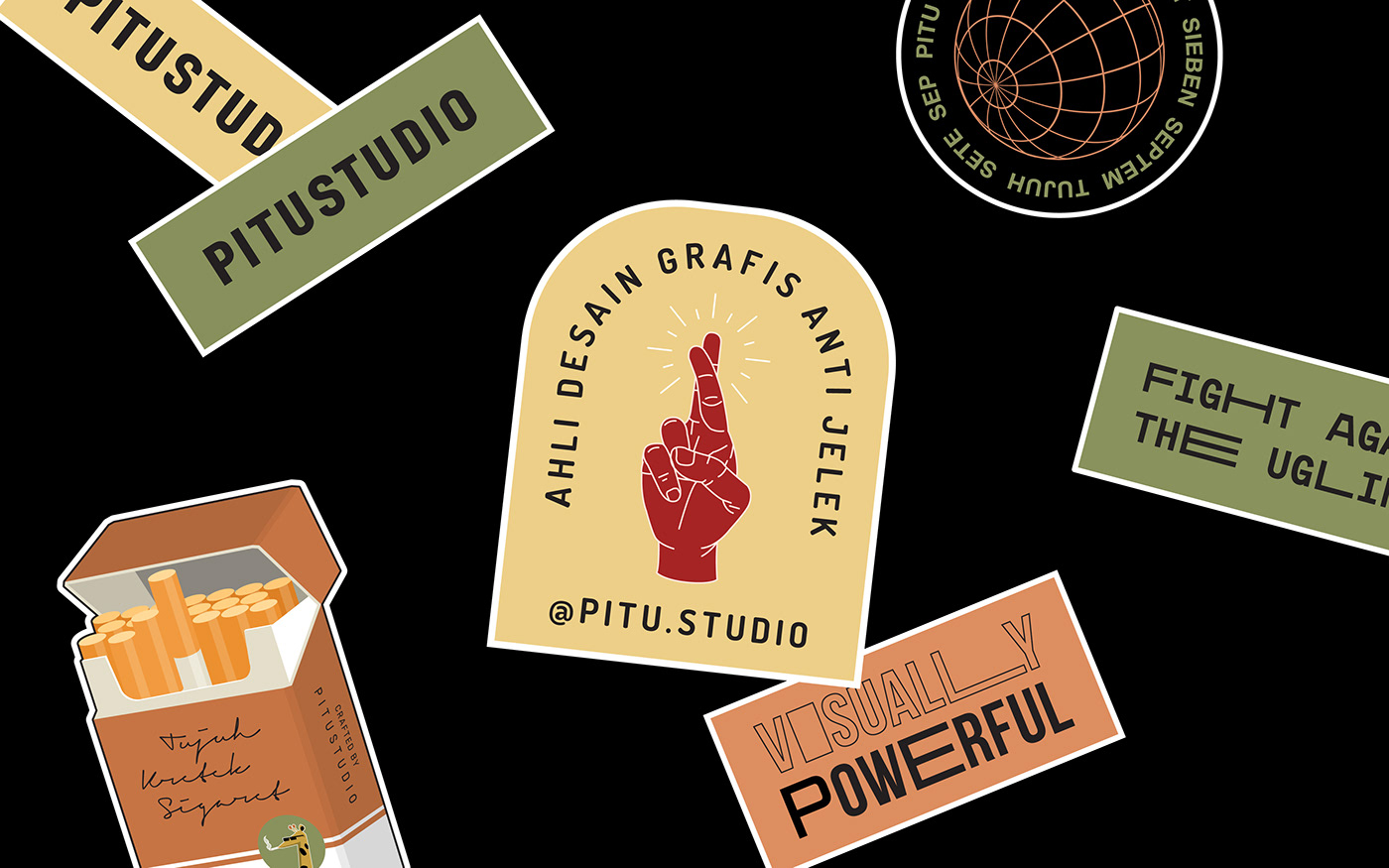
We are a collaborative graphic studio that combines both know-hows and intuition into sure wins. Based on the idea above, color combination concept is use. By keeping the typeface minimalist yet bold will make the three main colors as the main focus.
The color green intended to foster creativity and productivity, and we associate green with progress. The color of yellow helps activate the encourage communication, enhance vision and build confidence. Hence for coral, these colors would suggest a desire to be unique, perhaps a tilting towards the unconventional. This desire to be different often stems from a preference for intuition.