


These leaflets are designed with the humour and fun of Orchard Pig using light hearted pig puns that stand out with the use of vibrant colours to catch the attention of consumers. Being bold and mischievous i believe that this campaign could also be transferred over to a larger scale. The idea behind these leaflets is to be simple and introducing a modern positioning with people around the festival scene as i wanted this to be my main focus appealing to people who are adventurous and outgoing as that is the ethos and demographic of Orchard Pig.
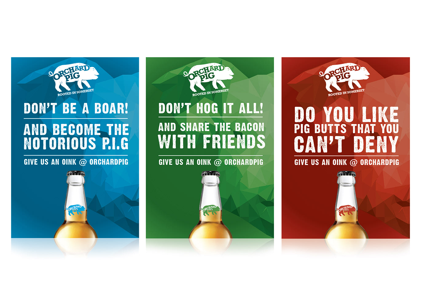

Concentrating on the campaigns i wanted to follow the theme throughout all of the elements so to create consistency, creating these posters it easily stands out and shows off the full range of products available for the consumer. This can be transferred into many mediums and conveying the bold colours of Orchard Pig the general idea of being different is key to standing out from the crowd, incorporating the pig puns which adds to their bold personality and the typeface is key to expressing this further which i think not only compliments the style of the campaign but also the message that they do not want to be conformed to restrictions.


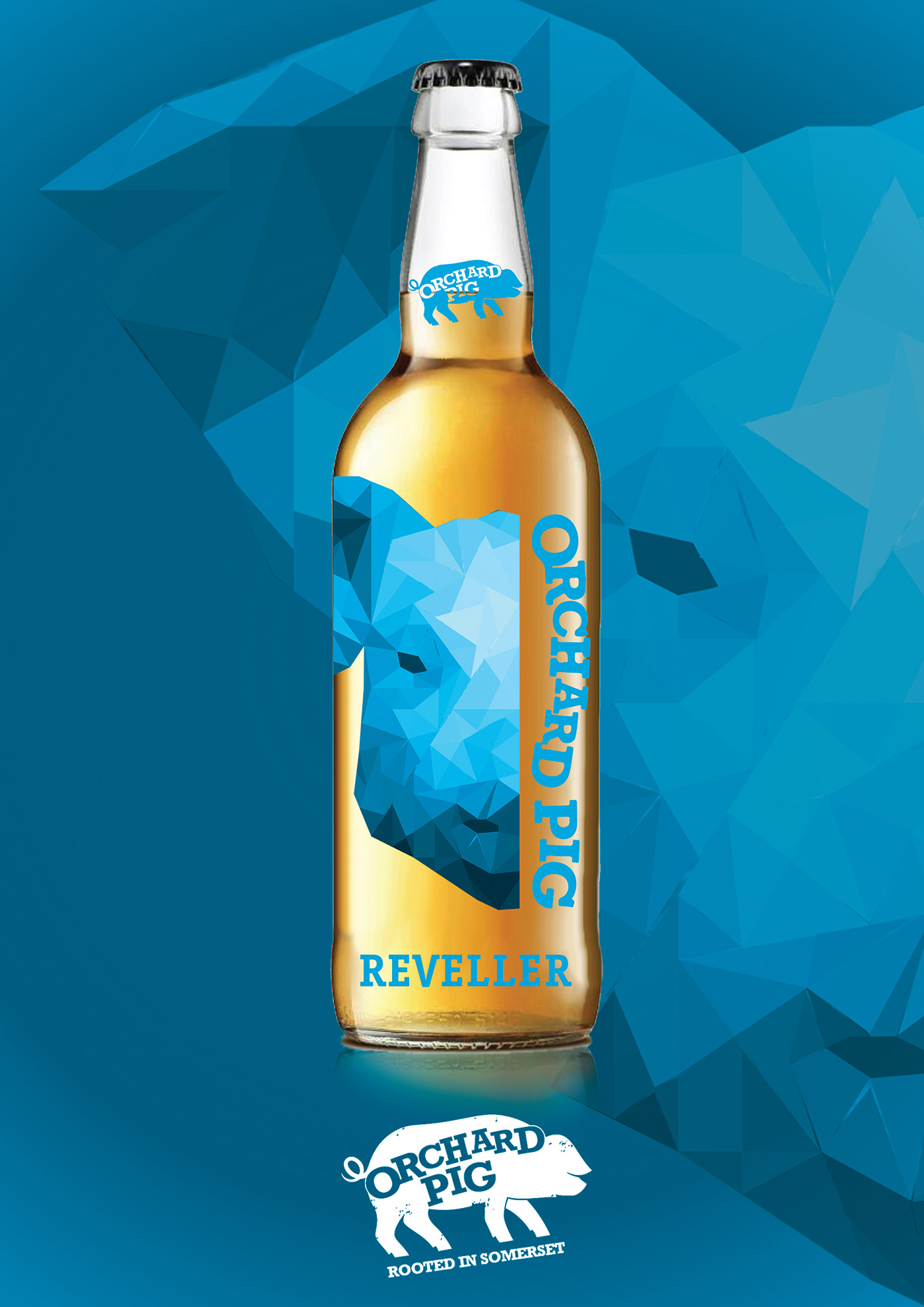

Looking at the products i wanted to re envision what cider was all about and to create and emphasise on their bold identity that disrupts the heritage of the cider sector. With a simple design using energetic colours to represent each of the different flavours, i created a consistency across all platforms which is recognisable and vibrant focusing on the audience who are the makers of mischief with a thirst for the new and exciting. i wanted to express this through my designs separating Orchard Pig from other companies and inject a bit of fun into peoples lives. The low poly pig also expresses the quirky nature of this cider.


