About the brand
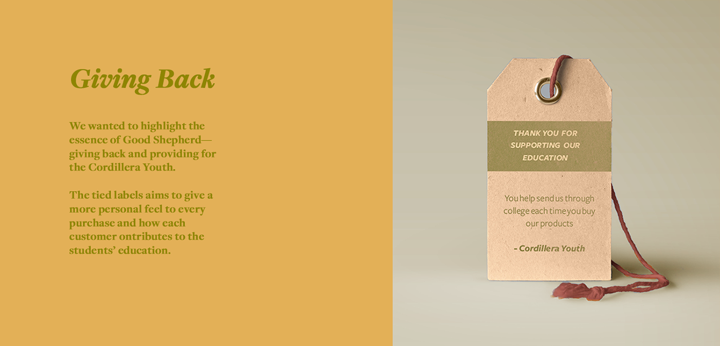
Good Shepherd is a local retailer of Filipino delicacies. Hailing from the mountain province, the brand is most famous for their jams, specifically ube, and various brittles and snacks. The brand, under Congregation of Our Lady of Charity of the Good Shepherd, also aims to provide for the education of the Cordillera Youth. Each purchase of Good Shepherd good contributes to the education of students' under the care of the congregation.
Why rebrand?
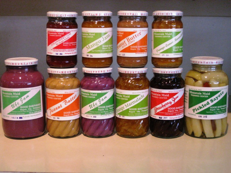
Currently, Good Shepherd has no distinguishable and unique package. This risk the brand losing out to competitors who have more memorable branding, especially when displayed in pasalubong centers or online re-seller stores. Fonts constantly change per item and the only consistent element is the square with a diagonal stripe. Furthermore, there is a lack of type hierarchy in the packaging resulting to the text being compressed into the front label. The brand name and details are not showcased properly, and it’s unique selling point, it’s advocacy is not properly highlighted. With the current packaging, one must have to look at the back label or read the small, and rather vague snippet at the top cap to be informed that the product is related to an advocacy.
Currently, Good Shepherd has no distinguishable and unique package. This risk the brand losing out to competitors who have more memorable branding, especially when displayed in pasalubong centers or online re-seller stores. Fonts constantly change per item and the only consistent element is the square with a diagonal stripe. Furthermore, there is a lack of type hierarchy in the packaging resulting to the text being compressed into the front label. The brand name and details are not showcased properly, and it’s unique selling point, it’s advocacy is not properly highlighted. With the current packaging, one must have to look at the back label or read the small, and rather vague snippet at the top cap to be informed that the product is related to an advocacy.
Current branding and packaging. [photo credit]
LOGO STUDIES
In the initial draft, we aimed to bled together the imagery of the shepherd, linking it to the religious roots of the brand, with the idea of growth and home-grown ingredients. However, this proved to be too modern-looking for the brand. We then decided to take familiar elements from their previous labels such as text cutting through shapes and plain and simple type.

FINAL LOGO AND PALETTE
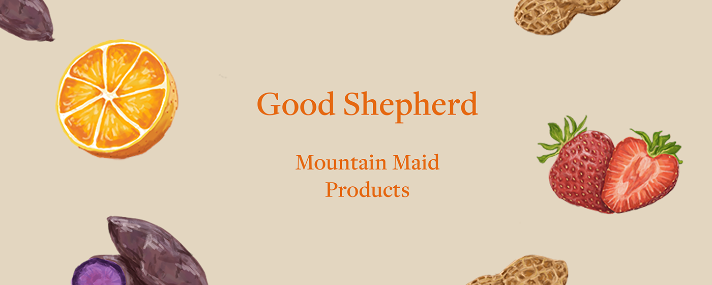
We decided to go with a simple serif logotype to emulate the rustic vibe of the brand. This also allowed the logo to blend with other design elements and packaging opportunities to help customers better identify the products.
Earthy colors were also chosen and inspired by the hearty and fresh product used by the brand, rooted in the mountain province!

Package Designs
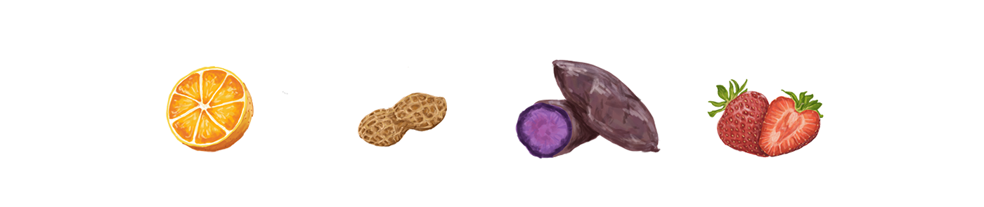
We designed for three of the brand's famous jams. We took the brand's familiar design element, the diagonal line that cuts through, and integrated it into the labels, as well as a checkered picnic-cloth like texture to emphasis the homey feel. We used illustrations into the labels as defining elements to help distinguish the products for both locals and foreigners who hope to bring them home as pasalubongs!


Illustrations by Julia Cu-Unjieng
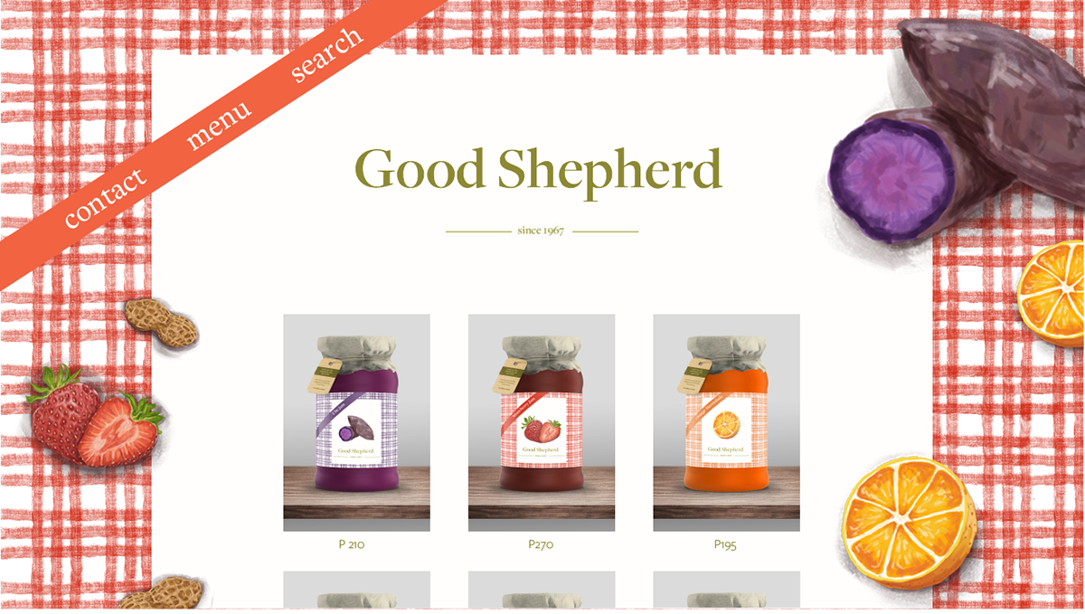
We also made a simple store website design for the brand as means for them to further expand sales!
Site design by Julia Cu-Unjieng
Have a hearty jar of Ube Jam today!
Visit the Good Shepherd store in Gibraltar Rd, Baguio, 2600 Benguet or find them in your local pasalubong centers and select supermarkets near you!


