


Five months of hard work and long nights (and train trips, and weekends, and holidays days...) after, here's to my first book design.
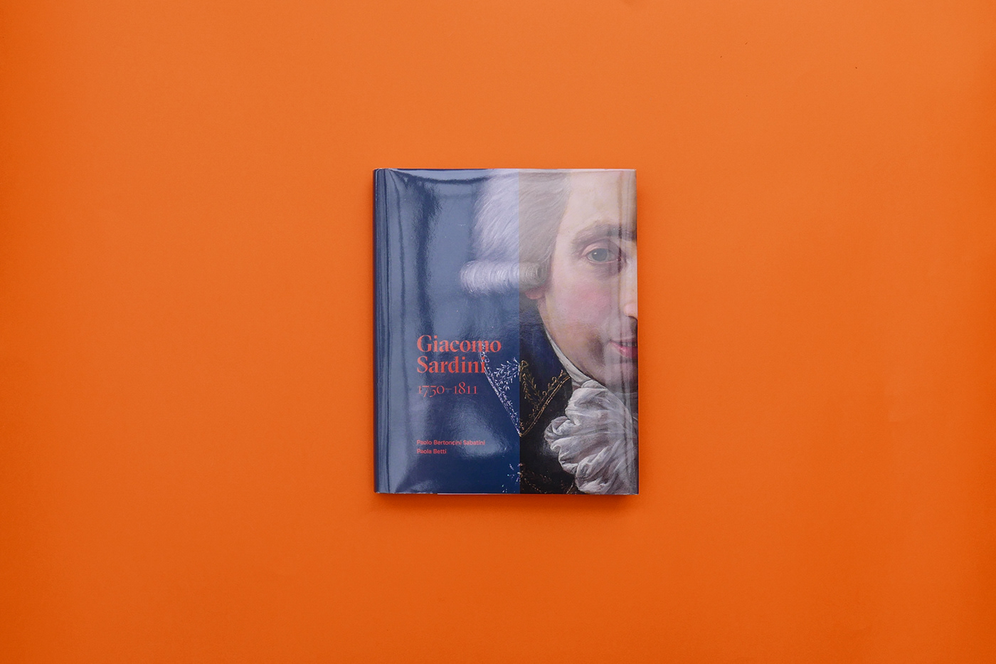
Paolo Bertoncini Sabatini and Paola Betti, the two authors of "Giacomo Sardini | 1750–1811" asked me to design the book and cover for the volume they were writing and which have been "under costruction" for nearly 25 years.
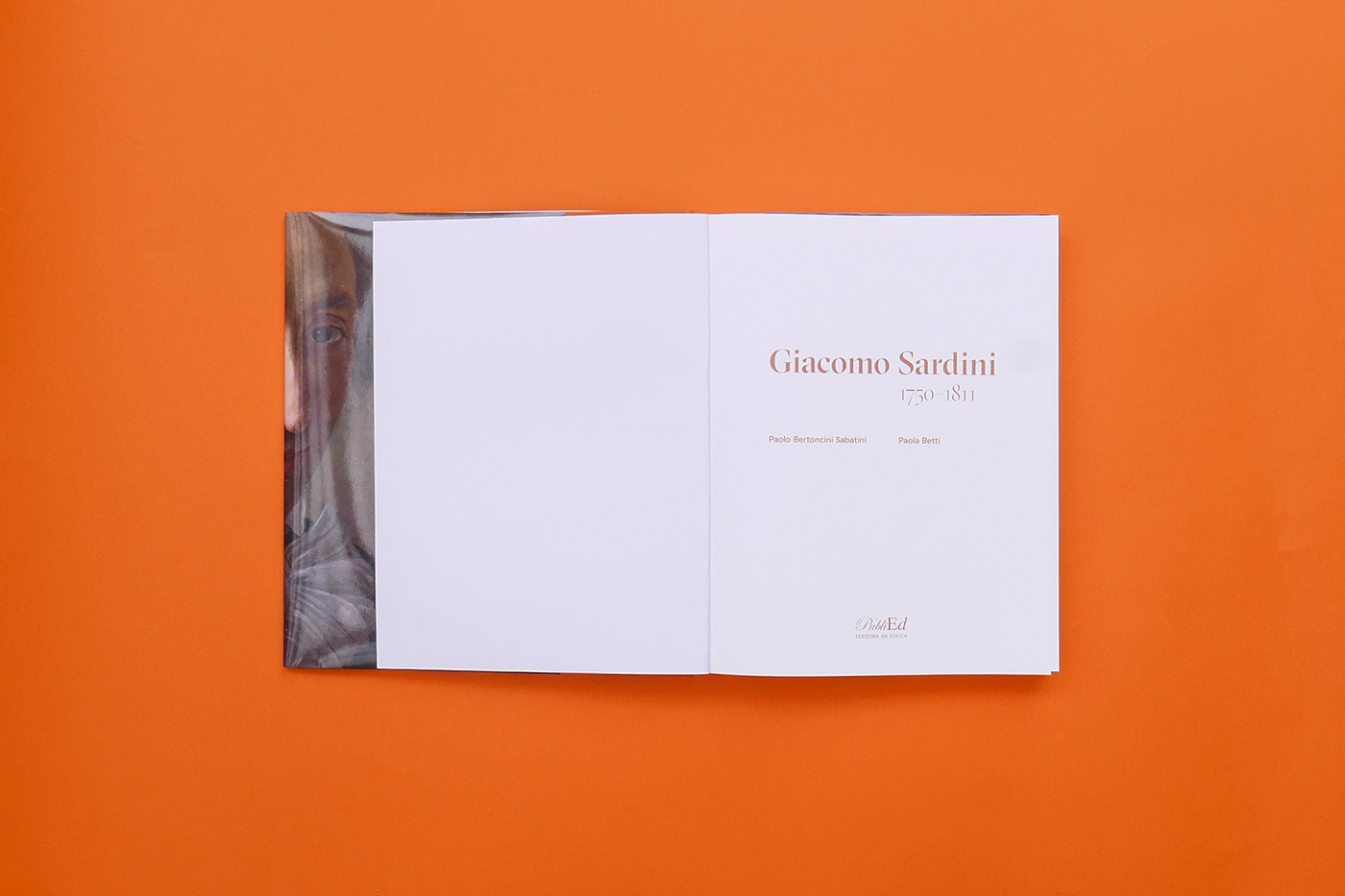
Dimensions and pages were already set by the editor: the tough part of all the project was to precisely define a baseline grid and font dimension after chosing the body font, Grilli Type's GT Super, to fill the 256 pages harmoniously with text and big, wonderful pictures of architecture, paintings and inedited drawings.

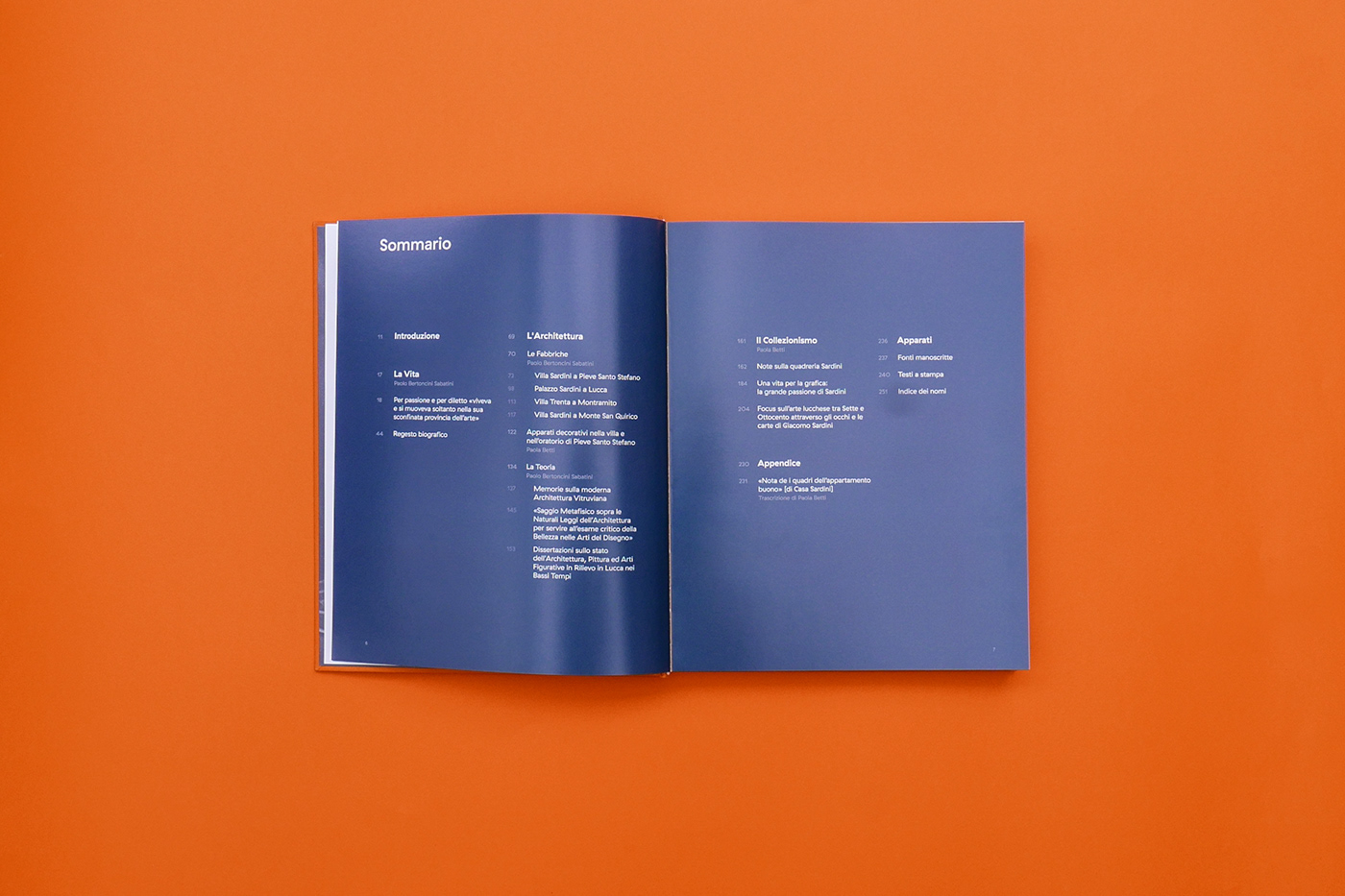
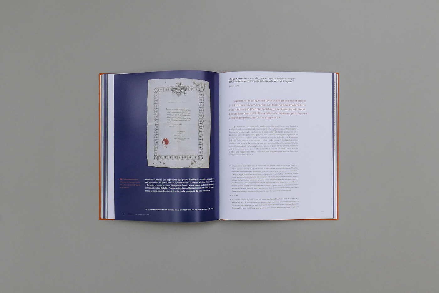
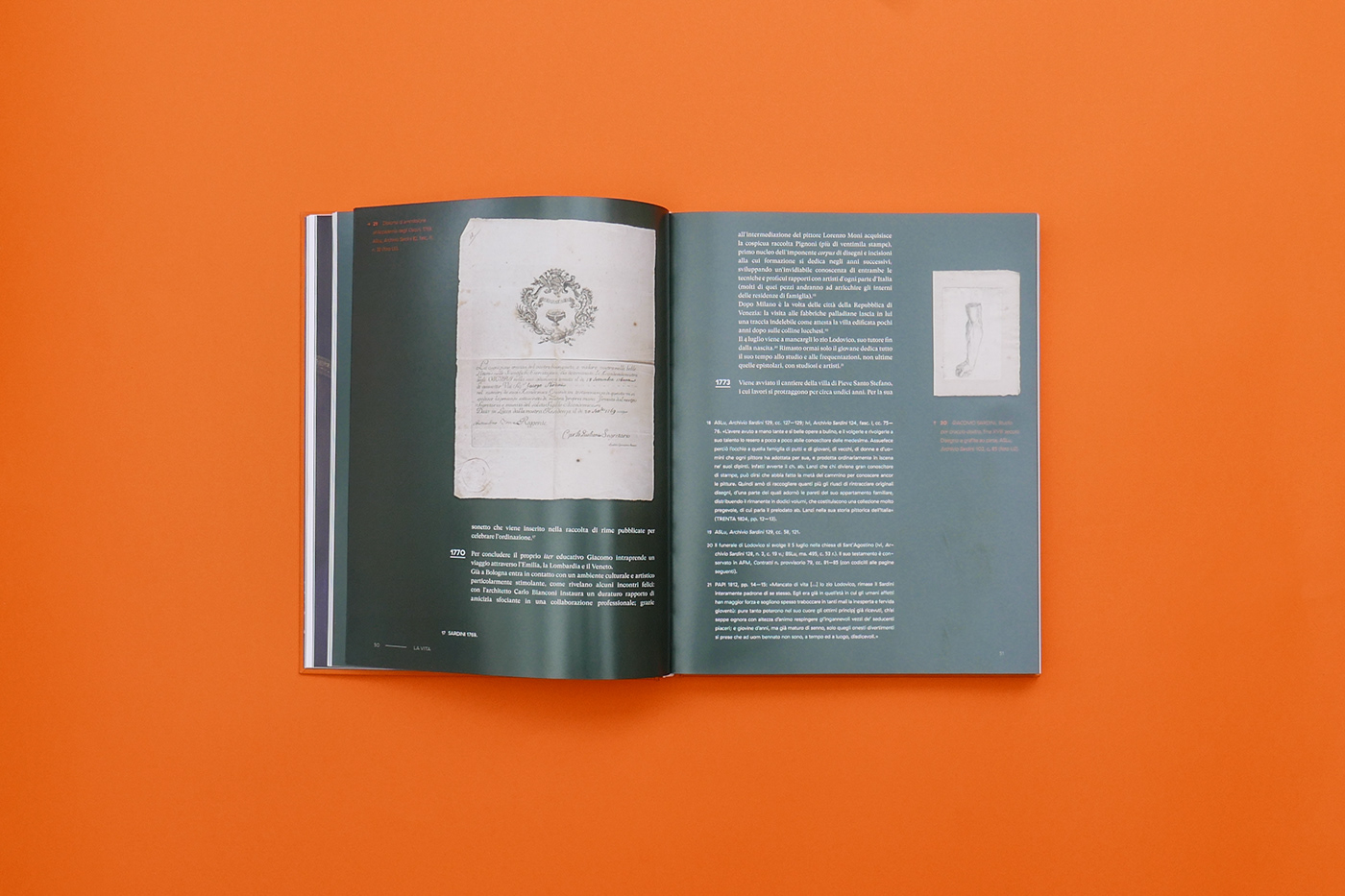
Each chapter — Introduction, the Life, the Architecture, the Collectionism, Appendix, Apparatuses — has its own color, helping the reader orientate throughout the book and serving, used as full background filling, as layer on which Giacomo's original drawings are gently leaned — imitating a museum's showcase.


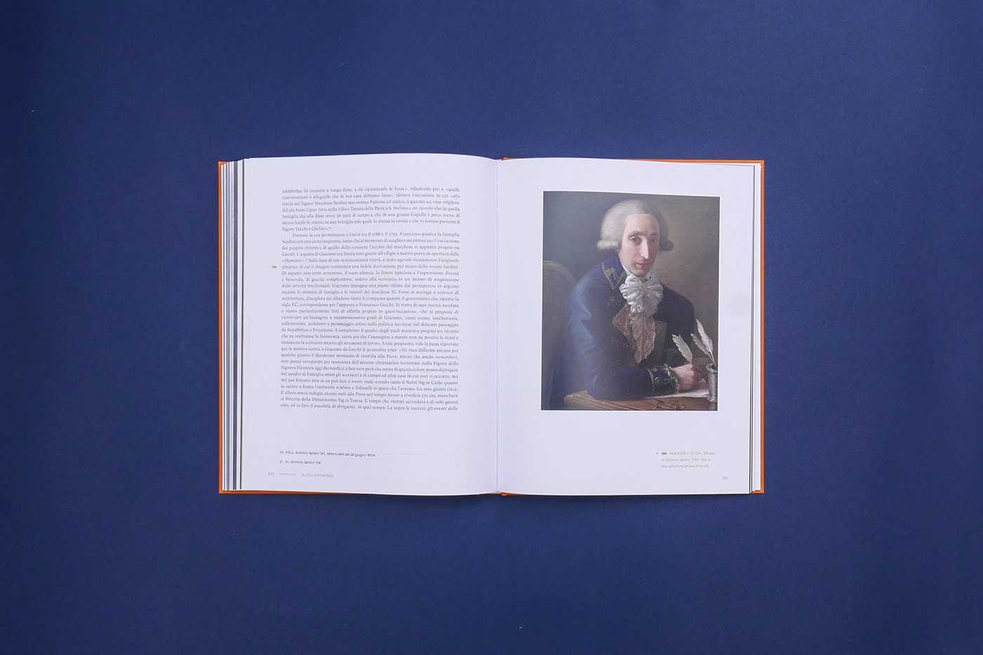
The layout is based on a 10-columns and 4-rows grid, on which text and images flow flawlessly. The grid never forces the images to sit into specific places or to have precise dimensions: all pictures, drawings and paintings retain their original ratio, never being cropped.


The accent color is a bright and warm orange, which gives a fresh and contemporary feeling to the book: the aim was to design a volume which was interesting and exciting to read and browse as Giacomo's life has been a bright happening in Lucca and Tuscany's history.


This wonderful printing and binding job has been done by Bandecchi & Vivaldi in Pontedera, thanks to the great support of Alex. I printed 9 copies: three with black cover for my family, three with gray cover for me and my boy, three with ivory cover for the relators.


☝︎


