

Responsive Web Design: Lonely Whale
A design solution intended to help Lonely Whale drive the conversation around marine plastic pollution on behalf of the ocean.
Timeline:
4 weeks (January 2019)
Role:
Solo project. Conducted research, developed insights, and created a responsive high-fidelity solution.
Deliverables:
client/user interviews, user persona, user flow, storyboard, sketches/wireframes, user testing, responsive high-fidelity prototypes, front-end coded home page
Tools:
Adobe XD, InVision, GitHub, VS Code

Problem Space: Global increase in marine plastic pollution.
___________________________________________________________
DESIGN QUESTION
How might we help Lonely Whale's target user choose to join the organization and subsequently help shift the conversation around marine plastic pollution?
__________________________________________________________
1. Research: Understanding the Problem Space
WHAT CAN A USER DO ON THE WEBSITE?
Before speaking with the client, I conducted a website audit to learn more about the organization and the website’s possible user flows.
KEY TAKEAWAYS: NO CALL TO ACTION
1. Only ways to interact are to donate or subscribe
2. No call to action or sense of urgency
3. Information is a summary of their work with no recent updates

Website Audit: Lonely Whale's website contains more general information than call to action.
By contrast, Lonely Whale’s social media accounts showed high engagement and activity suggesting that Lonely Whale has a strong brand identity and digital presence that was somehow missing from their website.

Social Media Audit: Lonely Whale's Instagram is updated frequently & maintains a strong following.
CLIENT INTERVIEW: WHAT IS THE WEBSITE TRYING TO ACHIEVE?
I conducted an in-person interview with the Director of Digital Strategy at Lonely Whale to understand:
• Who is the target user?
• What are the goals of the website?
• What challenges has the organization experienced?

Client Interview: The target user is a digital savvy modern millennial who is motivated to take action.
KEY TAKEAWAYS: TARGET DIGITAL SAVVY MODERN MILLENNIALS
• The target user is a digital savvy modern millennial woman who leads with her values and is ready to take action.
• The goal is to lead like a brand and influence the conversation around marine plastic pollution.
• The challenge is getting that target user to join the conversation.

Proto Persona: The user cares about the environment and curiously consumes information & alternative solutions.
USER INTERVIEWS: HOW DO THEY CHOOSE A NON-PROFIT?
I conducted in-person interviews with 5 digital savvy modern millennials with the goal of understanding:
1. What is their relationship to non-profits?
2. How do they decide which non-profits to support?
3. What type of brands do they follow on social media?

User Interviews: Users trust organizations that are personally recommended or are transparent about their business practices.
KEY TAKEAWAYS: TRUST IS KEY
• Users learn about non-profits on social media and through word-of-mouth.
• Users support non-profits that they trust. That trust is built through transparency of information (or personal recommendations).
• Users follow lifestyle brands that promote happiness & positivity.

User Persona: The user wants to support environmental organizations, but will only support ones that she trusts.
2. Define: Areas of Opportunity
KEY INSIGHTS
In order for Lonely Whale to spark new conversations, the organization first needs to show millennial women that the organization is worth recommending.
Kelsey is unlikely to trust Lonely Whale based on its current website because the user needs more information to determine if the organization is trustworthy. If Lonely Whale could communicate where the money goes and highlight their achievements, then that would create transparency around funding and direct impact.
VALUE PROPOSITION
The concept offers the user - someone who is guided by social and environmental responsibility - a clear opportunity to align with a non-profit organization that represents with her values and can be trusted with her time, donations, and moral support.
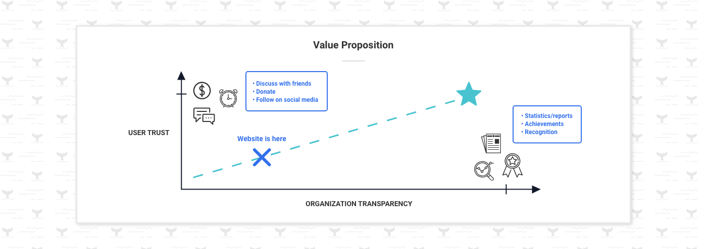
Value Proposition: More organization transparency around funding & impact would help build the user's trust.
3. Ideate: Updated Sitemap, Same Branding
MY APPROACH
While the sitemap needed to be updated, I kept the brand intact and took inspiration from their current website and Instagram account.
NEW SITEMAP
I noticed that the Instagram account hosted an external link to a list of resources that would offer the user more call to action if made available on the website. Taking this information into consideration, I built upon the current sitemap and created a structure that would accommodate the additional user flows.

New Sitemap: Consolidating an external list of resources with the main website.
CONCEPT & CONTENT STRUCTURE
The wireframes follow a simple user flow from the Home page, to the About page, to the Impact page. The plan was to integrate chunks of data about funding and/or impact to build transparency and communicate Lonely Whale’s authenticity throughout the user’s web experience.

Wireframes: Integrating chunks of information & additional data.
UX SCENARIO
Consistent with Lonely Whale’s strong digital presence and the user’s habits, the user discovers the organization through a friend’s post on Instagram and curiously navigates from Instagram to Lonely Whale’s website. The user recognizes a consistent tone across both platforms, appreciates the transparency of information, and feels encouraged to join the movement.
USER FLOW
The user flow follows the user’s decision-making process and her conversion from someone who is skeptical to someone who believes in the organization. The end result is more ideological and in practice would translate into action and conversation.

UX Scenario: The user explores Lonely Whale's website with curiosity & quickly sees an organization that is making a difference.
4. Prototyping & User Testing
Prototypes were built across 3 breakpoints (desktop, tablet, mobile), but tested on mobile in accordance with the technical habits of the user.
USER TESTING SCOPE: TRUST & COMPREHENSION
Mid-fidelity prototypes - built out with content and only styled with typography - were user tested with 5 digital savvy modern millennials. The goal was to test users’ understanding of the organization before applying visual design.
KEY TAKEAWAYS
Feedback highlighted opportunities to improve user comprehension including:
• Removing excess data
• Organizing projects chronologically or by relevance
• Rephrasing vague descriptions

User Testing Feedback: Users were unsure what information was the most important & were looking for a stronger call to action.
After making adjustments to content, colors and imagery were applied to a high-fidelity prototype that was user tested with 3 more digital savvy modern millennials. Comprehension improved significantly, however feedback suggested that the imagery could better support the content. Brand voice and UI styling were influenced by the current website and Instagram account.
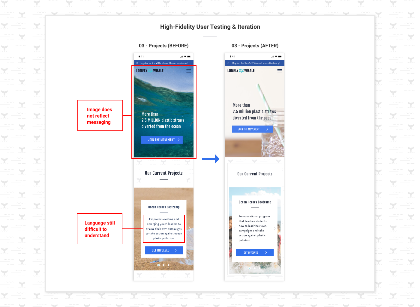
More User Testing Feedback: The imagery could better reflect the content.
Front-End Coded (Home Page): https://kristinechong.github.io/lonely-whale/
Future Opportunities
Add micro-interactions. Animations that would enhance the user experience and add delightful moments to otherwise ordinary tasks such as donating. Another opportunity would be to animate the whale tail motif in ways that would deliver feedback and spark joy throughout the design.
Create additional page templates. The content structure for the “Media,” “Get Involved,” and “Resources” sections would need to be developed to maintain a consistent user experience.


