
Website Design: Los Angeles Homeless Services Authority
Intended to help volunteers sign up for the Greater Los Angeles Homeless Count and secure the 8,000 volunteers LAHSA needs each year.
TIMELINE:
2.5 weeks (Fall 2018)
ROLE:
Collaborated with 2 UX design students with a personal contribution to user/client research, information architecture, early ideation, and project management.
DELIVERABLES:
user/client interviews, user persona, sitemap, UI style guide, user flow, sketches & wireframes, high-fidelity prototype
TOOLS:
Sketch, InVision, Slack, Trello
PROCESS:
1. Research: Understand the Problem Space
2. Define: Areas of Opportunity
3. Ideate: New Sitemap & Brand Identity
4. Prototype & User Test
PROBLEM STATEMENT
Volunteers in their 20s-30s want to help the homeless population in their community, but struggle to find an impactful opportunity that fits within their schedule.
DESIGN QUESTION
How might we help volunteers make an informed decision to register for LAHSA’s Greater Los Angeles Homeless Count so that LAHSA may also quickly reach their goal of 8,000 volunteers?

Problem Space: LAHSA relies on 8,000 volunteers each year to help secure funding for homeless services.
1. Research: Understanding the Problem Space
HOW IS THE WEBSITE CURRENTLY STRUCTURED?
A website audit was conducted to examine the current user experience for a volunteer trying to register for the Homeless Count. We looked at content, content structure, and user flow to understand how information was organized, framed, and communicated.
KEY TAKEAWAYS: SIGNING UP IS COMPLICATED
1. No clear path for volunteers to register for the Homeless Count from LAHSA.org
2. Information about the Homeless Count is difficult to find on LAHSA.org
3. Volunteers must register on TheyCountWillYou.org

Website Audit: No clear way to sign up or learn more about the Homeless Count on LAHSA.org.
WHO IS THE USER?
The user is a 36-year-old single male volunteer who works full-time as a high school teacher in Boyle Heights, CA. He wants to help the homeless in his community in some meaningful way, but struggles to feel like he's making an impact.

Proto Persona: The user wants to help the homeless in his community, but is unsure how to make an impact.
USER INTERVIEWS: WHAT ARE THEIR PAIN POINTS & MOTIVATIONS?
User interviews were conducted with 4 male individuals ages 23-41 who occasionally volunteer, but aspire to do more. The goal was to verify assumptions about the user, learn about the user's relationship to volunteering, and gauge his attitude towards the homelessness issue.

User Interviews: The biggest pain point is finding time to volunteer, followed by lack of awareness.
KEY TAKEAWAYS: LIMITED TIME & LACK OF AWARENESS
Interviews yielded helpful feedback regarding users’ approach to volunteering and reasons why it can be difficult to commit - limited time and lack of awareness. Users generally understood the complexity of homelessness as an issue, but responses varied with their understanding of what would be expected of them.

User Persona: The volunteer wants to make an informed decision about where to allocate his limited time.
CLIENT INTERVIEW: WHAT ARE LAHSA'S CHALLENGES?
After speaking with users, we spoke with a representative from LAHSA to better understand the Homeless Count from an inside perspective. What were their challenges? How did they recruit 8,000 volunteers every year? How did they address safety concerns?

Client Interview: Volunteers only need to commit 3-5 hours for this high-impact opportunity -- but many don't sign up right away.
KEY TAKEAWAYS: DELAY IN SIGN-UPS
Although volunteers only needed to commit 3-5 hours, many would not sign up until the week or so before. Volunteers were recruited by LAHSA, however they were asked to register on TheyCountWillYou.org -- dividing the user's attention between 2 different websites.
2. Define: Areas of Opportunity
The Homeless Count appeared to be a good fit for Victor’s schedule and would offer a high-impact volunteer opportunity, however the crowded information architecture and scattered details created ambiguities about volunteering for the Homeless Count. The existence of two websites also unnecessarily complicated a simple user flow.
HYPOTHESIS: BETTER COMMUNICATION, MORE VOLUNTEERS
If LAHSA could clarify the volunteer logistics and role of a volunteer as well as clearly communicate the importance of the Homeless Count, then Victor would see that choosing to volunteer with LAHSA would be an easy way to make a big impact with minimal time and effort. We also hypothesized that consolidating both websites into one would help LAHSA achieve their volunteer count more quickly.

Value Proposition: Better communication would help volunteers see the value of participating in the Homeless Count.
3. Ideate: Setting New Structural & Visual Standards
OUR APPROACH: REORGANIZE & REBRAND
LAHSA’s home page was cluttered with text, links, and unfamiliar terms. To solve this, we planned to reorganize the site map and enhance comprehension with more content chunking. We also developed a new brand voice with the goal of making LAHSA’s brand image more motivating, engaging, and unifying.
THE CURRENT SITE MAP: SCATTERED INFORMATION & NO HIERARCHY
During this phase, my role was to use the card sorting method to take an inventory of the navigation items, identify content patterns, and consolidate categories. We found that one of the biggest sources of confusion was that LAHSA.org targeted 2 users equally (1. homeless service providers and 2. people seeking homeless services) with no call to action for volunteers.
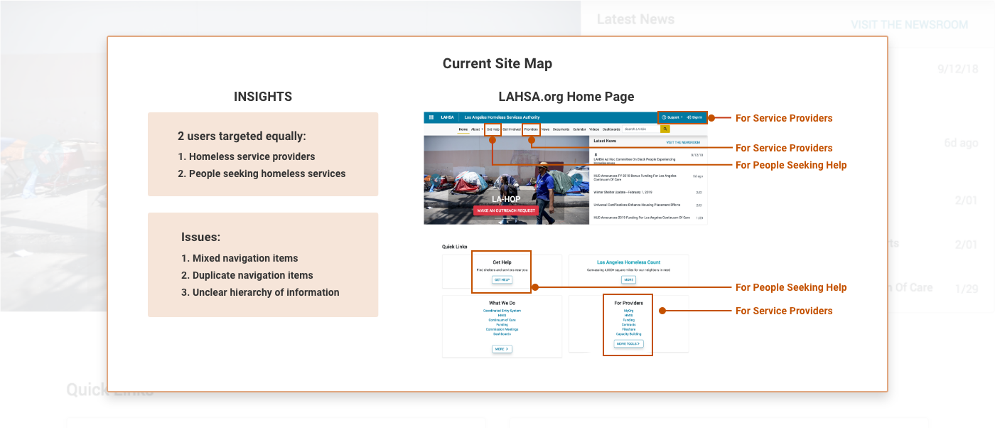
Current Site Map: Scattered information and no clear hierarchy.
THE NEW SITE MAP: CLEAR & FOCUSED
In the new site map, there is a designated tab for service providers, people seeking services, and volunteers - creating clarity and user focus. The card sorting method helped declutter the navigation bar from 9 to 5 items.

New Site Map: Fewer primary navigation items and more user focus.
CONTENT STRUCTURE & VISUAL DESIGN: EASY TO SCAN
We utilized content chunking and the rule of 3’s to make sections 'snackable' and “easy as 1, 2, 3.”

Design Concept: Making important details easy to scan.
NEW BRAND VOICE: MORE MOTIVATING & ENGAGING
We identified 5 adjectives that would give LAHSA a more approachable brand identity.

Brand Voice: Strategically identifying 5 adjectives to make LAHSA more motivating, engaging, and unifying.

4. Prototype & User Test
USER FLOW SCOPE: CONSIDERATION PHASE
We assume that the user is curious and motivated enough to navigate from LAHSA’s Facebook page to their website.

Decision Flow: Considering the user's thought process as he decides whether or not to volunteer.
WIREFRAMES: FOCUS ON STRUCTURE & FUNCTION
(Wireframes & prototypes by Celina Munoz.)
We quickly turned sketches into mid-fidelity wireframes that would be easy to user test in InVision. The wireframes focused on structural elements that would make the redesign functional and easy to use.

Wireframes: Making structure & function a priority before applying visual design.
USER TESTING SCOPE: COMPREHENSION
We user tested mid-fidelity prototypes with 3 potential volunteers focusing on their understanding of the Homeless Count. Their feedback influenced changes in the high-fidelity prototype such as including the organization’s mission statement.

User Testing: Gathering feedback and making iterations to improve comprehension.
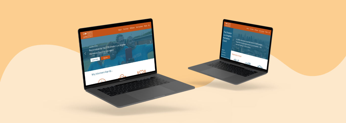
InVision Prototype (Desktop): https://invis.io/VAQKPZ669TF
Reflection
Balancing the needs/goals of the user and the client. Both the volunteer and LAHSA wanted to help the homeless population, but had different obstacles to achieving that goal. This project was about listening to both groups and finding a balanced solution.
Collaborating under a tight deadline. Within 2.5 weeks, our team only met up 5 times. In order to meet our project deadline, it was important for us to set deadlines for key deliverables. Our aim was to accomplish a certain amount of work by each session so that we could review and discuss our progress, make decisions, and establish new goals for the next session. While apart, we communicated regularly on Slack and assigned tasks on Trello.
Communicating a complicated organization clearly. It was a challenge to weave all of the stray information about LAHSA and the Homeless Count into a clear and concise redesign. Content chunking and site map reorganization were crucial in structuring content more clearly for our user.


