The Sentience 2012
Event Conceptualisation
This research project is an outcome of my classroom project done in National Institute of Design under the guidance of Ms. Shilpa Das as my project guide and Mr Immanuel Suresh as the project coordinator. It started with the study of 'Subcultures' as the main theme. As I dug deeper into my research, I streamlined my focus areas to specific subjects like choice of freedom, private and public selves and individualism/ collectivism. Finally my research filtered down to the topic of 'Identity', based on which I started working towards the final visual outcome.
Finally I decided to work on the conceptualisation and visualisation of a yearly conference which could discuss, study, interpret and share the various studies done on culture, identity, youth, society etc. My design intervention in this would be to make the conference more effective and accesible and to throw light upon the various topics of my research, theoretically, practically and visually.
The conference was named 'The Sentience' whose aim was to unite proffesional knowledge, scientific consciousness and social commitment of the members. Target audience would be people studying various subcultures, representatives of various cultures, anthropologists, sociologists, psychologists, philosophers, artists, designers, critical theorists, activists.
For the final outcome, identity for the event was designed along with three different visual languages for the event.

Event Identity
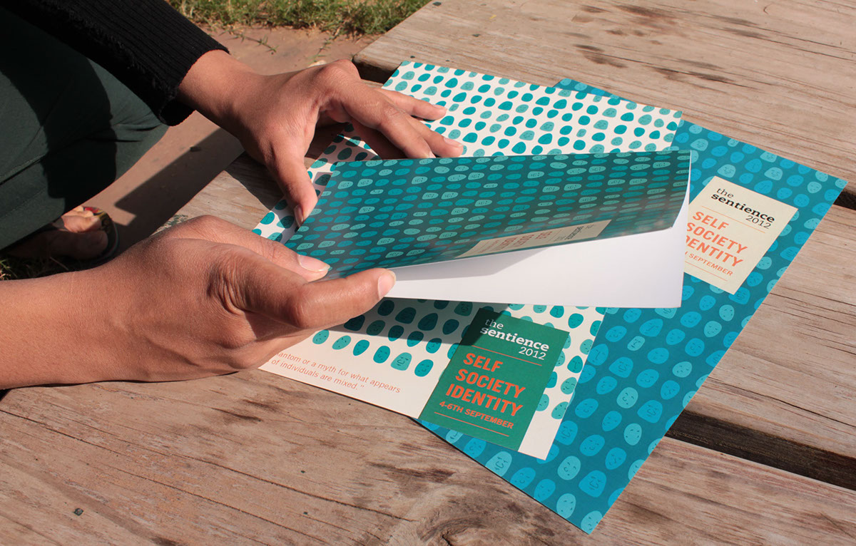
Visual Language 1
language inspired from my research. It will illustrations making it interesting, engaging and vibrant for both the youth and the elder audience.


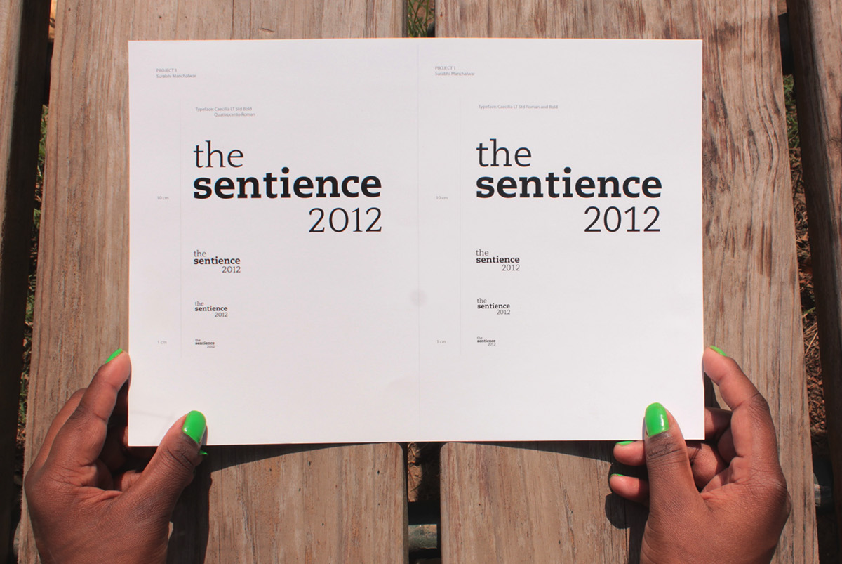
Details
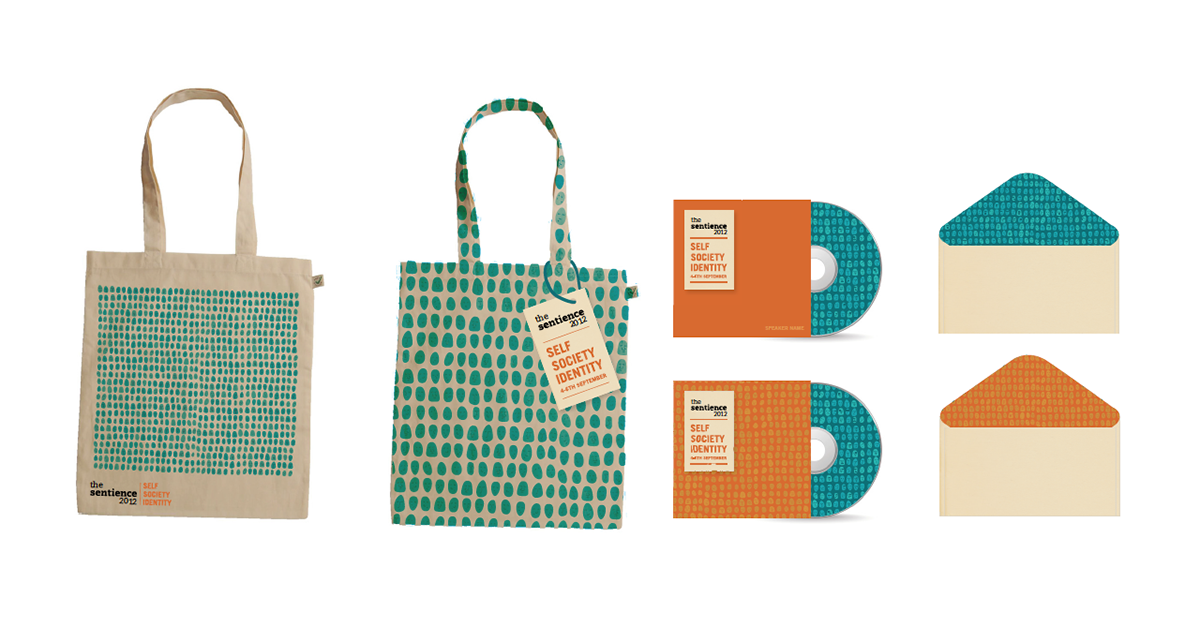
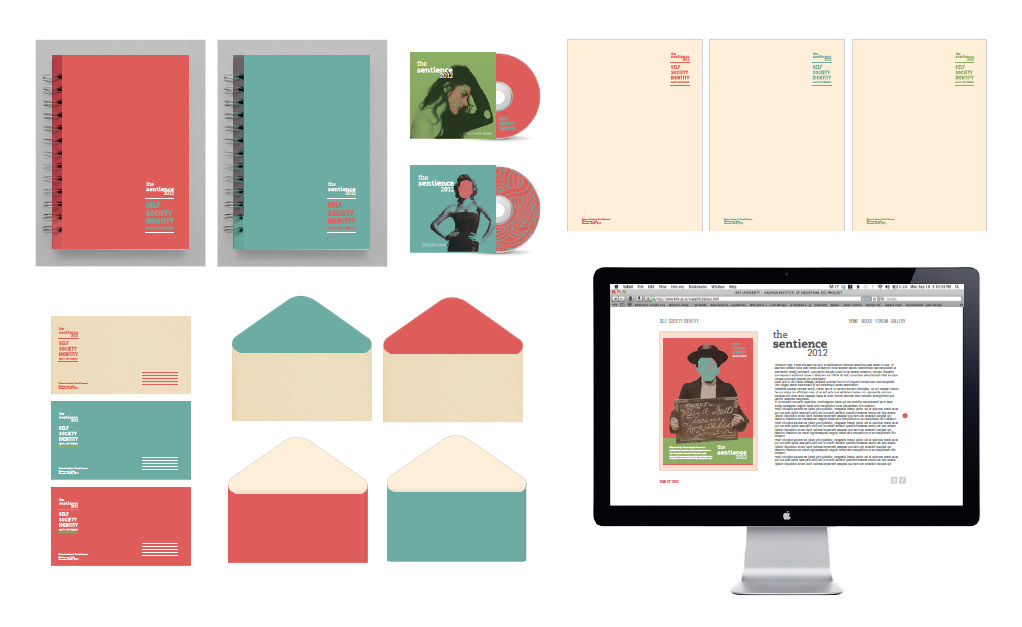
Visual Language 1 - Brand Applications
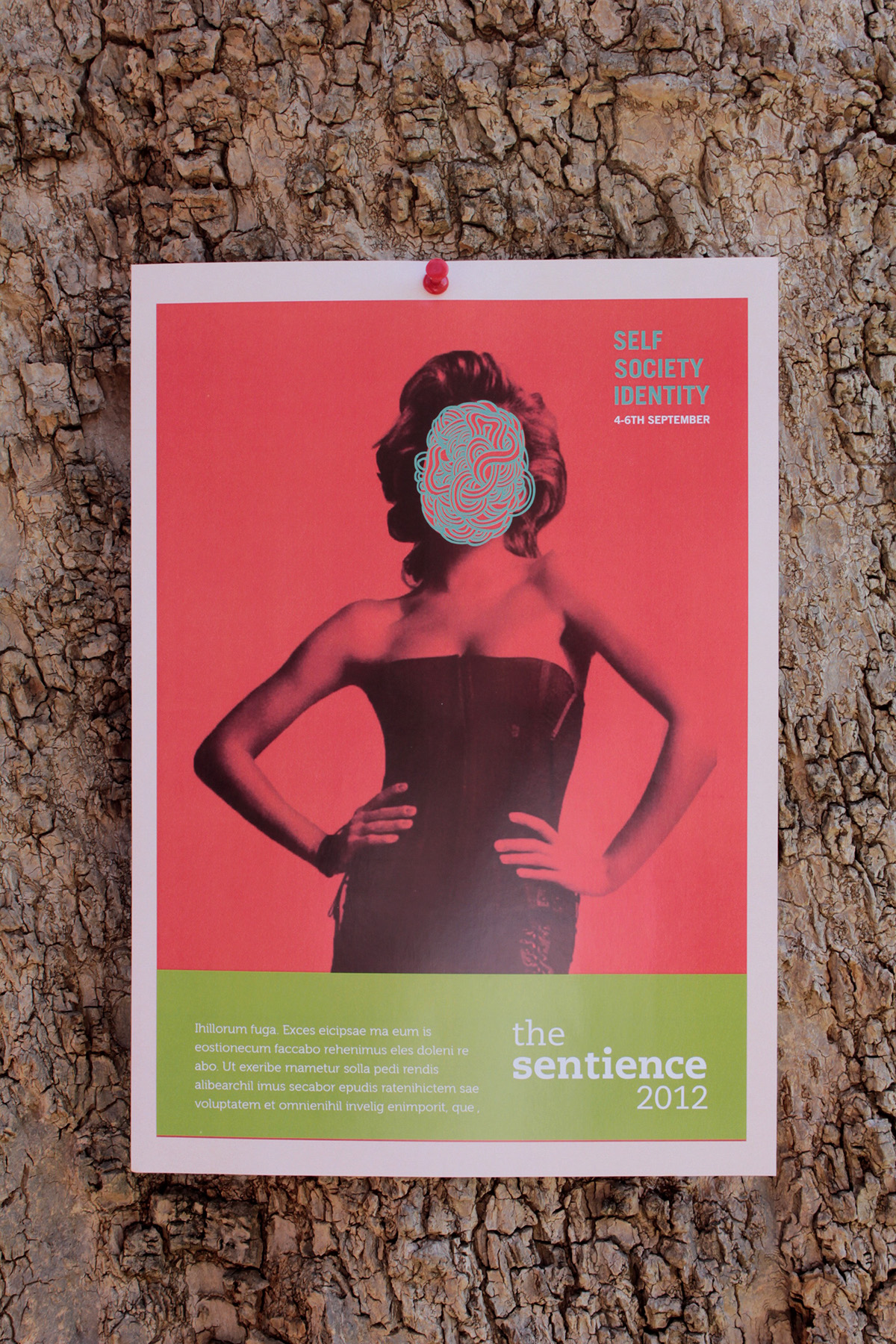
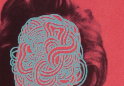
Visual Language 2
This concept uses a conetemporary style with the use of a mix of photographs, illustrations
and textures. The concept behind this is to depict all the elements of identity with which one can be identitfied, for eg. social identity, name, relationships, culture, rituals, etc.
The colour pallette is also an unusual blend of colours which is not generally seen in conference branding. Its vibrance and quirkiness will help make the visual language and stationary more appealing and engaging.


Details

Details
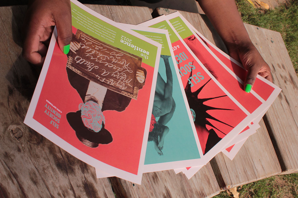
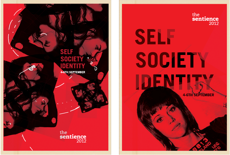
Visual Language 3
This concept is the most basic of all. Using the popular red black and white theme. Simple stationary and other layouts. Use of photographs and little bit of illustration. A slight hint of texture is given to break the monotony of the flat colours. Mainly focused on Youth as the target audience.


Visual Language 3- Brand Applications


